[Playlists] Green Playlist Icon when offline instead of Arrow

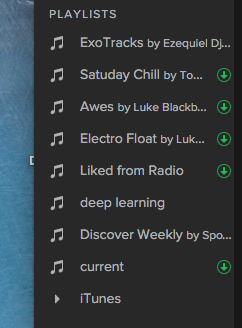
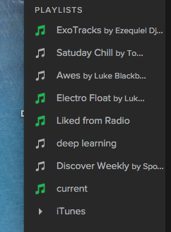
Needless to say, this "little green weird arrow" is an imporatnt part of UI, it's telling us, users, we are ready to play our songs on the offline... but what if? IMHO, it's such a waste of "territory" by adding it in the right sight just between "words" and "black" line. What if... that would be great to turn into green the other side, look at this...
Thanks for your attention! 🙂
Comments

Great idea! Since the interface doesn't rely on discerning red from green then this modificaition should also be suitable for individuals who are colorblind.


I don't think this would be as intuitive as it currently is. For a new user, a green down arrow will symbolise a complete download, but the usually grey music icon becoming green can have many interperatations, especially if you're new to Spotify and don't know what every part of the UI represents, where the UI being intuative is very important.

A great idea about a "hidden" UI element that just blends in but gives you even more information all while being in a sleek package.

Thanks for this idea @tscosj. We want to let you know this is under consideration and we've passed it on to our design team. When I have further updates I will let you all know right here, thanks!

I dont think its a good idea. The green arrow really shows immidiatly its downloaded. The green notes are confusing and not clear what it is for.

I also face this problem.

Arrow is good, I sometimes see colours incorrectly 😄

This design is much more beatifull than the currently!

4YtTX4GPvBvewbJvBfXCS2
@tscosj wrote:
<" size="large" width="242" sourcetype="quote">
Needless to say, this "little green weird arrow" is an imporatnt part of UI, it's telling us, users, we are ready to play our songs on the offline... but what if? IMHO, it's such a waste of "territory" by adding it in the right sight just between "words" and "black" line. What if... that would be great to turn into green the other side, look at this...
Thanks for your attention! 🙂
Updated on 2017-06-14
Hey @tscosj we're updating this idea status to 'Not Right Now'. Our teams carefully considered this one but at the moment the down arrow is single visual reference for offline used across all our platforms. We're hesitant to remove this altogether, but we're open to looking at other ways to indicate the playlist is offline.
Thanks for your feedback--we're continuing to pass it along to our design teams.

Updated on 2019-08-29
Hey!
Your idea has been submitted a while ago but unfortunately hasn't gathered enough kudos (100 per year). In order to keep an overview of the active & recent ideas in this forum, I'll close this idea for now. However this does not mean that your idea has been declined by Spotify.
If you still feel strongly about your request, I encourage you to post your idea in a little different form again! Maybe now is the right time to receive the support of our community for your suggestion! 😉
Do you have any further questions on how the idea exchange is managed? Just click here!
Marked as new idea and edited the title slightly to make it easier to find via search. 😉