Can Spotify please consider redoing the way the lock screen controls are on android.
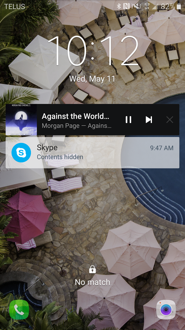
Right now these are really bad imo. It's not bad when you're at your desk but when you're driving they are impossible to use due to how small the buttons are. Plus with the skip song button being right next to the X half the time I end up closing the app instead of skipping my song. I feel unsafe even using these buttons to control my music while driving and end up waiting until a light to change tracks (which I guess I should do anyway but I feel like I should be able to skip songs while driving without trying to hit a 1/3" target).
Can you please:
a) Make these buttons bigger.
b) If A is not possible swap the position of 'Skip Track' and 'Pause' so that if I miss pressing skip all I do is pause what's playing instead of hitting the X and closing it like I do now, requiring me to unlock/reopen the app. Trying to pause and accidently closing the app is much less of a pain than trying to skip a song and closing.
c) Add a previous song button, but not at the expense of making the other buttons even smaller, (although the album art thumbnail can gtfo for all I care.)