[Desktop][Your Music] Reduce the size of the Icons (for Artists & Albums)

I propose to you this idea, which I think can be very useful:
I found the current view (with the large icons) a little disturbing. I'm following more than 200 artists, and have stored lots of albums and honestly it is very difficult to find an artist, without having to stir the whole list to find it.
I give to you a sketch of a type of view that might be useful to add it to both artists and
albums sections, besides of the large icons (just like the smartphone app).
This is the current view.
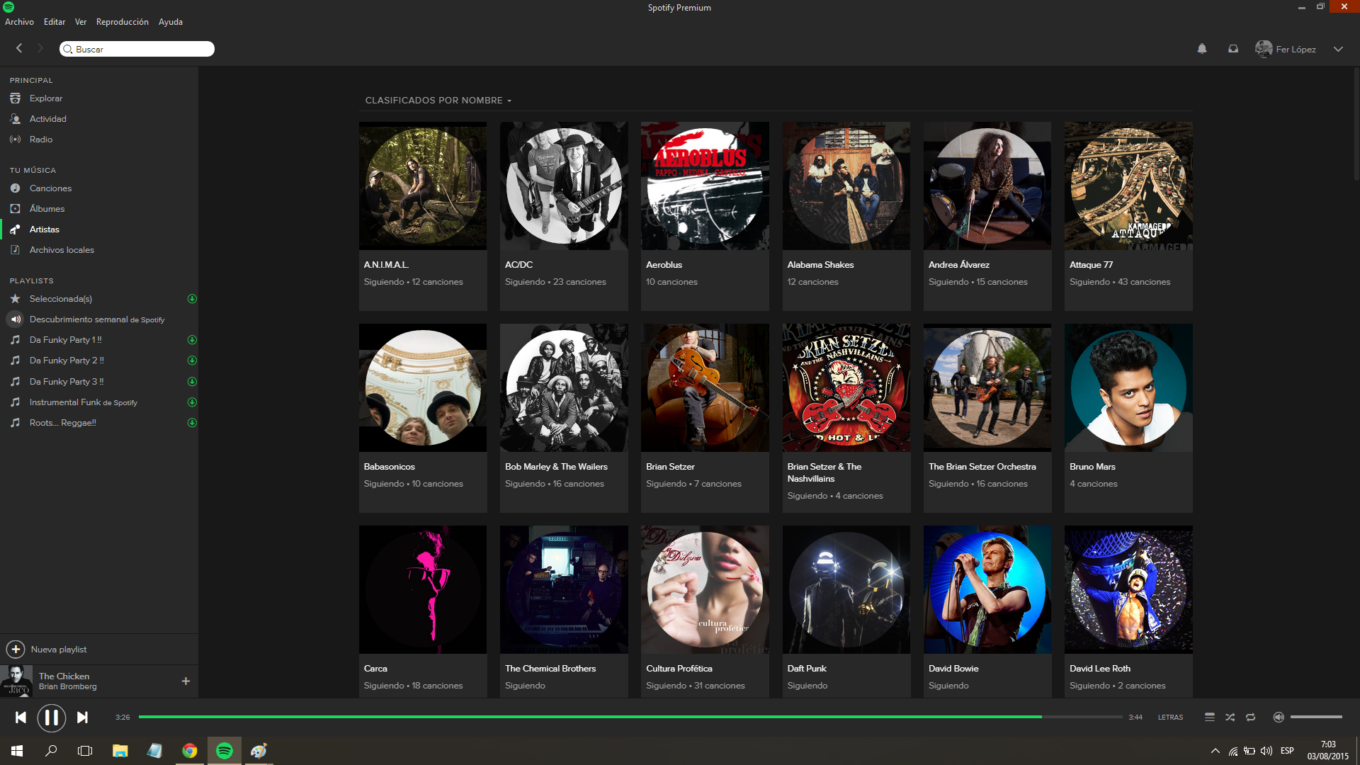 Current View
This is my sketch for a reduced view.
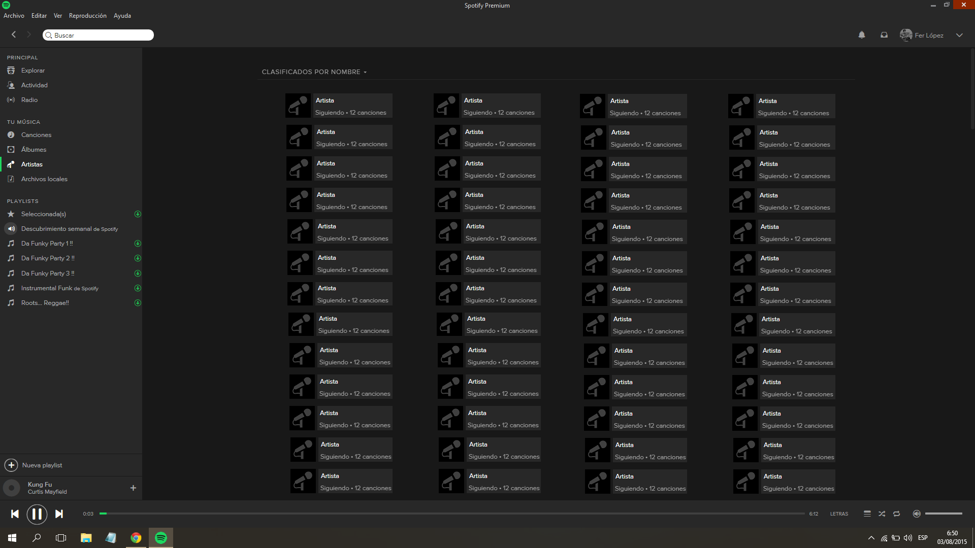 Reduced view
Thanks.
Comments

i agree. you only get about 12 items on a 22 inch monitor without having to scroll down.

Agree! The album section takes too much place, could you reduce the size of the album covers, please?

Update: This idea has been reposted here.
Updated on 2017-07-16
Hello!
Your idea has been submitted a while ago but unfortunately hasn't gathered enough kudos (50 per year). In order to keep an overview of the active & recent ideas in this forum, we will close this idea for now. However this does not mean that your idea has been declined by Spotify.
If you still feel strongly about your request, we encourage you to post your idea in a little different form again! Maybe now is the right time to receive the support of our community for your suggestion! 😉
Do you have any further questions on how the idea exchange is managed? Just click here!
Marked as new idea. This is a repost of the following inactive idea.