Spotify client should follow ClearType setting in Windows for subpixel rendering

Spotify seems to do it's own subpixel rendering and not adher to the Windows ClearType settings.
Not even disabling ClearType removes the subpixel rendering in Spotify.
This should be fixed. While most screens have RGB pattern some may have BGR or if mounted vertically it may be RGB or BGR from top to bottom. And some screens have a filter that blends the RGB values over the entire pixel. Using RGB subpixel optimization on these screens makes the text look worse.
Comments
 Marco

In the new spotify redesigned client, I'm looking at a screen containing all four of 1. non-antialiased text, 2. greyscale antialiased text, 3. cleartype anti-aliased text, and 4. windows-rendered text (in context menus). Of course, I have it antialiasing turned off in my OS. This is nothing unusual, most developers don't care. Apparently their eyeballs suck and they don't know the difference, or they havent ever tested an OS with a non-default text rendering configuration.
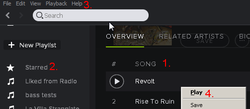
And then there's this... whatever it is.


This idea has been submitted more than 1 year ago but unfortunately hasn't gained enough kudos during that time (10 kudos/year). In order to keep an overview of the active ideas in this forum, this idea will be closed for now. Note that this does not mean the idea has been declined by Spotify.
Please feel free to re-post this idea if you still feel you want this implemented. With a little change in presentation, maybe this time it will gain the necessary support from the community.