[Android][Other] Improve the Spotify icon for rounded icons

Hello! The android Spotify icon recently got updated with a black border. For anyone with a dark or black wallpaper, the icon now appears to be smaller than all the other icons on the phone because the black blends in the the backdrops, making it look really off-putting and out of place.
Looked a lot nicer when the logo took up the whole space! Not sure if iPhone users would have the same issue, but it would make sense they do.
HopwHopef this can be easily adjusted!
Comments

Agreed, new icon looks absolutely terrible.
I am one of the few that actually bother to go onto the community to share my opinion, but I've asked around friends and nobody likes the new icon. Please change it back.

Please Change the icon to the old one, it does not fit with the rest of the other icons because of the black border.

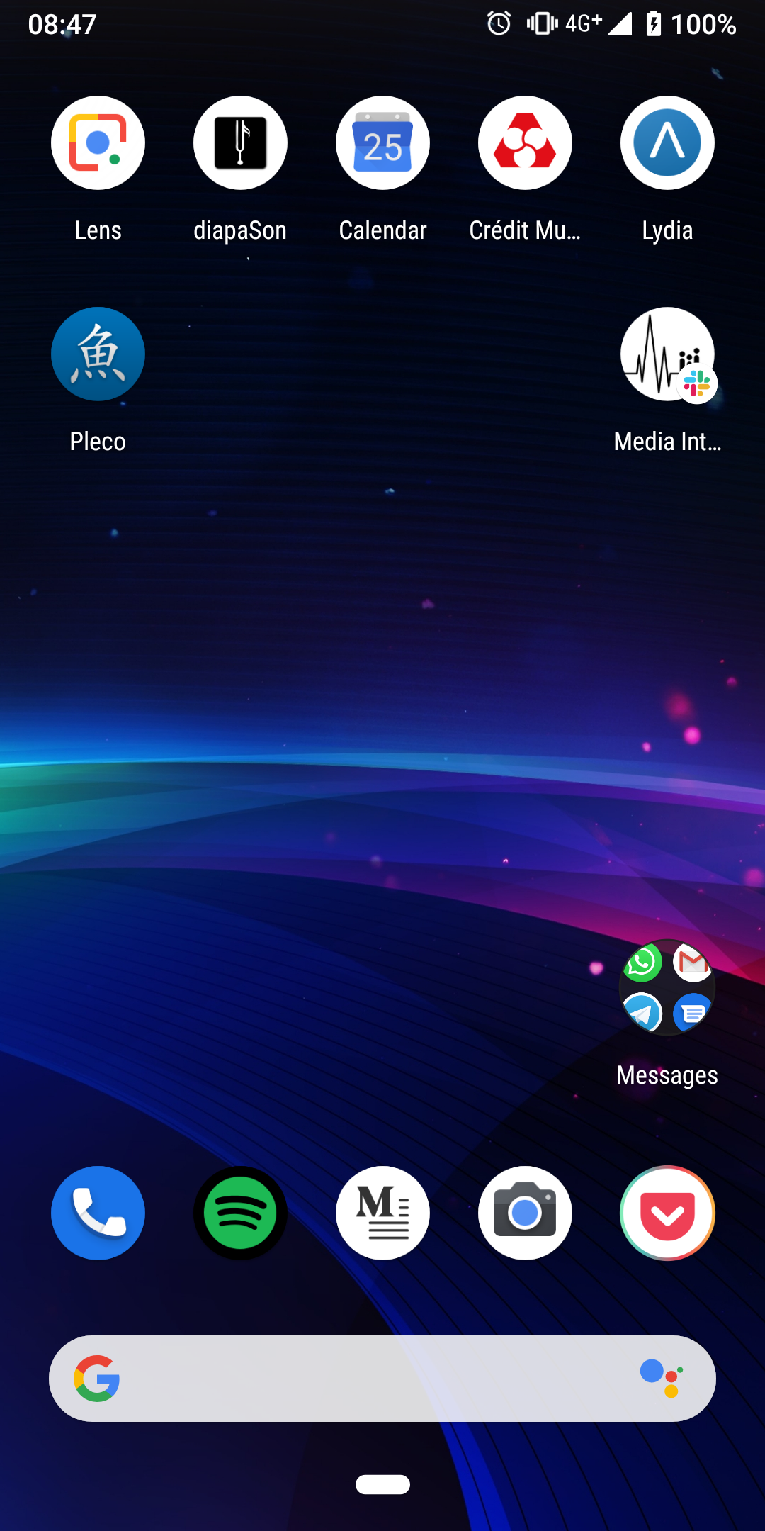
Looks like a mini app :'(
With a dark background, it's clearly a very bad design.

To any devs looking at this, this (should) be an easy fix! The Android Developer page outlines a "roundIcon" attribute (link) that should allow the regular, fully green icon to be used when a phone has circular icons set.

Please make it fully green. Every coworker with an android phone and Spotify was complaining about this at work today. I've yet to hear one person live or online actually compliment the change...

Fix it Spotify. My OCD is in overdrive. wth reason did you have for doing this?

New icon is aweful. Looks like something a new developer would make trying to learn the ins and outs of UX. I hope they change it back soon. This is not a welcomed update.

It's so dinky looking, can this please be changed back to the original design please
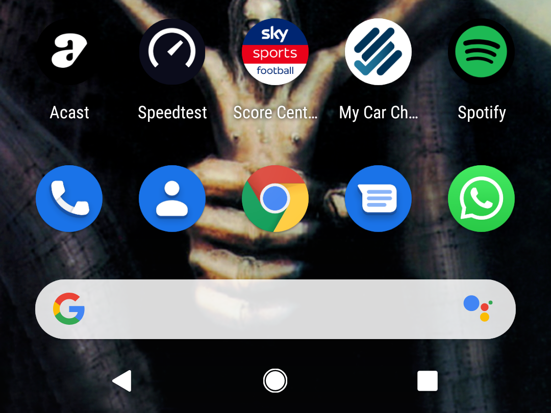

Please change it, it has me wanting to delete the app.

Even without a dark background it now looks odd compared to other icons. Please put it back as it was.

For once was quite happy with my Android Spotify app (having switched from iOS not so long ago) and now have this "beautiful" icon. Please bring the previous icon back!

Agreed. I wanted to know what was wrong with the icon so I searched the internet and found this post.

It's really ugly, both with a dark a non-dark wallpaper! It's bad and nonsensical design. 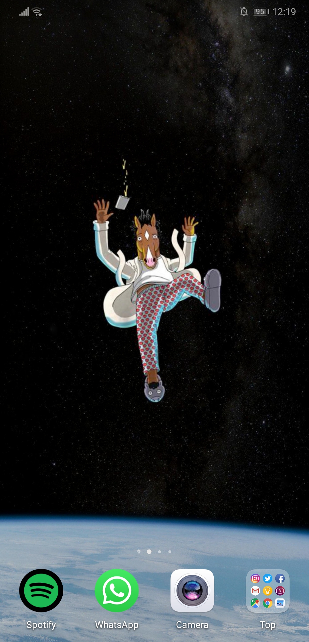
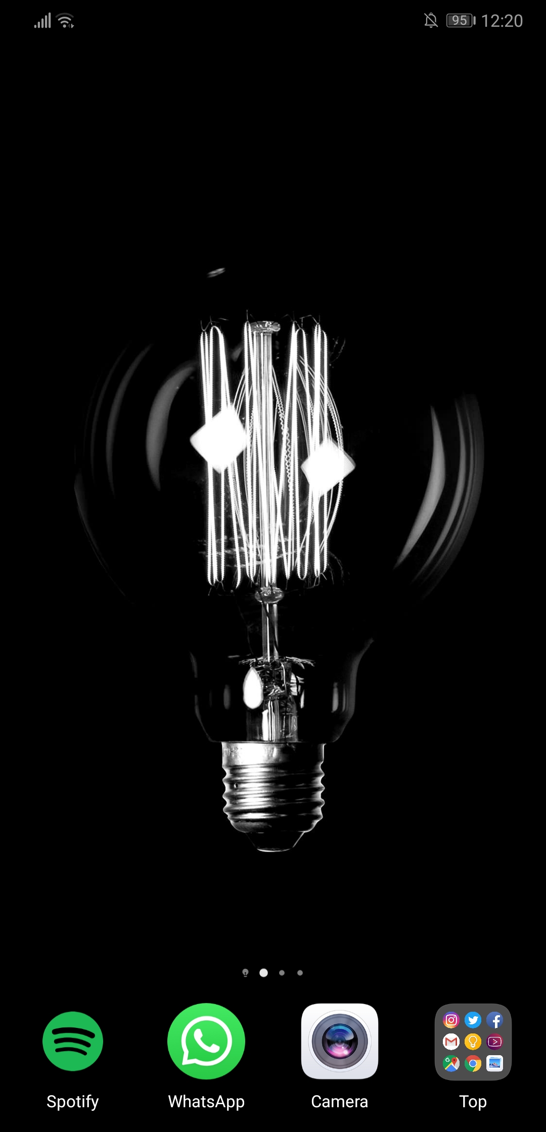

I agree. This new icon ruins my home screen. Please give us the old icon back !! I have no idea what could be wrong with it.

What genius came up with this idea?

It looks absolutely terrible. Who approved of this ugly black border???

I'd like to have this changed on behalf of the community, although it doesn't bother me since I just change the icon myself lolz

Hope to see the old icon coming back soon. The new one is too small compared to the others and it looks ugly with dark and white background

Yes, this was ill advised. Spotify now looks like it has a black eye in folders. I'm not sure what the goal was here but it doesn't gel with the rest of the UI or "Marketing 101" to have an artificially tiny logo sat against the likes of Apple Music and YouTube Premium on a potential customer's device.
Please reverse this, and since I'm curious - explain what the aim was?

It looks like a mistake from the developers... It certainly looks like it.
I couldn't see management take such a decision unless they don't have their own Spotify account !! 😁
Not only is the icon hideous, it really looks baaaaad amongst other apps...
Spotify, if it isn't a mistake, then consider it as one anyway...

I know this will sound extreme, but I've actually cancelled by Spotify Premium membership because of this. I was thinking of jumping ship for YouTube Music anyway, so I said 'if Spotify messes up one more thing I'm gonna leave", and then they pull this. I'm very particular about my home screen, I love customising the look so it all looks great. This completely ruined my setup, so I left. Sorry Spotify, you've messed up.

Agreed, the new icon doesn't make sense. Please change it back Spotify!
@Samwise98 That really is extreme. Especially since YouTube music offers worse quality music. Besides Tidal, Spotify has the best quality out there. While it definitely is a feather ruffler, I don't think something insignificant as an icon change should warrant moving to an inferior service

Please fix this, it is driving me crazy! 😠😠

Agree with everyone, this decision is infinitely worse and was 100% made by obnoxious designers who only use iPhones.

please keep Adaptive Icons in mind!!
https://developer.android.com/guide/practices/ui_guidelines/icon_design_adaptive
@tatertot_ wrote:please keep Adaptive Icons in mind!!
https://developer.android.com/guide/practices/ui_guidelines/icon_design_adaptive
Every other app seems to be handling them fine...except Spotify

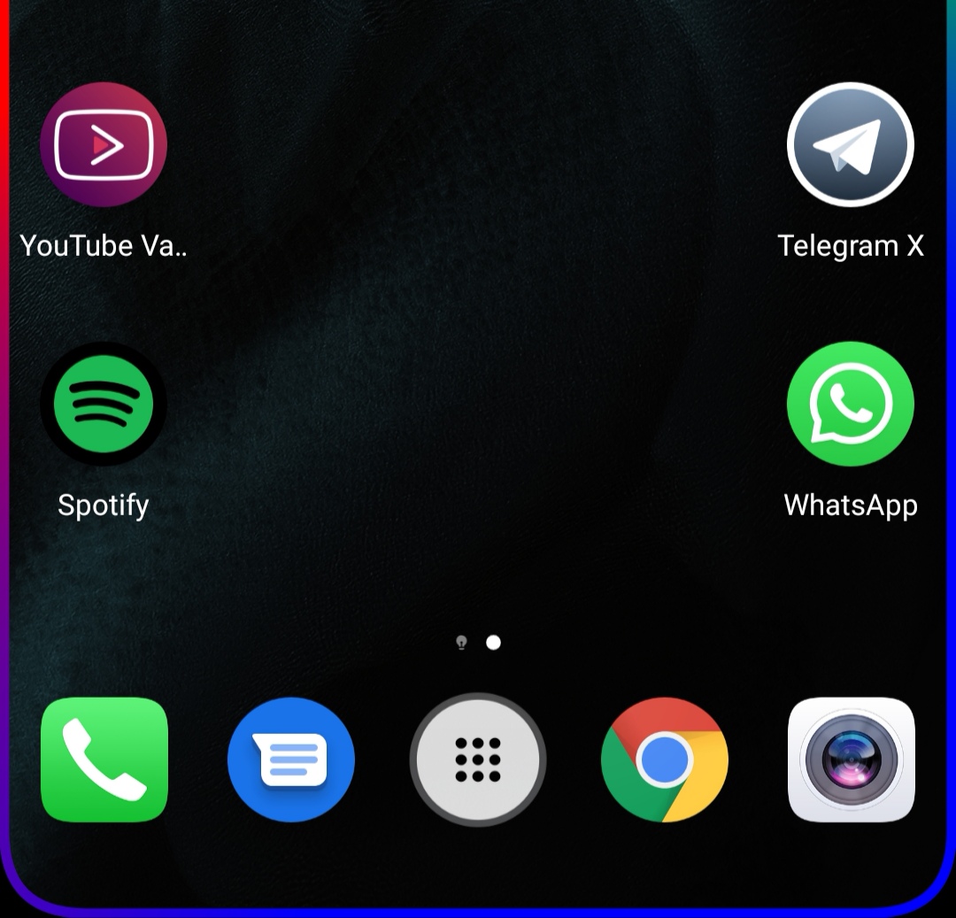 Good example

The new icon is catastrophic. It looks really bad and I have a bright background. With a dark background it must be even worse. Seriously, change it back.
The new icon is hideous!! Who came up with that horrible design?