[Big Screen] Now Playing layout on TVs and Consoles

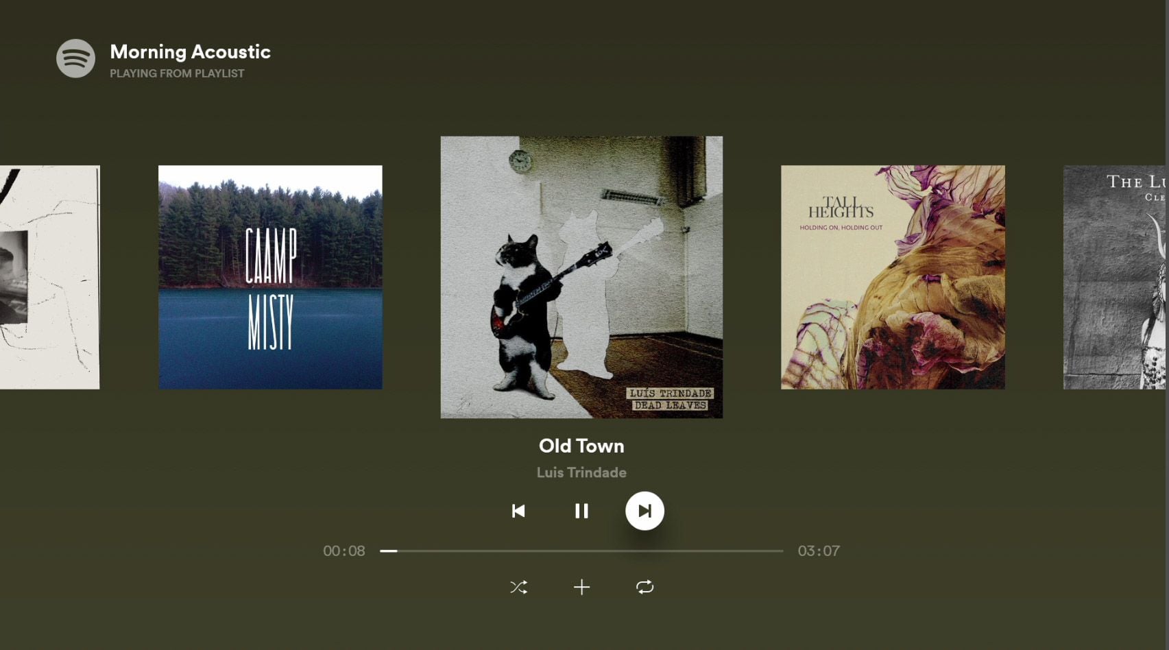
I want the 'Now Playing' layout back to the old one on Xbox.
It looks like this.
Comments

Updated on 2020-11-09
Hey there,
Thanks for submitting this to the Idea Exchange!
Spotify Staff will look into this idea once it reaches the necessary amount of votes.
More info on how your feedback reaches Spotify via the Idea Exchange can be found here.
Cheers!

When I put on a playlist I just want to see large album artwork - similar to what we used to have on the app where you could see the last couple of songs played and the songs coming up. The artist photos we get as the background now are a real mixed-bag of quality.
Plus, some playlists or genres tend to have pretty or interesting album art and it would be nice to actually have that on screen. An interesting sequence of cover art just becomes a series of giant faces now.
Updated on 2020-11-22
Hey there,
Thanks for submitting this to the Idea Exchange!
Spotify Staff will look into this idea once it reaches the necessary amount of votes.
More info on how your feedback reaches Spotify via the Idea Exchange can be found here.
Cheers!

The latest version is a downgrade for sure.
This also applies to Chromecast.

Commenting to echo my disdain for the new cast style. Please bring back the color gradient matching the album art, and the prominent display of the art itself; large and in the middle.

I don't know who thought it would be a good idea to have a creepy giant head staring at you while you're listening to music. Big Brother vibes, anyone?
If you are using a Chromecast, there is a possible "workaround" - create a speaker group and cast to the group.
https://support.google.com/chromecast/answer/7174267
Your screen will now be in ambient mode with the music playing in the background, and at the bottom of the screen there will be an overlay showing only basic artist/album/track info.
It is not ideal, but it is better than having Big Brother watching you.
¯\_(ツ)_/¯
Oh yes, ran into that speaker group alternative, too. Thanks for reminding. Way better than so-called artist pics, but still not good.


Yes, please change it back on Google nest. The cover art is soooo tiny. It should be something we should be able to configure from the app. Thanks!
Also, do not remove the cover art from the nest hub when the music is playing in a group of speakers. I want to have it constantly on it, not just for a while...

I can't cast spotify to my tv anymore because some artist backdrops are innappropriate and I have young kids. One artist had a nude photo that came up while listening... I vet my song content to be age appropriate but now I am afraid of what kind of artist images will pop up. Aside from that I agree that practically the idea mentioned is far superior. It shouldnt be that hard to select from a few visualizer options. Very dissapointed in this new visualizer which makes casting basically not an option anymore in our home unless we very specifically hand pick the songs

Devs, please fix.

Agreed! Full screen album artwork please. I am tired of seeing the same picture for the artists I love rather than the artwork that they purposefully chose to represent their song.
Thanks for considering this idea Spotify.

As someone who primarily uses Spotify via chromecast, I spend a lot of time looking at the chromecast interface, and I really do not like the current version. The previous layout to this (fullscreen album art with progress bar) was totally fine! Honestly, anything is better than the bizarre artist photos, which range from the merely boring to the actively offputting and distracting (who wants a stranger's face staring at them from the screen while they're trying to work or relax?) Album art is exactly that: art designed to complement a specific album. It's what the artist intended! And it's certainly more interesting to look at than a random publicity shot. I have been using Spotify premium for three years now but frankly the new layout is so poor that I have stopped using Spotify as much and am considering switching to another service that will allow me to listen to music while viewing the album art. Please consider this idea. Thank you!
@mountain_guide Here's what saved my sanity: create a "speakers group" with just one speaker - the one you want to play the audio. Then cast to that instead of to the device itself. Works pretty well.
@wheelofthelaw that works pretty well, thank you! Obviously I'd still prefer if spotify would let us customize the now playing screen but until then this is much better.

Please bring back the album art on big screen tv and not a photo of the artist

Hi, I'm wondering if it's possible to change the album cover screen on the spotify TV app. I remember it used to be a small picture of the album/song cover with some accent color around it, but now it's just a close up image of the artist. It's really unpleasant, and disturbing when you're having a dinner party or friends over.

Updated on 2021-03-23
Hello there!
It looks like your idea was posted a while ago but, unfortunately, it hasn't gathered the minimum amount of votes to stay active in the Ideas Exchange (50 votes in the first 3 months). I'll mark your idea as "Closed - Not Enough Votes". You can learn more on how the Ideas Exchange works here.
Have a nice day 🙂

Updated on 2021-04-06
Hello and thanks for submitting your idea to the Idea Exchange!
We've gone ahead and marked this as a new suggestion. Spotify Staff will look into this idea once it reaches the necessary amount of votes.
More info on how your feedback reaches Spotify via the Idea Exchange can be found here.
Cheers!

This is so annoying. I don't want to see random (because they're random) pics of artist or whatever Spotify thinks I must see in my TV when I play music in my Chomecast. Just let user decide instead forcing it to suffer your bad ideas for no reason. This doesn't improve my musical experiece in any way...

That it's very important. Album covers are part of the experience of music. And it looks way better than Black and White pictures of the band members.

At least give us an option to change the appearance? The old version was buggy as **bleep** (and still is) but the appearance was quite to my liking with the cover art getting the exposure it needs and deserves and the background blending in with the album cover colors. These sometimes really weird artist photos are really killing the mood and stealing the stage from the carefully made album covers that more or less represent the album.

Updated on 2021-05-20
Thank you for bringing your feedback to the Spotify Community!
Your suggestion didn’t quite reach 180 votes in 6 months. Users can still vote on this idea - if it gets enough votes, Spotify will still check it out and post a status update. You can read more about the idea process here.

Updated on 2021-06-18
Hello!
Your idea has been submitted a while ago but unfortunately hasn't gathered enough kudos. In order to keep an overview of the active ideas in this forum, we will close this idea for now. However, this does not mean that your idea has been declined by Spotify.
If you still feel strongly about your request, we encourage you to post your idea in a little different form again! Maybe now is the right time to receive the support of our community for your suggestion!
Do you have any further questions on how the idea exchange is managed? Just click here.

More agreement. Biggest thing on Chromecast screen should be the Album artwork. The current "artist picture" is a very poor experience.

Please fix this!
I don't want to keep being stared at by some random selfie of the artist you pulled off their twitter. Show me the art the artist intended for me to stare at while listening to their track!!

Cover Art. Give me. Looks like you aren't going to, so I guess I should switch to YouTube Music...

Updated on 2022-05-02
Hey @mya_666_
Your Idea has been submitted a while ago, and unfortunately hasn't gathered enough votes (180 votes within 6 months) to keep it active in the Exchange. Be sure to know that this does not mean that your Idea has been declined by Spotify.
If you still feel strongly about your suggestion, we encourage you to keep sharing your Idea to give it a chance to gain more votes.
For more info on how the Ideas Board works, click here. 🙂
So sad.
One of my main ways to listen music is streaming to my 65" TV with a good sound system and I had to switch to YouTube Music because some pictures are so disturbing that I can't even concentrate sometimes.
I understand the idea behind the votes, but a lot of users doesn't even know that this forum exist. For example, my wife just changed to iTunes the next day she had a minor issue with Spotify and Apple Car.
My work is related to software development and, just because that, I don't mind to search, post or subscribe to the answer of some improvement thread related... but as a client (as the majority of Spotify listeners) I don't really care about votes, forums or weird business desicions.
Just let the user choose in this kind of experiments, by default or not.
You probably have the best music platform today, but because a few weird and relative easy-fixable things like this, a lot of users are forced to choose between being uncomfortable or migrate to another platform.
Anyways, I've been subscribed to this thread hoping the issue will be fixed someday and I could subscribe again to the platform... but with the case closed it's look like that this isn't going to happen anytime soon.
Again, so sad...
Completely agree. I really enjoyed being able to see a large version of the album artwork that the artists spent time making for their songs as well as the next and previous songs on the playlist. Instead, the new format makes the album artwork tiny with some sort of artist banner that's the same for every one of their songs. I love the artists I'm listening to, but I really don't want to stare at their mug on a big TV. At least give us the option to turn off the artist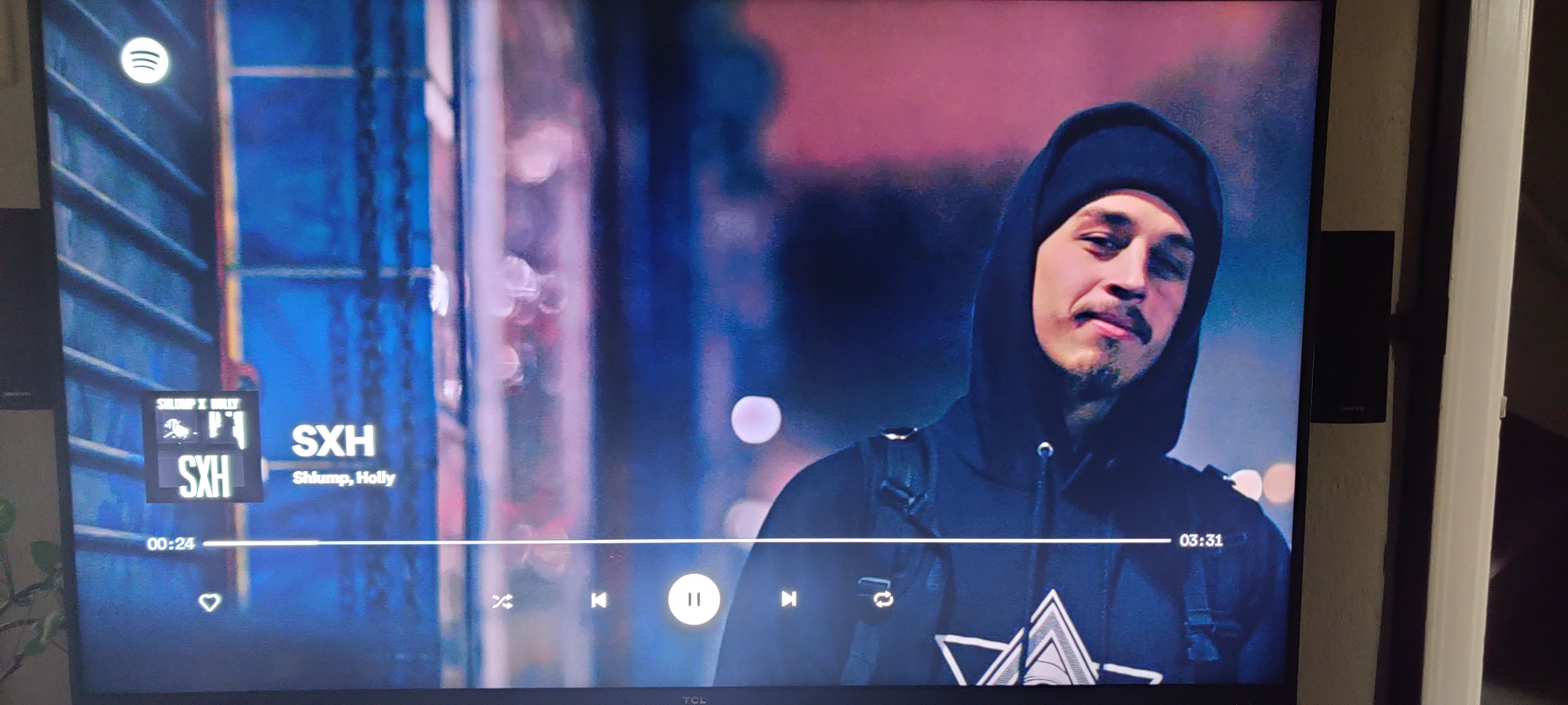 banner.