[Desktop][Friend Feed] Please remove the blue dot indicating that friends are online

Hello,
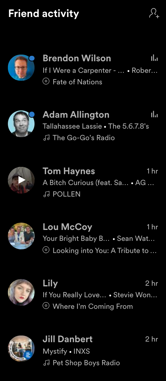
with the new update on desktop, friends who are active on Spotify are not indicated by the wiggling icon anymore but instead with a bright blue dot - very similiar to the dot that would usually notify you if there was a new update avalible.
It is very irritating to see something usually associated with a notification appear on the feed with no way to deactivate it, constantly drawing the attention of the viewer.
I enjoy seeing my friends activity and don't want to have to hide it completely, but this ux design change is not helpful.
Please remove the bright blue dot, thank you in advance
Comments

I agree with this


I agree! Especially as it people currently listening already have this symbol (pictured above) to show they’re active and their profile moves to the top of the page
its just so unnecessary distracting and aesthetically annoying spotify WHY???? 😞

I second this suggestion. Also, there's no apparent functionality involved with the blue dot... What is it for? What's the point of focusing our attention on them and not on the media we want to listen to? I'd rather have a lame but clear UI rather than a trendy but distracting one.

+1 - I was clicking away trying to find out what I was being notified about. Then I thought, 'maybe it's indicating they're listening to a song I've never listened to before, so it's like a "new" notification'.
Only realised it meant they were online when I googled and came to this page. Online status is usually a green dot, not sure where blue came from.

100% agree with all the comments so far. Very annoying/distracting using same "scheme" that elsewhere indicates user action required (e.g. SW update pending)

Agreed. I would prefer the option to have a genuinely private session where no one knows I'm online and no one knows what I'm listening to.

I ended up on this page when googling for "blue dot spotify desktop." I honestly thought it was to indicate that the friend connection was from facebook, but .. guess not!
I also liked the previous one (moving sound waves) to indicate that they were listening live.

Updated on 2021-05-08
Hello and thanks for bringing your feedback to the Idea Exchange. We've marked this as 'New Suggestion'.
Spotify Staff will look into this idea once it reaches the necessary amount of votes.
More information about how the Spotify Idea Exchange works can be found here.

Okay, so I legit created an account on here to vote on this suggestion. 😅
As with everyone else, I ended up having to google what the heck this blue dot was doing. I think the equalizer bars icon is enough for me to know someone is listening. Unless we're supposed to be able to chat with our friends via the app – that's where I would see the "online" indicator being significant.
But, Spotify, please don't do that. I don't need another app for people to message me on.
In conclusion, away with the bright blue dot! 🚀🔵🚀 Let's up these votes and get this to a 'Live Idea!'

Totally agreed, very distracting and quite useless. The previous was far better and still, the app has the "equaliser" icon to show the active users in the friends list. I think that is more than sufficiend and sleek, rather than this blue dot, which totally kills the sleek and black/green design of the app. Definitely something I'd remove (I checked to see if it could be removed in settings...)

Agree! I want to hide from everyone n_n
Updated on 2021-06-05
Hey! Looks like that your idea is growing up fast and it's amazing! We are going to change its status to 'Good Suggestion' now and I hope it continues to be supported by more and more users.
Thanks again for your idea. We really appreciate it 🙂
More information about how the Spotify Idea Exchange works can be found here.

I cry bad UI! 😉 Badges are meant for notifications – in fact they typically contain a number to indicate the number of unseen notifications. Plus they're meant to go away once the user has seen the notification(s).
That's why everyone gets confused about how this is used in Spotify.
In this case it's not really a notification but a state.
If you really want to show that, the "user is online" state is typically green and in the bottom-right corner! That won't confuse anyone. Thanks!

I was trying to figure out what the blue dot was for. Thought maybe there was something new that that user did to create that dot. Came here to find out it just means they're online which is silly since online is in green on every other platform. I noticed Spotify has both the blue dot AND the equalizer bars to indicate that they're listening. This seems overkill to me.

Agree.

Updated on 2021-10-08
Hello again!
It looks like your Idea has not gathered the minimum of 180 +VOTES within 6 months, so unfortunately it has to be marked as Closed - Not Enough Votes.
However, it's still open for voting! Even with a Closed status Spotify Staff will still be tracking this Idea and its votes.
More information about how the Spotify Idea Exchange works can be found here.
Thanks again for bringing your feedback to the Idea Exchange and have a great day!
Updated on 2022-10-02
Hey!
We've been keeping an eye on this submission for an extended period of time, and it doesn't seem this will reach the votes necessary to put it forward for prioritization.
As such, we're marking this case as closed. This includes any similar suggestions that are received.
If we do have any new information to share, rest assured we'll check back in here with a new status. Have in mind that the idea will continue open for getting votes, so if you still feel strongly about it, continue sharing it with more users.
More information about it can be found here.
Thanks for your comprehension!
And I thought it was a message notification or something . I support this request.