[Other] Use monospace font for displaying numbers eg: plays count, duration

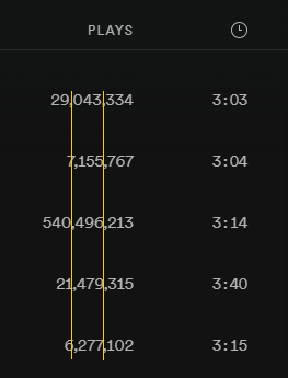
Please use monospace font for displaying numbers so they align perfectly. It is a subtle change and I guess most ppl wont even notice it but it would up the consistency and visual aesthetic on all platforms.
Example for not aligning numbers: (usually the number '1' is skinnier so it messes up the alignment)
Child Item
Status: Active
Child Item
Child Item
Child Item
Comments
Child Item
Child Item
Updated on 2021-07-06
Hey @brianelete ,
Thanks for bringing your feedback to the Idea Exchange.
We’re closing this idea since it doesn’t meet one of our Idea Exchange guidelines, namely “Checking for existing ideas”.
A similar idea has already been suggested here - feel free to add your vote to it!
If you think your idea should be considered as separate, feel free to submit it again highlighting how your idea is distinct from the existing one.
Cheers!