Buttons in top right corner of windows desktop app have top margin

Plan
Premium
Country
Germany
Device
different PCs
Operating System
Windows 10, Windows 11
My Question or Issue
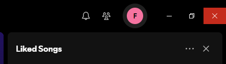
The buttons in the top right corner are no longer at the top of the app. This is very annoying for me, as it makes it significantly more difficult to click. Previously I could just move my mouse all the way in the top right corner to close the app, now I have to pay attention and make sure I don't click in the empty space above the button.
As you can see in the screenshot, the red area is where I can click and above it is some empty black area that does nothing:
UX design-wise this seems like an awful choice because the corners of a desktop display offer essentially an endless clickable area because the user can just move their mouse in the general direction of the respective corner and always hit the element. Windows even specifically made it so that the mouse doesn't slide into a different monitor when you hit the corners (if multiple monitors are used). This way you can always hit the corners, without even looking at the screen.
This is used for the windows button (bottom left) or minimise all (bottom right) or commonly the close button (top right) in basically all windows applications (except full screen)
Accepted answers
All comments

Plan
Premium
Device
Windows 10 Desktop
My Question or Issue
Hi,
I'm not sure if my Spotify client is bugged or if this is part of a new update, but the title bar at the top of my client is now positioned as shown in the attached image. The close, maximize, and minimize buttons are now offset, with an area above them that alters the clickable area.
If this is a glitch, could you please direct me to a fix? (I have already tried reinstalling). However, if this is intentional, please consider the following:
https /en.wikipedia.org/wiki/Fitts%27s_law
TLDR: Fitts's Law explains that the time to quickly and accurately hit a target (like the title bar buttons) depends on the distance and size of the target, with larger, closer targets being easier to click.
Placing elements like the title bar buttons in the corner of the screen makes the target "infinitely large" on two sides, eliminating concerns about overshooting with the cursor and significantly improving click accuracy and speed.
If this is a conscious change in design, please re-consider.
All the best.

Hey @Ed56,
Thanks for reaching out and flagging this!
The search bar's position is part of the new desktop layout our tech folks are working on. Thanks for the feedback!
As for the minimize, maximize and close buttons, we've reported this to our tech team, so that they can have a closer look and investigate this further. We'll let you know as soon as we get an update!
Take care.
Hey @Ed56,
Just heard back from the team!
It seems that this is actually expected behavior and is connected to the new desktop layout. We appreciate you taking the time to share your thoughts on this!
Cheers.

Hi there! Thanks for your feedback! 🌟
It sounds like you’ve noticed a recent change Spotify has made. We’re always testing out possible improvements for our app and content. I’ll make sure to pass your feedback along to the right team.
Hope this clears things up.
/Mateus

I too noticed this in the latest version of the Windows desktop client (1.2.47). It is extremely annoying, and seems like something that should have been caught before this version was pushed out to production. Please ensure that it is fixed promptly.
And MateusM - you chose the wrong prewritten response. The OP is talking about a bug, not an "improvement" or design change.

Please fix this bug. this is very annoying!

Looks like I'm not the only one who hate this. Who tf designed this? Spotify is THE ONLY software that have this space between edge of screen and closing button. I even spent some time to find software which has something like that and I couldn't find anything. Nobody who's got more than two digits on IQ scale doesn't do this. Fix it.

Windows even specifically made it so that the mouse doesn't slide into a different monitor when you hit the corners (if multiple monitors are used). This way you can always hit the corners, without even looking at the screen.This is used for the windows button (bottom left) or minimise all (bottom right) or commonly the close button (top right) in basically all windows applications (except full screen)
As the original user said. There's no other program on earth that does this. I find it funny though that 14 hours before you made this change I laughing at the fact that the buttons were more vertical than horizontal, but it was fixed in the worst possible way...

I experience the same, wierd layout. This is definetly not wanted.
It interupts workflows and makes the program annoying to use.
Your designers may have adjusted the center of the closing menu, without adjusting the size.
The buttons are supposed to fill to the top of the window. The height of these buttons is an adjustable setting, as you can easily observe when you opening different apps (like Browsers, Edge/Firefox/etc.) and comparing the sizes of the clickable areas - you will see that they can have different sizes.
Please report this as a bug back to your software department.
I am sure they will find a quick fix for this. 🙂

Hi there, as you can see in the attached screenshot the window control buttons (minimize, maximize, and close) are not correctly fill with color when the user hovers over them with the mouse as all other application do on Windows. I've tried reboot, uninstall and reinstall the app. As far as I can tell, this issue arises both for the Microsoft Store app version and the Installer from the Spotify website version. Software build is 1.2.48.405.gf2c48e6f and I'm running Windows 11 23H2.

If this shitty UI choice is actually "expected behaviour" I might just go back to only using the web app. Having the close button on the top right corner of the window has been standard for 20+ years for ALL applications on Windows. How come Spotify UI devs think their application is special enough to not use this standard? There is literally 0 (zero) reason for that.

> How come Spotify UI devs think their application is special enough to not use this standard? There is literally 0 (zero) reason for that.
100% this. Why skip all the standards and conventions and roll your own sub-par implementation? Please don't do this and revert this change. You're nothing special Spotify, you're just another app, no need to try to re-invent the wheel.

That has to be joke? You will lose alot of users if that is the case. A normal interaction with spotify is to open it find a sond and close it (minimze it) so we can continue being productive. Anoying to aim for a close button. Fix this!
Guys I found a solution, can't belive they didn't mention this for us. Install the Windows 10 (32bit) even if you are on windows 11. The button is now normal again.


Whatever was in charge of that UX-UI that person should never work in UX, this is so not user friendly and try to erase +20 years of a Windows behaviour...
And what a joke to say that is the expected behaviour, did any of the dev use windows?

I agree, this is not a good design decision. Please update it to use buttons that are in the normal location.
It really does work. Despite this not being a defenitive solution is a pretty good workaround, thank you!
I did have some problems that the windows 10 version force updated to work like the old windows 11 version again. So please spotify, how hard can it be to hot-fix this issue?
Also for transparency for the rest of the community, I did notice you deleted my message. Carefull guys, they are watching!
Can you guys fix it? This is an obvious deviation from the windows standard
They are not listening....it's been months and i'm at that point where youtube music it better...........
Can you stop spamming my email please.

This change isn't innovative or clever. It's annoying. Please fix it.
https://www.reddit.com/r/spotify/comments/jyp947/you_can_revert_back_to_previous_desktop_versions/
The fix - OP wants me banned though because i try to help others - too many replies or something

"EXPECTED behaviour"... Excuse me??? This is horrible, there is absolutely no reason to do this, and it's against all Windows GUI design guidelines. The "X" is in the corner for a reason: easy access.
Imagine if some car manufacturer designed a car that can only be changed to reverse gear from the backseat!

You are the problem.

@Dessi wrote:Hey @Ed56,
Just heard back from the team!
It seems that this is actually expected behavior and is connected to the new desktop layout. We appreciate you taking the time to share your thoughts on this!
Cheers.
Hey, can you please tell the team that this is bad layout and goes against Windows spec. No other mainstream app (webapp/CEF like Spotify or not) places a space between the caption buttons. (Chrome, Apple Music, Figma, Slack, VSCode, etc.) This "expected behavior" causes accessibility problems as many have complained about in this thread.
Caption controls (minimize, maximize, restore, close)
If you create your own caption buttons for your app, follow these guidelines to match the system caption buttons.
...
- Caption buttons have full bleed backplates.
It is very frustrating trying to close the Spotify app after this change, it significantly reduces my user experience. Thank you.
Spotify for Windows (64 bit)
1.2.51.345.gcc39d911

Is this a new strategy to keep users hooked? A subtle way to say, 'Don't you dare close this window!'? Please prioritize user experience over manipulative design tactics.
Just kidding, but seriously, the previous layout was more intuitive for quickly closing the app. 💚

You're fuggen kidding me, right? I appreciate that you've followed this up, it's the tech team's explanation beggars belief. This is a UI bug that breaks decades of computer GUI design principles, it's hard to overstate how much of a **bleep**-up this is. The top area doesn't need to be any bigger, but those buttons MUST go all the way to the top of the window, even if it's not indicated visually.
Lemme reiterate: this is a bug, it is a regression. It used to work properly and now it does not.
Fixing this costs pretty much nothing - you make the buttons taller and there is no compromise needed, no juggling of UI elements to make everything fit beautifully. Not fixing this has a real cost. If this wastes just 1 second of every one of your users' time, every day, you're racking up cumulative months or years of useless wasted time, each and every single day.
It looks like you've vertically-centered the buttons in the top bar. If it bothers you that it'd be weird to extend the button only upwards then fine, have it vertically-fill the top bar. It's fine if it extends down towards the right-sidebar as well.
I swear every time I sit down at my desk to get work done, I end up performing a "15 minutes of hate" ritual instead. It's directed at Spotify and their buttons. If I wanted floating buttons that violate Fitt's law, I would use macOS!


FIX THIS! wtffffff
We are making changes to improve how the window controls (close, minimize, maximize) behave in the desktop app. These improvements are already in progress and will be reflected in an upcoming public release.
While the update won’t appear immediately for everyone, it will be included in a future version of the desktop app that’s rolling out soon. We appreciate your patience as the update makes its way to all users