Add the “select” feature that was in the queue back.

I don’t know why it was ever removed in the first place. You could checkmark songs you wanted to remove from a playlist, rather than individually selecting each song and sliding it to remove. I don’t understand why that feature would ever disappear, as it was incredibly more convenient.
Comments
 Sergio11

My Spotify has updated to the new queue where you cannot select multiple songs to delete and makes the queue experience significantly worse. Being able to see album art is cool but not worth the removal of selecting multiple songs.

At first I loved the update as its better visually, but why they would remove the option to remove more than one song at time does baffle me.

I loved the previous Spotify queue, as it was even one of the reasons why I chose Spotify over other services. This is an outrage.

Please give back the ability to access a skip button from the queue.

I love love love Spotify, but the recent update to the queue is horrible. Sure, seeing the albums is nice, but all the user features are gone - skip, rewind, selecting multiple songs, etc. Please bring back the feature to select multiple songs at a time in the queue along with skip and rewind!

As much as I love most spotify updates, I do miss the old queue. I preferred the old queue where I could select and remove multiple songs from it, remove songs from my queue so I could replay them, see what is in my queue or what is just going to play next via separate sections, and add songs to the queue by sliding them up. I also preferred the way the old one covered the whole screen because it made it easier to change songs while walking/moving. This new update overall makes it more difficult for me to use, and I greatly miss the old queue. It was one of my favorite features, and I feel like this may have been a downgrade.

I agree, there is no reason to remove features. The UI changes aren’t bad, and I can get on board with the new swipeable screen interface, even though it’s not my favorite. However, there is no reason to remove features that were incredibly useful. Bring back the ability to select multiple songs in the queue.


I absolutely hate the new queue update. I liked being able to remove the songs I didn't want to listen to even if they were not in the queue. It allowed me to just not hear a specific song on a playlist or album instead of completely removing it from the album. It also took away the ability to add a song that was in a playlist to the queue and I used this frequently. It's very much a downgrade and I would like to have those features back.

Hey @kimbayaaa, welcome to the Spotify Community! 🎵
Could you share a screenshot of the new queue that you are seeing? It will help me take a closer look.
Also, try to swipe the item in the queue and see if that removes it. You can swipe from right to left on a track.
Let me know how it goes. 🙂

idk what yall did to the queue list but fix it, put it back to how it was. you've made it so I can't re-add things in the queue and can't remove things in the queue. also it just looks dumb now. it was perfect before put it back

Dear Spotify Technicians,
I can’t possibly be the only one who thinks the old design and layout were much better, easier to use, and more intuitive—especially when adding songs to the queue or selecting a specific song to play. Previously, when you pressed the queue button, it would open in a separate window, allowing you to rearrange songs effortlessly by dragging them up or down.
Now, with the new swipe function, managing the queue has become frustrating. The swipe-up-and-down effect to reorder songs is unnecessarily complicated and inconvenient compared to the previous setup. The old method was straightforward and practical, and it worked perfectly for music lovers who wanted quick and seamless control over their playlists.
Am I alone in feeling this way, or can we agree that the old layout was much more user-friendly and effective? Please consider bringing back the previous design—it truly made the experience better for those of us who love organizing our music.
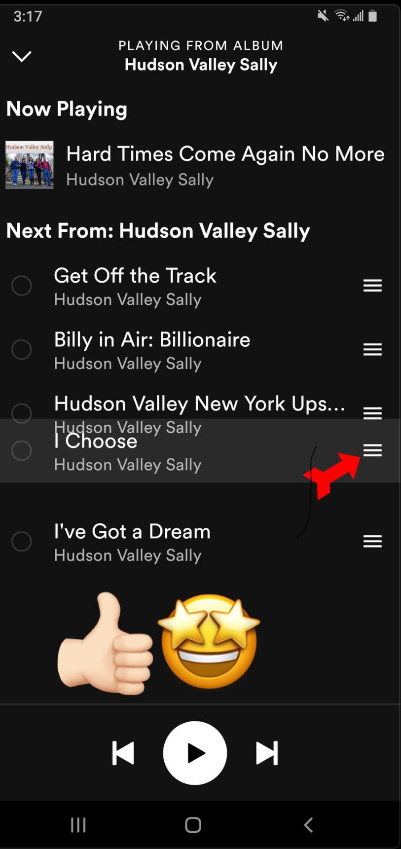
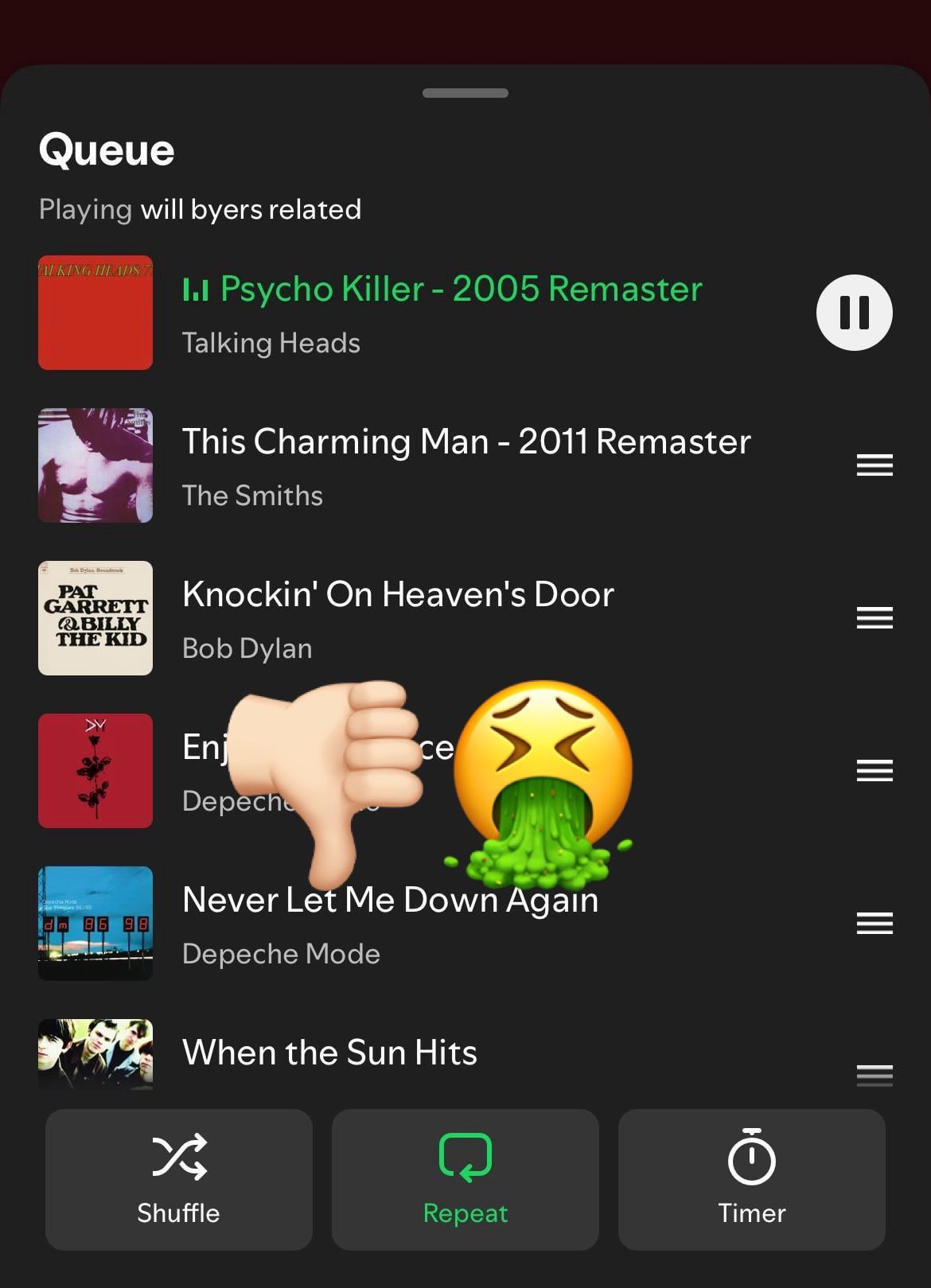
True! The old layout was way better!! The new swipe function is so bad and annoying. I miss having it open in a new window.

And now it is even worse, because when you remove a song from queue, screen jumps to the start of the queue and you have to scroll all the way down again to remove the next song. I think Spotify can still make this even worse, because it is a very innovative company. I really like their new "random song mute" feature. Now my ears can get some rest every now and then.
I wonder what they come up next.

Adding songs to my queue while listening to a playlist has become way more difficult than it should be. Please bring back the multi-select option for adding songs to the queue while listening to a playlist or album!!!!!

I am a premium spotify user of two or three years now, and I haven't once, before now, had any complaints about a new update of sorts. However, this new queue update just doesn't do it for me. I'm sorry, but I hate it with a passion.
When you would click the three lines in the bottom right hand corner of your spotify, bringing up the "queue" option, it always took up your whole screen. We had the "clear queue" option, the option to remove songs from the "play next" list, and it was overall more appealing to look at than this most recent change. Now it pops up at the bottom of your screen, though you can swipe up. It doesn't look right, and now there's no options to clear your queue or, again, remove songs. You can still sort them by which ones you'd like to play next, but it doesn't feel the same.
I am asking - begging, really - for a service provider to consider changing it back to the way that it was before. I thought that the app was perfect, but some things about the app just shouldn't be updated, in my humble opinion. I hope someone who works at or with the company sees this complaint and at least considers my idea to either switch it back to how it was originally, the way we are all used to and love, or add those other features again. Thank you!

Hi, I totally back this demand. The original queue was much more practical. It allowed us to select and delete any song in the queue.

The new layout of the queue looks horrible. Everything else looks fine like the artists profiles. But the new queue looks horrible. The old queue layout was much easier to use and looked a whole lot better than the one we have now.
So, I would like to say that I figured out how to remove the songs from the list if you don't want a specific one to play next. You simply swipe left on the song, but it was a bit confusing to begin with and, again, the way that it looked before, though now you can clearly see the cover of the songs, looked more visually appealing, at least to me.

There has been a change in the format (or whatever you call it) in the queue. Songs placed in the queue by hand are less separate from the playlist that is currently playing, which can be confusing and harder to notice. Worse, it is now impossible to remove songs from the queue, which I feel is a pretty basic function that premium members should be able to do.
I back this 100%. I am in the car a lot and I am always the one playing music (when I'm not driving of course), and this new update makes it incredibly difficult to do that. The half screen design is so annoying because my phone gets jostled around so I accidentally click out of it or click on the wrong song. I also cannot skip songs from this screen, which makes it worse. Along with that, it is very difficult to remove songs from your queue and into just your next up songs so you can go back and replay them, which was one of my favorite features.

Earlier tonight, I posted an idea to make the new queue interface optional per user. I got another reason why you all should vote for it. I just found out that I can't skip or repeat tracks while looking at the queue anymore. Did you like the ability to multitask like that? Let's make it optional everyone.

Spot on...this new queue update is trash. Someone saw the UI/UX of another application and thought to themselves oh that'd be cool in Spotify...then whomever approves product updates clearly went into bobblehead-yes mode because they were familiar woth the app it came from. Spoiler alert...
It doesn't work, it's awful.

Plan
Premium
Country
Thailand
Device
Samsung GalaxyZ Fold 4
Operating System
Android 14
My Question or Issue
The new queue UI removed the ⋮ icon. The only way to access it now is to play that song immediately, which is not what I want. I just want the queue to run as it supposed to while I still accessing data for other songs.

There is also the issue of if you delete a song from the que, every song under it gets deleted as well

- The new UI change for the queue removed a feature that I used fairly often AND it hides what is actually going to play next when you hit shuffle.

Same!!! This new queue is nonsensical. It is clunky and you have to so delicately move it up to see whats on it otherwise you might accidentally skip the current song and send half your queue into oblivion.
Why would you change something no one has a problem with? If you need things to change, please read these forums and maybe post a poll or something. Users need consistency and functionality. Thank you

Does anybody else dislike the new Spotify queue format? It seems inefficient in a few ways. You can no longer delete individual songs from the queue, other than moving them into the playing songs sections, and its not full screen either. There's also unnecessarily larger shuffle and repeat buttons. I've had a lot of people agree and I want to see more perspectives


Bring the queuing system back to how it was. Before I could go to my que, see the que and add or remove from there by selecting each song I wanted. I can't do that now. To add a song to the queue I have to go back and it's less efficient.