On playlist, artist name is not showing in same manners

Plan
Premium
Country
Device
mac mini
Operating System
mac os sonoma
My Question or Issue
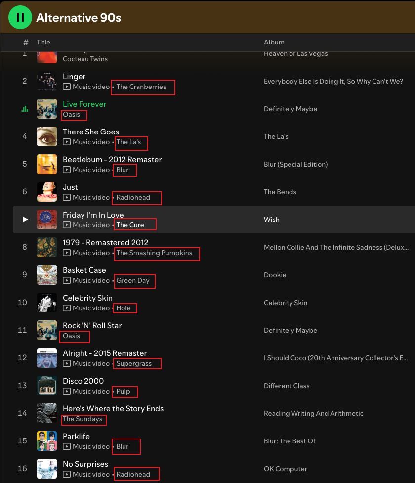
This playlist made by spotify is showing songs from multiple artists.
But the placement of "Music Video" button and text are at the wrong place.
When I skimmed to find the artist name I wanted to play, it mixed up between "Music Video" and real artist name like "Oasis" or "The Sundays" on this sample screenshot.
Is there any way to disable this "Music Video" text?
Accepted answers
All comments

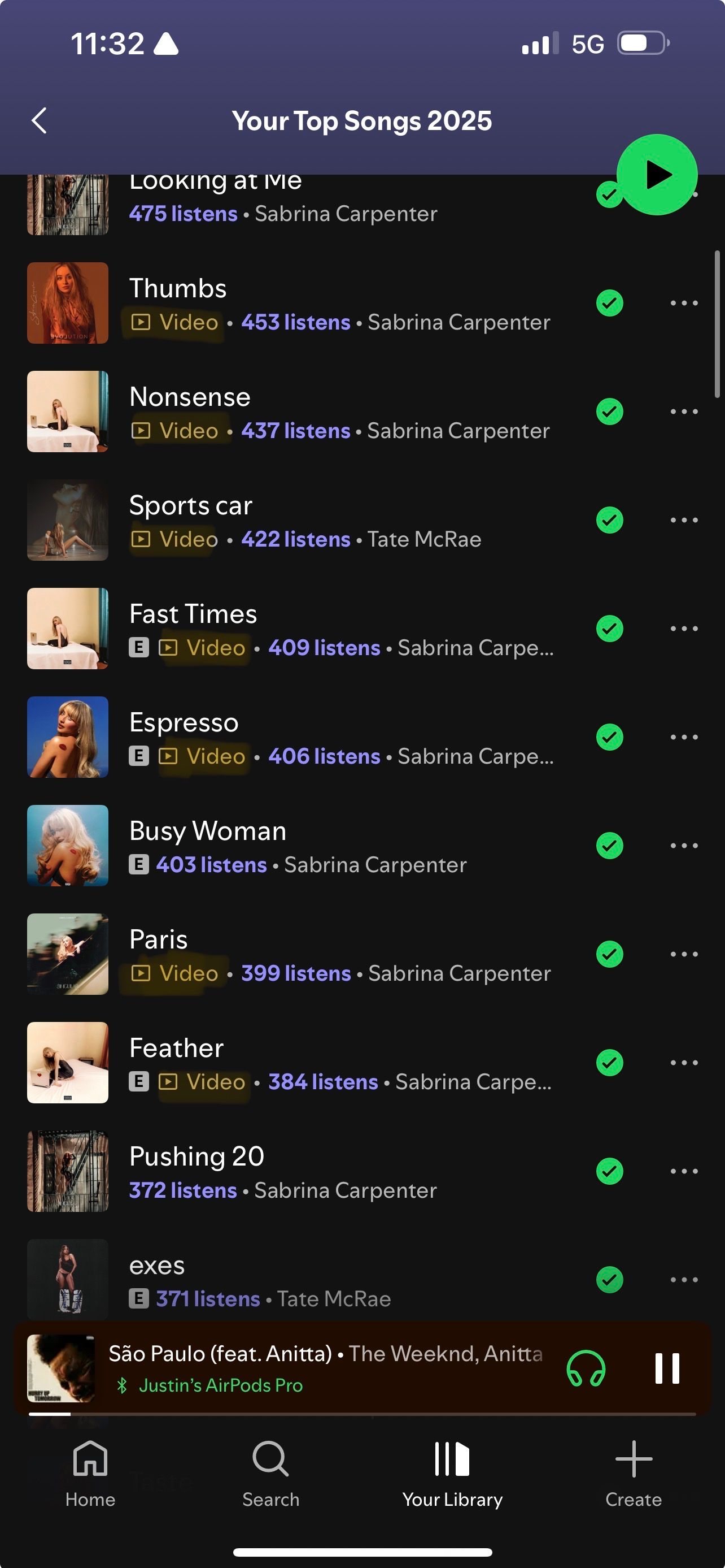
Hi, yes, this is very annoying. Since yesterday the “Video” text is appearing before the artist name.
please remove it as it is bad for UI, it should only display the artists name. The video text is appearing before the artist name and is making everything hard to read through. I wish for a feature to disable this.

This is a catastrophically bad UI "expected behavior". I thought that one of my favorite musicians had collaborated with a new artist named (aptly perhaps given this outrageous UI update) "Music Video"! Please, please, I'm begging the gods that are, to give us a toggle button to remove the icon and the words "music video" to the left of the artist name. I'm running Spotify on desktop Ubuntu 24.04 LTS.

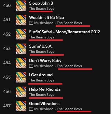
I turned off the music video option which is good, but when I'm going through my playlists, I hate that under the song titles the "> Music video" option comes up before the artists now so when I'm scrolling through it's very messy. For reference, see the pic I attached - it's visually annoying that the artists (in this case the Beach Boys) aren't all vertically aligned. At least put the 'music video' option AFTER the artist so they're aligned better. Hopefully it's bothering other people in addition to me 🙂
Plan
Premium
Country
USA
Device
Windows 10, Desktop
Please just get rid of the 'music video' text all together. Adding another column I don't want on the right side (Now playing) is not a good solution. Just more things I don't want on the screen!
Hi there @ifufu13,
Thanks for reaching out. We'll be glad to help clarify the functionality of the videos.
From what you've described and shown, this is currently the expected behaviour of the app. The button for the music video will appear on the left, before the artists' name. If you find this button to be a bit too distracting, I noticed that if you open the Now Playing View or the queue on the right and extend it enough to the left, the "Music Video" text will be hidden and the button will be collapsed into a simple play symbol. Perhaps you will find this more appealing.
In any case, we'll happily accept any feedback you have on the feature. If you have any specific suggestions you'd like to see implemented, consider checking out the Ideas section.
Hope this clears things up.