AS A DEVELOPER, YOU ARE MISSING AN EASY FEATURE FEEL UPGRADE TO THE USER EXPERIENCE
The spotify experience on ultra-wide screens should be better.
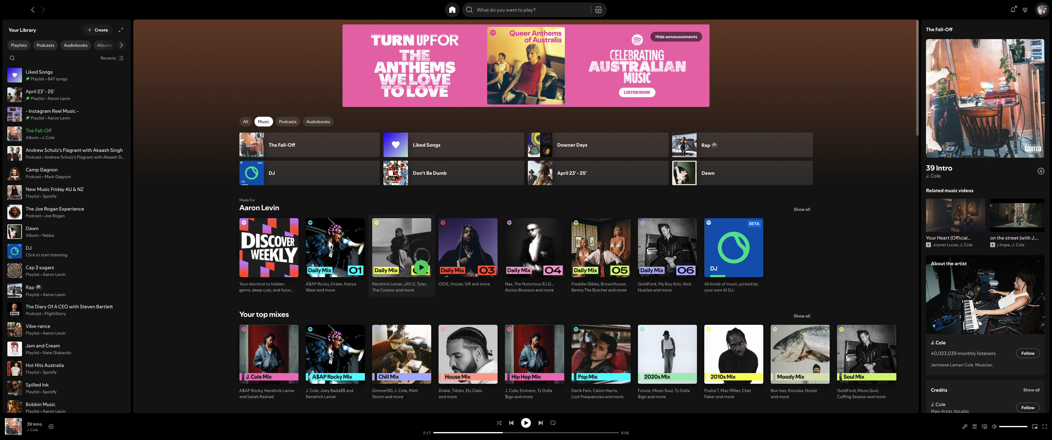
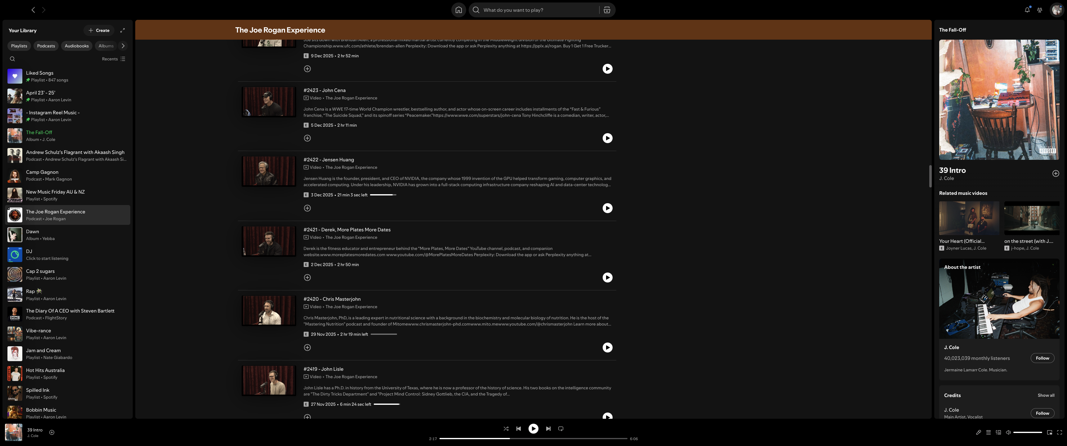
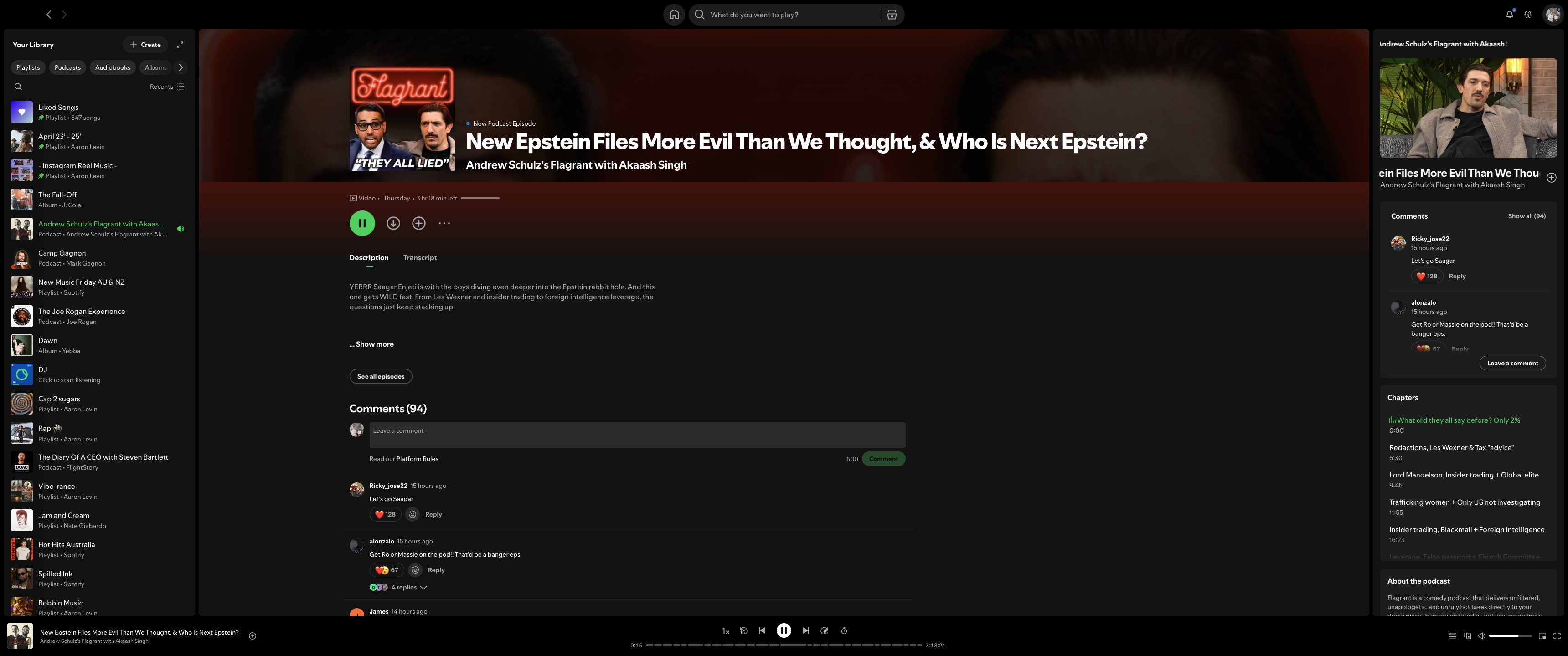
On ultra-wide and super-ultra-wide monitors, the Spotify desktop app currently feels underutilised. Large horizontal screens often end up showing a centred column with a lot of unused space on either side, which feels limiting given how much time people spend listening to Spotify while working at their desks. It poses accessibility problems, poor use of available space and missed opportunities.
With so many people working at their desks every day, Spotify doesn’t really take advantage of this kind of setup. This is especially noticeable on ultra-wide displays that are designed to feel immersive and “cinema-like”, especially for the longer form content or listening experience.
A potential improvement would be an optional ultra-wide / cinema-style desktop mode that better uses horizontal space. This could include expanded layouts for Now Playing, richer visual treatments, or ambient content that fills the screen in a way that still feels distinctly Spotify.
AI could play a role here by dynamically generating or adapting visual fill based on screen size, aspect ratio, or content type, so the experience scales naturally across different monitor setups. This approach could also translate well to larger-screen or workplace environments (e.g., offices, studios, shared spaces) where Spotify is often left running on wide displays.
I wanted to attach screenshots from an ultra-wide Kogan monitor to show how much unused space exists in the current desktop experience, but the Spotify post is not working for me.
I acknowledge this may be a small percentage of users who would use this, but that number is growing year on year, and with the speed and resources of Spoifty, I am certain they would be able to undertake a UI improvement that really is a feature.
Comments
 aaronlaspalmers