[Desktop][Your Library] Bring Back Separate Song Title and Artist

Not sure who thought it was a great idea to reformat how one can view songs by artist or by title...? It is much more convenient to have the two, side by side, while viewing a library rather than only being able to view the artist name or song name under the other...
Comments

I can't believe this is still MISSING. What the **bleep** is wrong with the devs here? Why haven't you brought back the artist column yet? Is it because you are trying to diminish the importance of the artist on your platform? Sure seems that way. This has been sitting in LIMBO for almost TWO YEARS now. We gathered the required votes, and since then we have heard CRICKETS. WHEN are you going to fix this error on your part?

Why isn’t 22 pages of comments speaking to remedy this seemingly corporate decision (this doesn’t benefit the end user) enough to garner a response from Spotify?

Basic functionality... sort music by the artist... is missing in Spotify. Unbelievable.
Why not let users decide themselves which columns they want? It's not too difficult programming.

Now being forced to use the 'new' desktop Spotify app, and I can't believe after all this time they still haven't fixed this. Why not give us options on how we would like to have our Spotify function, some optional settings that you can turn on/off would be ideal. I have a column for Album but not a seperate one for song and artist? Makes no sense at all!!

Best solution I've found - make the switch to Tidal. So far, so good!

Will Spotify ever care at all about the user experience and fix this incredible basic problem that makes no logical sense why they would ever do it this way?
Of course not.
I don't know why they even have this community forum. They should just post a message saying "We made the app worse again and we don't care how you feel about it. Hahahahahahaha" because honestly that's how it feels every time there's a desktop app update.
I notice the new sidebar is absolutely horrible and they still don't have an artist column. It's just beyond belief how little they care about UX at this company, especially in the desktop app; it's totally baffling.

Got a mail that I will be forced to upgrade the desktop app. Any news on fixing this layout issue?
I don't think this will ever be fixed, the issue we're not happy with is intended functionality.
This forum is useless and only here to make us feel like we have some sort of impact. They don't actually take any of these ideas or comments to heart.
This very active thread on the desktop app was closed today for no reason ("outdated" .. ok) https://community.spotify.com/t5/Community-Blog/The-New-Desktop-App/bc-p/5575863#M22851
And moved to another thread with a completely different topic. A little subtle attempt to shut us up.

It is absolutely UNNECESSARY to have to click the Title / Artist combo column FOUR times just to get a given play list or library to sort to however I want it. While it cleans the GUI up, I'd rather have the functionality and convenience of being able to A. being able to see the artist name in a DEDICATED column, and B. Have to be able to click no more than TWO times (for ascending order or descending order) to sort a given list. Good function in this case is at good expense of aesthetics and that expense is WORTH IT.

I just noticed that Song title and artist in playslists are now in same column in desktop version. It is much easier to get an overview when the columns are separated from each other like it was recently, one column for song title, one for artist. Please reconsider this change in interface.

Updated on 2023-09-28
Thank you for sharing your feedback with the Spotify Ideas Exchange.
Your suggestion has been marked as a New Suggestion and will be reviewed by the Spotify staff once it receives enough votes. We appreciate your contribution and look forward to your continued support of this idea!
For more details about how the Ideas Exchange works, please refer to here.

Agree with everything said above.
Since they're ignoring us anyway, I'll go off topic to say that aside from lost functionality, the layout of "Home" in the new desktop interface is nothing but suggested content - made for you, more of what you like, TGIF, and so on. Your own library is hidden behind a hot key (alt-shift-4).
Hard to believe there's a large market segment of users who prefer "served" content to saved content. The more likely explanation is that Spotify generates revenue from artists and curators pay for higher placement (similar to how Google maps and Google shopping are actually advertising platforms where results depend on who pays up, and not the user's search query. But those platforms are free, we pay for this.

Good news!
There is now a new Compact Mode for track lists (playlists and album pages) in the desktop app and Web Player
The drop down menu now has "Sort by" and "View as" options. To turn on compact mode, open up the drop down menu at the top right of a playlist or album page and click on "Compact" under "View as".
On Playlist pages, it removes the album art, and breaks out "Title" and "Artist" into their own separate columns again. This view is similar to before the redesign that added album art into playlists a few years ago.
On Album pages, it moves the artist and featured artists from below each track title, to a new "Artist" column to the right of the "Title" column.
When you turn on Compact Mode, it will be remembered and stay on when you are viewing both playlists and album pages. You can switch back to the regular "List" view at any time.
The new Compact Mode for track lists is rolling out in the desktop app and Web Player right now so you should be seeing it soon. This has been a highly requested feature since the redesign came out a few years ago.
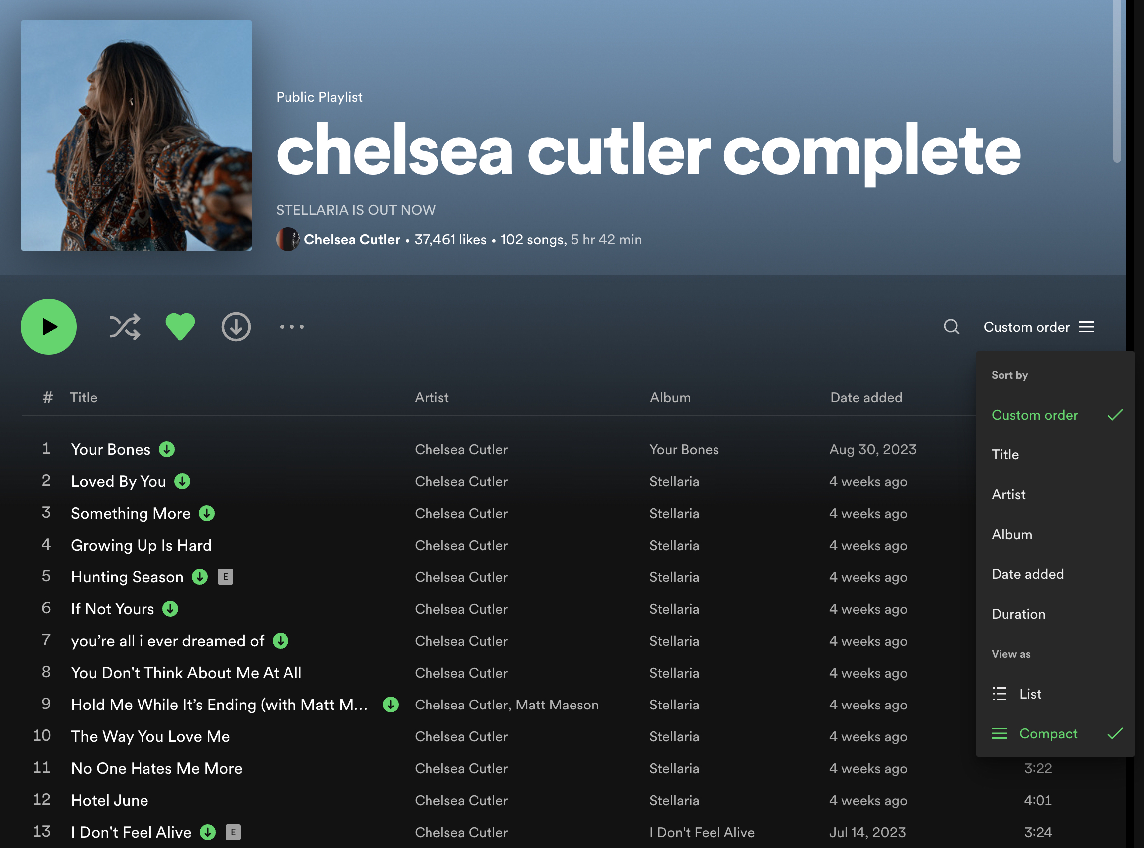
Hey @aliasq
Good news!
There is now a new Compact Mode for track lists (playlists and album pages) in the desktop app and Web Player
The drop down menu now has "Sort by" and "View as" options. To turn on compact mode, open up the drop down menu at the top right of a playlist or album page and click on "Compact" under "View as".
On Playlist pages, it removes the album art, and breaks out "Title" and "Artist" into their own separate columns again. This view is similar to before the redesign that added album art into playlists a few years ago.
On Album pages, it moves the artist and featured artists from below each track title, to a new "Artist" column to the right of the "Title" column.
When you turn on Compact Mode, it will be remembered and stay on when you are viewing both playlists and album pages. You can switch back to the regular "List" view at any time.
The new Compact Mode for track lists is rolling out in the desktop app and Web Player right now so you should be seeing it soon. This has been a highly requested feature since the redesign came out a few years ago.

This is great! Thank you for the update, Matt.
I mean, it would be nice if the columns could be manually resized, and if we could have the option to see all columns even if the window isn't fullscreen, but I'll take what we can get for the time being. 🙂

Updated on 2023-11-14
Hey folks,
Thanks for coming to the Spotify Idea Exchange and voting to make this happen.
We're happy to announce that a Compact mode which hides the album art and displays the song's title and artist under two separate columns in playlists and albums is now available on the desktop app and the Web Player! Check out @MattSuda's post here for a detailed overview.
Once again, thanks for helping us make Spotify better by participating here on the Community 💚
This is a horrible workaround. Why can we not make this the default option for all playlists? I have to manually select this on each and every one? Does the custom order remain intact when compact is selected? It hasn't rolled out to me yet.
Edit to above: Misread the post regarding playlist order. However I still think this is a weak solution.
When you turn on Compact Mode, it will be remembered and stay on when you are viewing both playlists and album pages. It should be shown that way for all playlists once you change the view mode. It will be your new default view when viewing all playlists. You can switch back to the regular "List" view at any time.
The playlist view mode can be set separately from the playlist sort order. Your playlist sort order is remembered in each playlist separately, the same as it was before this update.

i am so happy now!!! thank you for giving us this option!
Does anybody get this working for the Album list view under Discography? I can't seem to find the option for compact anywhere in that view?
It works fine for a single album, but seems to be missing for that view.
This is kind of annoying, because this is where I mainly browse and it would benefit a lot by this.
Also, the selection of compact mode seems to be the same for playlists and albums which is strange.
For a playlist it can make sense to show the album graphics as the songs comes from different albums.
For an album (or discography) view it is not really meaningful to allocate that space as everything is for the album displayed just above the list.
So in essence, this should be updated to have a different compact-state for playlists vs albums (+fixing the compact view for discography mode).

THANK YOU!

I need to sort by arstist seperately!
Can't believe this still isn't fixed. Meanwhile, my "idea" to be able to add and customize the columns was just closed because it didn't get enough support. Spotify DOES NOT CARE about its users, just their bottom line. The best thing we can collectively do is CANCEL OUR SUBSCRIPTIONS.