Desktop: Jam now available

Spotify is bringing Jam to the desktop app! 🥳 🖥️ 💻
Now you can start or join a listening party with your friends, family, colleagues, and classmates, with the Spotify desktop app in addition to the mobile app.
Although you can listen on your own, Jam in the desktop app offers you the ability to share a synced listening experience in real time with other people remotely or in person. For those people who like to listen when they are working, studying, or relaxing, this is a great way to socialize at the same time. The Jam experience is a much better option than just sharing links to songs or playlists with other people.
Let's Jam! Jam is now rolling out to Premium users using the desktop app.

Jam experience overview:
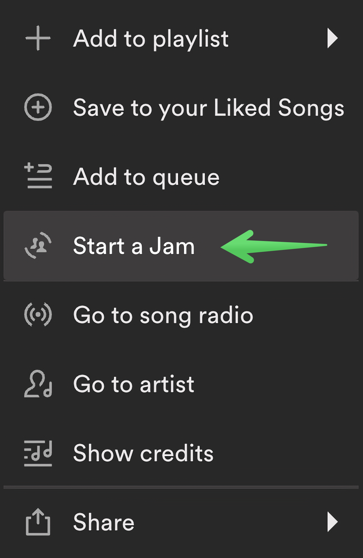
- Start a Jam: To start a Jam in the desktop app, right click on a song or playlist and select the "Start a Jam" option from the menu. You can also start a Jam by bringing up the same right click menu in the Now Playing View or the Queue in the right sidebar.
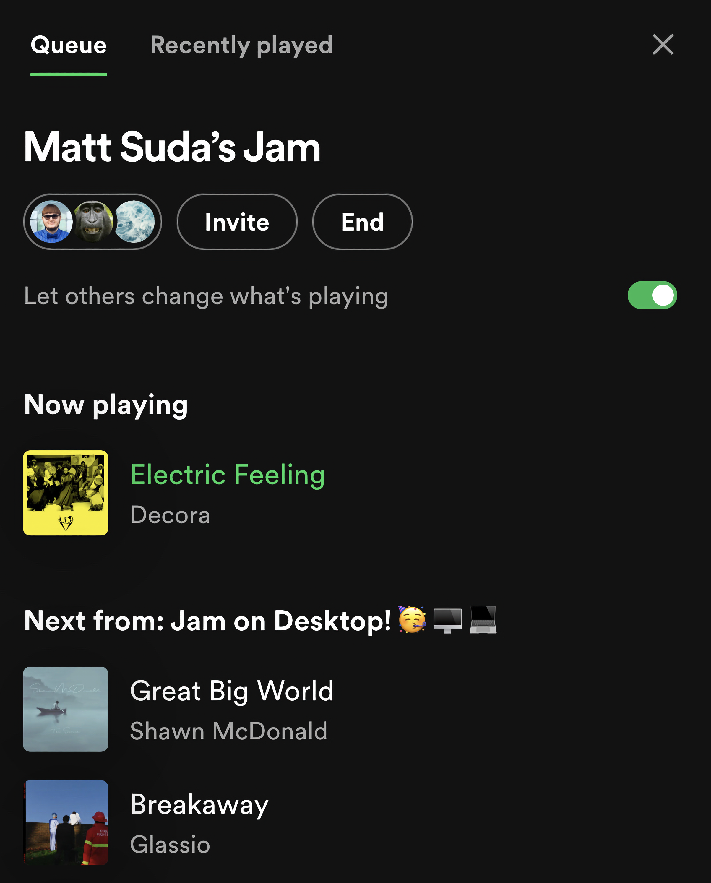
- Invite people to the Jam: Once you start a Jam, the Queue will open up in the right sidebar. Other people can participate in the Jam from anywhere in the world remotely. Click on the "Invite" button to copy a link to share with other people. Or, the people with you in person can scan the QR code. Spotify users with Premium will be able to join your Jam remotely and listen on their own audio setup and Spotify users (Free and Premium) will be able join with you in person and listen on your speakers. Free users can join an in person Jam using the mobile app.
- Join a Jam: You can join a Jam in the desktop app via a link shared by someone else. When you click to open a Jam invite link in your web browser, you should see a pop up that allows you to open the link in the Spotify desktop app. Once you open the link in the desktop app, you will see a pop up to join the Jam.
- Shared playback in real time: Everyone will experience a synced listening session in real time. Any participant can add to the Queue. Any participant can also change what is playing during the Jam session by clicking on a song, playlist, album, or podcast from anywhere in the app. The Jam host has the option to turn off the ability for the other participants to change what's playing, but they will still be able to add to the Queue. The Queue can be edited at any time.
The new Queue experience:
As part of this update, the Queue now opens up in the right sidebar. The Queue now being in the right sidebar allows you to browse content in the main area of the app while keeping an eye on what's playing next or the current Jam that you are participating in. When you are participating in a Jam, the Jam options will appear at the top of the Queue in the right sidebar. You can switch back to the Now Playing View or Friend Activity feed at any time by pressing the buttons that open them.
FAQ:
This section will answer your frequently asked questions and will be updated with the latest answers.
I don't see the option to start or join a Jam when using the Web Player in the web browser? Is Jam supported in the Web Player?
- Unfortunately, the Jam experience is currently only available in the desktop app for Premium users. You can download the desktop app here if your device is supported. When you click to open a Jam invite link in your web browser, you should see a pop up that allows you to open the link in the Spotify desktop app. Once you open the link in the desktop app, you will see a pop up to join the Jam.
I don't see the "Add songs" button in the Queue to go to the Group Recommendations section like I can in the mobile app. Is this available in the desktop app?
- The "Add songs" button in the Queue to go to Group Recommendations is currently not available in the desktop app. Participants can use the mobile app to add Group Recommendations to the Queue.
Feedback:
Where can I give my feedback about the Jam experience and Queue sidebar in the desktop app?
- We welcome your feedback about the new desktop update. The best way to share your feedback is to comment here in this thread.
Accepted answers
All comments

Spotify always has a knack for making their app WORSE upon each update, as the years go by.
Why on earth has Queue and Recently played been moved and is now cramped into the small right hand column??? This is just horrible, and a pain to look at. It makes zero sense from a usablity standpoint.
Before it was central which made for perfect legibility.
Just ridiculous...

Plan
Free/Premium Premium
Country - Canada
Device
(iPhone 8, Samsung Galaxy 9, Macbook Pro late 2016) Desktop
Operating System
(iOS 10, Android Oreo, Windows 10,etc.) Win 11
Spotify for Windows (64 bit)
1.2.33.1039.g8ddb5918
My Question or Issue
I used to have now playing in right column and queue in center column simultaneously when selected but now it's one or the other but not both.
I preferred it the old way.
All display / UI issues like this should be user selectable not dictated.

Please, please change it back. This is the opposite of an improvement.

Seconded. Not being able to see the song length or album name in queue view is simply unacceptable.

When they went to the three panel configuration I actually liked it because I could have my library on the left, the queue in the center and the now playing view on the right.
Well, I fire up the app at work today and now the center panel is locked to the home page and the right panel toggles between the now playing view and the queue. You can only have one or the other but not both at the same time. and you are forced to look at the home page even if you don't want or need it. Am I missing something?
I'm pretty tired of them changing the app every time I get used to it and have established a way I enjoy using it and they almost always reduce or remove functionality for the user. Please let me use the app the way I want to instead of forcing me to use it the way you want me to. Why should I have the home page shoved in my face front and center if I'm not using anything on it?
*EDIT* Okay so here is their logic: "The Queue now being in the right sidebar allows you to browse content in the main area of the app while keeping an eye on what's playing next or the current Jam that you are participating in."
Wonderful, except I don't use the Jam feature. At all. Does anybody? this isn't a social app. It's a music app. Regardless, I don't see why you can't have this functionality but still make it so that the Queue button is clicked, the queue is still displayed in the center panel.

Hi, just wanted to share two cents - I strongly dislike the queue change.
I know Spotify loves to change the UI every couple of months but I really am getting frustrated with the cluttered experience. I used to love full sized album art before the 'now playing' view, and then I at least enjoyed having the queue displayed as the main screen. But now both are changed.
I don't want to see what I *could* play, once I have chosen a playlist, I want to see what *will* play. Or at least have the option to full-screen it.

I agree. I also liked having the queue in the middle and being able to see album name with the song title and artist.
Amen! This update made the UI even worse. I didn't think it was possible.

Thanks for bringing Jam to the Desktop App, I'd like to have a feature where you could join a Jam session within the App without having to send out a link, like displaying the jam sessions you could join within the friends activity feature.

Please can we have the old view back, this new view is really unpleasant. I want to be able to fully view my upcoming playlist including further details such as how long tracks are. At least give us the option to click and drag it across the screen to make it full screen.
Likewise with having the play queue open now means I can't have my playlist list on the left open at the same time unless I fullscreen Spotify whereas before it was available in windowed.
This update feels really counter-intuitive if you're someone who has a full "upcoming music" playlist out on display as opposed to just the homepage of spotify which is useless for me to see most of the time.
Hard agree, new UI is awful to use and really need to give us the option to have the queue fullscreen again

Why is it no longer possible to have the queue in full screen? The way it is now, I can't see it and my friends' activities at the same time.
The queue is missing some information, especially the duration of the songs.
It is also no longer possible to select, move or delete multiple songs at the same time.
An option to get back the old queue view with the old features would be great.
I currently have the feeling that you are prioritizing the aesthetics of the Windows application over its functionality. Maybe you should reevaluate that.

I hate this queue change. I often shift songs in the queue in order to squeeze in as much music as possible before my next meeting. Now I can't see how long the upcoming songs are in the queue so I can't drag up a shorter song. And shifting the queue order has always been a draggier process than it should be but it's even slower and more difficult now.
Also, how come I can have 101 songs in the queue on the web player (and they will continue loading if I add more songs beyond the 101) but only 81 on the Mac app (and if I queue up more than that, it will ignore all but the most recent addition)? The only reason I use the app is because the web player doesn't allow seamless playback for some reason. Otherwise, I've found just about everything better on the web player, which is unfortunate. Well, except for some weird glitch that nobody else seems to have experienced where it would "link" two or more songs in my queue and dragging one of them would shift an entirely different song. Not sure what the heck that was but I haven't experienced it in the app fortunately.
I'm also noticing now that clicking on the album cover at the bottom left takes me to the sidebar with song info rather than the album. There's just so many extra clicks involved in everything. Like, why can't the heart to like songs and the plus button for playlists exist side by side?
There's no reason not to allow the option for old layouts. Update the UI all you want, but we're creatures of habit and most of the updates just make everything more complicated.

Change that ish back please

I love being able to have my friends activities on the side constantly. When the new Now-Playing view was added, I would always click back to my friends activities. Now i cant even see my queue and friend activity at the same time. A toggle should be added in settings to switch from opening the queue and now playing in the side panel or main panel.

This change doesn't work for how I use the queue. I often queue up a few albums / songs on a whim when I know exactly what I want to listen to... However;
- I can no longer see track length in the queue sidebar
- I can no longer see album name in the queue sidebar
- I can no longer see which songs are in my liked songs
- I can no longer see the queue and the "now playing view" at the same time
- I can no longer see the queue and my "friend activity" at the same time
It's a big backwards step for me.
There is a silly "workaround" that I'm now doing...
- Create a playlist called "Queue"
- Add songs to the playlist
- Play your "queue" using your Queue playlist
- When you've finished, select all songs and remove them from the playlist
It shouldn't be necessary for us to jump through hoops like this to make the queue usable though.
It seems like the only time it makes sense to put the queue in the sidebar is when you are in a "Jam", and for me that's 0% of the time.

Don't like the UI/queue change at all if I'm honest. It was nice being able to see the queue AND the now playing at the same time not to mention can't see the run times for songs now which is fairly annoying. Really hope this gets changed back or something

To echo what seems to be the general sentiment, the new desktop UI is inconvenient. Having to choose between seeing "Now Playing" or the playlist is massively annoying. I don't use Spotify to constantly interact with it.
Being able to see what's next, including all songs' albums and length at a glance, was useful to me.

Anyones having BIG issues with latency in the new app?
It appears to be running dog-like...I should probably not even use the verb 'run'!

Please let our followings/friends to join without needing link. (maybe an approve pop up to us)
It would be great to have such feature directly or indirectly

Spotify is so poorly run that it's almost comical. Too bad the joke is on us users. 😞
Matt "I'm not a Spotify employee." Suda. I'm not sure what his position is, other than bearer of bad news? Hey everyone, we regretfully inform you that we have added another new feature that you'll "love".
Based on previous experience, the best we can hope for is that in 3 months Matt will respond about how Spotify values our feedback and is evaluating every post we make. Not that they are changing anything. Not that they will consult their fanbase before making more changes. Never anything like that.
I'm throwing my voice in the ring that this is a stupid change and should be reverted. I'm doing so knowing that it won't change anything, but whatever...

Please for the love of god stop changing the UI every other month, or at least fire and hire someone whos better at making these UI decisions. OR make most of these UI changes have a toggleable option rather then having it forced. If im in my queue there is no reason for me to be browsing the main page, I would rather have my queue up and center. I also enjoyed having both the queue and now playing up at the same time, unfortunately your decision making thought it would be better to force it to only having one open at a time. Idc about the jam as this is a MUSIC APP and not a social app, but changing the queue to the squished mini sidebar is an atrocious UI choice. Please rethink these choices. -a very very annoyed user whos just trying to get by in life.

I am glad Jam has now been brought to desktop, but I must echo the complaints about the queue and Recently Played now being locked to a sidebar. I can understand when it would be nice to have it as a sidebar, but it is quite annoying to force it to be one as not only is it worse for general readability, it is now mutually exclusive with the now playing panel, which I'm sure for many viewing the queue with the Now Playing panel was a constant state in the app. Simply the option to focus the queue as a main page/center panel would surely solve most people's issue with the change.

As of 2 AM Central on Saturday, March 16- this thread has over 20 comments totaling over 150 likes denouncing the new format and asking to give users the option to go back to a full screen queue. ATTENTION SPOTIFY: Listen to your users. Accommodate those who want the full screen queue, including the album and song length.
Pandora is now offering a free 60 day trial so I'll be going to that. If after those two months Spotify allows the full screen queue I'll sign back up.

Please change the queue back or give us the option to decide ourselfs 😕

absolutely horrible update. i dont know how you guys do it but every time you change the ui it just gets worse and worse. why make it show less info, no track length or album names in queue? less songs shown at once because absolutely humongous album art? im done with this company and unsubbing.

Can you stop making the UI of your app objectively worse and more annoying? Why is the queue squeezed in on the right? It's inconvenient, and it isn't like it looks nice, either. Just some incredibly stupid changes.
No one asked for this.

I absolutely hate this change. I just want to see what's in my queue. Why would you want most of the screen space filled with stuff that has nothing to do with what's playing now??? This is honestly putting me off using spotify at all. Completely bizarre decision.

This UI change is probably the worst to date on the pc client. Managing my queue is now incredibly unintuitive as you cant directly see nor click on the album or see the track length. The fact that you were able to have the "now playing" card AND the queue visible at the same time was way more pleasant in terms of user experience.
At least make it a feature to be able to toggle between the UI options for the queue.

Stop harassing users with ads for this. Stop all ads entirely.
I do not pay for a premium service to be force fed ads.
Hi there folks,
Thanks for all the replies.
We appreciate all the feedback you've provided us. However, be advised that this post is intended primarily to introduce you all to the new Jam feature and you're welcome to use the comments here to let us know how you feel about it and share any feedback or suggestions you have related to that.
If you'd like to share about the new queue placement and the functionality around it, you're welcome to check out this idea. If the old placement is something you'd like to see, feel free to vote for it and share it around to help it gain traction. You're also welcome to share any other related feedback you have in the comments there.
Cheers!