Bring back the heart button!

It's SUPER frustrating, we can't see which songs we liked in our own playlists, Bring back the heart button PLEASE, the new way doesn't work AT ALL
Comments

I also don’t really like new liked features. Spotify, come on! I love the previous heart directly connected to the playlist “liked songs”

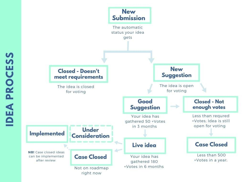
This is the outline of the process that follows an idea or suggestion on Spotify. This idea of the return of the heart has 1690 votes after 4 months. Spotify brands it as "Good Suggestion." Which means that it still has to go to the "Live Idea" phase, and subsequently, two things can happen, that the idea is considered "Under Consideration" or that it is not considered, "Case Closed". If it is considered, there is still one more step: implement the idea.
If the Great Wall of China had been commissioned to Spotify's designers and developers, they would still be analyzing the color of the rocks they would use.

Come on, invite a friend or something, we need one more upvote to break towards 1700. I guess given the millions of users of Spotify that's not much, but then again, 90% probably accept whatever, and of those 10% that are annoyed, 99% can't be bothered to complain. So this number is probably pretty serious.
Anyway, spread the word!

Reiterating my comment from another forum post to express my dissatisfaction with the current situation.
I "like" how Spotify organizes their application.
Choosing to replace the like feature with some kind of plus and then sorting songs by playlists has never been so annoying.
In large playlists, a few songs play on repeat while others go unheard for months, also a "great" feature.
And of course, the revamped queue view. My last straw.
"Thank you, Spotify."
I hope something will be done for the better, otherwise, unfortunately, I will have to say goodbye.
Unsatisfied user.

this resonate so much to me ... i'm avoiding using the green mark unless it's critical.
bring it back!
voted!
you can also add feedback to https://community.spotify.com/t5/Live-Ideas/Bring-back-the-heart-button/idc-p/5974832#M285782

Until recently I used the web player as workaround to see the hearts
Now Spotify has switched the web player to the checkmarks (removed the hearts) as well, even though this thread is labeled "Good Suggestion".
Are they kidding us?

Damn it, it was back for a few days. It worked great. I clicked the heart and in one click the song went into my liked songs, then a few days later, the like button is gone again. Why??? Just leave it there. I am not inherently against change. If you have an idea and it's a good idea that makes using the app easier, then please go ahead and do it. This change actively makes Spotify worse. So why are you changing it? Please bring it back. Please for the love of god.

I do occasionally use playlists, but 99% of my interactions are just liking or unliking a song. So for 99% of my interactions, I have to do 3x as many clicks in 3 different places. Such fine user interface design.

Removing the heart icon offers no benefit to playlist management either, but rather the opposite since you can no longer see which songs in a playlist are liked (as I mentioned above).

Yes! Bring it back!
I use it to sort my favorites in my playlists for when I create my DJ sets!! Please bring it back 🙂

A SUGGESTED BEHAVIOUR FOR THE LIKED/PLAYLIST ISSUE HERE
I hope this might address most of the issues people have raised - I haven't read all the comments, just thought about my own experience.
I only just noticed the Liked/Playlist change, apparently because it was only recently made to the web player, even though it has been in the pipeline for some time now. I use the Android app too but generally I only update apps manually once in a while.
I had written a long answer already based on the behaviour in the web player, but to be sure I thought I'd check what the Android app does now so I updated it, and I also ended up looking at some different scenarios so I've had to rewrite a little (and I hope it's worthwhile because it has taken quite some time)
This issue is called "Return the Like Button", but maybe it should be "Bring Back the Green Heart and be properly sensitive to context!", because:
- It seems that for many (most?) people the big issue is that you can no longer distinguish a Liked track from one which is in a regular playlist - and also for me that's the main problem.
- The behaviour isn't sensitive (enough) to context
Personally, I have mixed feelings about the change overall, for the following reasons:
- (-) A bug? When you're in one of your playlists (on web player and presumably computer app too?) the button which shows up on mouse-over of a track can be either Add to Liked or Add to Playlist and when I click it I can't see why there should be a difference; both sort of tracks are in the current playlist and nothing else...
- (-) You can't easily tell whether you've liked something as opposed to put it in a regular playlist (or if it's both)
- (?) It's still just as easy to add to Liked Songs... so long as the track isn't already in one of your playlists
- (-) Removing a track from Liked Songs now takes 3 clicks instead of one (in web interface anyway, looks like that's the case on mobile too).
- (+) Adding something to a playlist is now a little easier than going to the add-to-playlist option via "..." on the track list, and much easier if it's already Liked/in a playlist.
- (+) You can remove the currently playing track from any playlist it's in, including the one you're currently listening to, very easily. Until now I have maintained a "remove from playlists" playlist so I can deal with that in batches, because even if you were playing the playlist a track was in, you had to actually find it in the playlist in order to remove it. Removing from all playlists (something I once asked for) is also made easy by the "Clear All" button
If we look closely we can see that there are really two issues here:
- What that icon (in whichever state) reflects
- What clicking on it does
I think that the following might be a good compromise. It's based on the web player (and computer app?) format, but might be somewhat relevant to mobile apps too.
- The click action should continue to behave as it does now, i.e. according to the action offered in the status display...
- If Add to Liked, a click would add it to Liked (and offer "Change" to go to the selection display)
- otherwise, a click would take you to the new playlist selection display, without changing anything
- The status display/offered action needs enhancement:
- The heart DISPLAY should be restored with the behaviour it had before - if a track is in Liked, show a heart. (Action: Add to Playlist)
- If a track is in Liked and also in another playlist, show the heart, but with a checkmark in it. (Action: Add to Playlist, but named Playlists - Add/Remove)
- If a track is not Liked but is in a playlist, show the check. The only place the check should be suppressed is when showing the user's playlists and the track is ONLY in the playlist displayed (so you can tell if it's in another playlist too). (Action: Add to Playlist, but named Playlists - Add/Remove) [EDITED TO ADD: Since currently the icon is shown on mouse-over, in such a case the icon shouldn't be the green check as that would be confusing - a green check says "in another playlist". Instead, show a check mark icon but in white - sort of like the plus - rather than green. Would be great if in the player it would work the same way; white check if only in the current (playing) playlist, otherwise green check+/heart, or plus, as appropriate]
- If a track is not Liked and not in a playlist, show the plus, or maybe the previous white heart outline (Action: Add to Liked Songs)
- Basically, once a track is in a playlist, Liked is treated like any playlist, but if a track is not in any playlist, the default destination is Liked

At the very least, have distinct states of the button to distinguish between liked, and added to playlist but not liked.

bring back the heart icon likes, it's hard to find songs on a playlist which is 100 songs or more.
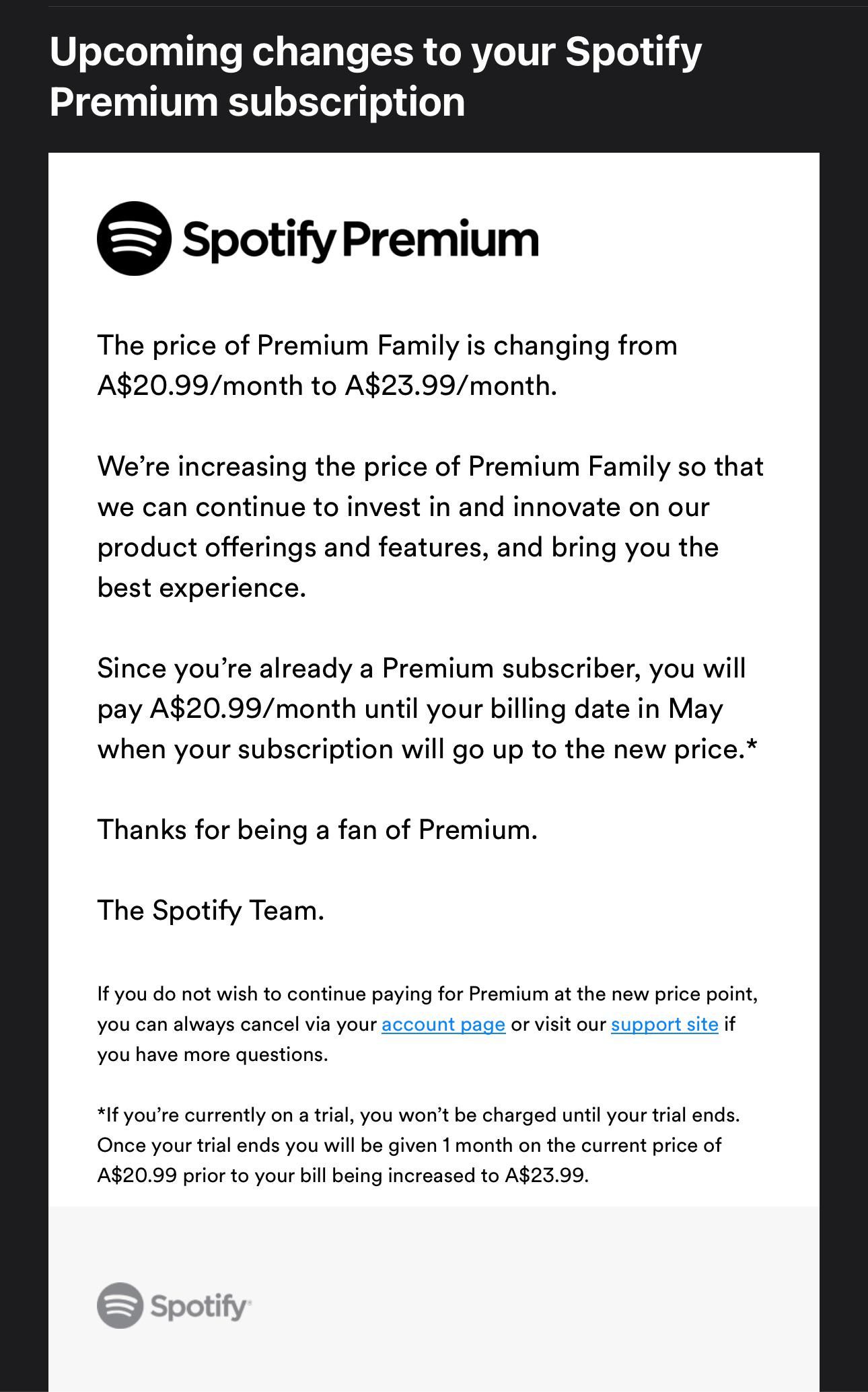
Everything correct, Spotify. Not only do you eliminate features that no one asks to eliminate, for example hearts, you ignore the opinion of your users, and you also increase the price. It is a price in HIFI, something that your sound does not have. We take note.

This new system is a mess and it's absolutely annoying that it's evidently implemented to make us spend more time in the app. It's disrespectful to waste paying customers' time like that. I use it all day everyday and have a library of over 1300 songs. I won't be giving three taps each time I want to unlike a song, I've been using the desktop version's backspace feature as a temporal workaround but seriously, it's been a problem since january and nothing has been done yet?
Supporting Baitijs' comment I will also be leaving the app if nothing is done about it. If this goes on at the end of april I will move on after being an 8 year user because I don't support these practices.

The green dot system doesn't even work!!!
If someone copies my entire playlist there's always around 10% of the songs that don't have the green dot..I have all these songs in my playlists. SO WHY THERE IS NO GREEN DOT??? This totally sucks and I told, explained, and I have send some artists that don't get the green dot, etc. to Spotify already a month ago...
I told them how to see this bug/error with their own eyes but they don't read my explaination well or they act as they are the dumbest person in the world and let me explain it for the 3rd time even with all the proof they can easily experience the same problem...
It's frustrating that so many artists don't get the green dot. Fix the database. Worthless system!
It happens so many times i listen to a song but i don't see the green dot, that supposed to be there because I have the song in my Playlists. I have to check all those songs all the time now...And guess what..They are in my playlists, exactly the same versions from the same albums. But no green dot!? Green dots have their own mind and I never experienced this with the hearts.
In your Spotify desktop browser you can see your TOP TRACKS THIS MONTH list of songs...they are all in my playlists...that's why they appear to be in my monthly TOP track list, but since the hearts had to replaced for the green dots, always 5-10% don't have the green dot! When I try to put these songs in my playlists, where they belong, Spotify tells me they are already added. That's what I say! But the song doesn't get the green dot. Fix this Bug!
Why we have the same option 2 times in one line...? I use desktop app, and with each song I have a double option to add songs to playlists...WHY IS THERE A DOUBLE OPTION FOR THAT and NO OPTION TO SEE MY LIKES THAT MAKES IT USELESS NOW TO LIKE SONGS??? The Green dot and the three grey dots are not even a centimeter distance from eachother.
Another crazy thing is that Spotify moved the back arrow on desktop and browser app. Now we have to scroll your cursor over our back arrow from Your Library and ignore it, to go the the far left corner if we want to go a page back in our Playlist...HOW MESSY, CONFUSING AND UNLOGICAL! Put the Library back arrow at the left side and put the back arrow for Playlist we are playing, back where it was.
I have not 'liked' any song since december 2023 when the hearts dissappeared. It's useless now and I don;t understand the purpose of 'liking' songs. (three frustrating steps and it has not any positive effect...we can't see our likes!)
Make sure things work well, before you take away the good things...
Bring back the heart...!
Maybe someone can create a Browser (add-on) Extension or something, to make the Spotify Hearts come back? Similar to the extension that brought back the Youtube like/dislike buttons when Youtube took it away...
Thousands, maybe millions of users will use this extension...100% guaranteed. Not like the worthless and frustrating 95% guarantee that we are getting now with the green dots NOT showing all the songs we have in our playlists.
Lanciano007: A browser extension would provide a workaround if most people used the Spotify browser version, but most people instead use the desktop and mobile apps – plus, they're much better/faster. So it wouldn't be worthwhile to develop one, and it's likely that they'll eventually restore the icon b/c it's undeniably universal and popular. Spotify has an ugly history of reckless, haphazard, and illogical feature removals, while simultaneously ignoring user requests and preferences.
Also, did you delete your other comment that contained all the forum links, or did a moderator remove it? It's not showing up here, but I received the emails. Great job researching all the duplicate Ideas. These should all be consolidated and merged into the same one. The total vote count for all 5 Ideas is now 4,175!! In addition to this are 55 pgs of negative feedback in the official announcement. Talk about blatantly ignoring user requests and preferences. I updated my previous post above, and included the links to all of them. Please everyone, vote for each of these to keep the numbers increasing.
I’ve also been a premium user for about a decade. This new change makes anything involving likes so much more time-consuming, confusing, and frustrating.
Removing features almost always causes problems for the users who depend on them. At the very least, add a preference to enable/disable the feature rather than remove it, so that those who use the feature can still enable it if Spotify for whatever reason no longer recognizes its usefulness.
Firstly, there are discrepancies w/ this feature (and others too) between the iPhone and Mac desktop apps, when functionality and layout between all platforms should be consistent with each other in order to maximize universality/usability.
On both the mobile and desktop app, you can no longer tell which songs in a playlist are liked without another few steps: tapping the “add to playlist” option to see whether they’re in Liked Songs (3 steps on mobile!) or clicking on the song menu icons (desktop), since all the non-liked songs are also checkmarked on both platforms (confusing enough?). Obviously, this backwards process is completely ridiculous and nonsensical b/c it requires extra convoluted steps (rather than 0 steps before) to simply view an icon which you’d normally be able to see next to every song. So now, rather than being able to see in a few seconds which songs out of potentially hundreds (or thousands) in a playlist are liked, you have to click on each individual song’s menu (desktop) or tap 2-3 other options (mobile), which nobody would even bother doing for this many. Plus, you can’t remember which ones are liked or not liked if the icons are hidden from plain sight. The checkmark is also very confusing b/c you can’t tell if it means the song is liked or just added to a playlist, since it represents both.
The “like” and “add to playlist” functions and icons also need to be independent of each other, b/c not all songs you add to playlists are necessarily ones you also want to heart. This makes the “like” option pointless and unnecessary if every song added to a playlist is also liked.
To make this ideal for all users would be to add a preference to show/hide these 2 separate icons: one for likes, and another for playlists. Both should be enabled by default, and when disabled would exist in the drop-down menu only. Both of these are needed for the large majority of users, they often do not overlap, and should appear next to each other by every song in all playlists and albums, and be visible at all times, like the heart icon used to. Likes should then be removed from the drop-down menu when enabled, since this is redundant.
Also be sure to vote for these ideas below which address the same issue, although they should all be consolidated into the same Idea. The total vote count for all 5 Ideas is now 4,175!! In addition to this are 55 pgs of negative feedback in the official announcement. Talk about blatantly ignoring user requests and preferences.
Bring back the heart button! - The Spotify Community
[Mobile] Change like button back to a heart but keep the + button too - The Spotify Community
New "likes" system is a mess - The Spotify Community
RETURN THE LIKE BUTTON - The Spotify Community
And this is the official announcement page for this utter feature catastrophe which states: “The best way to share your feedback is to comment here in this thread.”
The ♡ Heart button is being replaced with a (+) Plus button - The Spotify Community
I highly recommend also voting for this new feature to improve the checkmark icon. This can still be used in conjunction w/ the heart icon:
Additional Green Checkmark for Same Song on OTHER ... - The Spotify Community
I’ve also been a premium user for about a decade. This new change makes anything involving likes so much more time-consuming, confusing, and frustrating.
Removing features almost always causes problems for the users who depend on them. At the very least, add a preference to enable/disable the feature rather than remove it, so that those who use the feature can still enable it if Spotify for whatever reason no longer recognizes its usefulness.
Firstly, there are discrepancies w/ this feature (and others too) between the iPhone and Mac desktop apps, when functionality and layout between all platforms should be consistent with each other in order to maximize universality/usability.
On both the mobile and desktop app, you can no longer tell which songs in a playlist are liked without another few steps: tapping the “add to playlist” option to see whether they’re in Liked Songs (3 steps on mobile!) or clicking on the song menu icons (desktop), since all the non-liked songs are also checkmarked on both platforms (confusing enough?). Obviously, this backwards process is completely ridiculous and nonsensical b/c it requires extra convoluted steps (rather than 0 steps before) to simply view an icon which you’d normally be able to see next to every song. So now, rather than being able to see in a few seconds which songs out of potentially hundreds (or thousands) in a playlist are liked, you have to click on each individual song’s menu (desktop) or tap 2-3 other options (mobile), which nobody would even bother doing for this many. Plus, you can’t remember which ones are liked or not liked if the icons are hidden from plain sight. The checkmark is also very confusing b/c you can’t tell if it means the song is liked or just added to a playlist, since it represents both.
The “like” and “add to playlist” functions and icons also need to be independent of each other, b/c not all songs you add to playlists are necessarily ones you also want to heart. This makes the “like” option pointless and unnecessary if every song added to a playlist is also liked.
To make this ideal for all users would be to add a preference to show/hide these 2 separate icons: one for likes, and another for playlists. Both should be enabled by default, and when disabled would exist in the drop-down menu only. Both of these are needed for the large majority of users, they often do not overlap, and should appear next to each other by every song in all playlists and albums, and be visible at all times, like the heart icon used to. Likes should then be removed from the drop-down menu when enabled, since this is redundant.
Also be sure to vote for these ideas below which address the same issue, although they should all be consolidated into the same Idea. The total vote count for all 5 Ideas is now 4,175!! In addition to this are 55 pgs of negative feedback in the official announcement. Talk about blatantly ignoring user requests and preferences.
Bring back the heart button! - The Spotify Community
[Mobile][Browse] Bring back like indicator on album/playlist - The Spotify Community
[Mobile] Change like button back to a heart but keep the + button too - The Spotify Community
New "likes" system is a mess - The Spotify Community
And this is the official announcement page for this utter feature catastrophe which states: “The best way to share your feedback is to comment here in this thread.”
The ♡ Heart button is being replaced with a (+) Plus button - The Spotify Community
I highly recommend also voting for this new feature to improve the checkmark icon. This can still be used in conjunction w/ the heart icon:
Additional Green Checkmark for Same Song on OTHER ... - The Spotify Community
I’ve also been a premium user for about a decade. This new change makes anything involving likes so much more time-consuming, confusing, and frustrating.
Removing features almost always causes problems for the users who depend on them. At the very least, add a preference to enable/disable the feature rather than remove it, so that those who use the feature can still enable it if Spotify for whatever reason no longer recognizes its usefulness.
Firstly, there are discrepancies w/ this feature (and others too) between the iPhone and Mac desktop apps, when functionality and layout between all platforms should be consistent with each other in order to maximize universality/usability.
On both the mobile and desktop app, you can no longer tell which songs in a playlist are liked without another few steps: tapping the “add to playlist” option to see whether they’re in Liked Songs (3 steps on mobile!) or clicking on the song menu icons (desktop), since all the non-liked songs are also checkmarked on both platforms (confusing enough?). Obviously, this backwards process is completely ridiculous and nonsensical b/c it requires extra convoluted steps (rather than 0 steps before) to simply view an icon which you’d normally be able to see next to every song. So now, rather than being able to see in a few seconds which songs out of potentially hundreds (or thousands) in a playlist are liked, you have to click on each individual song’s menu (desktop) or tap 2-3 other options (mobile), which nobody would even bother doing for this many. Plus, you can’t remember which ones are liked or not liked if the icons are hidden from plain sight. The checkmark is also very confusing b/c you can’t tell if it means the song is liked or just added to a playlist, since it represents both.
The “like” and “add to playlist” functions and icons also need to be independent of each other, b/c not all songs you add to playlists are necessarily ones you also want to heart. This makes the “like” option pointless and unnecessary if every song added to a playlist is also liked.
To make this ideal for all users would be to add a preference to show/hide these 2 separate icons: one for likes, and another for playlists. Both should be enabled by default, and when disabled would exist in the drop-down menu only. Both of these are needed for the large majority of users, they often do not overlap, and should appear next to each other by every song in all playlists and albums, and be visible at all times, like the heart icon used to. Likes should then be removed from the drop-down menu when enabled, since this is redundant.
Also be sure to vote for these ideas below which address the same issue, although they should all be consolidated into the same Idea. The total vote count for all 5 Ideas is now 4,175!! In addition to this are 55 pgs of negative feedback in the official announcement. Talk about blatantly ignoring user requests and preferences.
[Mobile][Browse] Bring back like indicator on album/playlist - The Spotify Community
[Mobile] Change like button back to a heart but keep the + button too - The Spotify Community
New "likes" system is a mess - The Spotify Community
RETURN THE LIKE BUTTON - The Spotify Community
And this is the official announcement page for this utter feature catastrophe which states: “The best way to share your feedback is to comment here in this thread.”
The ♡ Heart button is being replaced with a (+) Plus button - The Spotify Community
I highly recommend also voting for this new feature to improve the checkmark icon. This can still be used in conjunction w/ the heart icon:
Additional Green Checkmark for Same Song on OTHER ... - The Spotify Community
@Shape5: I didn't delete my comment. It was removed by the moderator (in their eyes it would be spam). The message got a support 'like' within a minute (that's why I got a copy of my message in my mail) and after that it got removed. I already had the same message for over 2 months in another thread and it was no problem. So I thought I remove the other message and place the message again in this thread, and now it got removed here and it's waiting for approval. I feel a bit censured. 🤐
First page, last message... 😉
https://community.spotify.com/t5/Live-Ideas/Bring-back-the-heart-button/idc-p/5907928#M283321
I think 99% (maybe 100%) of the users, that took time to find, register and respond on this Community Forum, are dissatisfied/disappointed Premium-paying users giving feedback.. And I believe 99% of us just want to organise, discover and listen to our beliked music instead of responding on this forum...
I switched from Youtube to Spotify because I wanted to 'listen' music on my mobile (without annoying Youtube ads). Now I'm experiencing that I'm almost not using Spotify on my mobile anymore, because the Hearts disappeared and I need 'organised' Playlists to 'listen' to music... When I 'listen' to my music, I dislike to be disturbed by anything else...So the one click 'Like' button was not disturbing (frustrating) me...the new three steps do... especially when it has no purpose to do so...can't 'see' my 'Like' (Heart) anymore!).
@Shape5: For me a browser (add-on) extension will work perfectly...
On my mobile, I only 'listen' to my playlists... Because the mobile app doesn't give the needs and it's impossible to use my mobile to 'discover' songs, and 'create' and 'organise' my playlists... So I use Spotify on desktop and browser to 'listen', 'create' and 'organise' my playlists...
Don't get me wrong. I am satisfied with the new function of the green dot. I think many of us will appreciate and benefit from this new feature. But it remains incomprehensible that the 'visible heart' had to make way for the green dot, while it can also be merged with the three gray dots, so that the 'visible heart' can be kept in the same place.
Spotify's player now looks like one of the first (but with more bugs and messier) Windows Media Player Classic versions, that I actually liked.
In that era....a few decades ago 🤔

I love the button to add to playlist easily and the update where we can add to several playlists at once - there was a brief time recently where the playlists a song was already on would appear at the top, please bring back and cement that feature! I hear that many people preferred the like button simplicity. If it's possible to have the heart for likes next to a plus sign for playlist adds that sounds ideal perhaps.
Wasn't it one tap to like and a second tap to add to playlists at one point? That seemed best honestly.
@Sblocks94. I believe their UX team was already fired before, or they left ...
Are they going to make their own Spotify song productions now (Spotify Sessions the Originals..Bye bye classics...) like Netflix?
In the beginning, Netflix became huge, with a nice amount of movies and a classic database...Prices went up...And today we have more DVDs on our shelves than Netflix has movies in their database...Netflix even admits that this is why we can't see and scroll through their entire database...Because we'll notice that they only have a small selection to offer these days...The reason why you get the 10 movies THEY suggest you'll like, and that you can't watch the movies YOU were trying to look for in the first place...
Almost everyone I know has stopped using Netflix or is thinking about it... Way too expensive for what they offer now! Own work and a periodic rotating system of 100 movies or less, and some series.
Hope Spotify is not going the same way...
Lanciano007: That’s what I figured, b/c it also happened to me just after I read your post and commented. It was false flagged by their spam filter, not censored though. I submitted a “Report Inappropriate Content” message, and explained in the comment box that there were several false flagged comments I posted which included no spam, or even links to 3rd party sites, but were removed all at once without notice. The security team must have restored them based on this, as within an hour they were back. I’d suggest trying this too.
But I was also able to get the case escalated from 2nd tier chat to the Escalations Team via email, which they said is the highest level of support they offer. I gave them the link to your removed comment (which came thru via email) and asked them to restore it, and said this proves that their filter is not working as intended.
My assumption is that the system is marking them as spam due to several included links (even though they were to other forum Ideas), or separate messages being posted back-to-back, as both of us did this on the same day. Of course, I also asked them to take a good look at this Idea and the other 4 which should be merged into one, along with a plethora of other bugs and functionality issues I submitted. I agree there are a ton of problems on both Spotify platforms. They regularly update the apps, esp the iOS version, but rarely fix critical bugs and essential missing features. It’s been like this for many years, 9 to be exact! This was when Spotify started to go downhill: New Update 1.0.1.1060.gc75ebdfd Mega Discussion Thread [Complaints, Workarounds, Changelog] : r/spotify, but they’ve made many improvements since this catastrophic makeover which removed dozens and dozens of features all in one shot, the worst version they ever released.
I hear you on the browser extension. It’s just that most people don’t use this version. Either 2 separate icons are needed next to each other, or 1 icon that can display 2 different ways to communicate these 2 separate meanings: liked & playlisted. But they need to be independent.
I have updated my message with 6 more threads from users experiences after the changes...
First page, last message...
https://community.spotify.com/t5/Live-Ideas/Bring-back-the-heart-button/idc-p/5907928#M283321
@Lanciano007: Nice – yeah, this is the one that came thru via email and was auto-removed. I already passed on the relevant links from here to the Escalations Team, and asked them to merge all 5 into one Idea since they all refer to the same issue. The would increase the tally to over 4200 votes. I also added them to my previous post on pg. 3, as noted above.
bring b ack he likes in playlist