- Home
- The Vault
- Blog Vault
- The New Desktop App
Help Wizard
Step 1
Type in your question below and we'll check to see what answers we can find...
Loading article...
Submitting...
If you couldn't find any answers in the previous step then we need to post your question in the community and wait for someone to respond. You'll be notified when that happens.
Simply add some detail to your question and refine the title if needed, choose the relevant category, then post.
Just quickly...
Before we can post your question we need you to quickly make an account (or sign in if you already have one).
Don't worry - it's quick and painless! Just click below, and once you're logged in we'll bring you right back here and post your question. We'll remember what you've already typed in so you won't have to do it again.
The New Desktop App
- Mark as New
- Bookmark
- Subscribe
- Mute
- Subscribe to RSS Feed
- Permalink
- Report Inappropriate Content
UPDATE - May 5th, 2023
Hey folks,
We appreciate the feedback you've provided us with regarding the new desktop UI; it's being taken into account!
We're chiming in to redirect you to the current main thread regarding the latest updates to the desktop app and we'll be closing new comments here as it is an outdated thread 🙂
Thanks!
UPDATE - April 16th, 2021
Hey folks,
We've tried to cover most of the frequently asked questions concerning the new update in this Spotify Answer - Make sure to check it out!
We'll continue to go through all your posts in this blog, so if you have any other questions besides the ones in the FAQ, feel free to add them in a comment below.
Thanks,
The Community Moderator Team
UPDATE - April 8th, 2021
Hi Everyone,
Yesterday we published a blog post on our engineering blog which goes into more details on the new UI, the reasons behind it and the process of building it. If you'd like to read a few more details like that you can check it out here.
I'd also like to mention a few things coming in upcoming versions of Desktop
- We're working on bringing back a list-like Discography view, something many of you have mentioned missing in the new UI. We expect this to land in an upcoming release, so do watch this space and make sure you remain fully updated.
- "Discovered On" playlists for artists will be back in an upcoming release.
- We're working on bringing to Desktop the ability (like in our mobile apps) to see all the saved songs by a particular artist from within the artist page itself. Again this will be arriving in an upcoming Desktop release.
Thanks,
Dan
ORIGINAL POST -----
Hi everyone
Dan here from the Desktop team again. I wanted to make another post to once again thank you all for your continued feedback, and also give a little more detail about what we’re doing from here on in.
In short, the new user interface is the future of the Spotify Desktop client, and over the coming weeks we’ll roll out the new UI to all Desktop users. Many of you will have noticed already, but we’ve based the new experience on the more modern and scalable Web Player codebase, and in doing so made both versions more aligned and easier to use than ever before.
Why are we making this change?
We believe in the future of the Desktop platform and want to make sure it can still serve the needs of our users now and into the future.
The existing Desktop UI codebase became increasingly hard to maintain as time went on, and you may have noticed a growing gap between the Desktop and Mobile apps in some cases. For those of you interested in the technical details, a blog post on the engineering blog is coming soon. The short story, however, is that our desire to continue pushing Desktop forward and bringing new features to it became incompatible with the reality of maintaining the legacy experience.
Meanwhile, we had a Web Player serving similar user needs, but built in a much more modern and scalable way — with a more cohesive Spotify “look & feel”. We therefore resolved to use the Web Player UI code as the basis for both Web and Desktop in the future, and have been spending quite some bringing the Desktop-class features that you’ve come to expect to this shared platform. You’ve had a sneak peek of this as we’ve been testing and building things out, so once again I’d like to thank you for both being a part of it and giving great feedback on this thread that has definitely helped us improve.
Benefits of this approach
Firstly, I’d like to say that this really is a new beginning for the Desktop app. Long-term Desktop users will start to notice more rapid iteration on the app than they’ve seen in the past.
I’d like to call out some of the things in the new Desktop, and also give you a little taste of what’s to come.
Design - We’ve focused on consistency, are using more color to enhance the experience where appropriate, and are making better use of cover art and album images in the app. We're also better aligned to other platforms, put an increased focus on accessibility, interactions and animations, and have tightened up our design language, so it’s more in line with what users have come to expect from Spotify.
Functionality - We’ve brought the functionality that users expect from Desktop, like sorting/filtering, drag & drop, and advanced settings and options, whilst improving areas like playlist creation and curation, profile pages, and more. In many cases these improvements have landed in the Web Player, so the work here has benefited our combined users on both platforms.
Tip! You’ll also find new keyboard shortcuts for many tasks (press ctrl+? to see them) which makes certain actions much faster and easier for any user.
We are also aware that there are a few aspects raised in the community that haven't been fully addressed as part of this update, but items like the Search Bar and discography on artist pages have ultimately been brought closer in line with other Spotify applications. That said, we will continue to iterate on the experience across both platforms moving forward.
The future of Desktop
As mentioned above, this change to the Desktop UI gives us the ability to move faster in bringing you new improvements, features and functionality — so you can expect to see continued improvements to the client in the weeks and months to come.
Once again, I’d like to thank you all for helping us shape the Desktop App over the past year on behalf of everyone here at Spotify, and please do continue to post your feedback and use our Ideas section here in the Community to tell us what you’d like to see and why.
Thanks again,
Dan
- Subscribe to RSS Feed
- Mark as New
- Mark as Read
- Bookmark
- Subscribe
- Printer Friendly Page
- Report Inappropriate Content
- Previous
-
- 1
- …
- 171
- 172
- 173
- …
- 458
- Next »
- Mark as Read
- Mark as New
- Bookmark
- Permalink
- Report Inappropriate Content
@KatsPurr Thank you so much for this workaround!
- Mark as Read
- Mark as New
- Bookmark
- Permalink
- Report Inappropriate Content
Can anyone explain how removing the search bar, probably the single most used feature, from the top of every screen (where there is just empty, unused space anyway) is a UX improvement? Who thought of this? Are there actually metrics saying the search field was under used? What is the benefit of having unused space occupy this area on every other Spotify page????
- Mark as Read
- Mark as New
- Bookmark
- Permalink
- Report Inappropriate Content
Hey folks,
Thanks for the many comments and all your input on the new desktop update!
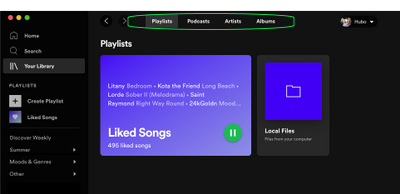
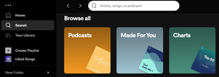
We’ve seen a few mentions that several items, such as Made for You, Local Files as well as individual library links, have disappeared from the left sidebar navigation.
Please note that the previously separate Your Library links have been combined into a single link:
This is also where you’ll find the Local Files folder - it’s in the Playlists tab right next to your Liked Songs.
You’ll find the Made for You playlists in Search:
There’s also been some feedback about certain changes regarding Podcasts - If you'd like to contribute to these suggestions, it'd be great for you to add your +VOTE and subscribe to the following ideas:
- [Desktop] [Podcasts] ''Your episodes'' available on desktop
- [Desktop][Podcasts] Sort by Unplayed/Recently Added
- [Desktop][Podcasts] Filtered by unplayed episodes
- [Desktop] Video size in podcasts
You’re welcome to submit a new idea, if you’d like to suggest something different. Just keep in mind that we can’t accept complete rollback requests and other ideas that include multiple requests. More info on that here.
Hope this info is helpful but don't hesitate to let us know if you have any further questions!
- Mark as Read
- Mark as New
- Bookmark
- Permalink
- Report Inappropriate Content
You guys are either blind or really despise your customers.
There are almost a thousand comments containing "further questions" that you guys, as usual, pretend don't exist....
It's not "ideas", its fix the regressions....
Incredible...
- Mark as Read
- Mark as New
- Bookmark
- Permalink
- Report Inappropriate Content
@Xenia:
You’re welcome to submit a new idea, if you’d like to suggest something different. Just keep in mind that we can’t accept complete rollback requests and other ideas that include multiple requests. More info on that here.
Do you mean that we should put every regression in there as a separate post?
Feels a bit excessive if you ask me, but if it's required I guess that's what needs to happen. Maybe someone could set up a separate (external) bugtracker to make it a bit easier?


