- Home
- The Vault
- Blog Vault
- The New Desktop App
Help Wizard
Step 1
Type in your question below and we'll check to see what answers we can find...
Loading article...
Submitting...
If you couldn't find any answers in the previous step then we need to post your question in the community and wait for someone to respond. You'll be notified when that happens.
Simply add some detail to your question and refine the title if needed, choose the relevant category, then post.
Just quickly...
Before we can post your question we need you to quickly make an account (or sign in if you already have one).
Don't worry - it's quick and painless! Just click below, and once you're logged in we'll bring you right back here and post your question. We'll remember what you've already typed in so you won't have to do it again.
The New Desktop App
- Mark as New
- Bookmark
- Subscribe
- Mute
- Subscribe to RSS Feed
- Permalink
- Report Inappropriate Content
UPDATE - May 5th, 2023
Hey folks,
We appreciate the feedback you've provided us with regarding the new desktop UI; it's being taken into account!
We're chiming in to redirect you to the current main thread regarding the latest updates to the desktop app and we'll be closing new comments here as it is an outdated thread 🙂
Thanks!
UPDATE - April 16th, 2021
Hey folks,
We've tried to cover most of the frequently asked questions concerning the new update in this Spotify Answer - Make sure to check it out!
We'll continue to go through all your posts in this blog, so if you have any other questions besides the ones in the FAQ, feel free to add them in a comment below.
Thanks,
The Community Moderator Team
UPDATE - April 8th, 2021
Hi Everyone,
Yesterday we published a blog post on our engineering blog which goes into more details on the new UI, the reasons behind it and the process of building it. If you'd like to read a few more details like that you can check it out here.
I'd also like to mention a few things coming in upcoming versions of Desktop
- We're working on bringing back a list-like Discography view, something many of you have mentioned missing in the new UI. We expect this to land in an upcoming release, so do watch this space and make sure you remain fully updated.
- "Discovered On" playlists for artists will be back in an upcoming release.
- We're working on bringing to Desktop the ability (like in our mobile apps) to see all the saved songs by a particular artist from within the artist page itself. Again this will be arriving in an upcoming Desktop release.
Thanks,
Dan
ORIGINAL POST -----
Hi everyone
Dan here from the Desktop team again. I wanted to make another post to once again thank you all for your continued feedback, and also give a little more detail about what we’re doing from here on in.
In short, the new user interface is the future of the Spotify Desktop client, and over the coming weeks we’ll roll out the new UI to all Desktop users. Many of you will have noticed already, but we’ve based the new experience on the more modern and scalable Web Player codebase, and in doing so made both versions more aligned and easier to use than ever before.
Why are we making this change?
We believe in the future of the Desktop platform and want to make sure it can still serve the needs of our users now and into the future.
The existing Desktop UI codebase became increasingly hard to maintain as time went on, and you may have noticed a growing gap between the Desktop and Mobile apps in some cases. For those of you interested in the technical details, a blog post on the engineering blog is coming soon. The short story, however, is that our desire to continue pushing Desktop forward and bringing new features to it became incompatible with the reality of maintaining the legacy experience.
Meanwhile, we had a Web Player serving similar user needs, but built in a much more modern and scalable way — with a more cohesive Spotify “look & feel”. We therefore resolved to use the Web Player UI code as the basis for both Web and Desktop in the future, and have been spending quite some bringing the Desktop-class features that you’ve come to expect to this shared platform. You’ve had a sneak peek of this as we’ve been testing and building things out, so once again I’d like to thank you for both being a part of it and giving great feedback on this thread that has definitely helped us improve.
Benefits of this approach
Firstly, I’d like to say that this really is a new beginning for the Desktop app. Long-term Desktop users will start to notice more rapid iteration on the app than they’ve seen in the past.
I’d like to call out some of the things in the new Desktop, and also give you a little taste of what’s to come.
Design - We’ve focused on consistency, are using more color to enhance the experience where appropriate, and are making better use of cover art and album images in the app. We're also better aligned to other platforms, put an increased focus on accessibility, interactions and animations, and have tightened up our design language, so it’s more in line with what users have come to expect from Spotify.
Functionality - We’ve brought the functionality that users expect from Desktop, like sorting/filtering, drag & drop, and advanced settings and options, whilst improving areas like playlist creation and curation, profile pages, and more. In many cases these improvements have landed in the Web Player, so the work here has benefited our combined users on both platforms.
Tip! You’ll also find new keyboard shortcuts for many tasks (press ctrl+? to see them) which makes certain actions much faster and easier for any user.
We are also aware that there are a few aspects raised in the community that haven't been fully addressed as part of this update, but items like the Search Bar and discography on artist pages have ultimately been brought closer in line with other Spotify applications. That said, we will continue to iterate on the experience across both platforms moving forward.
The future of Desktop
As mentioned above, this change to the Desktop UI gives us the ability to move faster in bringing you new improvements, features and functionality — so you can expect to see continued improvements to the client in the weeks and months to come.
Once again, I’d like to thank you all for helping us shape the Desktop App over the past year on behalf of everyone here at Spotify, and please do continue to post your feedback and use our Ideas section here in the Community to tell us what you’d like to see and why.
Thanks again,
Dan
- Subscribe to RSS Feed
- Mark as New
- Mark as Read
- Bookmark
- Subscribe
- Printer Friendly Page
- Report Inappropriate Content
- Previous
-
- 1
- …
- 283
- 284
- 285
- …
- 458
- Next »
- Mark as Read
- Mark as New
- Bookmark
- Permalink
- Report Inappropriate Content
Funny you should mention that - I used to use, and abandoned Last.fm some time ago, since the only reason anyone would have for still using it (historical statistics / information) was no longer actually accessible.
- Mark as Read
- Mark as New
- Bookmark
- Permalink
- Report Inappropriate Content
One of my favorite and most utilized features was the filter and sort in podcasts. Prior to this update, we were able to filter out "Played" episodes. You removed that functionality so now I have to scroll forever past all of the episodes I've already heard. It's incredibly frustrating and leaves me wondering why you would mess with a good thing? This is on the Desktop app running Windows 10. That particular version also will show that the sort is "Oldest to Newest" but the episodes still show with the most recent on top. I have to click on the filter (after maximizing the screen as there seems to be a sizing issue when clicking where it won't show the menu options) for it to then sort properly.
- Mark as Read
- Mark as New
- Bookmark
- Permalink
- Report Inappropriate Content
I miss Browse for when one is not sure what one is looking for. I miss how these features were kept separate from Search which is for when one knows what one is looking for.
- Mark as Read
- Mark as New
- Bookmark
- Permalink
- Report Inappropriate Content
I understand that sometimes change is necessary.
However, I'm also a paying customer. I work a lot with music both in my career in the creative sector and an avid fan. This means I have thousands of songs, and hundreds of playlists.
A part of my workflow and enjoyment of Spotify is based on being able to sort and view my playlists in a way that is coherent and efficient for me, the paying customer.
It seems that this change was disproportionate - I can't believe that the benefit to Spotify by removing the "artist" column was greater than the frustration caused by changing it.
Yes, I understand the argument for a unified UI, and for making changes from time to time. But when you give the user no power to customize their experience, and do something that is visually disruptive to a lot of people (particularly neuro atypical individuals) it is both frustrating and causes them immense unhappiness, for a service that they PAY you for.
Customers should have the option to sort and organize their playlists in the way that makes logistical and visual sense to them, and not have that ability arbitrarily removed. Your entire product is possible because of the artistry of others, musicians, that resonates on a personal level. Please show more consideration for the personal experience and comfort of your users so we can remain passionate and positive about your service.
- Mark as Read
- Mark as New
- Bookmark
- Permalink
- Report Inappropriate Content
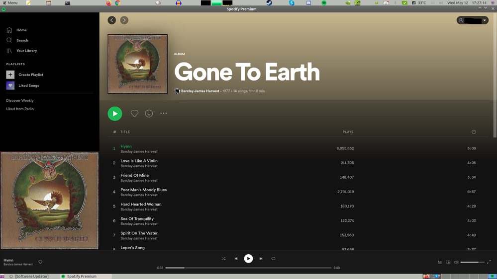
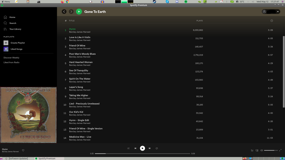
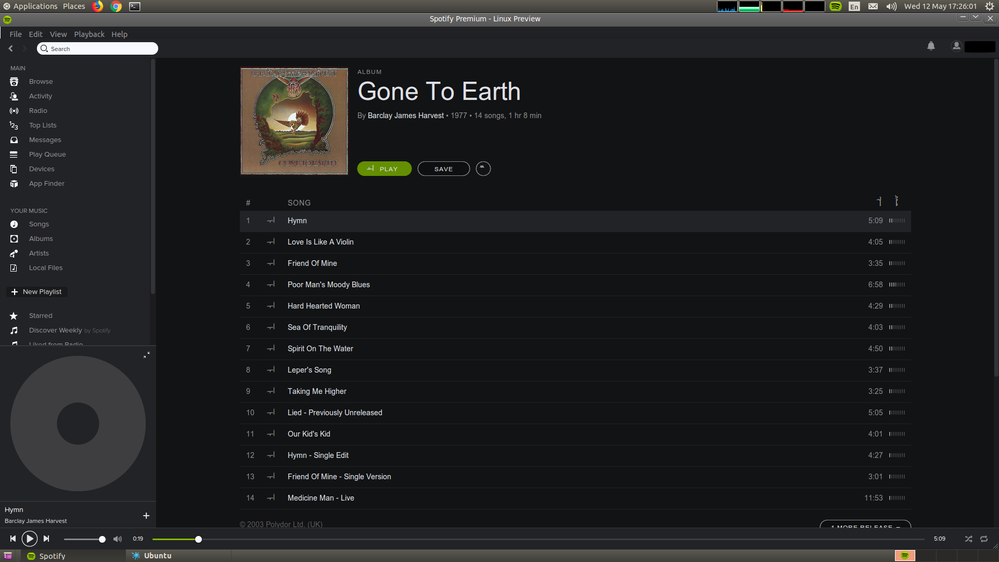
I'm certainly not keen on this new interface at all. Every time Spotify has had an update, it had got worse visually in my opinion. On my old PC that I don't use with a monitor any more, that still has a really old version and I've got a picture that highlights a big problem (pun not intended) with the new interface. It gets far bigger every time. The text is massively oversized. The album title size is just ridiculous. Makes it look like I am viewing a browser zoomed into 150% and also makes it feel like I am using a really low resolution monitor.
It looks far to like the android version and doesn't feel suited for desktop use at all. Far too much scrolling is needed just to see a full album. 14 tracks fills the whole screen!
The bottom picture is a much older version. It is now unstable as it isn't supported, it everything is scaled far better. It fits all the tracks of this album and has room for 2 more - and it includes the album art and title at the top. The art is also the same size as the new one which just shows how oversized the text now is. This is the desktop version... It doesn't need to be big as if you are viewing it on a phone screen and are selecting things with your fingers. Buttons are also over sized. You use a mouse with your desktop, so literally everything should be scaled down somewhat in my opinion.
There also should be an option to change the size yourself like you can with browsers. Ctrl + scroll in / out. If only I could, I would shrink this right down.
Other things that are now worse:
Now things are bigger, there are less options on the left on the home screen than the previous version. They are still there, but you have to click more times to get there. Give the screen more room by shrinking it and bring back the short cuts! I can't remember exactly, but going to the albums in your library takes at least 2 more clicks than it used to. When you click on "Your Library" You ALWAYS have to click on albums to get there. It used to remember where you last were when you visited each time.
No list view of albums displaying all the tracks of each. It is EXTREMELY annoying not having a quick way to go from a track of one album to one from another simply by scrolling. You have to go back to the annoying 6 wide grid and the navigation there is not nice to look at. Feels like a maze in comparison as you have to scan all over the place to find the album you want. A list view of the albums and tracks needs bringing back. never used Spotify without this.
Search box: This has a poor placement that isn't obvious enough.
Being between home and your library just seems out of place. It used to be on it's own just left of the centre at the top of the screen. Much easier to see as it was a very visible white box. Now it is merged in grey in the middle of other completely unrelated things. It was also far better in the really old version as my screenshot shows.
Now onto the search box results and suggestions. This is the worst it has ever been. Searching the band in the screenshots i provided (barklay james harvest), a playlist someone random created comes up before it suggests the official band page. And the "Top Result" box just shows 1 suggestion, and the box is so massive that you have to scan and read the stupid grid of artists below it which takes far more eye movement than it did before. Why do we need such HUGE artwork for a search suggestion........ It makes it harder to read and limits what is on there.
Just think how annoying google suggestions would be if instead of a list, you got a page full of oversized images relating to your search before you selected anything. Who would want that?? Many previous versions of spotify just had many artists appear as you begin to type in a vertical drop down list with discrete thumbnail images of the artists. It was far easier and quicker to get to the official artists page too. This is all the search box needs.
Something else that Spotify had long ago was a way of listening to all the songs from all the albums you had saved as a playlist. Since an update long ago (which this update still hasn't changed), you have to manually save every single track in the reverse order of each album to get a playlist that allows you to listen to multiple unrelated albums without having to manually play them at the start of each album (like the list view of artists?) If there is an option to make a list of unrelated songs as a play list, why can't you add the albums to a playlist? This option was removed years ago now and I posted about it here: https://community.spotify.com/t5/Desktop-Linux/Albums-not-showing-in-Library-songs-section/m-p/47837...
I'm also not keen on the fact that the first think you see on track names to the right is the number of plays it has. Surely the album and track time is more relevant than this! Popularity should be on the far right as it isn't an important thing compared to the title, album and time. Another thing the old versions of spotify had how it should be.
I've only used this for a couple of hours but it is so frustrating to navigate due to being oversized and less much less user friendly than before.
Lets end on a positive. The addition of the back and forward buttons on a mouse being supported will make a big difference. I'm used to doing this on browsers, folders and virtually all other programs. Always was annoying to have to move the mouse to the arrows in the top left to return. Lets hope Spotify keep this and don't remove it like they do with other features all of us like!


