- Home
- The Vault
- Blog Vault
- The New Desktop App
Help Wizard
Step 1
Type in your question below and we'll check to see what answers we can find...
Loading article...
Submitting...
If you couldn't find any answers in the previous step then we need to post your question in the community and wait for someone to respond. You'll be notified when that happens.
Simply add some detail to your question and refine the title if needed, choose the relevant category, then post.
Just quickly...
Before we can post your question we need you to quickly make an account (or sign in if you already have one).
Don't worry - it's quick and painless! Just click below, and once you're logged in we'll bring you right back here and post your question. We'll remember what you've already typed in so you won't have to do it again.
The New Desktop App
- Mark as New
- Bookmark
- Subscribe
- Mute
- Subscribe to RSS Feed
- Permalink
- Report Inappropriate Content
UPDATE - May 5th, 2023
Hey folks,
We appreciate the feedback you've provided us with regarding the new desktop UI; it's being taken into account!
We're chiming in to redirect you to the current main thread regarding the latest updates to the desktop app and we'll be closing new comments here as it is an outdated thread 🙂
Thanks!
UPDATE - April 16th, 2021
Hey folks,
We've tried to cover most of the frequently asked questions concerning the new update in this Spotify Answer - Make sure to check it out!
We'll continue to go through all your posts in this blog, so if you have any other questions besides the ones in the FAQ, feel free to add them in a comment below.
Thanks,
The Community Moderator Team
UPDATE - April 8th, 2021
Hi Everyone,
Yesterday we published a blog post on our engineering blog which goes into more details on the new UI, the reasons behind it and the process of building it. If you'd like to read a few more details like that you can check it out here.
I'd also like to mention a few things coming in upcoming versions of Desktop
- We're working on bringing back a list-like Discography view, something many of you have mentioned missing in the new UI. We expect this to land in an upcoming release, so do watch this space and make sure you remain fully updated.
- "Discovered On" playlists for artists will be back in an upcoming release.
- We're working on bringing to Desktop the ability (like in our mobile apps) to see all the saved songs by a particular artist from within the artist page itself. Again this will be arriving in an upcoming Desktop release.
Thanks,
Dan
ORIGINAL POST -----
Hi everyone
Dan here from the Desktop team again. I wanted to make another post to once again thank you all for your continued feedback, and also give a little more detail about what we’re doing from here on in.
In short, the new user interface is the future of the Spotify Desktop client, and over the coming weeks we’ll roll out the new UI to all Desktop users. Many of you will have noticed already, but we’ve based the new experience on the more modern and scalable Web Player codebase, and in doing so made both versions more aligned and easier to use than ever before.
Why are we making this change?
We believe in the future of the Desktop platform and want to make sure it can still serve the needs of our users now and into the future.
The existing Desktop UI codebase became increasingly hard to maintain as time went on, and you may have noticed a growing gap between the Desktop and Mobile apps in some cases. For those of you interested in the technical details, a blog post on the engineering blog is coming soon. The short story, however, is that our desire to continue pushing Desktop forward and bringing new features to it became incompatible with the reality of maintaining the legacy experience.
Meanwhile, we had a Web Player serving similar user needs, but built in a much more modern and scalable way — with a more cohesive Spotify “look & feel”. We therefore resolved to use the Web Player UI code as the basis for both Web and Desktop in the future, and have been spending quite some bringing the Desktop-class features that you’ve come to expect to this shared platform. You’ve had a sneak peek of this as we’ve been testing and building things out, so once again I’d like to thank you for both being a part of it and giving great feedback on this thread that has definitely helped us improve.
Benefits of this approach
Firstly, I’d like to say that this really is a new beginning for the Desktop app. Long-term Desktop users will start to notice more rapid iteration on the app than they’ve seen in the past.
I’d like to call out some of the things in the new Desktop, and also give you a little taste of what’s to come.
Design - We’ve focused on consistency, are using more color to enhance the experience where appropriate, and are making better use of cover art and album images in the app. We're also better aligned to other platforms, put an increased focus on accessibility, interactions and animations, and have tightened up our design language, so it’s more in line with what users have come to expect from Spotify.
Functionality - We’ve brought the functionality that users expect from Desktop, like sorting/filtering, drag & drop, and advanced settings and options, whilst improving areas like playlist creation and curation, profile pages, and more. In many cases these improvements have landed in the Web Player, so the work here has benefited our combined users on both platforms.
Tip! You’ll also find new keyboard shortcuts for many tasks (press ctrl+? to see them) which makes certain actions much faster and easier for any user.
We are also aware that there are a few aspects raised in the community that haven't been fully addressed as part of this update, but items like the Search Bar and discography on artist pages have ultimately been brought closer in line with other Spotify applications. That said, we will continue to iterate on the experience across both platforms moving forward.
The future of Desktop
As mentioned above, this change to the Desktop UI gives us the ability to move faster in bringing you new improvements, features and functionality — so you can expect to see continued improvements to the client in the weeks and months to come.
Once again, I’d like to thank you all for helping us shape the Desktop App over the past year on behalf of everyone here at Spotify, and please do continue to post your feedback and use our Ideas section here in the Community to tell us what you’d like to see and why.
Thanks again,
Dan
- Subscribe to RSS Feed
- Mark as New
- Mark as Read
- Bookmark
- Subscribe
- Printer Friendly Page
- Report Inappropriate Content
- Previous
-
- 1
- …
- 310
- 311
- 312
- …
- 458
- Next »
- Mark as Read
- Mark as New
- Bookmark
- Permalink
- Report Inappropriate Content
Wow, so Spotify "fixed" the workaround to the old UI, instead of improving the functionality of the new UI (like artists in their own column, search bar, discography).
Glad someone on Reddit figured out a new workaround.
Just search on Reddit for "Reverting to the classic Desktop UI" or search for the user "Reubzen".
Long story short: uninstall Spotify. Install Spotify december 2020 version, use "prefs" file method, remove auto update.
I will use this method untill Spotify will fix there new UI.
Nothing wrong with the look of that UI imo, but it needs a lot better functionality.
- Mark as Read
- Mark as New
- Bookmark
- Permalink
- Report Inappropriate Content
@nippleDonkey
I went with apple music. Yes the UI is very similar from what I hate now from spotify but apple music allow me to go over 10 000 songs in a playlist, I have now synced lyrics which spotify refuse to provide us with in canada, the library is way larger one apple music too. I'd say that the quality of the sound is a bit better too or at least sound "wider/richer" to me but I have nothing to back that up it's only from what I perceive. I was also surprised I had 3500-ish old songs on my computer's itunes library and it is free synced via cloud, didn't take any icloud space nor iphone storage at all. (it is actually 20+Gb worth of songs freely accessible from any device now, impressive!) I've found a site that transfer my spotify playlist to the other so very easy transition too so far too for my streamed songs.
Is it perfect? nope. But I feel like I at least receive a bit more for my money and I truly hope more people follow. If y'all keep giving them your money when your unsatisfied they will take your money and ignore you. Simple as that. Plus, you can always go back if you truly regrets your choice but honestly I'm tired of their sht. I've promised myself to stay away from them unless I see they actually make changes toward the USERS demands, or at least show us that that's what they want to achieve... but even then, I'll will probably be very familiar with my new services by then and would not want to change back.
- Mark as Read
- Mark as New
- Bookmark
- Permalink
- Report Inappropriate Content
The forum keeps deleting my post when i add images, so I will do a separate one for that. But what does that matter? You only need to scroll right down to see them like you now do with the artist biography!!
Lets look through and highlight some of the questions and answers here. Some are ridiculous.
https://community.spotify.com/t5/FAQs/FAQ-The-New-Spotify-App-for-PC-and-Mac/ta-p/5188911
1: Why did the design change in the first place?
"The new UI allows us to roll out features and improvements more swiftly so we can continue providing you with the best listening experience possible, all the while expanding user accessibility and design functionality."
This part above just can't be taken seriously. This interface DOES NOT provide the best listening experience possible! It is also not more accessible... So many things are partially hidden and take many more clicks to get places.
5: Why was the Search bar moved?
"This change was made as part of our efforts to improve accessibility and functionality, so that the app is more in line with what users have come to expect from Spotify."
Really? Why would we expect the search bar to be moved from a permanent location to a location that is harder to see and click on?
"We've made sure that this change did not lead to an increase in the number of actions a user makes when searching as previously a click was needed to activate the search bar. Now when you click Search the app automatically focuses the search input and you can start typing straight away after one click. Alternatively, you can hit Ctrl+l to jump to search even faster."
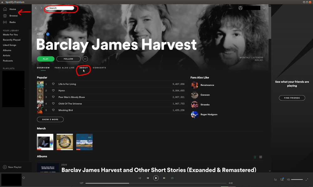
This is nonsense...... They have just added a totally pointless gimmick. When you go to the annoyingly positioned search "button", it magically allows you to start typing in a search "box" that pops up without having to click it. Previously a click was needed to allow you to type in the search box. And now, you may not need to click in the search box, but you still need to click on a button to get there. All they have done is made it harder. Hitting CTRL+L makes it even faster? This combination is in the middle of the keyboard and not ideal for your right or left hand and it is FAR easier just having a search box like it used to be in this screenshot below.
IMAGE 1 in post below
Who thought squeezing it between where the arrow is was a good idea?
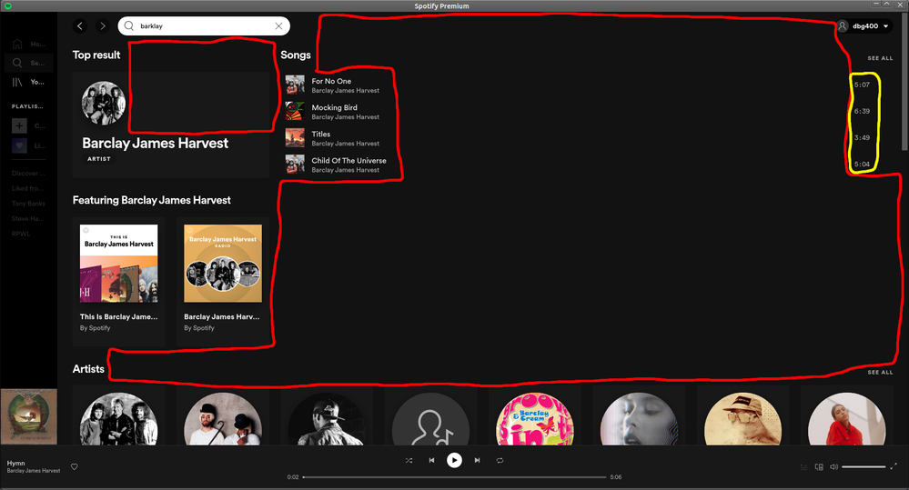
IMAGE 2 in post below
Now onto the interface when searching. There was a serious lack of thought gone into this. Look at the crazy amount of wasted space there is here. It is laughable that they claim to have "improved accessibility and functionality" to the search function. Look how far down artists are that are all chopped in half. Look at the gap of NOTHING between the track titles and somewhere totally unrelated in the yellow circle are the track times. They look just dumped there.
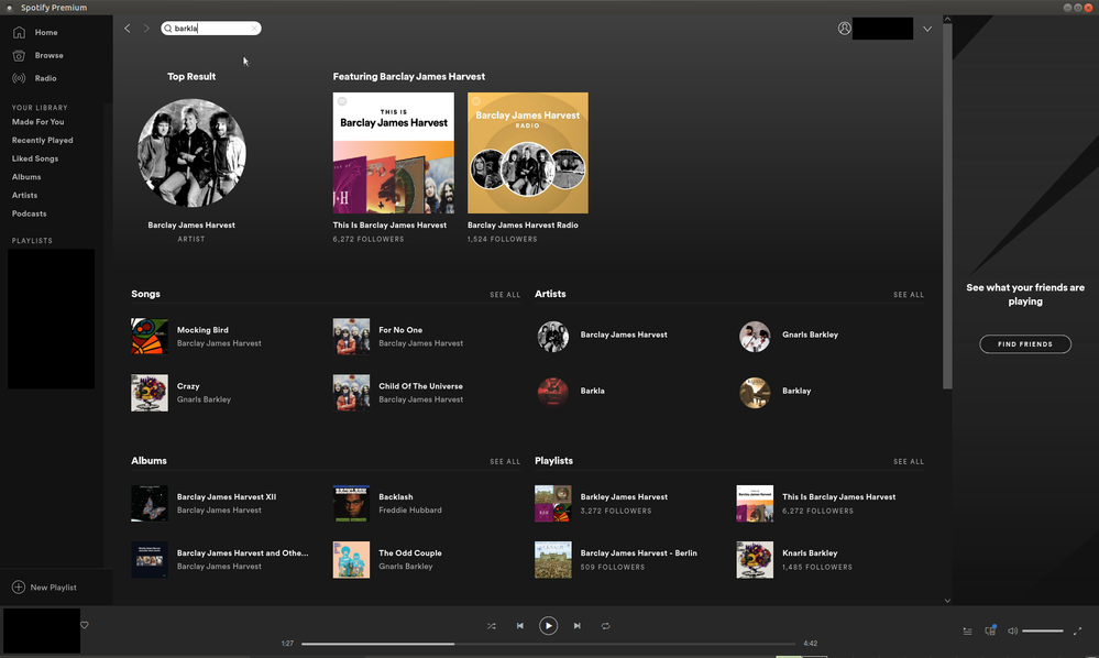
IMAGE 3 in post below
This is the previous version. It is still bad compared to the pre 2014 version i have, but certainly usable. Far less wasted space here. But the search bar was still far better when it had a google like search and had a drop down list of artists. These were all very readable, compact and you could fir far more on the list without the rest of your screen getting cluttered with an oversized grid maze....
10: What happened to the Artist's About section?
"This section was moved to the bottom of the Artist page and can now be reached by scrolling down.
There is no logical reasoning behind this at all. Imagine your TV's freeview guide having an update and you then see the Program names and times, but have to scroll right down to the bottom to see the information about the programs when you wanted to find out right away. Ridiculous. I've highlighted where it was when it was in the sensible position in one of my pictures.
13: Where is the option to show unavailable (greyed out) songs?
"Unavailable songs are now shown by default, this is why the option was removed from the setting menu."
Where is the reasoning behind removing the option to disable this though? I myself prefer to see them even if i can't play them, but it seems ridiculous to have spotify premium and see a whole load of tracks that you can't play without having an option to make them not visible. In this case you may end up going through and endless list of unplayable tracks... Very stupid decision to remove this option.
15: Can I get the old UI back?
"The old UI will stop receiving updates, fixes and support, so it's not something that's considered."
Well, my PC that I haven't used for much in the past 6 years hasn't had spotify updated since around 2014, and there are only one or two things that no longer are supported in that. Still seems rather stable overall! So I would strongly suggest sticking to or going back the the previous version.
The way they answer some of these questions doesn't really make sense. For example, they said this:
"The new UI will be gradually rolled out to everyone over the coming weeks."
Most of us now have it, and there are 3 FAQ on this page all with features that are not currently supported, and they admit that. What was the point of suggesting that going back to the old version of spotify in question 15 shouldn't be considered when you have forced us to get an unstable version with lacking features that is SIGNIFICANTLY worse?!
In all the years I've used spotify (I think at least 8 ) this is the closest I have felt to giving up with it.
This post took a lot of effort to write and capture the screenshots of the older version and the area it is much better at.
Spotify had better read it. There is virtually nobody here that is happy at the moment. They should be working on reverting us back to the old one based on the feedback at the moment...
- Mark as Read
- Mark as New
- Bookmark
- Permalink
- Report Inappropriate Content
Pictures to go with my previous post:
Image 1
Image 2
Image 3
- Mark as Read
- Mark as New
- Bookmark
- Permalink
- Report Inappropriate Content
@ThegiantHogweet,
one day you have to change and evolve. the application should not remain the same for a decade. the spotify group, did well to change the application for a modern.


