Help Wizard

Step 1

NEXT STEP

FAQs

Please see below the most popular frequently asked questions.

Loading article...

Loading faqs...

VIEW ALL

Ongoing Issues

Please see below the current ongoing issues which are under investigation.

Loading issue...

Loading ongoing issues...

VIEW ALL

[Desktop] Full Discography Reinstatement

The full chronological artist discography, with all tracks listed out, has been removed from artist pages. Please add this back, as it was the most efficient way to explore an Artist's discography. Very simple.


Spotify seems to be attempting to bury this issue by closing attempts to bring it up and referring to other versions of this question that have also been closed. This is a new issue for users that are experiencing this change for the first time.


See:

https://community.spotify.com/t5/Closed-Ideas/Desktop-Put-all-of-an-artist-s-songs-back-on-their-pag...


and:

https://community.spotify.com/t5/Closed-Ideas/All-Platforms-Browse-Provide-a-simple-Tracklist-with-a...

Updated on 2021-04-06

Hi there,


Thanks for reaching out about this.


We'll mark this Idea as "Under Consideration" as we discuss ways in the team to bring this use-case back to Desktop, and perhaps to web for the first time.


You can currently play through the entire discography (with shuffle on or off) by using the large play button on the artist page, but we appreciate that starting this from a specific track was something many of you were keen on.


You can get more info about this here. You can also take a peek at the newsroom announcement for the new desktop app.


You can also Subscribe via the 3-dot menu and keep an eye on this thread for updates.


Cheers!

Top Answer
MattSuda
Spotify Star

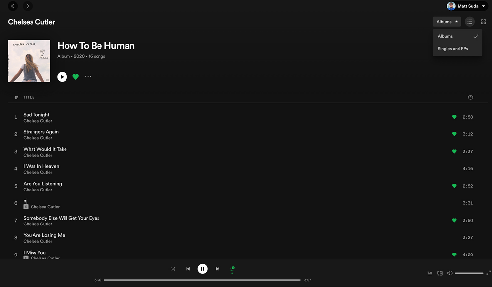
Artist page list view is back! WOOOOHOOOOOO! And it has come to the web player for the first time. I like how more advanced the web player is getting at the same time. 


However, I don't like that you have to switch between an albums and singles view. There should be a little box you can check for combined view for those that prefer it like in the old desktop app. Having more options is good in this case. So glad to have this view back. Thank you! 💚


Artist page list view is back!.png

Comments
pmactiv

While you are at it, where is the 'About' section gone? My process to find new music is simple -> look at discover or find a new track in a play list -> check out their background in About and then their track list to sample. New UI looks slick, it might work better but there's less usable content, bring them back!

yipmonster

The "workaround" of using the large green play button on the artist page doesn't replicate the old behavior.  Pressing the play button starts playing the "Popular" tracks, and THEN it plays the albums.  Of course, that's after having to go through the newly created headache of clicking on Your Library and Artists, rather than just having Artist and Album shortcuts in the left pane like before.  To start playing an artist's entire discography has gone from 4 clicks to 20 or so, depending on how many popular songs they have.  

icemuon

Whoever decided on this change must not use your product. You have eliminated what appears to be the biggest use case for most people using Spotify. I listen during my work day, and want to listen to all songs by an artist. I do not have time to be constantly monitoring what album I'm going to listen to. I click Like on songs I want to hear again -- with your change, I can't find the songs I've listened to without clicking Back endless times. Once I'm finished work, I listen to my Liked songs or my playlists -- but the next day at work I want to continue where I left off the previous work day. You have made this essentially impossible for me. I can see myself drifting away from using Spotify in the future because of this nonsense.

Ohdjony

Hi.
Several changes have taken place in the past few days and not all have been for the better. We know that it takes time to adjust details, review processes, etc. but some problems already apparent since the last update are about the 'queue' and its sequence of songs: the scroll bar on the page no longer follows the movement intended by the user.
Bringing a song / track from the bottom of the list to put it further ahead, for example, is important. But if the scroll bar on the page doesn't follow the mouse's intent and orders ... well, it's difficult.
The songs / tracks can even be moved downwards towards the end of the queue, but not upwards towards the beginning of the queue: they must move up the queue.
We also have no more varied options to view the albums, just "View all" on the sides.

My suggestion here is to give more viewing options to albums / discographies (cover art, year of publication, etc.).
Thank you for your attention.

Traiden

In the new Spotify update, the artist page is way less useful. I loved being able to scroll through every song an artist had. Now I have to individually click on each album to see their songs. A lot of artist albums are singles, which means I have to click on an album to see one song.


This suddenly made it way harder to scroll through an artist's discography.


I don't know why you had to change the interface. It was great as is. The new version is way more "busy". Too much cluttered information (with photos and things). Way higher cognitive load to scroll.


Please give me the old version. I am considering cancelling my service.

LOLHICRONO

Absolutely mind boggling that a group of people sat down, looked over their sprint plans, saw "remove list of songs in artists page" and thought it was a good idea. Developers never cease to amaze me.

91Tiger

This latest update is terrible. Please change it back. I can no longer search my playlist by artist! You only see title, how many times a song is played and the length (time) of the track. Who cares! I need to see the artist name.  The need to search by artist or song title is important on playlists. Now it is just song title combined with artist, name of album date added and time (song length) = not helpful.


I understand, say with a band like The Rolling Stones, U2 or the Beatles with their endless discography and you had to scroll though every album with tracks to make it down to 1981 or 1967. BUT ... If you keep the eye candy album cover pic you have to at least bring back song title - artist name - album - time. Surely you can do that.


This is all visual eye candy of photos of bands or albums? I need the information, I'm not watching or playing a video game I'm listening to music here! 


PLEASE change it back.


Thank you.


91Tiger

Opportunist

"We'll mark this Idea as "Under Consideration" as we discuss ways in the team to bring this use-case back to Desktop, and perhaps to web for the first time.


You can currently play through the entire discography (with shuffle on or off) by using the large play button on the artist page, but we appreciate that starting this from a specific track was something many of you were keen on."

Find a Way.

As someone who works in tech I fully understand the need and desire to unify your codebase and I am prepared to put up with a transition period while you bring back the features currently missing from the new Desktop App.

But if they don't come back I will leave. period.

I want a desktop user interface optimised for a large screen and keyboard and mouse, not a half-baked mobile interface.
I can currently fit 27 tracks on my 1440p monitor while zoomed out and full-screen.
I should get 80~100.

I can no-longer find the tracks I have liked under each artist, and many artists I have liked tracks for have vanished.
And I can't browse through an artists catalogue and find tracks I want to add to my library.

These are deal breaking changes if they don't get fixed.

IcEEyE

Totally agree with opportunist here above. It seams to be a big trend to make desktop apps look like mobile apps instead of using the power of a large screen for more content and better control.
I think one of the reason the track-list was removed is because the choose to put "Fans also like" and "About" below, that is they got rid of the tabs at the top with this information, an other very annoying mobile app trend.  I personally like the tabs at the top, categorizes content nicely and I don't have to scroll down to look for it.  If the track list was there, we would have to scroll very far.  So, bring back the tabs.
And please compact things, this is such a waste of space.

collisiont934

Please bring back the old UI or at least give an option. The new desktop UI is closer to the mobile version and I always thought that UI was horrible but worked because it was mobile. This desktop UI is horrible - it's really a terrible user experience.