The content you are looking for has been archived. View related content below.
Help Wizard
Step 1
Type in your question below and we'll check to see what answers we can find...
Loading article...
Submitting...
If you couldn't find any answers in the previous step then we need to post your question in the community and wait for someone to respond. You'll be notified when that happens.
Simply add some detail to your question and refine the title if needed, choose the relevant category, then post.
Just quickly...
Before we can post your question we need you to quickly make an account (or sign in if you already have one).
Don't worry - it's quick and painless! Just click below, and once you're logged in we'll bring you right back here and post your question. We'll remember what you've already typed in so you won't have to do it again.
What's up with this new Home screen?
What's up with this new Home screen?
- Mark as New
- Bookmark
- Subscribe
- Mute
- Subscribe to RSS Feed
- Permalink
- Report Inappropriate Content
Whats up with the new home screen being random playlist? Its really bad, can I change it back?
- Labels:
-
iOS
- Subscribe to RSS Feed
- Mark Topic as New
- Mark Topic as Read
- Float this Topic for Current User
- Bookmark
- Subscribe
- Printer Friendly Page
Hey there folks,
Thank you for your posts and feedback.
As this thread here has become too general and has grown a bit old, going forward, we'd like to close it off and refer you to post in our new Home Feed Update feedback thread.
Cheers!
- Mark as New
- Bookmark
- Subscribe
- Mute
- Subscribe to RSS Feed
- Permalink
- Report Inappropriate Content
This is absolute insanity. Is everyone working on UX at Spotify brain dead or just the higher ups forcing those people to F things up? Look at this garbage! I couldn't find any of my Daily Mixes, I spent my train commute just scrolling all kinds of **bleep** I have zero interest in instead of actually listening to anything.


I left earlier this year because of podcasts being forced into the interface, was lured back with a 3/months for the price of one offer, but at this point I'm thinking even that couldn't bring me back again. PlexAmp is just too damn good and Bandcamp will actually get money to the artists. There's no reason to continue punishing myself by giving money to this service that obviously hates us.
- Mark as New
- Bookmark
- Subscribe
- Mute
- Subscribe to RSS Feed
- Permalink
- Report Inappropriate Content
Will SOMEONE from Spotify please address us? 18 pages of complaint, all unified in HATING this UI and not one world from Spotify. Not only has this interface ruined Spotify, it's also created disharmony in my home as now my daughter hates me for cancelling and forcing her to use Tidal..! She didn't have the garbage interface inflicted on her so can't see what the problem is...
- Mark as New
- Bookmark
- Subscribe
- Mute
- Subscribe to RSS Feed
- Permalink
- Report Inappropriate Content
Sweet ****** who thought this was a good idea? Having used Spotify for years I now have NO IDEA how to find new music. New Music Friday now consists of.... nothing, I don't know where it is. My homepage is now a giant list of albums I've either listened to a million times or random **bleep** I have no interest in. Just to make things ever better, not only is then entire homepage a huge pointless list of stuff I have no interest in, but the scrolling is so jerky my brain hurts. And so far nothing on the list has changed all week. It's the exact same list of stuff I have no interest in that was there at the start of the week. I pay for a Family plan, yet the entire family has now just fallen back to using YouTube with an adblocker installed from their laptops / computers. rant-complete.
- Mark as New
- Bookmark
- Subscribe
- Mute
- Subscribe to RSS Feed
- Permalink
- Report Inappropriate Content
I just registered on this forum after 5 years of using Spotify Premium to specifically post here. Not much to add to all that's been said, just to say that I cancelled over a week ago and uninstalled the app from all devices. This new UI is just too much – it's wrong on so many levels that were already mentioned. Finally, I have no excuse to really try out Apple Music algorithm for longer and see how it learns. Good job, Spotify.
- Mark as New
- Bookmark
- Subscribe
- Mute
- Subscribe to RSS Feed
- Permalink
- Report Inappropriate Content
The new mobile home screen is virtually unusable for me. I do not care for 90% or more of the podcasts and playlists it shows. On mobile, I mostly listen to my daily mixes, release radar, and selected songs—I cannot even figure out how to access my daily mixes and release radar on mobile anymore.
If the mobile interface stays this way, I'll definitely look at moving to another music service.
- Mark as New
- Bookmark
- Subscribe
- Mute
- Subscribe to RSS Feed
- Permalink
- Report Inappropriate Content
For the first time in 5 years I'm considering switching. Spotify is suffering from an old probem, the app was done and nothing needed to change.
But a new PO came in and had to justify their job so here we are.
This new homepage is completely useless for me. I don't care AT ALL about podcasts in Spotify yet they're shoved into my face even more with this change, and now I can't find the "recently listened" list anymore, which I use all the time.
Oh well, it's not like Spotify is the only player in this game anymore.
- Mark as New
- Bookmark
- Subscribe
- Mute
- Subscribe to RSS Feed
- Permalink
- Report Inappropriate Content
Give its back the old interface! This new one with big icons is useless.
- Mark as New
- Bookmark
- Subscribe
- Mute
- Subscribe to RSS Feed
- Permalink
- Report Inappropriate Content
The worst user interface design I’ve seen in any application ever. Legitimately terrible and unusable. Please revert to the old UI. Nobody likes this change
- Mark as New
- Bookmark
- Subscribe
- Mute
- Subscribe to RSS Feed
- Permalink
- Report Inappropriate Content
Wow, the new home UI is absolutely horrible. I found this thread only to discover that Spotify has *known* and *left* the bad home UI?!? Please change it back Spotify, seriously.
- Mark as New
- Bookmark
- Subscribe
- Mute
- Subscribe to RSS Feed
- Permalink
- Report Inappropriate Content
it’s terrible. i hate it so much. i want my old app back or i will just go back to apple music. i don’t want to scroll through ransom stations.
- Mark as New
- Bookmark
- Subscribe
- Mute
- Subscribe to RSS Feed
- Permalink
- Report Inappropriate Content
Plan
Free/Premium
premium
Country
Finland
Device
iPhone 11 pro max
Operating System
iOS 15.6.1.
My Question or Issue
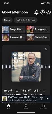
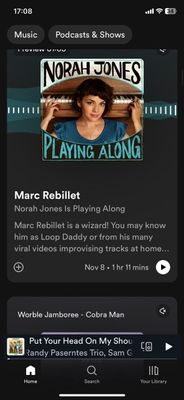
When I open my Spotify it usually shows front page so that you can scroll list’a etc horisontally and vertically and the icons are small. About a week ago it started to look like auto mode (which is not active) and the icons are huge and you can scroll it only vertically. It doesn’t show everything on the front page either. I have to log out and log in multiple times to get it in the normal view. Is there anything I can do? It is starting to be really frustraring to log off all the time.
- Mark as New
- Bookmark
- Subscribe
- Mute
- Subscribe to RSS Feed
- Permalink
- Report Inappropriate Content
Awful interface. Have tried clearing cache, reinstalling app, logging off/on multiple times - still get the same issue.
In my opinion it's a clunky, childish interface for teenage tiktok users - but guess what - my teenager daughter and sons hate the interface too! The panels are huge, do not encourage me to listen, and detract from the usability of finding favourites or previously listened playlists (which should be the main user goal you are trying to support). The recommendations in these mega-panels don't even change, so they're as much use as a chocolate teapot. I don't really want to have to scroll through all this dross. Even if you insist on serving up recommendations, there are so many better ways of doing it. Go back to your design team and have a look at, hmm, let's see, just about every alternative suggestion they came up with.
Most other Spotify users I know don't see this 'feature'. Why are you conducting some A/B testing without getting opt-in agreements? With your PAYING customers??!! Someone in your Customer Experience department needs to be told how bad their decision-making is.
Please, please sort this out - it's a truly terrible experience.
- Mark as New
- Bookmark
- Subscribe
- Mute
- Subscribe to RSS Feed
- Permalink
- Report Inappropriate Content
after this. As for complaining, no point what so ever as it's falling on
deaf ears. My advice is to try an alternative - Tidal (excellent audio but
a bit pricy and hard to move your library), Deezer (like old Spotify UI but
lacks connect features, extremely easy to move your library), YouTube
premium (added benefit of ad free YouTube, haven't tested), apple music
(never tried but probably decent on iphones). Don't bother contacting
customer services just cancel, migrate your library and move on.
- Mark as New
- Bookmark
- Subscribe
- Mute
- Subscribe to RSS Feed
- Permalink
- Report Inappropriate Content
Spotify, nobody wanted this. This is one of the worst UI decisions I’ve ever seen a company make and I want out. The fact that the majority of recent responses in this thread have been as severe as people unsubscribing, I would say that this is just a microcosm of just how unpopular this change is.
- Mark as New
- Bookmark
- Subscribe
- Mute
- Subscribe to RSS Feed
- Permalink
- Report Inappropriate Content
Just tried submitting a reply and got an error message, so hopefully this one goes through. My homepage is also in this weird beta format, just a list of single songs with LARGE icons - waste of space. Which replaced all the suggested playlists, new albums and new singles, which I loved. No one else I know has the beta either. Spotify, can you please revert my home screen back?
- Mark as New
- Bookmark
- Subscribe
- Mute
- Subscribe to RSS Feed
- Permalink
- Report Inappropriate Content
after i canceld my premium the homescreen went back to the old one. i do not subscribing again.
- Mark as New
- Bookmark
- Subscribe
- Mute
- Subscribe to RSS Feed
- Permalink
- Report Inappropriate Content
Quick note on Tidal - you have to use a 3rd party app to move your library, which will incur a small one-off charge, but it all happened pretty smoothly. Customer Service has been really responsive and genuinely 'on-it'. A real breath of fresh air after Spotify.
My Spotify UI also reverted back to the old one AFTER I cancelled my subscription, which is really f*cked up! Are they literally out to self-destruct or something?
- Mark as New
- Bookmark
- Subscribe
- Mute
- Subscribe to RSS Feed
- Permalink
- Report Inappropriate Content
This update is intolerable. To elaborate:
- The information density is horrendous
- There are only three touch targets representing two different content selections
- Both content selections are podcasts that I haven't listened to in months
- I use Spotify primarily AirPlaying to an Apple TV. Even when I've tapped to show the "now playing" screen, the podcast "preview" that should be muted ends up playing, sometimes exclusively, sometimes on top of the music I am attempting to listen to.
I would prefer some control over what my "Home" screen presents. This screen seems to be losing any connection to the meaning of the word "Home".
- Mark as New
- Bookmark
- Subscribe
- Mute
- Subscribe to RSS Feed
- Permalink
- Report Inappropriate Content
This update is the WORST update I’ve ever seen. Cannot turn previews off, takes forever to scroll through, is unsafe to listen to while driving, and took away all curated content like Daily Playlists. It was so much better to have all suggestions in one uniform place like the old home page. I absolutely hate it and it is driving me so insane that I am considering leaving spotify for taking away so many of its features that I loved. Really changed the way I listen to music and i can’t do it anymore.
- Mark as New
- Bookmark
- Subscribe
- Mute
- Subscribe to RSS Feed
- Permalink
- Report Inappropriate Content
CHANGE IT BACK SPOTIFY- ITS HORRIBLE AND IT MAKES ME WANT TO THROW MY PHONE I CANT FIND ANYTHING.
Suggested posts
Let's introduce ourselves!
Hey there you, Yeah, you! 😁 Welcome - we're glad you joined the Spotify Community! While you here, let's have a fun game and get…