- Home
- Help
- Desktop Windows
- Fix your AWFUL UI
Help Wizard
Step 1
Type in your question below and we'll check to see what answers we can find...
Loading article...
Submitting...
If you couldn't find any answers in the previous step then we need to post your question in the community and wait for someone to respond. You'll be notified when that happens.
Simply add some detail to your question and refine the title if needed, choose the relevant category, then post.
Just quickly...
Before we can post your question we need you to quickly make an account (or sign in if you already have one).
Don't worry - it's quick and painless! Just click below, and once you're logged in we'll bring you right back here and post your question. We'll remember what you've already typed in so you won't have to do it again.
FAQs
Please see below the most popular frequently asked questions.
Loading article...
Loading faqs...
Ongoing Issues
Please see below the current ongoing issues which are under investigation.
Loading issue...
Loading ongoing issues...
Help categories
Account & Payment
Using Spotify
Listen Everywhere
Fix your AWFUL UI
Fix your AWFUL UI
- Mark as New
- Bookmark
- Subscribe
- Mute
- Subscribe to RSS Feed
- Permalink
- Report Inappropriate Content
Plan
Premium
Operating System
Windows 10/11
Your UI is actually just a joke at this point.
It is clear to me that you do not care about your users feedback and insist on making changes that dont need to be made. The now playing bar is still as obstructing to my view as every, and i cant even resize spotify to its minimum size anymore. Well, i can actually, however, when i minimize spotify and reopen it IT IS SOMEHOW LARGER BECAUSE YOU'VE SET A MINIMUM BOUNDRY THATS BIGGER THAN YOUR ACUAL MINIMUM WINDOW SIZE
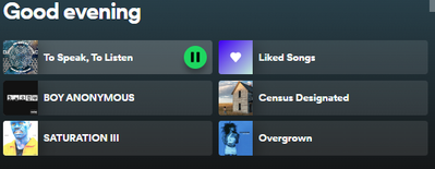
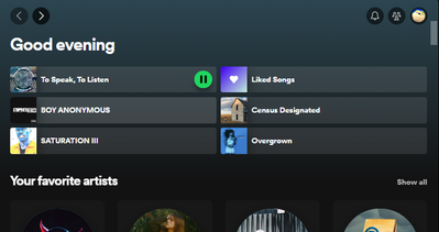
Also: the new homescreen overflow is really bothering me.
This is how small the text is in windowed mode, the playbutton thing is now just invisble instead of dissapearing when not hovering the albums, this causes the text to become smaller to make space for the button, but the next becomes SO UNNECESSARILY SMALL and it isn't even dynamic anymore (heres me streching the page more for context)
Make your ui more dynamic again and actually nice to use. Give us back the expandable album covers in the bottom left so the friend activity doesn't dissapear. Fix your boundry issues and give me a ring when youve decided you care about UX
Also, the new way of adding thing to likes/new playlist feels unnecessary - id rather have a one click like button than having to decide if i want to put a song in my liked songs or a playlist - this same sequence also makes it really annoying to remove songs from likes
Sincerely someone who actually gives a single F about spotify's UI/UX
- Subscribe to RSS Feed
- Mark Topic as New
- Mark Topic as Read
- Float this Topic for Current User
- Bookmark
- Subscribe
- Printer Friendly Page
- Mark as New
- Bookmark
- Subscribe
- Mute
- Subscribe to RSS Feed
- Permalink
- Report Inappropriate Content
just another example
- Mark as New
- Bookmark
- Subscribe
- Mute
- Subscribe to RSS Feed
- Permalink
- Report Inappropriate Content
Whenever apps or websites revamp a basic UI component that aided our workflow for years, it can initially feel as if something existential has been ripped out of our lives. The moment I noticed the "heart button" was replaced by a checkmark generating a pop-up menu, I felt enraged. More options to consider for something that should be so arbitrary - who on this planet could've asked for that?
But quickly after that, I realized Spotify has introduced a powerful tool that actually takes some burdens off navigating and managing our playlists' content. Especially if one has numerous playlists, like me.
What stays the same:
- Tap "like" will simply add a song to our "liked songs". Just like before.
After that, the button turns into a sort of playlist manager.
- We can now instantly see to which playlists the same song has been added. Something we previously had to memorize ourselves - which is near impossible.
- Deleting the same song from multiple playlists can now be done from the menu. Before, we had to open each relevant playlist (assuming we would've remembered which ones), locate the song and delete it.
But perhaps my favorite new feature addresses an issue I had for years already...
When quickly sifting through dozens of releases a day, hundreds a week, thousands a year, I can't remember all the songs I once liked enough to be added to a playlist. More than often, I wasted time scanning through, and selecting songs from an album for the second time, because there was nothing in the UI that somehow indicated I had already done so before.
Now there is! On albums and artist pages, songs that are already present in our playlists are indicated as such by the green dot - similar to how it has always been for liked songs.
- Mark as New
- Bookmark
- Subscribe
- Mute
- Subscribe to RSS Feed
- Permalink
- Report Inappropriate Content
The "now playing" display panel replaces the "friend activity" display panel whenever you click on a song. This is really annoying as you have to go into settings to bring the friend activity panel back. The issue is resolved by removing the "now playing" display panel altogether in settings but, ideally, I would have both! I would love a way to do this easily.
- Mark as New
- Bookmark
- Subscribe
- Mute
- Subscribe to RSS Feed
- Permalink
- Report Inappropriate Content
Update: Clicking the button with 3 people just left of your profile photo brings the "friend activity" display panel up. To bring "now playing" panel back you have to click the button that is a play button inside of a rectangle that shows up in the bottom right when playing a song.
A single button that toggles back/forth between the views would be preferred, IMO.


- Mark as New
- Bookmark
- Subscribe
- Mute
- Subscribe to RSS Feed
- Permalink
- Report Inappropriate Content
I seriously came in to try to clean up the worst platform in the history of playing /viewin. I don't use Spotify a lot. I am on rumble. However I needed to use it yesterday for a specific reason.
I have never in my life seen so much cluster clutter and mess on the home screen.
I couldn't navigate anything.
I thought I'd go to desktop to see if there was anything in life that I could do to limit the total **bleep** that's everywhere.
No ability to delete or clean up history.
No ability to get rid of (for you ) which takes up the entire screen.
No ability to just limit MY MY MY home- screen to just what I I I I want and pay for.
What a freaking nightmare mess.
I needed to do one small thing, and couldn't even complete a simple task of revisiting a white noise channel. All I wanted to do was revisit it so I could move over to YouTube. Which is what Verizon is offering me for practically nothing.
The ads are absolutely sickening.
So, I'm going in to download the names of everything in my playlist, and MOVING out.
I never visit because I absolutely detest their interface, and never find time to move out.
After last night, I'm doing it all at work tomorrow, and gleefully, contacting them to tell them to f off. Paying for **bleep** I don't even use, because I've been lazy. After last night, it is officially O V E R.
God it will feel good.
Suggested posts
Hey there you, Yeah, you! 😁 Welcome - we're glad you joined the Spotify Community! While you here, let's have a fun game and get…


