- Home
- Chat
- Social & Random
- Your favorite view for the New Your Library sideba...
Help Wizard
Step 1
Type in your question below and we'll check to see what answers we can find...
Loading article...
Submitting...
If you couldn't find any answers in the previous step then we need to post your question in the community and wait for someone to respond. You'll be notified when that happens.
Simply add some detail to your question and refine the title if needed, choose the relevant category, then post.
Just quickly...
Before we can post your question we need you to quickly make an account (or sign in if you already have one).
Don't worry - it's quick and painless! Just click below, and once you're logged in we'll bring you right back here and post your question. We'll remember what you've already typed in so you won't have to do it again.
FAQs
Please see below the most popular frequently asked questions.
Loading article...
Loading faqs...
Ongoing Issues
Please see below the current ongoing issues which are under investigation.
Loading issue...
Loading ongoing issues...
Help categories
Account & Payment
Using Spotify
Listen Everywhere
Your favorite view for the New Your Library sidebar on desktop: Compact, List, or Grid view?
- Subscribe to RSS Feed
- Mark Topic as New
- Mark Topic as Read
- Float this Topic for Current User
- Bookmark
- Subscribe
- Printer Friendly Page
Your favorite view for the New Your Library sidebar on desktop: Compact, List, or Grid view?
- Mark as New
- Bookmark
- Subscribe
- Mute
- Subscribe to RSS Feed
- Permalink
- Report Inappropriate Content
On the desktop app or web player, what’s your favorite view for the New Your Library sidebar (which was announced earlier this year in this thread and in this Newsroom article)? Do you like Compact, List, or Grid view the best?
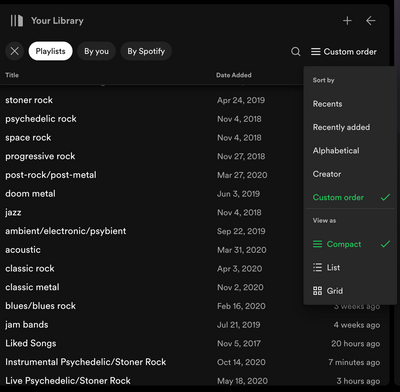
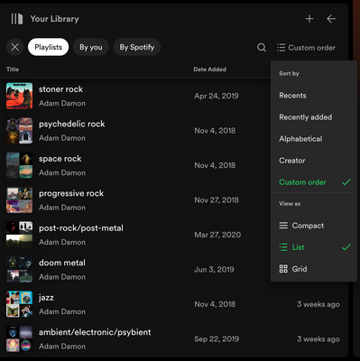
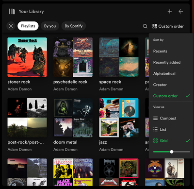
Personally, I like to switch between the three different views of the sidebar on different occasions, but I’d say that I like the List view the best—probably because unlike in Compact view, List view shows the artwork for saved playlists and albums as well as the profile pictures of artists I’m following, which I find to be useful for finding items in the sidebar from a visual standpoint. Yet at the same time, List view also keeps the items ordered in a single-file vertical “list” when the sidebar is expanded, which I find to be easier to scan through to find what I’m looking for compared to when using Grid view.
You’re probably already familiar with how the different views of the New Your Library sidebar appear, but here are a few screenshots anyway where I’m viewing some of my playlists in Custom order in the sidebar; the middle screenshot (List view) represents how I usually view the New Your Library sidebar these days:
I’m curious to hear if other Spotify users have a favorite view for the New Your Library sidebar as well, so feel free to share! Or if you like all of these New Your Library views equally and don’t care which one you’re using, feel free to share as well.
Cheers!
- Mark as New
- Bookmark
- Subscribe
- Mute
- Subscribe to RSS Feed
- Permalink
- Report Inappropriate Content
I usually have my library in "List View" so that I can see the art covers and the titles.
Sometimes I use the arrow at the top right to expand my library more and then I switch to the "Grid View".
Sometimes I will also click on the "Your Library" heading to fully collapse the library sidebar so that just the art covers are showing. This is great for when you are in discovery mode and don't want any distractions when checking out artist pages and playlists and want the main content area of the app to take up more space.
- Mark as New
- Bookmark
- Subscribe
- Mute
- Subscribe to RSS Feed
- Permalink
- Report Inappropriate Content
I usually hit Shift-Alt-1 when I want to select a playlist (or 2 or 5 or whatever). Except for the (inexplicably) permanently pinned (and empty) "Liked Songs" playlist and "your episodes" (non)podcast, I think it's the best view for finding the playlist or album from my library I'm looking for.
- Mark as New
- Bookmark
- Subscribe
- Mute
- Subscribe to RSS Feed
- Permalink
- Report Inappropriate Content
Thanks for sharing, @MattSuda and @Inudesu!
@MattSuda I think it’s cool that you also like to use the List view most often on the library sidebar. I’ll fully collapse the sidebar sometimes as well, such as when I’m browsing search results or viewing/editing a playlist. Also, it’s a great guide that you wrote about the sidebar—really comprehensive with lots of helpful tips.
@Inudesu I appreciate you sharing this useful keyboard shortcut; I didn’t know about it before, but I’ve been trying it out the past few days (Shift-Option-1 on a Mac), and I like how it uses more of the space on the app interface to show the contents of my library. I agree, this view makes it easy to find the playlists that I’m looking for there (or albums, too, although I don’t have many saved albums personally).
Cheers!
- Mark as New
- Bookmark
- Subscribe
- Mute
- Subscribe to RSS Feed
- Permalink
- Report Inappropriate Content
personally i like the "list view"
- Mark as New
- Bookmark
- Subscribe
- Mute
- Subscribe to RSS Feed
- Permalink
- Report Inappropriate Content
@mattsuda
Can you confirm that this shortcut has been removed (like on purpose???)?
Be a shame if so.
- Mark as New
- Bookmark
- Subscribe
- Mute
- Subscribe to RSS Feed
- Permalink
- Report Inappropriate Content
Yes, in a recent desktop app update, the keyboard shortcuts to view the old Your Library view in the main content area were discontinued. The keyboard shortcuts now will filter the content show in the Your Library sidebar on the left.
The new Your Library sidebar on the left can be expanded in size if you would like to view bigger art covers similar to the old view. When the new Your Library sidebar was announced earlier this year, it was also said that the current keyboard shortcuts workaround to view the old Your Library would at some point be discontinued. The workaround has now been discontinued.
While I do enjoy the new Your Library sidebar, I did sometimes like to view the old view of my library in the main content area. Hopefully the developers of the desktop app will allow us to view Your Library in the main content area again in the future.
- Mark as New
- Bookmark
- Subscribe
- Mute
- Subscribe to RSS Feed
- Permalink
- Report Inappropriate Content
Thanks for the confirmation.
What a terrible decision to double down on such a bad design! The old library view had flaws (like the pinned and giant "Favorites") but it was way better than even the expanded view of the sidebar. It's a shame they took this option away. Now the library is much worse in both the mobile and the desktop apps. On mobile I was able to turn off updates in time to avoid the degradation (for now). But there wasn't enough warning here to turn off automatic updates.
"We recommend that you always use the latest version so you get all the latest features" rings so hollow when every update is a downgrade in quality.
- Mark as New
- Bookmark
- Subscribe
- Mute
- Subscribe to RSS Feed
- Permalink
- Report Inappropriate Content
I use it ONLY in this View.
- Tiny screen, low resolution, so I need to save all the space. You can not have the view extended, too much information and you as well can not use any 3rd column, steals too much space, especially together full view.
- It has too much options, like look at this drop down menu posted before, too much selections. Too cluttered. They could stick with one option only, like view I use for example. At least it does not steal space and looks bearable.
I don't like this view, but it gets used in the option I use it.
Tried all text, but it makes app colorless and too light, almost like a disaster for ears.
Now playing sidebar totally unneeded.
- Mark as New
- Bookmark
- Subscribe
- Mute
- Subscribe to RSS Feed
- Permalink
- Report Inappropriate Content
I really miss that shortcut to the old library (well, what I miss is the old library view). I just don't understand this approach. It's less of a headache to me on the desktop app than the mobile app (where it's truly awful) but is this what UX people think we want? Is this really the preference? Like with data showing it's better somehow? I guess it's possible, but I can't see any positives. What is better?
- Mark as New
- Bookmark
- Subscribe
- Mute
- Subscribe to RSS Feed
- Permalink
- Report Inappropriate Content
List!
Suggested posts
Hey there you, Yeah, you! 😁 Welcome - we're glad you joined the Spotify Community! While you here, let's have a fun game and get…


