- Home
- Help
- Desktop Windows
- Desktop App Feedback thread
Help Wizard
Step 1
Type in your question below and we'll check to see what answers we can find...
Loading article...
Submitting...
If you couldn't find any answers in the previous step then we need to post your question in the community and wait for someone to respond. You'll be notified when that happens.
Simply add some detail to your question and refine the title if needed, choose the relevant category, then post.
Just quickly...
Before we can post your question we need you to quickly make an account (or sign in if you already have one).
Don't worry - it's quick and painless! Just click below, and once you're logged in we'll bring you right back here and post your question. We'll remember what you've already typed in so you won't have to do it again.
FAQs
Please see below the most popular frequently asked questions.
Loading article...
Loading faqs...
Ongoing Issues
Please see below the current ongoing issues which are under investigation.
Loading issue...
Loading ongoing issues...
Help categories
Account & Payment
Using Spotify
Listen Everywhere
Desktop App Feedback thread
Desktop App Feedback thread
- Mark as New
- Bookmark
- Subscribe
- Mute
- Subscribe to RSS Feed
- Permalink
- Report Inappropriate Content
Since the comments from the "official" feedback thread are no longer shows up in the "latest comments" section, i'm starting this thread so people can share their feedback and spotify team can ignore it once again.
- Labels:
-
ignored feedback
- Subscribe to RSS Feed
- Mark Topic as New
- Mark Topic as Read
- Float this Topic for Current User
- Bookmark
- Subscribe
- Printer Friendly Page
- Mark as New
- Bookmark
- Subscribe
- Mute
- Subscribe to RSS Feed
- Permalink
- Report Inappropriate Content
Nice one. Thanks, going to repost some previous posts in the hope they get some visibility:
Plan
Premium
Country
UK
Device
Desktop Computer Intel i9, 32GB Ram, 1080ti GPU
Operating System
Windows 10
Spotify Version
@latest
My Question or Issue(s)
1: Text and icons are not smooth:
Previous UI for comparison:
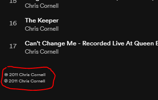
2: Double copyright notices on bottom of albums:
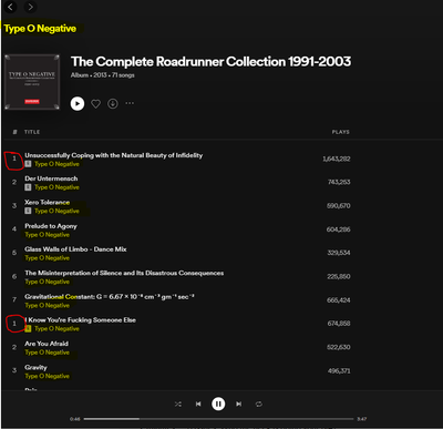
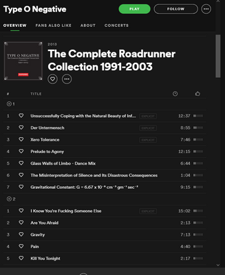
3: Album view is cluttered with repeated information and "Discs" don't show up anymore:
Why are you showing the artist name in the album for the artist over and over and over. It's a waste of space.
Previous UI for comparison:
4: Removed minimum dimension restrictions results in broken UI. You've removed min-width and that's not very clever:
Old UI for comparison (had restrictions)
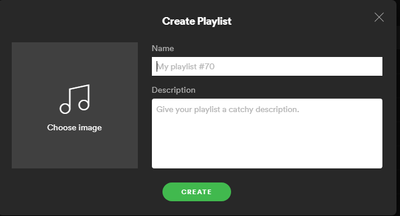
5: Create playlist flow is broken. Creating a new playlist adds it offscreen and not focused. You have to find it then edit it to specify a name. I don't have screenshot of that as there is nothing to capture. But just so you remember what it should be like, here is the old UI:
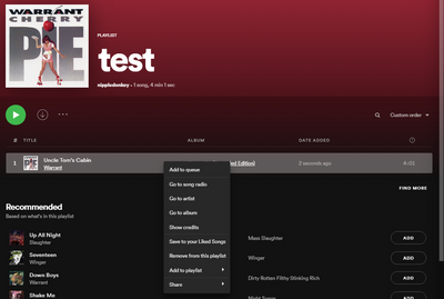
6: Can't delete the final song from a playlist. Selecting remove from playlist results in refresh and song still there.
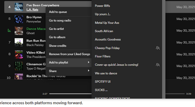
7: When trying to add song to a playlist the scrolling does not go all the way to the bottom and playlists are cut off or not accessible. I've noticed it happens when right clicking on the 4th song of albums when scrolled to the top.
8: Artist info is in the worst location possible and to make things worse the mouse pointer does not change to indicate it is clickable. Why don't you want people learning more about an artist? Do you have to pay them more?
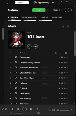
9: Play button not circular. Not sure if this is by design, but the simple fact the other icons are suggests it should be:
10: Blank playlist name, even though you can't add a blank playlist
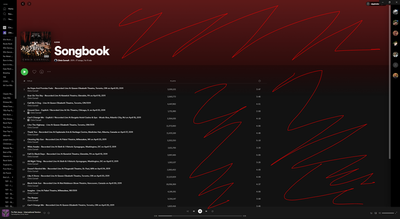
11. This is not a bug but a simple question WHY SO MUCH BLANK SPACE
These are just a small bucnh of bugs I've found. This does not include the horrible UX design choices they've made. Those can be found in the THOUSANDS of complaints over here:
https://community.spotify.com/t5/Community-Blog/The-New-Desktop-App/bc-p/5219813#M20747
- Mark as New
- Bookmark
- Subscribe
- Mute
- Subscribe to RSS Feed
- Permalink
- Report Inappropriate Content
I will refuse to use it, so installed a previous Spotify version 1.1.58.820.g2ae50076
Next, prevent Spotfire from updating by removing all permissions from its Update folder.
See here for a detailed explanation on how to do this.
https://www.youtube.com/watch?v=84TT-deLQtU
- Mark as New
- Bookmark
- Subscribe
- Mute
- Subscribe to RSS Feed
- Permalink
- Report Inappropriate Content
The fact that users are willing to jump through multi-stage hoops to get AWAY from the updated version of Spotify says a lot. Unfortunately I'm sure Spotify either won't hear, or doesn't care.
- Mark as New
- Bookmark
- Subscribe
- Mute
- Subscribe to RSS Feed
- Permalink
- Report Inappropriate Content
To whomever at Spotify monitors this thread (and the main thread for Desktop feedback),
What many of us really want are updates that let us know which items in the laundry list are being addressed, which are being researched, and which have firmly been determined to no longer be possible. There's been such little feedback in return after asking the customers/clients/users to provide the fieldwork, beta testing, and basic QA.
The notes at the top of the thread haven't been updated since April 16th. That's 54 days as of this post. Please, it's not discourteous or disrespectful of those people working on this project for those who are also working on the project, just from the client end.
We want to know which items are being addressed and what items will be in those rollouts. It feels like we're blundering along in the dark. No one wants that. Please, some kind of official updates would be appropriate and welcome.
lblackwelluk
- Mark as New
- Bookmark
- Subscribe
- Mute
- Subscribe to RSS Feed
- Permalink
- Report Inappropriate Content
surprised they havent shut this down like every other thread criticizing the horrible ui. maybe instead of ignoring and censoring users the spotify pr team should listen and pass along the legitimate complaints listed here.
- Mark as New
- Bookmark
- Subscribe
- Mute
- Subscribe to RSS Feed
- Permalink
- Report Inappropriate Content
Every time I receive a new desktop update, the first BUG I check to see if it's been fixed is: copy-paste local tracks doesn't work. So far, it's still a BUG.
- Mark as New
- Bookmark
- Subscribe
- Mute
- Subscribe to RSS Feed
- Permalink
- Report Inappropriate Content
- Mark as New
- Bookmark
- Subscribe
- Mute
- Subscribe to RSS Feed
- Permalink
- Report Inappropriate Content
Reposting because I do not doubt that a Green will be in here to close the thread. Might be the only time Green eyes are forced to read feedback.
- - -
- Vertical text padding in the left-panel main menu is excessive.
- Horizontal text padding in the left-panel main menu is excessive.
- Vertical element padding in the left-panel main menu is excessive.
- Horizontal element padding in the left-panel main menu is excessive.
- Icon use in the left-panel main menu is excessive.
- Element separator bar padding in the left-panel main menu is excessive.
- Element separator bars are used inconsistently in the left-panel main menu.
- Elements in the left-panel main menu cannot be added, removed, or re-ordered.
- Vertical text padding in the upper-panel browsing menu is excessive.
- Horizontal text padding in the upper-panel browsing menu is excessive.
- Vertical element padding in the upper-panel browsing menu is excessive.
- Horizontal element padding in the upper-panel browsing menu is excessive.
- Icon element scaling in the upper-panel browsing menu is excessive.
- The Artist-Name panel shown when browsing an artist’s page is gratuitously excessive.
- The Artist-Name panel shown when browsing an artist’s page does not scale with render-window size.
- Vertical element padding when browsing an artist’s page is gratuitously excessive.
- “Play,” “Follow,” and More Options buttons shown when browsing an artist’s page are excessively oversized.
- Vertical element padding between popular songs shown when browsing an artist’s page is excessive.
- Vertical element padding between artist-page sub-panels (Popular, Discography, Featuring) is gratuitously excessive.
- Category label fonts between artist-page sub-panels is excessively oversized.
- Vertical padding between albums shown on an artist’s page is gratuitously excessive.
- Horizontal padding between albums shown on an artist’s page is excessive.
- Album-art scaling on artists’ pages is exceedingly oversized.
- “Featuring,” “Fans Also Like,” and similar sub-panels are subject to the same criticisms given by 18, 19, 20, 21, 22, and 23.
- Albums shown on an artist’s page cannot be sorted into alternative orders such as release-date or play-count.
- Horizontal real-estate is utterly neglected on artists’ pages, necessitating gratuitous scrolling.
- The Album-Name panels shown when browsing an album are subject to the same criticisms given by 14, 15, 16, 17, and 24.
- There exists no option to pin or un-pin playlists or other items from the left-panel main menu.
- The play-control panel on the bottom of the app is excessively oversized.
- Horizontal element padding on the play-control panel on the bottom of the app is excessive.
- The abundant overuse of shortcut icons such as the, “Like Song,” “Home,” “Search,” and, “Your Library,” buttons is pervasive and conveys a homogeneity normally endemic only to social-media apps.
- Playlists element scaling is gratuitously excessive and inconsistent between elements.
- Options to change the sort-order while browsing artists are absent.
- There exists no reason to remove the dislike button.
- There exists no option to set, “See All [Albums],” as a default viewing state.
- There still exists no option for a reduced-graphic, “compact,” or, “simple,” theme.
- There exists no option to collapse the left-panel main menu.
- There still exists no option to shuffle all contents of a library or discography.
- There exists no reason to hide artist popularity metrics.
- There exists no option to hide the Spotify logo even though its persistent display is a redundant waste of screen real-estate.
- There exists no reason to remove sorting functions from playlists.
- There exists no means to customize the positions, width, and presence/absence of informational columns shown in playlists.
- There exists no reason to obfuscate the delete function behind a context menu.
- There exists no reason to fix the scale of the Friend Activity panel.
- There exists no reason for the search bar to hide by default.
- There exists no reason for the main-menu search function to change the primary browsing page in order to perform a search.
- There still exists no app-native function to synchronously listen with friends.
- The app-integrated functions intended to allow listening with friends rarely work for more than three tracks before desynchronizing.
- There exists no excuse for a music-player to take ten minutes to load.
- There exists no excuse for a music-player to require over 400mb of memory to run.
- There exists no excuse for a music-player to require five processes.
- There exists no excuse for a music-player to require ninety-seven process threads.
Honestly, I just want to use Foobar to access my Spotify library. Or MusicBee. Or WinAmp. I'd take Windows Media Player circa Windows XP at this point.
I really despise the direction your design team is taking. I think that it looks like another cheap, generic, attention-grabbing social media app that is unsure whether it's for desktops, tablets, or phones. I see these changes as a compromise between the design maxims of these platforms made at the expense of an enormous loss of functionality and an enormous waste of screen real-estate.
Please go back to the 2014 design or, in the alternative, redirect your design team towards opening Spotify to UI modding and plugins.
- Mark as New
- Bookmark
- Subscribe
- Mute
- Subscribe to RSS Feed
- Permalink
- Report Inappropriate Content
Bump.
- Mark as New
- Bookmark
- Subscribe
- Mute
- Subscribe to RSS Feed
- Permalink
- Report Inappropriate Content
Bump again, cuz nothing changed since this thread was created.
Suggested posts
Hey there you, Yeah, you! 😁 Welcome - we're glad you joined the Spotify Community! While you here, let's have a fun game and get…


