- Home
- Help
- Desktop Windows
- Spotify for Windows client getting worse with ever...
Help Wizard
Step 1
Type in your question below and we'll check to see what answers we can find...
Loading article...
Submitting...
If you couldn't find any answers in the previous step then we need to post your question in the community and wait for someone to respond. You'll be notified when that happens.
Simply add some detail to your question and refine the title if needed, choose the relevant category, then post.
Just quickly...
Before we can post your question we need you to quickly make an account (or sign in if you already have one).
Don't worry - it's quick and painless! Just click below, and once you're logged in we'll bring you right back here and post your question. We'll remember what you've already typed in so you won't have to do it again.
FAQs
Please see below the most popular frequently asked questions.
Loading article...
Loading faqs...
Ongoing Issues
Please see below the current ongoing issues which are under investigation.
Loading issue...
Loading ongoing issues...
Help categories
Account & Payment
Using Spotify
Listen Everywhere
Spotify for Windows client getting worse with every update
Spotify for Windows client getting worse with every update
- Mark as New
- Bookmark
- Subscribe
- Mute
- Subscribe to RSS Feed
- Permalink
- Report Inappropriate Content
Plan
Premium
Country
Czech Republic
Device
PC
Operating System
Windows 10
My Question or Issue
Hello,
I would just like to congratulate Spotify Windows Desktop client team for probably the most rapid barrage of regressions I've seen in years. It's getting worse at a lot faster rate than for example Skype Windows Client, which is a remarkable achievement.
First, the title bar of Spotify client window got extremely ugly, with the window control buttons looking like a incorrectly rendered GUI layer which has nothing to do with the rest of window header.
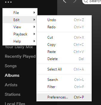
Then the menu bar got hidden under 3 dots, making all the actions one more click away, and also displaying it in a bright windows context menu theme not matching the dark UI:
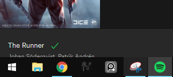
Now, with a new amazing update, every second attempt to maximize the spotify window will maximize the window incorrectly, leaving a gap at the top and a part of the UI cut by the windows taskbar at the bottom:
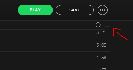
And on top of that, with the very recent update, the columns title bar now weirdly and in a quite laggy manner slides over the top of playlist, while popping a little to the left and becoming unaligned:
Thanks to your continuous and successful efforts of making Spotify for Windows client exponentially less usable and worse looking, if you keep up at this trajectory, I will have to considering for the first time in 3 years of using Spotify Premium to look for another music streaming service. You are doing a remarkable job at making Spotify for Windows the worst it can be with every new version.
Thank you!
- Subscribe to RSS Feed
- Mark Topic as New
- Mark Topic as Read
- Float this Topic for Current User
- Bookmark
- Subscribe
- Printer Friendly Page
- Mark as New
- Bookmark
- Subscribe
- Mute
- Subscribe to RSS Feed
- Permalink
- Report Inappropriate Content
Hey @Rawalanche, welcome to the Community.
Hope you are doing great!
Thanks for writing this!
I will make sure to pass your feedback to the right folks at Spotify!
If you would like to, you can support this idea for a new UI of Spotify 🙂
Have a great week!
- Mark as New
- Bookmark
- Subscribe
- Mute
- Subscribe to RSS Feed
- Permalink
- Report Inappropriate Content
Also Fidelify (with ASIO4ALL = bit perfect) stoped working week ago. Sound quality of "naked" Spotify is now far less than with Fidelify, even via Fidelizer 7.6, 8.1 and 8.2
Time for Qobuz?
- Mark as New
- Bookmark
- Subscribe
- Mute
- Subscribe to RSS Feed
- Permalink
- Report Inappropriate Content
The Spotify and Gmail developers seem to be in a frantic race to strip the most basic usability features from their UIs. The Gmail team is currently a little ahead, so I'm expecting Spotify to come up with a really big takeaway in their next release.
- Mark as New
- Bookmark
- Subscribe
- Mute
- Subscribe to RSS Feed
- Permalink
- Report Inappropriate Content
Now, with a new amazing update, every second attempt to maximize the spotify window will maximize the window incorrectly, leaving a gap at the top and a part of the UI cut by the windows taskbar at the bottom
I have this problem too:
- When moving the Spotify window, even to a different monitor, and dragging it to the top of the screen (thus maximizing it), it will maximize, but with a 16px offset downward (so the bottom 16px of the window are also missing, hidden behind the taskbar. This happens once in every *two* maximizing attempts; it doesn't matter if the window gets resized in between attempts.
- When I first open Spotify, it spawns on my second monitor by default. However, the taskbar icon is on the taskbar of my first (main) monitor. I have to move the Spotify window to my first monitor, then back to the second, and then re-maximize it because the first time it maximizes 16px downward of where it should be.
This is really annoying, and to be honest, kinda noobish.
The out-of-tone coloring of the space above the scrollbar (pic below) makes the entire UI look sketchy, same goes for the window control buttons.
- Mark as New
- Bookmark
- Subscribe
- Mute
- Subscribe to RSS Feed
- Permalink
- Report Inappropriate Content
The caption buttons issue has been bothering me for a long time already. I use Windows 11, and Spotify renders these buttons with incorrect colours. Caption buttons have a transparent background, but the colour is the same as the system provides for a chosen theme (Light/Dark).
Developers can fix it almost effortlessly. Not so long ago, Microsoft released WinUI 3 as a part of their Windows App SDK. It provides tools to create native UI for Windows systems, but the most interesting thing there is title bar customization. It allows setting colours for caption buttons and their background directly. It is possible to use Windows App SDK together with Win32 API, or even embed this logic into existing Qt code. Please, check the links below for more information.
- Title bar customization: https://learn.microsoft.com/en-us/windows/apps/develop/title-bar.
- Code examples (C++/WinRT and C#) on how to customize the title bar and caption buttons at runtime: https://github.com/microsoft/WindowsAppSDK/issues/1626.
- How to deal with AppWindow class: https://learn.microsoft.com/en-us/windows/apps/windows-app-sdk/windowing/windowing-overview.
Note that it works only for Windows 11. For Windows 10, however, you need to implement a custom title bar.
Suggested posts
Hey there you, Yeah, you! 😁 Welcome - we're glad you joined the Spotify Community! While you here, let's have a fun game and get…


