Help Wizard

Step 1

NEXT STEP

What's up with this new desktop UI?

Solved!

What's up with this new desktop UI?

Device

PC

Operating System

Windows 10


I don't know where else to post this, but the new desktop UI is terrible. I'm running version 1.2.7.1277.g2b3ce637 and have tried the methods to revert the UI I've found elsewhere in the community (like changing prefs file, which I had to dig for), but none have worked.


The UI is just the complete opposite of what I'd want on desktop- very noncompact, difficult for no reason, and generally looks to be modeled more for phones than for a desktop.


If anyone knows a way to revert the update, please let me know.

Reply
312 Replies

Hello, since the latest update to the desktop app of Spotify, you can no longer adjust the position of folders or playlists within your library unless they are pinned. However, you cannot pin items within other folders. This has left my major folders unorganised and messy with content that I no longer listen to near the top. You can drag an item from the same folder into the folder again, and this places it straight at the top, but this is an incredibly time consuming method to reorganise a folder with more than a few items in it. Having said that I do appreciate the simplifying of the library in the new update, and how it is now combined into a single panel. Thanks for your help.

The recent update from the way the library section on the left of the screen has been for a long time, to something for similar to what has been on my phone (ios), has been pretty disappointing. I think the way that it was before (~two weeks ago, early March 2023) was pretty much perfect, and a nice escape from the annoying UI on my phone.


Reasons for disappointment:

- On the left side of the screen, playlists now take up more vertical space, so fewer playlists are visible at a time. As a result I've minimized the album cover art to see more, which is unfortunate because I like seeing the art.

- I find the playlists/albums/podcasts tab system to be clunky. I have a lot of albums liked, and my library will often be flooded by those which can be pretty annoying.

- Removing the large liked songs button is annoying to me as I use that pretty regularly (or used to at least 😔)

- Before this update, being able to click the library icon and see every playlist in a grid view was great. I would use this to scroll through all of my playlists when I wanted to go through playlists without being limited to the small left sidebar, or use the extra space to do some organization


I've been a big Spotify fan for a long time, and this is the first time I have seriously considered moving to Apple Music.

The new version of the desktop app where the sidebar appears like the mobile app is awful.


Over the years I've created probably 60+ playlists, which I have sorted into playlist folders. In the old version of the desktop app, I could click the triangle next to the folder and have all of my playlists visible by folder, whereas in the new version I can only view one folder at a time - This makes it so much more difficult to navigate my folders.


Also, showing all of playlists, podcasts, albums, and artists by default looks incredibly clunky - please allow us to set the library tabs default view.


Plan

Premium

Country
France


Device

PC

Operating System

Windows 10

Spotify Version

1.2.8.923.g4f94bf0d


My Question or Issue

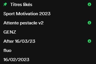
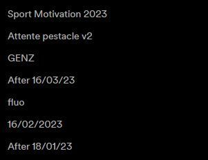
Hello, since last update, I really struggle to read name of playlist in my library.

I have astigmatism and I wear glasses for this.

The text is just too bright on the dark for me and "leak" on lcd screen , please help.

I temporarily use the web version, but please help, i want to continue use the desktop app.


New (up) vs old (down)

Capture_current.JPGCapture_old.JPG


Best regards,

Alexandre


My "expand" the album artwork does not react as expected. Clicking here loads the right "Now Playing" side-bar rather than expanding the albumart. I've shrunk the albumart to the shown size, and now there's no way to get it back in the floating view.

2023-03-31-2.png

Hey @pizzicatoiv


It looks like you are seeing a change that Spotify is testing.


This new "Now Playing View" sidebar replaces the floating album art cover in the bottom left corner. Instead, a Now Playing View will show in a sidebar to the right. You can drag this sidebar to make it bigger or smaller so you can customize the amount of space it takes up. 


The new Now Playing View will also auto open when you start playback. If you go to the Spotify desktop app Settings, there should be a setting to turn this behavior off somewhere under "Display". If you don't see the option under "Display", it might be somewhere else in the settings.

MattSudaSpotify Star
Help others find this answer and click "Accept as Solution".
If you appreciate my answer, maybe give me a Like.
Note: I'm not a Spotify employee.

Mine updated automatically, and this UI is absolutely awful. Every time I open spotify on my laptop I now have to spend a minute confused by the layout and trying to find what I need. The old UI was fine, and at least somewhat intuitive. This is just bad. 

Just adding to the conversation,

Restricting Your Library to the side panel makes for a cluttered UI. I have maybe 500 or so albums saved in my library, and scrolling through them in a side panel is infuriating. This is only exacerbated on a small laptop screen; left side panel, main panel, and a friends panel - very poor/anti-minimalist design.

Screenshot 2023-04-02 210238.png

#bringbackoldspotifypcuserinterface

For real, this might be a different update but I still agree, just because that layout worked else where doesn't mean it'll work here. I had a specific way my music was organized on desktop and the new updated layout just looks like a bunch of bloat ware on my screen. It's terrible.


This new sorting through playlists, albums and artists in the same layout is terrible and the previous one where I could move it all around to where I wanted it sorted should be brought back. aka, not copy the album into a folder, move the album into the folder, or better yet, don't show the album/artist in the same slots as playlists unless I actually listened to the album as a playlist or the artists radio/discography. 

image.png
image.png

Playing around with the new layout update and found that double clicking a playlist automatically brings up an artist information side bar on the righthand side of the desktop app of the song that plays (said sidebar is also the new 'expand' feature when you click the ^ on the album art in the bottom left corner). It's ok as the optional expand but is a nuisance to have to close every time I go to play a playlist and would love a away to opt out of this sidebar opening automatically. 

already tired of complaining the UI design, but at least pls reconsider Playlist design. Previously, it allows user expand playlist folder and you still see the playlists inside a folder together with other playlists from different layer. Now I have to go back and forth between outside and inside playlist folder, it's a navigation disaster....


-----

Update: found change to Compact library in Settings can solve this issue.

I will echo most of what people are saying here. It seems like this version of the app is trying to be more like a mobile app, large buttons and icons, rounded corners, which is fine for smaller screens like a phone. But on a desktop, the UI seems very cluttered and disorganized, too many icons and columns shifting around, I like seeing the album art on songs, but the 4 album art tiles per playlists AND the playlist author name for every single one is extremely distracting, even when collapsed. The now playing view is also very distracting, way too much information on the screen. After turning it off I cant seem to get the album art to display on the left like in previous versions, clicking the arrow just brings up the "now playing" column again.


Even with the library in "compact view", it still seems cluttered. I have two screenshots, one has the default visual settings, and the other is what I ended up with after changing to "compact view. It's still not quite as good as it used to be...


The previous version was much better optimized for mouse and keyboard users, more easily scalable and compactable, and more organized.

Image20230403120118.png
Image20230403120114.png

The new app is awful why is a phone app on my computer. Let me out please god I hate it so much. why is it so hard to search my albums or look at my library on anything but the tiny awful sidebar. Revert this please or tell me how to get out of it. my friends do not have it. I want to unsub because of it

My spotify just 'upgraded' on my Mac desktop and it's awful. Please allow us to use the previous versions, or allow us to change the look of the thing in settings. If this is not an option and you keep trying to force a tiktok feel into a completely different program/process/thing I will be finding another listening platform.

I strongly dislike this UI change... What possible sensible reason could there be to only have my library - arguably the most important part of the interface - with thousands of albums available in the sidebar only? This change makes scrolling through and finding something to listen to a pain. At least provide the option to make it fullscreen. Or better yet: make it possible to reorder/arrange UI components with a snapping system so users can customize positioning of the elements as they see fit. Shoving those changes down paying users throats just makes them less likely to continue using Spotify in the future... 

hi,

I agree with the original poster about the new update, the desktop app is now horribly disorganised - I particularly hate the change to the left-hand panel! I have a lot of playlists and relied on the folders system to organise them, but the neat list of playlists and folders in the left panel is now cluttered with other albums, podcast episodes, recently played playlists outside of their folders, etc. It is very similar to the way the library is layed out in the mobile app, which I also find next to useless since it was brought in a while ago. Please bring back the folders list! I don't need to see my whole library and listening history in the sidebar, there were perfectly good separate pages for that before! I would really love to just be able to organise and view my playlists neatly in the side panel as before. Please consider reverting this change, thanks!


p.s. on the subject of folders, it would also be great to be able to create and edit them on the mobile ap instead of just desktop!

I agree. I really like how the left bar on the previous version showed a very compact list of all of my playlists, and I had arranged them in a specific order for different categories. Now all of that is gone, and I get this clunky huge list without any custom ways to arrange them, with information on playlists that I don't need (I don't need to know that it's a playlist, or who the author of the playlist is, or a picture of the cover. I just want the title. If I want the other information I will open the playlist.) It's so disappointing because I was very satisfied with the previous functionality and ease of looking through my library in a controlled way, and now that's all gone. I can see that it is supposed to look like mobile or be more similar to the way mobile functions and lays out information, but my favorite part of desktop was that I could OVERCOME the limited functionality of mobile. 

I've tried to drag my playlist out of a folder and back into my library, and it seems as if it will be added back into my library, but all of the playlists in my library are gray and it pops back into the folder. And when I try to delete the folder, the only option is to delete the playlists. please help! the folders make choosing a playlist too confusing for me. I was trying to test it out and see what the folders were, but I did not know it was irreversible.

This new update makes navigating the left panel (that was for playlist only) so confusing. Can you please have the option to revert back? It used to be a lot more compact and easier to find playlists/folders.

Suggested posts