Evolution of the Spotify Apps
Can you believe it? It's been 10 years since the Spotify Community was launched on February 8, 2012. Time flies when we're having fun in the Community! 🎂 🔟 💚
You can read how the Spotify Community has changed over the last 10 years by going here.
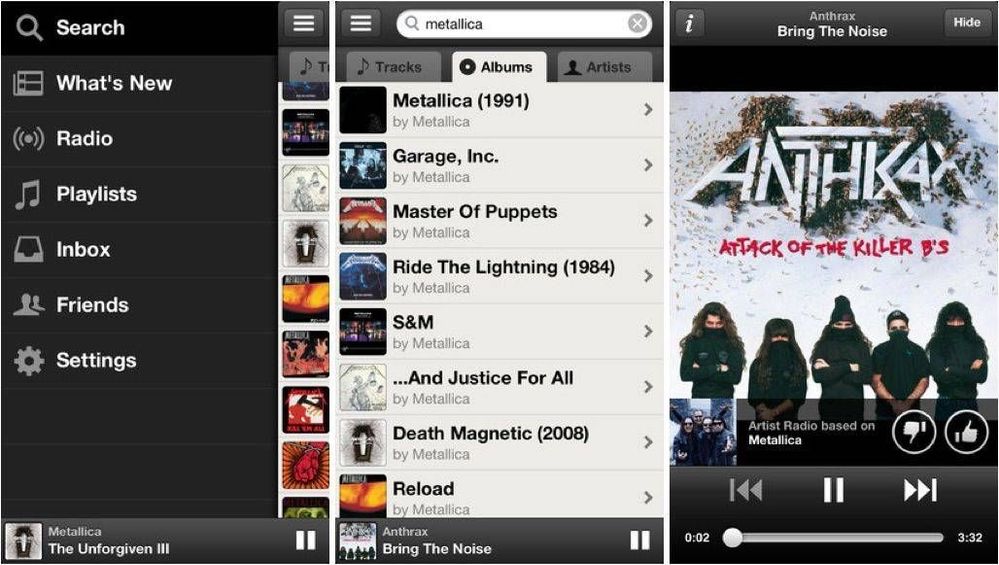
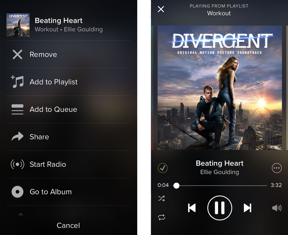
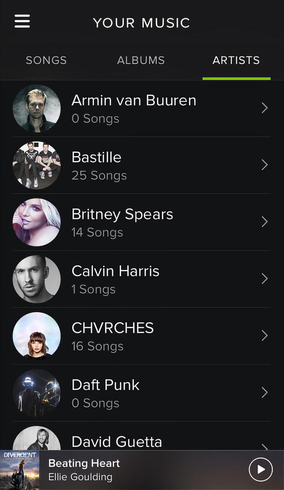
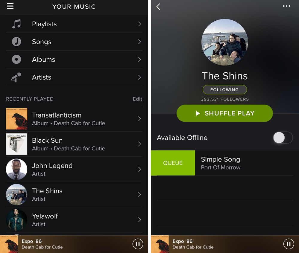
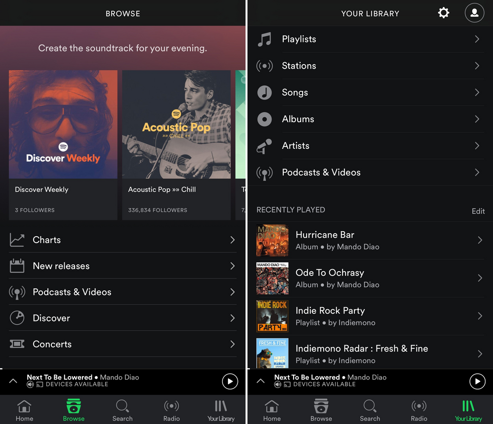
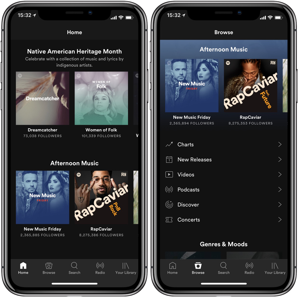
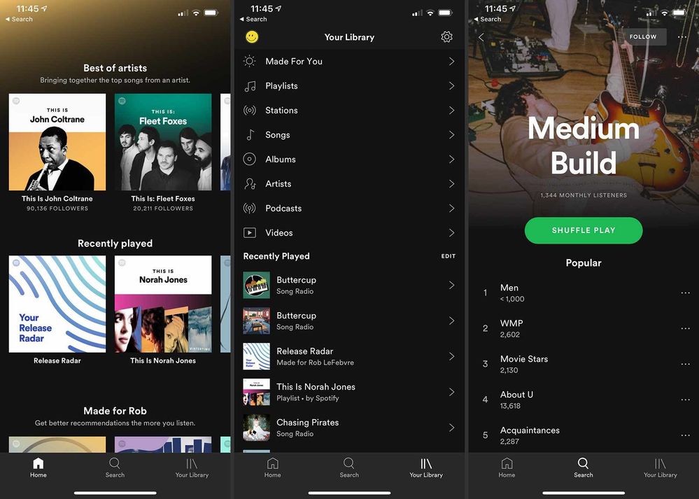
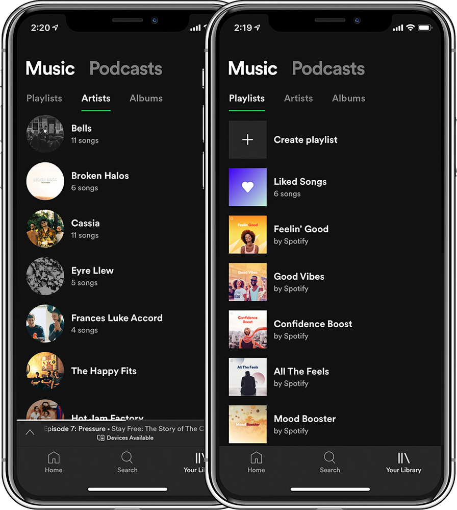
In this post we are going to take the time machine back in time to look back at how the Spotify apps have evolved over the past 10 years. We'll start from 2012 until now in 2022, and along the way we'll go over all of the major changes.
There is a bonus section in the comments section below that goes over all the major features added since 2012. Make sure to check that out as well.
Desktop App:
2012:

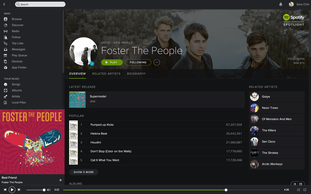
2014:
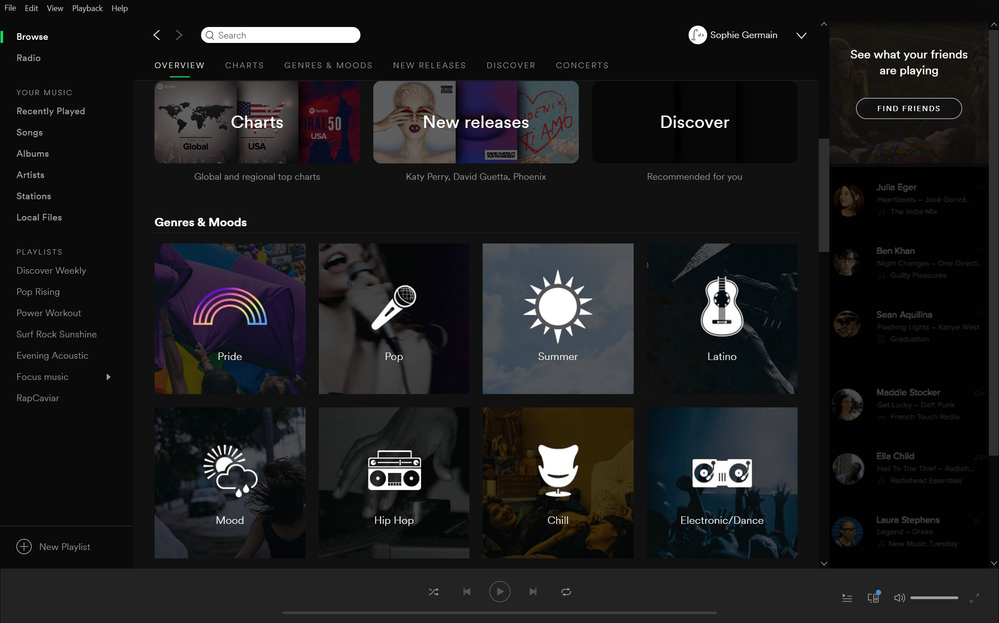
In early 2014, the desktop app was updated with a new look and got a new dark theme. (more info)

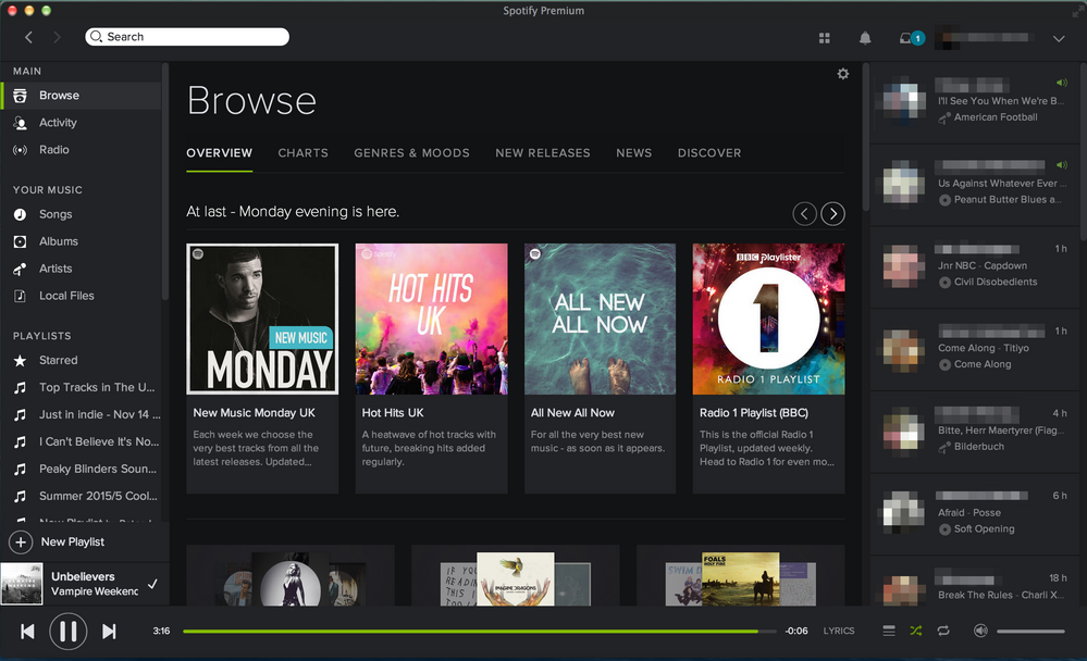
2015:
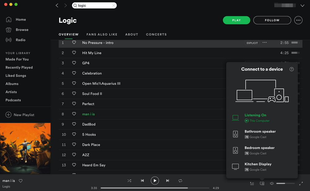
In early 2015, the desktop app was rewritten and received a design and feature update. (more info)

2017:

2020:

2021:
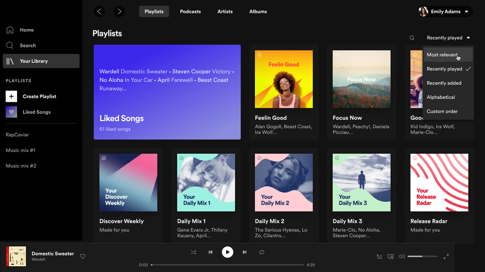
In early 2021, the desktop app was rewritten and received a redesign. This was the first time that the web player and the desktop app shared the same design and basic features. The more advanced features can be found in the desktop app. (more info)

2022:
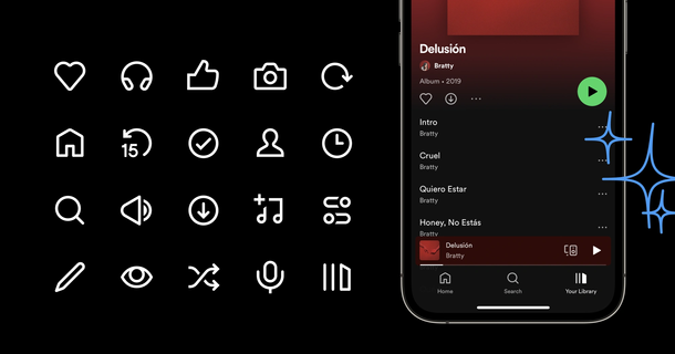
In January 2022, new icons started rolling out to the desktop app. (more info)

iOS Mobile App: (Similar on Android)
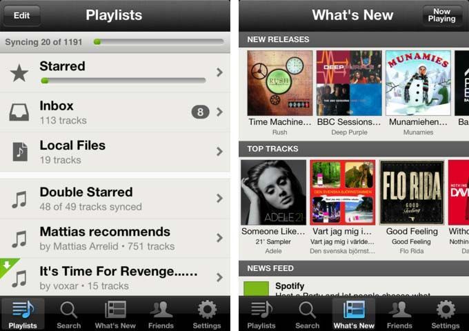
2012:

2013:

2014:
In early 2014, the mobile app was updated with a new look and got a new dark theme. (more info)


2015:

2016:

2017:

2018:

2019:
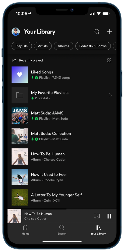
In early 2019, the mobile app was updated with a new Your Library view. (more info)

2021:
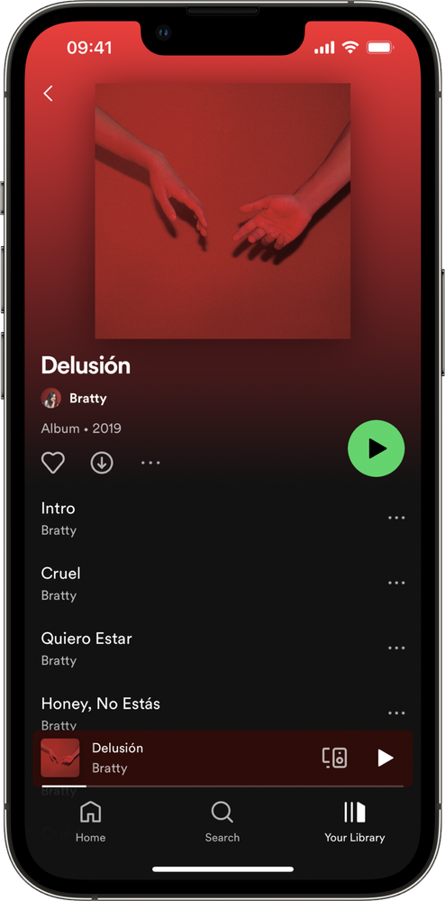
In early 2021, the mobile app was updated with a new Your Library view. (more info)

2022:
In January 2022, new icons started rolling out to the mobile app after a new bottom now playing bar was previously rolled out in late 2021. (more info)

Evolution of the Spotify App Icon
iOS Mobile App: (Similar on Android & Desktop)


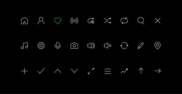
Evolution of the Icon System
2016:
You can read more about the 2016 icon redesign here:
Redesigning the Spotify Icon Suite

2022:
Did you notice anything different in the Spotify app recently?
Spotify's icons are getting a refresh for 2022.
You can read more behind the scenes info here:
Refreshing our Icon System: the why and how behind the changes


Evolution of the Spotify Logo
2008 - 2013:

2013 - 2015:

2015 - Present:
Usually Green, Black, or White depending on the use case
Full logo including wordmark or just the icon depending on the use case


Bonus: Major features added since 2012
Check out the comments section below to see all of the major features added since 2012.
Do you want to learn more?
You can read how the Spotify Community has changed over the last 10 years by going here.
