- Home
- Help
- Your Library
- New Your Library view (iOS & Android)
Help Wizard
Step 1
Type in your question below and we'll check to see what answers we can find...
Loading article...
Submitting...
If you couldn't find any answers in the previous step then we need to post your question in the community and wait for someone to respond. You'll be notified when that happens.
Simply add some detail to your question and refine the title if needed, choose the relevant category, then post.
Just quickly...
Before we can post your question we need you to quickly make an account (or sign in if you already have one).
Don't worry - it's quick and painless! Just click below, and once you're logged in we'll bring you right back here and post your question. We'll remember what you've already typed in so you won't have to do it again.
FAQs
Please see below the most popular frequently asked questions.
Loading article...
Loading faqs...
Ongoing Issues
Please see below the current ongoing issues which are under investigation.
Loading issue...
Loading ongoing issues...
Help categories
Account & Payment
Using Spotify
Listen Everywhere
New Your Library view (iOS & Android)
New Your Library view (iOS & Android)
- Mark as New
- Bookmark
- Subscribe
- Mute
- Subscribe to RSS Feed
- Permalink
- Report Inappropriate Content
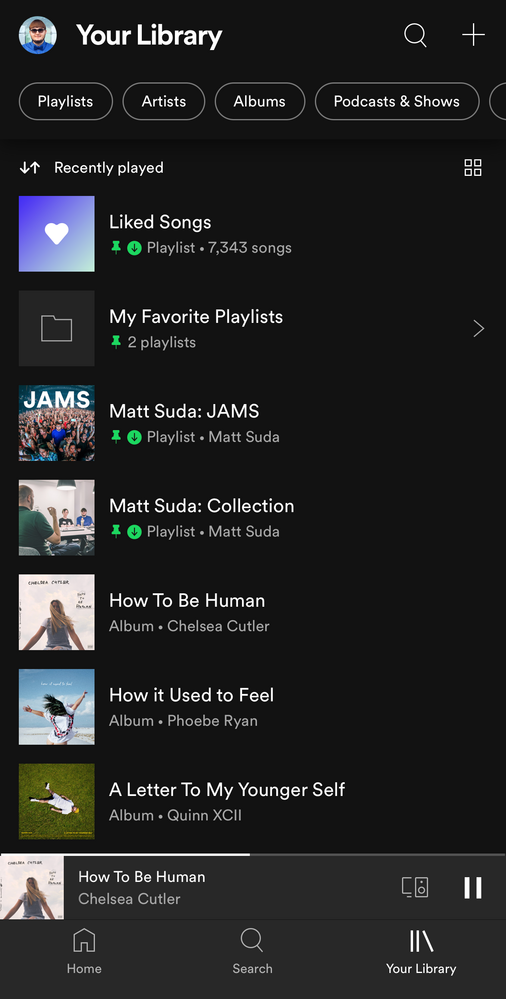
Spotify is introducing a new version of the Your Library view to mobile users of the iOS and Android apps. When you open up the Spotify mobile app you will see this new view. 📱
Check out this Spotify news article for more information:
Listeners Can Explore Their Spotify Collections Faster and Easier With a New ‘Your Library’
This thread is your go-to destination for getting an overview of what's new, asking questions, getting help for issues you might have, as well as to share your feedback on this new version of Your Library. Also, do you have any tips for other users on how you are using the new Your Library? We'd love to hear them.
What's new?
- See your entire collection in one simple list
- Dynamic filters and better sort options for your collection
- Pinned library items to find your favorites, faster
- More control at your fingertips with a new grid view
- Universal search allows you to search through your entire collection and see your recent searches
- Faster settings navigation allows you to tap on your profile picture to get to settings faster
- Get to your downloads, faster
Here is a walkthrough of what's new:
One simple list:
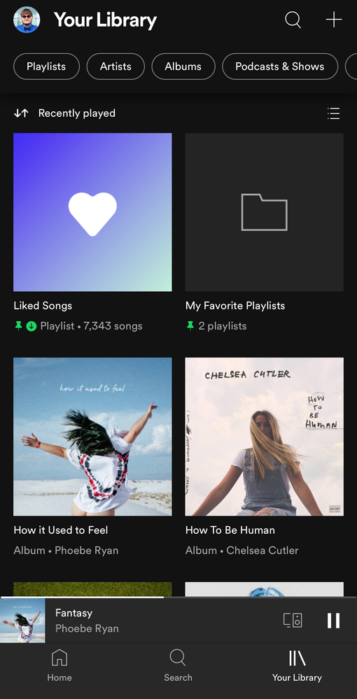
Your Library is now one simple list. At the top, tap on the filters to filter the content you want to see and tap on the sort options to change the sort order of the list. To create a new playlist, tap on the + (plus) symbol at the top right corner.
Dynamic filter options:
At the top, tap on the filters to filter the content you want to see. Tap on the X and then chose another filter to see another type of content. Having no filter selected will show all types of content in the list.
- Playlists
- Artists
- Albums
- Podcasts & Shows
- Downloaded
Sort options:
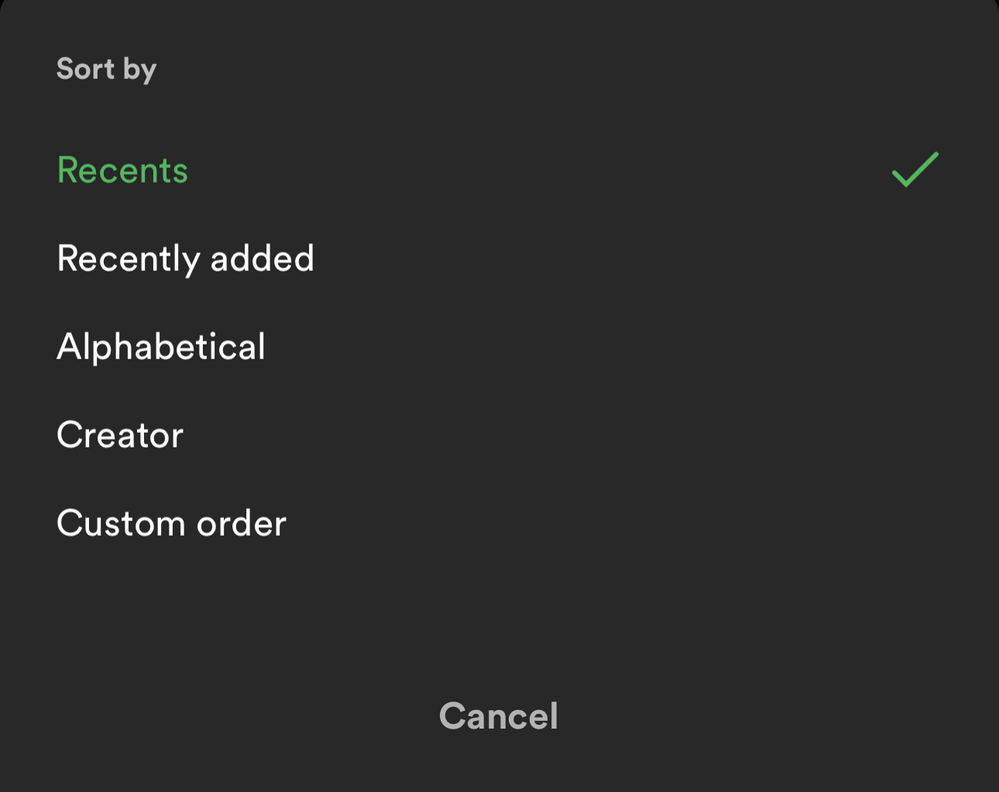
At the top, tap on the sort options to change the sort order of the list.
- Recents
- Recently added
- Alphabetical
- Creator
And in the "Playlists" filter view, you'll have this option to see your playlists in your own order like in the desktop app and web player:
- Custom order
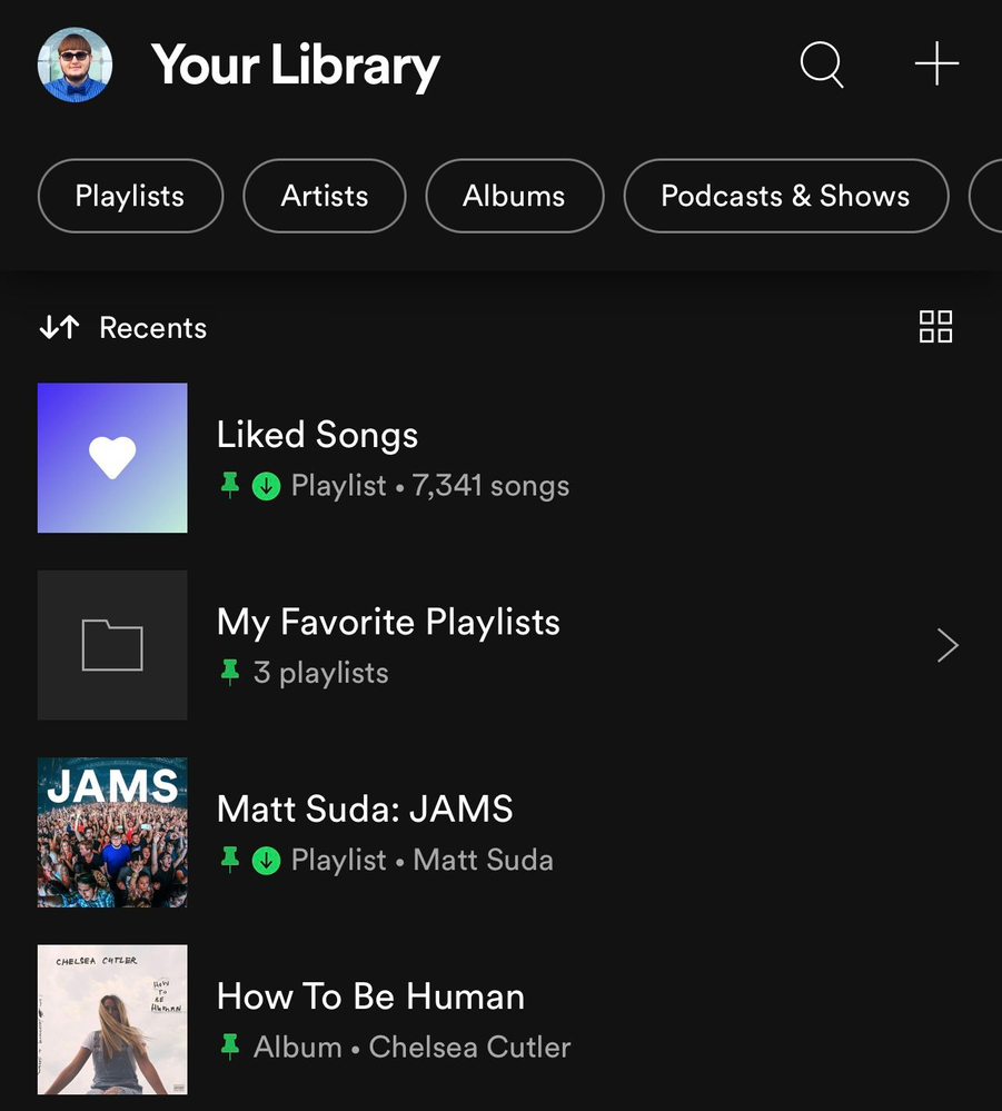
📌 Pinned library items:
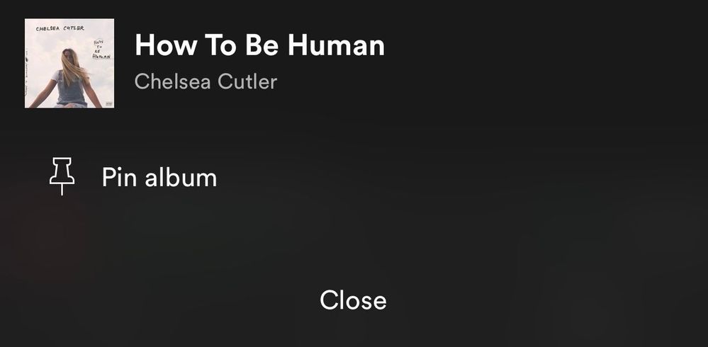
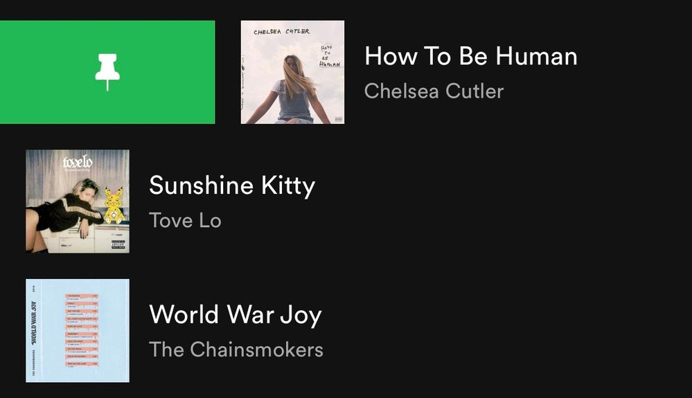
If you tap and hold on the screen on any item in the Your Library list or swipe right on it, an option will show up allowing you to pin it and it will stay at the top of the Your Library list.
You can pin anything in Your Library such as playlists, playlist folders, artists, albums, and podcasts. The limit is 4 pinned items. You can unpin "New Episodes" to free up a pin and still get to that using the "Podcasts & Shows" filter or by searching for it. Same with "Liked Songs", you can unpin it and still get back to it at the top of the "Playlists" filter when it is sorted by "Custom order" or by searching for it. You can also pin the "Your Episodes" list to the main library view in addition to the "New Episodes" list if you also want to be able to access "Your Episodes" from the main library view without having to filter to "Podcasts & Shows" first.
To pin more playlists when you run out of the 4 item pins, you can make a playlist folder in the desktop app or web player and then move multiple playlists inside it and then pin the folder in the mobile app. Then tap on the folder at the top and there you go, easier access to all the playlists in that folder and that can be your 4th pin. However, you can't pin a specific playlist if it is in a folder, so you will need to pin the folder instead. Tip: In the desktop app or web player you can also move playlist folders inside of another playlist folder. That means you can pin a playlist folder that contains a whole bunch of other playlist folders if you want to get super organized.
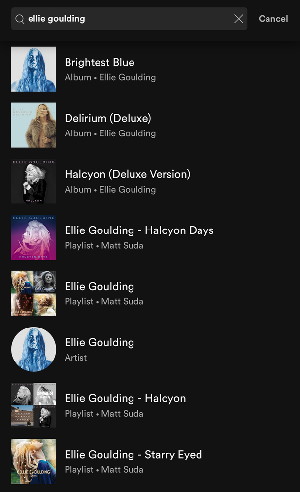
To easily find the item you want to pin, the best way is to use the universal search. At the top of Your Library, tap on the search icon and search for the item you want to pin. The universal search searches your entire library for playlists, playlist folders, artists, albums, podcasts and also shows you your recent searches.
Grid view:
Are you a visual person? You're in control. With the new grid view you can view Your Library with bigger artwork if that's your jam. This is great for when you're on the go or in the car so you can find what you're looking for faster. To switch to the grid view, tap on the squares icon to the right. Tap on it again to go back to the list view.
Universal search:
The new universal search can be accessed by tapping the search icon at the top right corner. The new search allows you to quickly search through your entire library for playlists, playlist folders, artists, albums, and podcasts without having to go to a specific content section.
Recent searches:
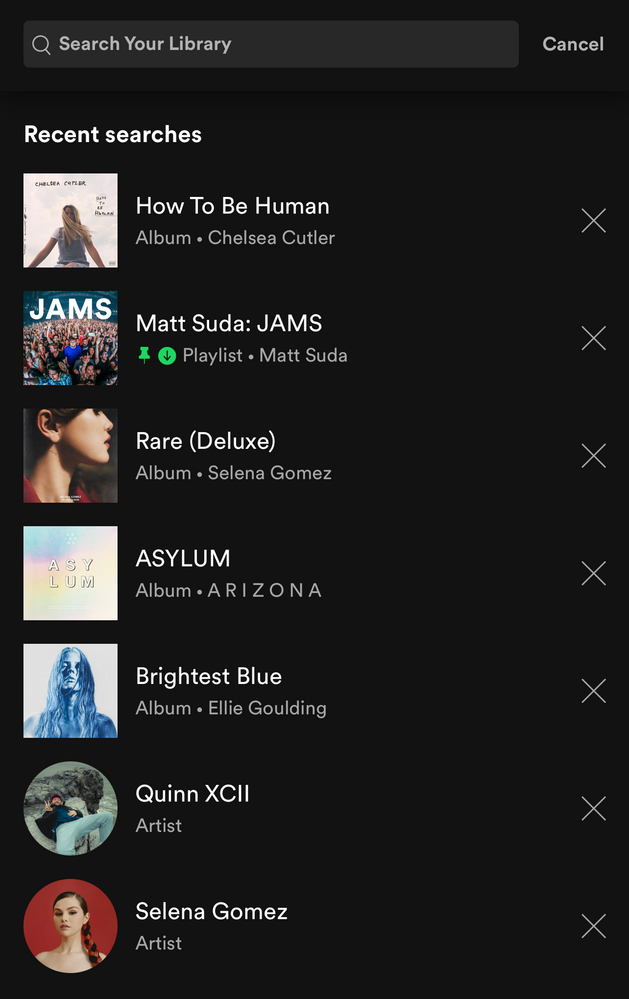
The new universal search also shows you your most recent Your Library searches so you can quickly get back to what you previously searched for.
Faster settings navigation:
Tap on your profile picture in the top left corner to get to settings faster.
Downloads: (Requires Premium)
When you are in offline mode you'll see your downloaded content faster upon app launch in the home tab.
In Your Library, tap on the "Downloaded" filter either in the main list view or after tapping on a filter to view your downloaded content.
How the new version of Your Library (iOS & Android) evolved over time during testing:
When the new version of Your Library on mobile was being tested with users, a few of the main points of feedback were the following:
- Add a custom sort option for the playlists filter like in the old library view
- Add a way to see a feed of new podcast episodes like in the old library view
These two options were added during the testing phase. Other points of feedback were also made by users during the test, but Spotify is always looking to improve the app so hopefully the new library experience will improve over time.
I personally like being able to see my playlists in the same custom sort order I have them arranged in the desktop app, so I was glad to see that issue was addressed. A bonus feature was also added which is the ability to pin a few of your favorite items to the top of Your Library. I really like being able to have my favorites one tap away at the top of my library. A few other new features that I like are being able to quickly search through my entire library, being able to see my library in a new grid view, and being able to get to settings right from the library view.
Feedback:
Now that the new version of Your Library on mobile is rolling out to all users, what do you think? You can leave your feedback as a reply in this thread. If your feedback is suggesting certain changes, it is best to also post each individual idea in the Community Idea Exchange where users can vote and comment on your ideas and it'll be easier to track each idea. You can read more about how your feedback reaches Spotify here.
- Subscribe to RSS Feed
- Mark Topic as New
- Mark Topic as Read
- Float this Topic for Current User
- Bookmark
- Subscribe
- Printer Friendly Page
- Mark as New
- Bookmark
- Subscribe
- Mute
- Subscribe to RSS Feed
- Permalink
- Report Inappropriate Content
Im missing the „recently asses button“ so bad for podcasts!!
I need it for my morning routine so see all morning podcasts which update in the morning and put them in my morning playlist.
also i can just pin 4 podcasts....would be great to add more
- Mark as New
- Bookmark
- Subscribe
- Mute
- Subscribe to RSS Feed
- Permalink
- Report Inappropriate Content
I need it for my morning routine so see all morning podcasts which update in the morning and put them in my morning playlist.
also i can just pin 4 podcasts....would be great to add more
- Mark as New
- Bookmark
- Subscribe
- Mute
- Subscribe to RSS Feed
- Permalink
- Report Inappropriate Content
Well it looks fresh I guess but still I can see only following artists and only liked albums which can include not liked songs tho.
Just show me what I added and nothing more. Please show me every artist with any liked songs no matter if I follow them or not please show me every album with any liked songs like it was before. Is it really so hard to do?
You could say that "liked songs" playlist can be sorted but swipe list of songs takes more time than just swipe a little square album cover or tiny circle with artist photo.
Do you even use your own app?
Update
Instead of one swipe now I need to reach to the top of the screen and tap little buttons and choose sorting option. This is counterproductive
- Mark as New
- Bookmark
- Subscribe
- Mute
- Subscribe to RSS Feed
- Permalink
- Report Inappropriate Content
- Mark as New
- Bookmark
- Subscribe
- Mute
- Subscribe to RSS Feed
- Permalink
- Report Inappropriate Content
- Mark as New
- Bookmark
- Subscribe
- Mute
- Subscribe to RSS Feed
- Permalink
- Report Inappropriate Content
- Mark as New
- Bookmark
- Subscribe
- Mute
- Subscribe to RSS Feed
- Permalink
- Report Inappropriate Content
I hate this new 'design', I can't believe you removed the 'custom' option so that the ordering matches my desktop app. Now my playlists are scattered all over the place. It's ridiculous, and makes using spotify an infuriating experience. It's felt like you've been trying to push users away from playlists for years, and this is the cynical nail in the coffin. It's either that, or you're blithering idiots...
- Mark as New
- Bookmark
- Subscribe
- Mute
- Subscribe to RSS Feed
- Permalink
- Report Inappropriate Content
I think the new library is nice, but I really miss sorting my podcasts by last updated. The new filters make it easy to miss a new episode of a program, cause you have to scroll and squint in order to find wich podcasts has updated. The offer in my homepage shows me some podcast, but I knda listen to a lot of them.
Otherwise I think it's a nice transformation, and it's always fun to explore new features 😄
- Mark as New
- Bookmark
- Subscribe
- Mute
- Subscribe to RSS Feed
- Permalink
- Report Inappropriate Content
Quote from SPOTIFY: "Listeners can explore their Spotify collections faster and easier with a new 'Your Library'" There have been many hundreds of complaints from premium users that indicates that this statement is completely false and yet 2 weeks later there has been no attempt to improve the user interface to make it faster and easier to use than the previous version. Does this mean there are other motives involved in this update not to the benefit of users?
- Mark as New
- Bookmark
- Subscribe
- Mute
- Subscribe to RSS Feed
- Permalink
- Report Inappropriate Content
Yeah this is genuinely terrible, lumping everything together not only makes it harder to use, but makes me feel really unorganised about my playlists/artists/albums, etc. Please reconsider this Spotify
- Mark as New
- Bookmark
- Subscribe
- Mute
- Subscribe to RSS Feed
- Permalink
- Report Inappropriate Content
I am still shocked about Spotify and their habit.
so many, many complains with 90% high quality direct feedback. And - nothing happens, silence, no changes announced.
I would be the greatest, if I as entrepreneur would habe these customers. And I would listen to them.
My conclusion: Spotify already is on the path of a burned up star dieing a silent dead. Like all these Blackberries or Nokias before.
- Mark as New
- Bookmark
- Subscribe
- Mute
- Subscribe to RSS Feed
- Permalink
- Report Inappropriate Content
I'm an avid user of Spotify for over 5 years and I migrated my entire podcasts library to Spotify. The new update makes the library pretty much unusable - here are the issues:
- Accessing my downloaded / saved episodes is now impossible - I only see a list of podcasts
- No filtering in "New Episodes" - how is anyone supposed to use this view?
- Blending Music and Podcasts together is just a bad idea - music and podcasts are organized very differently, while music is a collection that needs to be curated, podcasts function like a news stream.
- The previous UI was brilliant - why waste the space by replacing the big Music and Podcasts tabs with the useless "Your Library", the redundant search icon, and the + button?
Apologies if this comes across as a ramble, but I am deeply frustrated with this update and I'm seriously considering eating platform switching costs to a different podcasts app.
- Mark as New
- Bookmark
- Subscribe
- Mute
- Subscribe to RSS Feed
- Permalink
- Report Inappropriate Content
Agreed, been able to see all your artists is one of the most basic features of every media player out there, er, except spotify now it seems.
Seriously, what's the point of an artists tab that does not display the artists you have in your library??
Back to media monkey I guess 😞
- Mark as New
- Bookmark
- Subscribe
- Mute
- Subscribe to RSS Feed
- Permalink
- Report Inappropriate Content
I think this update has hindered usability of the app greatly. If we could change the default view, or make certain filters show up by default, it would be better, but as is, it's a massive regression that I'm extremely unhappy with. When I open the app, I always want to go to my downloaded playlists, in the custom order that I want them, and then chose music. Before, it was one tap. Now, it's a tap to library, a tap on playlists, and then a tap on downloads. Not to mention, almost every time a filter is put in place, it takes time to load, and I've encountered several bugs.
These are noticed on the Android app, on a Google Pixel 2. Most times that I click the filter "playlists", the library screen goes black/blank. Selecting the filter "downloaded" makes my playlists reappear, but the I;m not able to scroll down. I then have to remove the filters and go through the process again. It feels barely usable. As someone who uses the mobile app to play downloaded music during their commute, going through 8 different motions to get to the same view that I used to get to with one tap before I start driving is unacceptable.
- Mark as New
- Bookmark
- Subscribe
- Mute
- Subscribe to RSS Feed
- Permalink
- Report Inappropriate Content
- Mark as New
- Bookmark
- Subscribe
- Mute
- Subscribe to RSS Feed
- Permalink
- Report Inappropriate Content
A bug or an overlooked detail I found: when tapping "Add to playlist" on a track, the view for selecting a playlist doesn't respect the sort order I have set in the library ("custom" in my case, which reflects the old behavior).
I have a lot of playlists and pretty much rely on their order rather than remembering the exact name of each playlist. It feels like a bad design choice to override the sort order set set by the user, and replace it with a default sort order the user cannot even understand (it's not alphabetical, that I can say).
- Mark as New
- Bookmark
- Subscribe
- Mute
- Subscribe to RSS Feed
- Permalink
- Report Inappropriate Content
- Mark as New
- Bookmark
- Subscribe
- Mute
- Subscribe to RSS Feed
- Permalink
- Report Inappropriate Content
How do I save one of the filters as the default view on app startup?
That is currently not possible. To see only your playlists for example, tap on the "playlists" filter at the top of Your Library
Why not? This would allow those of us that dislike the new layout to at least save something similar to the old library layout as our default! Every time I open the app I have to go through several more clicks to get my preferred layout.
- Mark as New
- Bookmark
- Subscribe
- Mute
- Subscribe to RSS Feed
- Permalink
- Report Inappropriate Content
Ugh, this update is the WORST. I can change the Playlist order on mobile (to mirror all the work i did to make it perfect on desktop), but it doens't stay that way, I have to keep selecting it to get it back to my standard view.
The WORST part of this is that every time I hear a song and want to add it to a specific playlist, the order of the playlists I'm selecting default BACK to "most recent". So adding a song to a playlist used to take me seconds b/c my playlist order is so specifically curated. Now I have to hunt around, and I can't tell you how much I HATE this.
Why would you take the power away of mirroring what we do on desktop to keep that on mobile?
- Mark as New
- Bookmark
- Subscribe
- Mute
- Subscribe to RSS Feed
- Permalink
- Report Inappropriate Content
I'm continuously disappointed by updates to the desktop and mobile apps. It seems that every time an update occurs, functionality is sacrificed for the sake of a marginally improved aesthetic. At this point, I am fed up to the point that I have made a community account specifically to reply to this thread and indicate that changes must be made or my subscription will be going elsewhere.
Things started to go downhill, in my opinion, when the library was updated to categorize songs, albums, and artists independent of one another. While it's been a while since this change, it really hasn't aged well. It is commonplace among music streaming services for these categories to be intertwined. If I like songs, I would like to see the associated albums and artists in those without needing to save the entirety of an album or manually follow an artist. Perhaps add an option related to this functionality.
What followed recently was a clunky desktop update.
-The Home page is inundated with recommendations that are by-and-large useless. Please consider customization of this page so that I can remove podcast recommendations or other "recommended" categories that are not of interest.
-In playlists, sorting by artist has become a hassle. While it still possible, it takes an excessive number of inputs. Please prioritize functionality over aesthetics in some respects. I would recommend adding customization to the album/playlist view to allow individuals to choose which columns that would like to have displayed. Artist, Title, Album, Time, Date Added, etc. This leaves room for additional metrics that individuals can opt into as well, including number of times played, for instance.
Most recently, the mobile app update is a time waster. The claim that the changes make the mobile app easier to navigate are absolute hogwash. While in theory it opens the opportunity for me to quickly search the entirety of my library, I tend to go to my library with a specific purpose. If I wanted to search for my intended result, I would use the existing search feature. Moreover, having to sort and unsort categories makes viewing different categories require more input. Time seems to be wasted here. Even from an aesthetic standpoint, which seems to be the priority rather than functionality if you ask me, the combined list of podcasts, playlists, albums, and artists is ugly. Perhaps keep the combined list if you insist it will save time, but adjust the interface to allow a simple swipe between categories rather than requiring two or more taps/clicks to get between categories.
All in all, the desktop and mobile apps would benefit from allowing individuals users to customize different aspects of the experience to best suit their needs.
Suggested posts
Hey there you, Yeah, you! 😁 Welcome - we're glad you joined the Spotify Community! While you here, let's have a fun game and get…
