Help Wizard
Step 1
Type in your question below and we'll check to see what answers we can find...
Loading article...
Submitting...
If you couldn't find any answers in the previous step then we need to post your question in the community and wait for someone to respond. You'll be notified when that happens.
Simply add some detail to your question and refine the title if needed, choose the relevant category, then post.
Just quickly...
Before we can post your question we need you to quickly make an account (or sign in if you already have one).
Don't worry - it's quick and painless! Just click below, and once you're logged in we'll bring you right back here and post your question. We'll remember what you've already typed in so you won't have to do it again.
FAQs
Please see below the most popular frequently asked questions.
Loading article...
Loading faqs...
Ongoing Issues
Please see below the current ongoing issues which are under investigation.
Loading issue...
Loading ongoing issues...
Help categories
Account & Payment
Using Spotify
Listen Everywhere
Who Me Too'd this topic
The UI update is hurting our feelings - this is why
- Mark as New
- Bookmark
- Subscribe
- Mute
- Subscribe to RSS Feed
- Permalink
- Report Inappropriate Content
I'm using spotify for over 5 years now. I was loyal all the time, except that one time when I tried to switch to Apple Music for better phone integration - but your interface was better. Now - If this UI stays as it is - I will finally make the switch.
This update invaded our homes and pushed our content away from us. This is emotional. Look through all the new posts, people really feel hurt.
You oversimplified, wasted huge amounts of precious space. Scrolling through my playlists or albums now feels like using a Windows Phone with this HUGE tiles (ew).
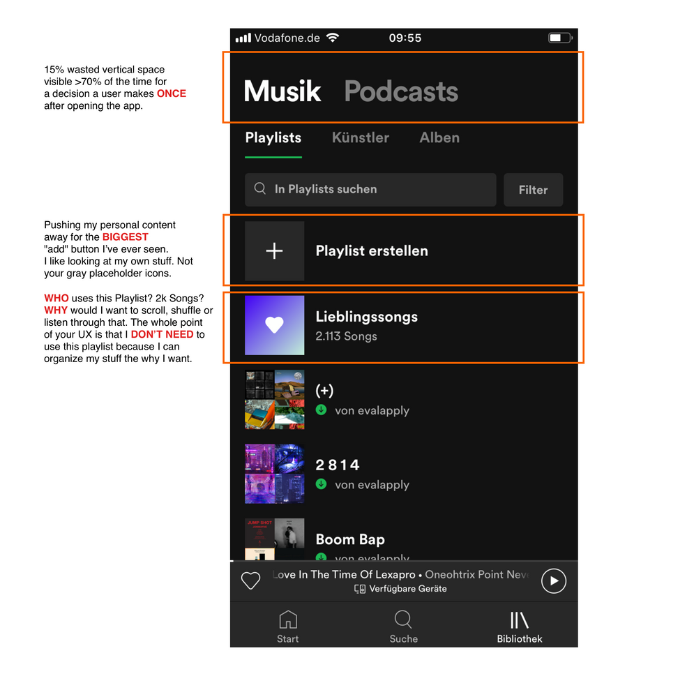
I compiled the main concerns I have with this update and also provided a visual on top:
- We decide wether to listen to music or to podcasts even before opening the app. You choose to show us that option ALL THE TIME using ~15% vertical space, pushing our own content further down.
- The whole point of your App is to allow us to organize and listen to music. By putting this utterly useless "Favorite Songs" Playlists with thousands of singles in it on TOP with no option to hide it or even move out of the way you're encouraging the oppisite of organization: chaos. Because that's what this "Playlist" is: pure chaos. Who wants to scroll through 2k songs or even Shuffle them? Excpet when your whole library consists of 2k big room house singles, no offense.
- This "Add Playlist" Icon is the biggest "Add" button I've ever seen. And it is also ALWAYS on top and visible, pushing my own content further down. Please, make it smaller and put it in one of the 4 corners like a mobile phone user is used to. They recognize the little "+" sign, even if it's not HUGE - trust me!
Put simply:
- You made the wrong things big
- You pushed our own beloved content away by doing so
- You made us feel like we are too dumb to choose from a reasonable long list of options (like we could in the old UI)
Please bring back the following UI model:
Start App -> Overview of my Stuff -> List to choose from (Albums, Artists, Podcasts), etc -> full screen content
All we want is full screen content, beautifully listed without >5 filter options distracting us all the time.
Thank you for your attention.
edit: guess they wanted to shill the podcast functionality..
