Announcements

Help Wizard

Step 1

NEXT STEP

FAQs

Please see below the most popular frequently asked questions.

Loading article...

Loading faqs...

VIEW ALL

Ongoing Issues

Please see below the current ongoing issues which are under investigation.

Loading issue...

Loading ongoing issues...
VIEW ALL

[Desktop][Your Library] Bring Back Separate Song Title and Artist

Not sure who thought it was a great idea to reformat how one can view songs by artist or by title...? It is much more convenient to have the two, side by side, while viewing a library rather than only being able to view the artist name or song name under the other...

Updated on 2023-11-14

Hey folks,


Thanks for coming to the Spotify Idea Exchange and voting to make this happen.


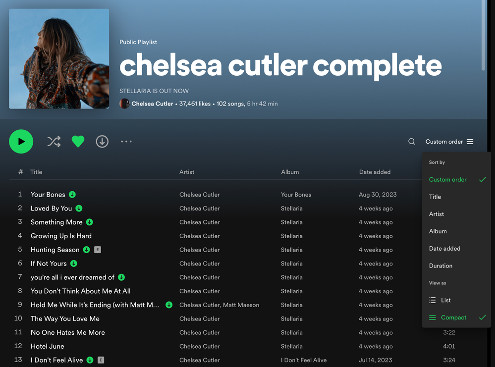
We're happy to announce that a Compact mode which hides the album art and displays the song's title and artist under two separate columns in playlists and albums is now available on the desktop app and the Web Player! Check out @MattSuda's post here for a detailed overview.


Once again, thanks for helping us make Spotify better by participating here on the Community 💚

Top Answer
MattSuda
Spotify Star

Good news!


There is now a new Compact Mode for track lists (playlists and album pages) in the desktop app and Web Player


The drop down menu now has "Sort by" and "View as" options. To turn on compact mode, open up the drop down menu at the top right of a playlist or album page and click on "Compact" under "View as".


On Playlist pages, it removes the album art, and breaks out "Title" and "Artist" into their own separate columns again. This view is similar to before the redesign that added album art into playlists a few years ago.


On Album pages, it moves the artist and featured artists from below each track title, to a new "Artist" column to the right of the "Title" column.


When you turn on Compact Mode, it will be remembered and stay on when you are viewing both playlists and album pages. You can switch back to the regular "List" view at any time.


The new Compact Mode for track lists is rolling out in the desktop app and Web Player right now so you should be seeing it soon. This has been a highly requested feature since the redesign came out a few years ago.


Desktop Compact List Mode.png

Comments
Xiol

Me: "I'm going to buy some bigger, higher resolution monitors so I can fit more information on my screens at once."


Spotify UX: "MORE WHITESPACE"

balonlon
GianlucaBianchi

I agree balonlon, totally unnecessary unless you like it, of course. They should just let us choose what we like to have there and its size, the opposite of what they're doing.

arielfmdp

I totally agree!! there is a lot of space on screen ! Put back the columns as it was before... I don't know why you change user interface this way without asking users.... It would be better to have user interface configuration so we can place the things as we like. It is time to have user interface customization options.

The latest changes you have implemented are inexplicable. I'm not agree with most of them

I totally agree with this request but the real fundamental problem is that you can't customise the interface at all. They keep dumbing down the UI presumably for people who just play playlists and don't care that they listen to.

LaCidiana

The fact that this essential, basic function was ever taken away from a music catalog/streaming service is nothing short of insanity. Please at least give us an option to bring the Artists column back.

SamuelC

Please! 


Revert to the older design. It makes more sense and is in line with DECADES of UI design and other applications. I understand spotify has tried to bring the desktop app in line with the web app but it should clearly be the other way around. 

This update is so hard to use. 

avadif

You guys this is SO BASIC, I shouldn’t even need to explain to you why it is necessary to have an artist column. I don’t give a s*** about any of the other changes, just bring it back. Dealbreaker 

fritthaze

Someone moved the Artist Name below the song title. There are huge amounts of space available, why is this necessary? We all lost lots of tidiness and overview because of this. 

Unbenannt.PNG
simonebacker

Completely agree with the user sentiment here. I've been a Premium user since 2011 and this is the most disappointed I've ever been with a software UI update in anything. I love Spotify; I'm listening to music practically all day, every day. I always sort by either Artist or Song Title. Why is Album locked into the column design and you have to choose between Artist or Song Title? I have NEVER sorted by Album in 10 years of using Spotify. It's a completely useless column for me. Meanwhile, now either the Artist or Song Title font is a tiny, illegible subtitle beneath the larger font. I honestly have zero respect for whatever UI/UX designer thought this was a good idea and the chain of command that agreed with them. Please listen to your users and at least make this customizable so that we can configure the columns how WE WANT not your arbitrary decisions. This is insanely frustrating.