Announcements

Help Wizard

Step 1

NEXT STEP

FAQs

Please see below the most popular frequently asked questions.

Loading article...

Loading faqs...

VIEW ALL

Ongoing Issues

Please see below the current ongoing issues which are under investigation.

Loading issue...

Loading ongoing issues...
VIEW ALL

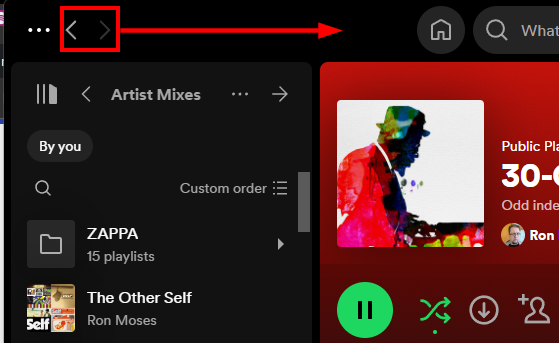
Back/forward buttons are in the wrong place

Recently the back/forward buttons in the desktop app were moved to the far left. This places them much farther from the center panel, which is what those buttons control. Those buttons need to reside above the center panel.


This is what I'm talking about.This is what I'm talking about.

Comments
eufhsnz

Totally, from a U.X perspective it makes no sense, you have to go across the entire page to search, then bounce to the very left of the screen to go back. It's stressful, bulky, and makes no sense from an ergonomic point of view. I am all for change if it makes sense, and improves the user experience. This change is both aesthetically, and ergonomically flawed, and makes the search feature way way worse.
At least give us an option to revert to the old location.

errsu

Absolutely true. Lots of extra mouse travel to the back button when searching for something specific in the new layout. Please move the forward/back buttons back into the middle part. Thanks!

mtaddict

Plan

Premium

Operating System

macOS Sonoma 14.6.1


My Question or Issue

Hello,


You've just updated Spotify to version 1.2.44.405 and since then the two arrows at the top of the application (to return to the previous page or go to the next page) have moved from the top centre of the window to the top left corner.


In my humble opinion, this is a huge mistake in the sense that these arrows are used when navigating the main part of Spotify, i.e. the list of tracks in a playlist, an EP, an album... And the gesture is more natural, more direct and shorter when the arrows are positioned more centrally at the top.


If you put them just to the left of the home icon, that would be perfect. But now they're too far away from everything.


If you agree with me, please leave a comment here to make this topic more visible.


Best regards,
Martial

Flèches Spotify.png
nhogendoorn

Why have you moved the back button (a button that I use so often while navigating the app) to another location? It's terrible and makes me question my positioning each time I want to go back to the previous screen.


Please move it back to its old location...

Natalie_Tran

Agree! I find myself using the desktop app most of the time because I use it at work and the fact that I have to travel across the width of the screen just to go back is so frustrating.

betobon

Plan

Premium

Country

Brazil

Device

PC

Operating System

Windows 10

My Question or Issue

Could you change the position of "<" ">"? bring to the middle of the screen.

It's a little bit annoying to go to the other side of the screen to click to "go back" or "go forward" on Spotify screen to navigate among the pages or playlists.

Thank you.

spotify123.jpg
bblay

My back button is gone! How do I get it to appear!  At this point I don't care where it is, I just want it back!

Nedpoleon

This is an exasperating and pointless change. A lot of the time it feels like Spotify's attitude to their users is "Let's not let them get too comfortable, we don't want them to forget who's boss around there."

camillion6031

The new update doesn't make any sense and isn't very user friendly. Previously the 'back' button or 'forward' buttons were closer to the search in the top center of the screen, and now I have to drag my mouse all the way to the top left corner to navigate. The old format was far better and I hope that it can be restored, I'm sure many others feel this way as well.

andreamorelli

Please move back the back button where it belongs -- next to the search bar and the home button.


navigating in playlists, discographies, artists has become a real PIA!

and yes - i'm aware there's a shorcut.


thank u 


Screenshot 2024-09-06 at 15.33.20.png