- Home
- Help
- Your Library
- New Your Library view (iOS & Android)
Help Wizard
Step 1
Type in your question below and we'll check to see what answers we can find...
Loading article...
Submitting...
If you couldn't find any answers in the previous step then we need to post your question in the community and wait for someone to respond. You'll be notified when that happens.
Simply add some detail to your question and refine the title if needed, choose the relevant category, then post.
Just quickly...
Before we can post your question we need you to quickly make an account (or sign in if you already have one).
Don't worry - it's quick and painless! Just click below, and once you're logged in we'll bring you right back here and post your question. We'll remember what you've already typed in so you won't have to do it again.
FAQs
Please see below the most popular frequently asked questions.
Loading article...
Loading faqs...
Ongoing Issues
Please see below the current ongoing issues which are under investigation.
Loading issue...
Loading ongoing issues...
Help categories
Account & Payment
Using Spotify
Listen Everywhere
New Your Library view (iOS & Android)
New Your Library view (iOS & Android)
- Mark as New
- Bookmark
- Subscribe
- Mute
- Subscribe to RSS Feed
- Permalink
- Report Inappropriate Content
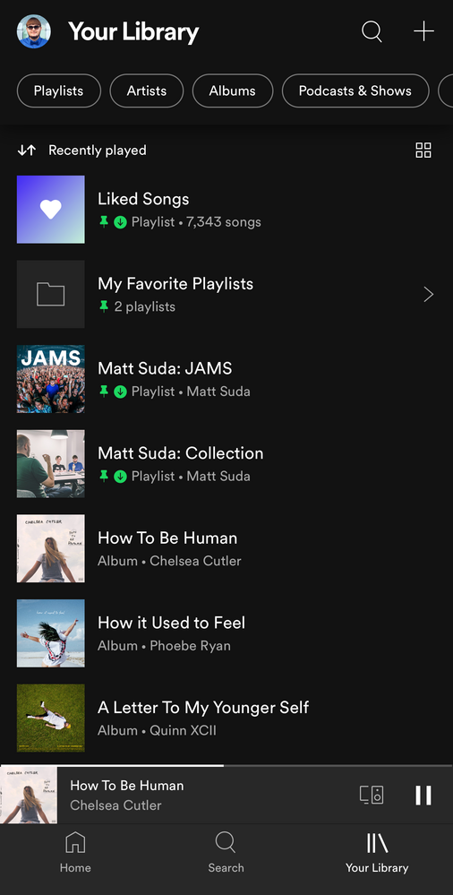
Spotify is introducing a new version of the Your Library view to mobile users of the iOS and Android apps. When you open up the Spotify mobile app you will see this new view. 📱
Check out this Spotify news article for more information:
Listeners Can Explore Their Spotify Collections Faster and Easier With a New ‘Your Library’
This thread is your go-to destination for getting an overview of what's new, asking questions, getting help for issues you might have, as well as to share your feedback on this new version of Your Library. Also, do you have any tips for other users on how you are using the new Your Library? We'd love to hear them.
What's new?
- See your entire collection in one simple list
- Dynamic filters and better sort options for your collection
- Pinned library items to find your favorites, faster
- More control at your fingertips with a new grid view
- Universal search allows you to search through your entire collection and see your recent searches
- Faster settings navigation allows you to tap on your profile picture to get to settings faster
- Get to your downloads, faster
Here is a walkthrough of what's new:
One simple list:
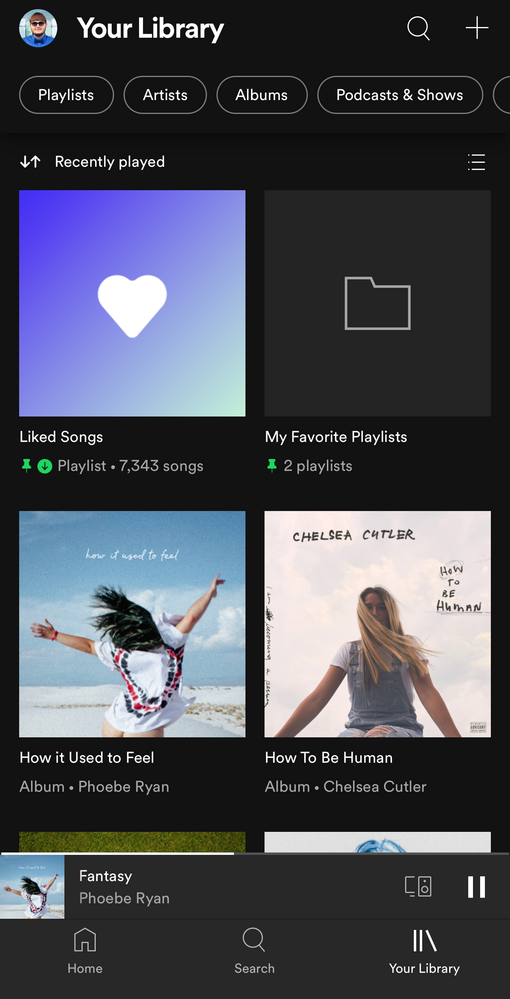
Your Library is now one simple list. At the top, tap on the filters to filter the content you want to see and tap on the sort options to change the sort order of the list. To create a new playlist, tap on the + (plus) symbol at the top right corner.
Dynamic filter options:
At the top, tap on the filters to filter the content you want to see. Tap on the X and then chose another filter to see another type of content. Having no filter selected will show all types of content in the list.
- Playlists
- Artists
- Albums
- Podcasts & Shows
- Downloaded
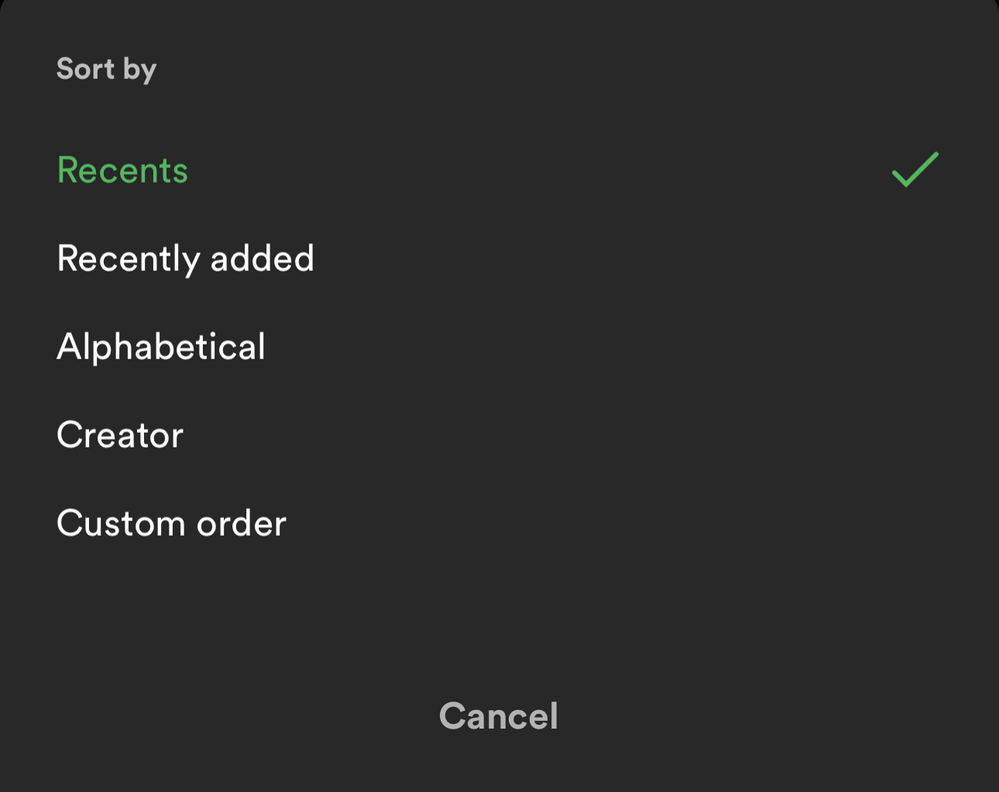
Sort options:
At the top, tap on the sort options to change the sort order of the list.
- Recents
- Recently added
- Alphabetical
- Creator
And in the "Playlists" filter view, you'll have this option to see your playlists in your own order like in the desktop app and web player:
- Custom order
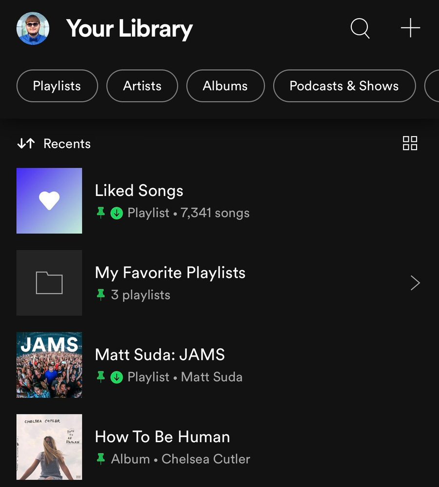
📌 Pinned library items:
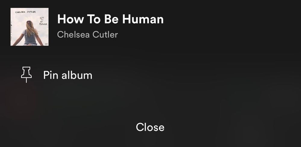
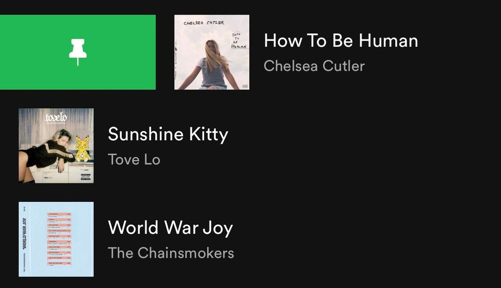
If you tap and hold on the screen on any item in the Your Library list or swipe right on it, an option will show up allowing you to pin it and it will stay at the top of the Your Library list.
You can pin anything in Your Library such as playlists, playlist folders, artists, albums, and podcasts. The limit is 4 pinned items. You can unpin "New Episodes" to free up a pin and still get to that using the "Podcasts & Shows" filter or by searching for it. Same with "Liked Songs", you can unpin it and still get back to it at the top of the "Playlists" filter when it is sorted by "Custom order" or by searching for it. You can also pin the "Your Episodes" list to the main library view in addition to the "New Episodes" list if you also want to be able to access "Your Episodes" from the main library view without having to filter to "Podcasts & Shows" first.
To pin more playlists when you run out of the 4 item pins, you can make a playlist folder in the desktop app or web player and then move multiple playlists inside it and then pin the folder in the mobile app. Then tap on the folder at the top and there you go, easier access to all the playlists in that folder and that can be your 4th pin. However, you can't pin a specific playlist if it is in a folder, so you will need to pin the folder instead. Tip: In the desktop app or web player you can also move playlist folders inside of another playlist folder. That means you can pin a playlist folder that contains a whole bunch of other playlist folders if you want to get super organized.
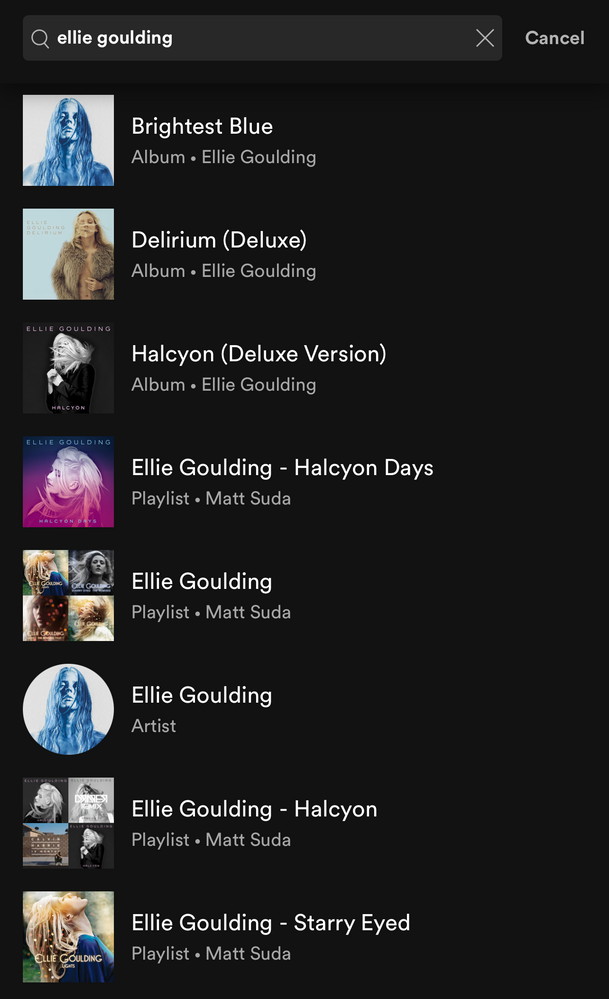
To easily find the item you want to pin, the best way is to use the universal search. At the top of Your Library, tap on the search icon and search for the item you want to pin. The universal search searches your entire library for playlists, playlist folders, artists, albums, podcasts and also shows you your recent searches.
Grid view:
Are you a visual person? You're in control. With the new grid view you can view Your Library with bigger artwork if that's your jam. This is great for when you're on the go or in the car so you can find what you're looking for faster. To switch to the grid view, tap on the squares icon to the right. Tap on it again to go back to the list view.
Universal search:
The new universal search can be accessed by tapping the search icon at the top right corner. The new search allows you to quickly search through your entire library for playlists, playlist folders, artists, albums, and podcasts without having to go to a specific content section.
Recent searches:
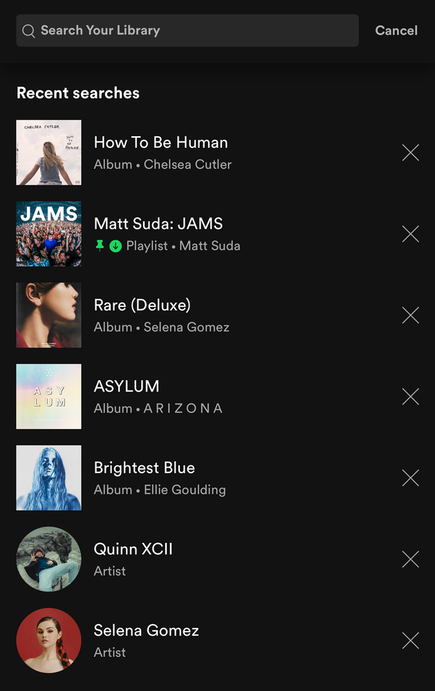
The new universal search also shows you your most recent Your Library searches so you can quickly get back to what you previously searched for.
Faster settings navigation:
Tap on your profile picture in the top left corner to get to settings faster.
Downloads: (Requires Premium)
When you are in offline mode you'll see your downloaded content faster upon app launch in the home tab.
In Your Library, tap on the "Downloaded" filter either in the main list view or after tapping on a filter to view your downloaded content.
How the new version of Your Library (iOS & Android) evolved over time during testing:
When the new version of Your Library on mobile was being tested with users, a few of the main points of feedback were the following:
- Add a custom sort option for the playlists filter like in the old library view
- Add a way to see a feed of new podcast episodes like in the old library view
These two options were added during the testing phase. Other points of feedback were also made by users during the test, but Spotify is always looking to improve the app so hopefully the new library experience will improve over time.
I personally like being able to see my playlists in the same custom sort order I have them arranged in the desktop app, so I was glad to see that issue was addressed. A bonus feature was also added which is the ability to pin a few of your favorite items to the top of Your Library. I really like being able to have my favorites one tap away at the top of my library. A few other new features that I like are being able to quickly search through my entire library, being able to see my library in a new grid view, and being able to get to settings right from the library view.
Feedback:
Now that the new version of Your Library on mobile is rolling out to all users, what do you think? You can leave your feedback as a reply in this thread. If your feedback is suggesting certain changes, it is best to also post each individual idea in the Community Idea Exchange where users can vote and comment on your ideas and it'll be easier to track each idea. You can read more about how your feedback reaches Spotify here.
- Subscribe to RSS Feed
- Mark Topic as New
- Mark Topic as Read
- Float this Topic for Current User
- Bookmark
- Subscribe
- Printer Friendly Page
- Mark as New
- Bookmark
- Subscribe
- Mute
- Subscribe to RSS Feed
- Permalink
- Report Inappropriate Content
I feel this update was a huge step in the wrong direction, particularly when it comes to using the app primarily offline/with downloaded content.
It has muddled my music and podcasts all together into a big list that I now have to sort through (even with filters). And in order to find my downloaded music playlists, I have to dig through all the downloaded podcasts that I have as well, instead of everything being separated into concise music and podcast specific sections.
Also, the removal of the nicely organized Shows tab in the podcasts section was a big faux pas. It's now more difficult to find out which shows have been updated/have a new episode at a glance. I used to be able to check in daily and see them all at a glance, but now I have to dig through each show's page to see what's new. Disappointing.
Also, I would like to request that there be a way for us to disable the whole "download an episode and it gets added to this 'My Episode' " thing. I already have everything organized as I need, and I don't need another random playlist option to pop up every time I download something.
- Mark as New
- Bookmark
- Subscribe
- Mute
- Subscribe to RSS Feed
- Permalink
- Report Inappropriate Content
I want Spotify to do two things.
1. Let me listen to my playlists
2. Let me listen to music by Artist
You just fully axed one of these two options as far as I can tell, great.
- Mark as New
- Bookmark
- Subscribe
- Mute
- Subscribe to RSS Feed
- Permalink
- Report Inappropriate Content
To me by far the biggest disappointment here has been Spotify's response. They have pages and pages of complaints and ides of improvement here, they have tons of reviews of both desktop and mobile app that voice displeasure, and their social feeds are clogged with folks unhappy; yet their response is always something along the lines of "we are sorry you do not like the new interface, but we plan on using this going forward. if you have an idea please submit one". It's been weeks and they give the same answers, they clearly don't care about customer complaints
- Mark as New
- Bookmark
- Subscribe
- Mute
- Subscribe to RSS Feed
- Permalink
- Report Inappropriate Content

- Mark as New
- Bookmark
- Subscribe
- Mute
- Subscribe to RSS Feed
- Permalink
- Report Inappropriate Content
I have this JUNK too! The search is now UNUSEABLE!
You have to scroll left/right in an super small area, instead of scrolling up/down!
Oooh Spotify devs, such a STUPID JUNK!
- Mark as New
- Bookmark
- Subscribe
- Mute
- Subscribe to RSS Feed
- Permalink
- Report Inappropriate Content
I strongly dislike the new look. It is more difficult to use, I don't want everything all in my face at once. The graphics are too big, and also my Decade and Genre and Artist Mixes, which I LOVE are all totally gone. It's a disaster. I'm trying to find 'Podcasts' and I can't even see it anywhere. There are little photos next to the one podcast I can find, since I was listening to it recently. I like that. But otherwise. It's awful, like someone's just come into your house and put everything in the wrong cupboards. 😫
- Mark as New
- Bookmark
- Subscribe
- Mute
- Subscribe to RSS Feed
- Permalink
- Report Inappropriate Content
I seem to have an issue on Android. When I choose a filter everything disappears and I have to toggle back to Home, then Your Library again to get everything back, often multiple times.

- Mark as New
- Bookmark
- Subscribe
- Mute
- Subscribe to RSS Feed
- Permalink
- Report Inappropriate Content
I genuinely wouldn't mind this change if it were possible to customize the new Library tab. As it is, every time I open the app and want to get to my playlists I have to tap an extra button to filter, then tap two more times to sort (because the app doesn't remember what state the tab was in last time I used it? For some reason?), which is three more taps than it used to take to get where I needed to be.
Also, the meaning of the words "alphabetical order" has apparently changed? All my playlists whose names started with emojis used to be pretty much grouped together, which was great, because lines of text tend to blur together for me but images and colors are easy to parse quickly. Now they're distributed throughout the list. I can't overstate how much I hate this, and how much I would have been pacified if "custom sort" meant that I could decide what order my playlists appear in myself... but it doesn't, because I can apparently only sort them on desktop. Why?
If this update had allowed me to fully customize what appears in my library tab and have it stay put, it would have been an improvement. As it is, it's very much the opposite. I'm sure Spotify isn't obligated to care whether I have a good experience using their app, but I hope the people responsible for the direction taken in this update are feeling the weight of my scorn, and I hope someone with even an ounce of design sense gets a say in the next one.
- Mark as New
- Bookmark
- Subscribe
- Mute
- Subscribe to RSS Feed
- Permalink
- Report Inappropriate Content
Please roll this change back. It is cluttered and less organized than the old one. Also takes too many button pushes to change from one view to another in Your Library. The Android gestures don't go back to Your Library if I go back from any of the options. That means it takes two hands to hit the x because it way in the top corner of the phone. I feel like this was a big miss and needs to go back to the developers to rethink how basic user friendly UI should be designed.
- Mark as New
- Bookmark
- Subscribe
- Mute
- Subscribe to RSS Feed
- Permalink
- Report Inappropriate Content
- I reordered playlists on desktop app but this was not reflected in the android app. There is not custom sort order on android but using order called "creator" still does not work. There are no positives with the new library view. Did this release coincide with April fools day?
- Mark as New
- Bookmark
- Subscribe
- Mute
- Subscribe to RSS Feed
- Permalink
- Report Inappropriate Content
This change has transformed my podcast library to a pure mess that is nothing but source of frustration when I am trying to orient in it. Everything mixed together, no matter when the content was added, even though I have selected order by "newest". Please, really do consider going back to the previous version. it was working just fine.
- Mark as New
- Bookmark
- Subscribe
- Mute
- Subscribe to RSS Feed
- Permalink
- Report Inappropriate Content
This update has not been that bad for me, as I now only like songs, and add those into some playlists, so essentially my library now shows Liked Songs and then some playlists/playlist folders. However, I am horrified at this idea - in case I had some artists and albums added, everything would be in a list like this:
Artist X
Album Y
Liked Songs
Album Z
Artist A
Playlist P
Artist B
...
Who thought this kind of a layout is even usable without using the filters at top, which is again, difficult to reach on modern phones and also an additional click?
In fact, thinking of the numerous other posts across this community, what do artists and albums signify anyway in Spotify? Why do we need to follow artists to get them into the library? Ideally the library should show an artist if I have added/liked songs or albums by them. Weird all around.
- Mark as New
- Bookmark
- Subscribe
- Mute
- Subscribe to RSS Feed
- Permalink
- Report Inappropriate Content
Unironically, Spotify needs to fire whoever is in charge of their UI team. Every single update makes the app UI worse, especially when there wasn't a problem to begin with. This update is by far the worst example of trying to fix what isn't broken. Instead of adding actual useful features, like swiping to queue a song on Android or swiping from the top to search in a playlist, this is what they implement? The most recent UI was fine! It was way better than this, you know where everything is all the time and it takes so few interactions to find what you're looking for. From app startup, literally a tap on a large button and I'm on my playlists in my preferred order. A tap on a large button and a swipe and I'm in my albums in my preferred order. Now, I have to go to my library, tap on a small button, and then sort by my preferred order. It's not a small difference on paper but why would a decrease in usability be a step in the right direction? I used to be able to open the app, navigate to my music and play it without even looking while driving. It was intuitive and generous to where you can tap on the screen. Now, I either have to wait for a red light or risk getting in an accident. It has literally made using the app more dangerous.
- Mark as New
- Bookmark
- Subscribe
- Mute
- Subscribe to RSS Feed
- Permalink
- Report Inappropriate Content
Also, the library page is literally broken. 1/3 times I sort by one medium it goes black for a few seconds, and then doesn't sort by the correct medium.


- Mark as New
- Bookmark
- Subscribe
- Mute
- Subscribe to RSS Feed
- Permalink
- Report Inappropriate Content
They did it with the 'feature' that added a whole album to albums if you favorited a single song and now again… If they did, I'm almost sure that not many people would have wanted artists to clutter up their playlists view. Because artists as a category have a totally different function.
Given, I've always wanted to be able to add new albums (temporarily) in my playlist tree (instead of having to make a playlist for every new album) but not all.
The new solution feels like something the marketing department came up with. "People stick too much to what they have placed in playlists. They don't switch to other tabs... How do we solve that?" I hear them think.
A solution for this mess could be that you allow users to select two categories: e.g. playlists and albums and that this selection sticks. I'm not interested in podcasts and artists, I follow only to stay up to date for new releases. Thanks for fixing this.
- Mark as New
- Bookmark
- Subscribe
- Mute
- Subscribe to RSS Feed
- Permalink
- Report Inappropriate Content
- Mark as New
- Bookmark
- Subscribe
- Mute
- Subscribe to RSS Feed
- Permalink
- Report Inappropriate Content
- Mark as New
- Bookmark
- Subscribe
- Mute
- Subscribe to RSS Feed
- Permalink
- Report Inappropriate Content
A great start! Here is a good idea for improving the library view if anyone wants to vote for it (I didn't put it there myself, but I support it as a good idea).
- Mark as New
- Bookmark
- Subscribe
- Mute
- Subscribe to RSS Feed
- Permalink
- Report Inappropriate Content
God! Thank you! Im so happy to see I’m not the only one that hates this new UI! I’m here losing my mind trying to sort this as I want it and hating every bit of this new design. It’s not easier at all. Spotify has become an apple knockoff by removing my ability to use and customise my library as I want. I’ve had my library set up the same way for 10 years and now I can’t find anything. If I wanted to be stuck with my playlists setup in a **bleep** up way I would use Apple Music. With the frustration I’m currently feeling I’m ready to delete my account.
- Mark as New
- Bookmark
- Subscribe
- Mute
- Subscribe to RSS Feed
- Permalink
- Report Inappropriate Content
The custom order does not work that easy and it does not put my playlists back into the order in which I had them. It still includes all of these miscellaneous liked lists and podcasts and such that I do not want in this view. I’ve started unliking and deleting lists just so I can see what I want and nothing more. Who did Spotify run this new UI by before they decided to roll it out to the masses? Based on the negative and annoyed comments (mine included) that answer is NO ONE except their developers who thought this would be ingenious. I don’t need a view to show me a selection of topics and lists that I never listen to. That’s what search is for if I chose to find something new. In addition, why do I have 2 separate family playlists now? This is so damn annoying! You have failed, Spotify!
Suggested posts
Hey there you, Yeah, you! 😁 Welcome - we're glad you joined the Spotify Community! While you here, let's have a fun game and get…
