Announcements
The Spotify Stars Program: Celebrating Values Week!

Help Wizard

Step 1

NEXT STEP

What's up with this new Home screen?

What's up with this new Home screen?

Whats up with the new home screen being random playlist? Its really bad, can I change it back?

Reply
Top Answer
Lyubka
Moderator

Hey there folks,


Thank you for your posts and feedback.


As this thread here has become too general and has grown a bit old, going forward, we'd like to close it off and refer you to post in our new Home Feed Update feedback thread.


Cheers!

1,004 Replies

EDIT: It's not a bug or test, it is a feature:

https://www.theverge.com/23638082/spotify-redesign-gustav-soderstrom-tiktok-stream-podcasts-music-di...

https://twitter.com/SpotifyCares/status/1580263655035523072

They ignored all of us.


Plan

Premium

Country

DE

Device

Samsung A52s

Operating System

Android 12


My Question or Issue

App mixes languages: everything is de-DE except the bottom bar which is en-US

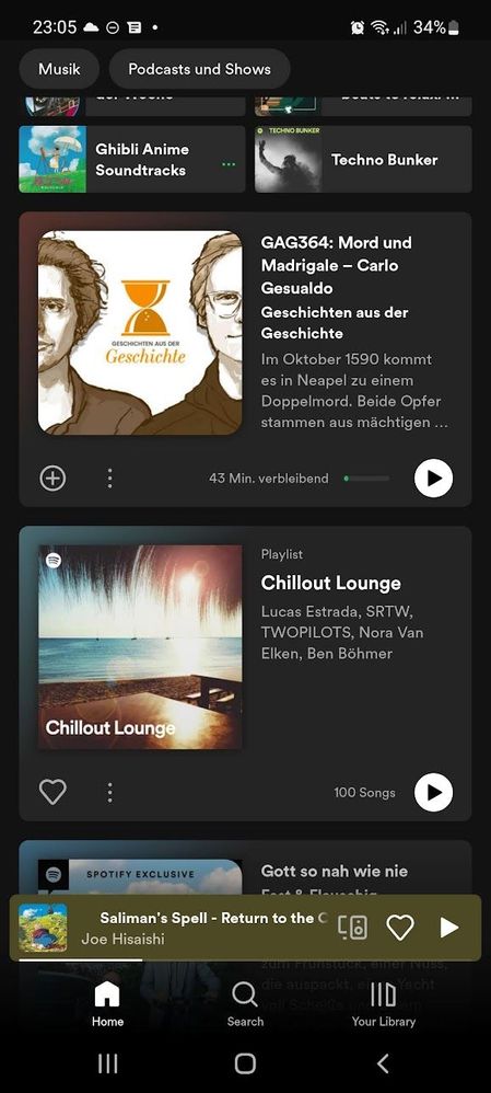
All categories, themes, groups, recommendations are gone. Home is just a list of 50 or so giant random cards:

Screenshot_20220926-230544_Spotify.jpg


The app is unusable like this. How am I supposed to find anything? I heavily rely on recommendations and "similar to x" lists. I don't need like buttonts on things I've never listened to. Who cares about description, artists, song count... It fits just 3 cards on my large phone screen. Three. I'm not blind.

It happens on iOS as well? The GUI is broken, I hope they fix it and fast

Plan

Premium

Country

USA

Device

Iphone11

Operating System

IOS 16

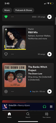
I am using IOS 16 and its the same way - Its completely unusable and is a major turn off to use the home page. It used to be a place of discovery now its a scrolling nightmare! Frustrating!

IMG_0671.PNG

I have the same issue. I can’t find a fix and have reinstalled the app (same issue remains). The new Home Screen display is nowhere near as good as the previous one. 

I contacted Customer Support about this issue and was told it's a new change and can't be undone. Very unsatisfactory from a user experience perspective.

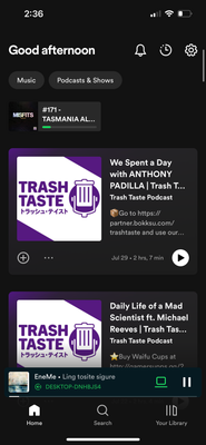
My iOS app just changes to this home layout a few hours ago. The home tab has completely changed and it’s devastating. There’s no side scrolling or themes anymore, it’s just a feed of suggestions. Also there’s no way of finding recently played music. BAD 🤯


The home tab used to be a place where I could successfully discover new music and artists. Now, the home tab has no purpose, it’s a LONG exhausting feed of BAD library suggestions. Nothing new or interesting. The new home design is useless.

8240456A-CDA0-4A77-8971-F4967D0BB7FC.png

my homepage suddenly changed and there is no longer a recently played list. It’s now just a few podcasts and playlists in a weird format and I cannot pick up where I left off. I was speaking to an agent and they said that Spotify released like a test update and I got it. I really do not like it at all.

Another update to the UI and another dissapointment. On desktop, the new UI is fine but oh boy when it came to my android phone.


Everything was nicely under their own labels before and you could see alot more stuff at the same time. This new UI seems to throw all of that into the trash, nothing is under any label or category and only 2 albums/playlists/artists are fully visible on the screen, so horrible.


I hope this **bleep** is a bug or otherwise doesn't stick around.

Screenshot_20220927_143006.jpg

Yeah I cancelled my Premium once I realised there's no way to revert it. It seems this is some A/B test so let's hope that it gets cancelled and the people responsible are never allowed to touch the app design again. My subscription ends on October 10th so they've got 2 weeks to fix this disaster.

The latest update is hideous and I hope it gets reversed.

1. My ability to browse new music has been severely limited by the giant album covers. Are all my daily mixed there? Why do I need to spend a heap of time scrolling through content I have seen before and don't want to see again?


2. I listen to podcasts once in awhile, but this app seems to think I want to be up to date with every single one. Just because I listened to a random meditation podcast X years ago doesn't mean I want updates about it. 


Overall, I hope Spotify sees this and reverts it. I can't understate how unintuitive and difficult it is to use. 


If anybody has found out how to change it back manually, please let me know.

Worst UI ever. How can I revert it back?

the new home page for ios is in my opinion horrible. Is there any way to revert it back to the old one?  It wastes so much space and recommends podcasts, when i rarely listen to podcasts, maybe 1 episode every few months. I used to use the home page to find new similar bands to what i listen to but now it just feels horrible and cluttery to use. I have to scroll almost to the bottom to find anything interesting 

4C34DB99-5BE7-4454-9852-DA1DC1AA0FE0.png

I definitely approve of what you are saying! The usecase of the home page was completely missed with the last update. As a user, I can no longer find my most recently listened to playlists. I have a hard time accessing personalized playlists. The wasted space on iPhone and iPad is immense, rarely have I had to scroll so much in an app. 

With the update, I can't find the playlist I've been listening to constantly for the last few days. No chance! I know neither the name of the playlist, nor the name of the creator. 

I can't find a single interesting musical suggestion. The generated suggestions completely miss my taste.

I hate this new UI. Please, please, please revert this back to the original.

I can't find anything. The big icons take up my whole screen. I seem to have an endless scroll with **bleep** I don't want or need.

Please trash this UI, and keep working at it while keeping the other.

If you insist on keeping this new design, at least give us the option to switch back.

I could not agree with this review more. It uses to much real estate on screen, and feels as if Spotify is trying to force feed podcasts rather than promoting the use of common playlists are suggested music. What should be a three second selection has become a twenty second ordeal having to dig and search for recently played music or recommended playlist. Spotify is not a podcast app, they are a music app, that has podcasts. Quit trying to force feed what isn't in your wheelhouse.


UI updates/rollouts should always have a reversion option in app. Not offering that option shows lack of foresight. Do gooder.

This is probably the worst UI I've ever seen. It can't even show 3 full items at once. If this can't be changed I think this is the final straw for canceling spotify and moving to Tidal 

It looks soooooo sh!t. And I realized: It isn't "helpful" anymore. The recommended podcasts (I DESPISE podcasts, don't listen to that bs) and music isn't what I like. It's just random bs. Hope they change it back. 

After uninstall and reinstall I got the old home screen back. Good.
The ugly cards are still there in the music/podcast tabs making them completely useless as filtered views.

Suggested posts