Announcements

Help Wizard

Step 1

NEXT STEP

FAQs

Please see below the most popular frequently asked questions.

Loading article...

Loading faqs...

VIEW ALL

Ongoing Issues

Please see below the current ongoing issues which are under investigation.

Loading issue...

Loading ongoing issues...

VIEW ALL

Tapping in between certain regions in app UI produces unexpected results

Tapping in between certain regions in app UI produces unexpected results

Case 1:
1. I'm viewing an album/playlist while I listen to a song
2. I want to expand the play bar to see duration, have full control over playhead, etc
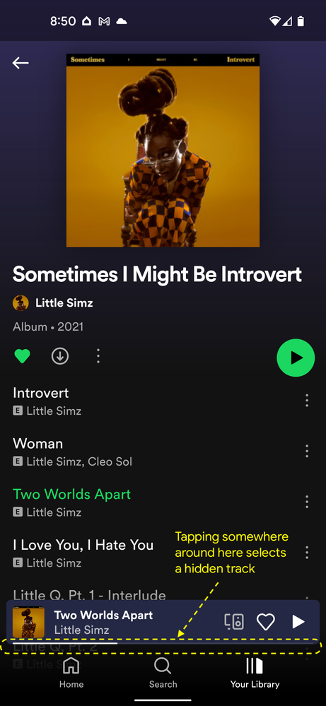
3. I unintentionally tap *just below* the play bar (about 1mm space between play bar and Home/Search/Library)

Expected: Play bar opens to full screen as if I touched play bar, or Home/Search/Library tap opens (whatever Spotify thinks is right?)
Actual: A song that is further down the playlist/album starts playing because apparently the app thinks I was trying to select a song that I can't even see because it's hidden by the play bar.

There's a similar occurrence in another screen that I can add as well.

Pixel 4a 5G Spotify version 8.7.20.1261
Reply
7 Replies

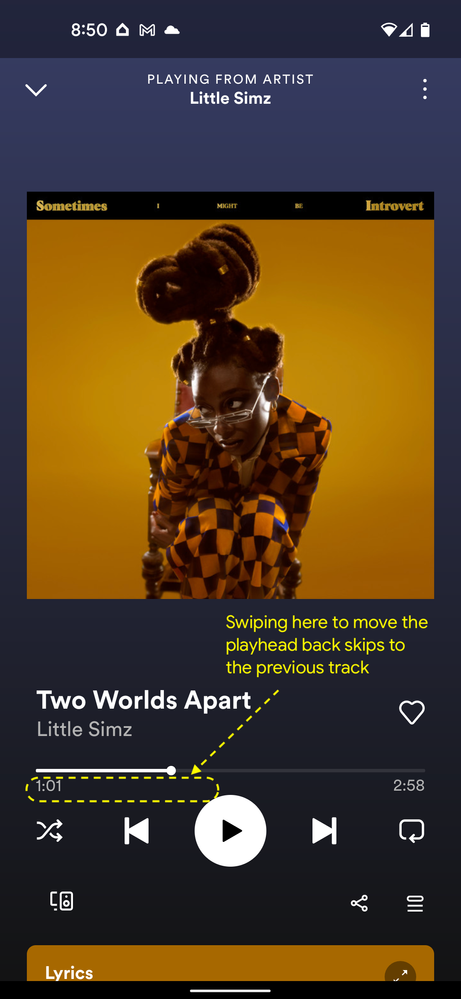
Here are two examples of this issue. Basically it appears that if no touch region is defined, the app believes I'm trying to interact with the background. However, I can't imagine anyone intending to interact with the background in either of these cases. IMO a wider touch target OR a neutral zone that does nothing would provide a better user experience than doing something unintended and unpredictable (like changing songs!) when I am not precise enough with my gestures.


Thanks!


Swiping below expanded play bar.pngTapping below minimized play bar.png

Hey there @jumunius,


We appreciate you sharing this with the Community!
It looks like this is expected behaviour, as clicking anywhere outside of the Now Playing bar means selecting something else.
We do however get how this can be frustrating and we'd like to suggest that you open an Idea about altering this feature so the Playlist section in its proximity isn't selectable as it currently is 🙂

Thanks and good luck!

VasilModerator
Help others find this answer and click "Accept as Solution".
If you appreciate an answer, maybe give it a Like.
Are you new to the Community? Take a moment to introduce yourself!

Thanks Vasil, I went ahead and filed as an Idea as you recommended. I have a hard time believing this is "expected behavior" that was consciously designed by Spotify. It seems more like an oversight that creates unexpected behaviors for a user. I should not be able to interact with invisible elements in a UI. But hopefully this gets more attention as an idea, as I'm tired of accidentally causing my songs to skip because of my lack of surgical precision with my phone screen.

Device

iPhone 13

Operating System

iOS 16.3.1

Spotify Version

8.8.14


My Issue

6E330DF7-91B2-40AD-9A14-EA33EC735B03.jpeg

There is a clickable space in between the tab bar and currently listening section which is clickable and let's you accidentally switch songs or- even worse unlike songs. When you are in your liked songs, you at least get a warning notification if you really want to unlike that song, which you are not getting when you are in a playlist. 


Hey @discoverspace,


Thanks for your reply and for the info shared. 


We hope you don't mind us moving your post, as it fits better here in this thread.


That being said, as mentioned previously in this thread by @Vasil, we can confirm this is expected behavior. We understand where you're coming from and we appreciate the time you took to let us know about it.


We'd like to share with you that another user had the same idea about this behavior. Even though the status is set as Closed - Not Enough Vote, it doesn't mean the idea has been rejected. We’d suggest adding your vote in the thumbs up icon and subscribing to the idea to get notified as soon as we have any updates to share.


We'll be here if anything else comes up. Once again, thanks for the feedback.

AlejaRModerator
Help others find this answer and click "Accept as Solution".
If you appreciate an answer, maybe give it a Like.

"That being said, as mentioned previously in this thread by @Vasil, we can confirm this is expected behavior."


Sorry, is ChatGPT your moderator? I really cannot believe that any human designer worth a 6 figure salary would actually define this as expected behavior. You are either insulting the intelligence of your designers or your users or both. If this is "as designed" then it is an oversight. What a waste of time this board is.

Also to add, if this is actually "expected" then it would be useful to understand WHY. As it stands it just seems like nobody has investigated the issue serious, beyond just looking up "what is the thin region between two UI elements supposed to do" and finding no specific recommendation, thus calling it "working as expected."

Suggested posts