Announcements

Help Wizard

Step 1

NEXT STEP

FAQs

Please see below the most popular frequently asked questions.

Loading article...

Loading faqs...

VIEW ALL

Ongoing Issues

Please see below the current ongoing issues which are under investigation.

Loading issue...

Loading ongoing issues...

VIEW ALL

New Desktop Experience - your feedback wanted!

Solved!

New Desktop Experience - your feedback wanted!

Spotify is testing a new way for you to connect with your music on Desktop. The new desktop experience features an all-new design, streamlined with the Spotify apps on all your devices. 


This is a brand-new experience and some parts are still being fine-tuned. Be sure to give feedback with the steps below to let the right folks know what you think could be improved.


The other Rock Stars and I got the chance to test the new desktop experience first and now more users will be able to test it out and give their feedback for the team. If you are a passionate Spotify user and would like to join the Rock Star Program and be part of cool experiences like this, then check out this help article.

image.png


How do I know if I’m using the New Desktop Experience?

The new desktop experience is not hard to spot with its new design! Your Library looks like this for example:

Why did the app change? 

This test is rolled out to a specific group of users at this moment. It’s not possible to sign up for this right now, but your interest is really appreciated. If you’re interested in testing out new versions of Spotify before everyone else, check this out: https://community.spotify.com/t5/Spotify-Answers/How-do-I-become-a-Spotify-Beta-tester/ta-p/4551518


If you’re looking for more information about how tests work and about how features are released, take a look here: https://support.spotify.com/article/why-am-i-seeing-different-features-than-my-friends/.


How to give feedback?

This thread is your go-to destination for asking questions, getting help for issues you may have, as well as to share your impressions and feedback on this new desktop experience. 


Keep in mind that pictures can say a thousand words, so if you have any screenshots of something you’d like to share of your experience be sure to post them here as well! The right teams at Spotify take their time to read the posts in this thread and use your feedback to fine-tune this new experience for everyone.

HuboSpotify Star
Help others find this answer and click "Accept as Solution".
If you appreciate my answer, maybe give me a Like.
Note: I'm not a Spotify employee.
Reply
Top Answer
dan
Spotify
Spotify

Hi Everyone,

Dan here from the Desktop team again.  Desktop 1.1.55 is starting to roll out now and I wanted to let you know what to expect.


Fullscreen mode
We’ve brought back a new and improved fullscreen mode for Desktop, making better use hi-res artist imagery where available.


Playlisting

  • The “create similar” playlist context menu item has been added to the main playlist list in the app
  • We’ve improved playlist loading performance when navigating throughout the client
  • Show the downloaded badge in the liked songs button when it’s available offline
  • Improvements to the use-case of filtering to find a track within a long playlist

General

  • Episode sorting on podcast show pages, back with improved performance
  • Podcast play order improvements, better selecting which episode to play when playing from cards/search etc
  • Added the ability to see subtitles on videos where they are available.
  • Improved refreshing of content on Home to ensure fresh content
  • Show the top 5 cities where people listen to an artist on the artist about page
  • Where there are multiple versions of a release, show a dropdown on the album page allowing the user to switch between them

As always, please do ensure you’re fully updated and are running the latest version. We again thank you for the feedback provided. 

Thanks,
Dan

1,317 Replies

Please guys this... still being forced to use the new interface... still hate it. very little has changed.

I honestly can't understand why over the years we have gone from iTunes having such a sensible library UI - to this. You have certainly improved the overall aesthetic and feel but at the major expense of functionallity and intuitiveness.

Revert the artist page please. I click on an artist and all i see is a ton of compilations and similar artists!??!

Discography page please

I also don't like the new Spotify interface. Ever since it rolled out in late 2020, it only appeared in my account, but my mom's account has the current (old) interface.

Screenshot 2021-03-21 151952.png

@Dan


Could we please get this sticky of info updated to reflect where the updates (accomplished and projected) are currently? I feel like there's been a lot going on and time passed, and I'm still monitoring in hopes of things reaching a level of stability where I could come back and subscribe again.


Thank you.


lblackwelluk


EDITED: for user ID

Probably already requested, but whatever:

Please bring back the Fullscreen button or add another method for displaying the current track's album cover in a big and nice way.


Kind regards

@Dan,


What are the new features for  the new version 1.1.55.498.gf9a83c60 after  have install the update on the app desktop.

Hello,


Just captured this part.

Fresh download, install and first time run of Spotify on Windows 10. No click on any objects or songs yet, pure first load 🙂


kadalzzz_0-1616516867077.png


Hope this helps for improvement. Cheers!


it's too bad what  the liked songs still hasn't the number songs and the cover to the playlist.


Hi Everyone,

Dan here from the Desktop team again.  Desktop 1.1.55 is starting to roll out now and I wanted to let you know what to expect.


Fullscreen mode
We’ve brought back a new and improved fullscreen mode for Desktop, making better use hi-res artist imagery where available.


Playlisting

  • The “create similar” playlist context menu item has been added to the main playlist list in the app
  • We’ve improved playlist loading performance when navigating throughout the client
  • Show the downloaded badge in the liked songs button when it’s available offline
  • Improvements to the use-case of filtering to find a track within a long playlist

General

  • Episode sorting on podcast show pages, back with improved performance
  • Podcast play order improvements, better selecting which episode to play when playing from cards/search etc
  • Added the ability to see subtitles on videos where they are available.
  • Improved refreshing of content on Home to ensure fresh content
  • Show the top 5 cities where people listen to an artist on the artist about page
  • Where there are multiple versions of a release, show a dropdown on the album page allowing the user to switch between them

As always, please do ensure you’re fully updated and are running the latest version. We again thank you for the feedback provided. 

Thanks,
Dan

Please bring back all tracks of all albums on the artist page.

Hi Francoisvdv

I can't yet promise anything definitive on this, but we've definitely seen the feedback around this particular change and are discussing potential options internally.

Thanks,
Dan

Thanks Kadalzzz for the report! It looks like this bug is present in the old UI but not in the new experience, but thanks for this.

  • I'm disappointed to see full screen mode go the same route as the connect apps such as TV apps and Chromecast with the artist image full screen and then the album art very small in the corner. I'd rather more focus went to seeing the album art really big. A lot goes into an album cover and I think putting it small in the corner is just bad. It appears that the full screen mode just cycles between very few artist images. That's really boring seeing the same artist image again and again, compared to the many different album covers for the artists's releases. A full screen mode with big album art, artist name, song name, album name, where it's playing from at the top (playlist name or album name), and a colorful background that adapts to the album art color would be the most idea full screen visual in my opinion. I noticed you can't scrub through the song progress in fullscreen mode, but you can click to change repeat mode and other controls. There is also no marker that moves to show the current progress on the bar. It's just white with a time on both sides -- doesn't serve any purpose at the moment than just take up space. Please add the ability to click on progress bar to change time in the song and add a marker to show the current progress. The up next notification in the top right banner is a nice addition though.


  • Thank you for looking into bringing back all songs view to artist pages, it's great news! One of the main downgrades with the new desktop app is having to go into each album individually to see all of the songs. It takes much more time to browse an artist page and I much prefer the overview of being able to scan an artist page and see all of the songs from every album. The desktop app should be more advanced for advanced users. Not just a larger size mobile app with limited features. If this is brought back it will be a great change.


  • The top cities and social links on the artist about popup should be moved to the right side of the artist bio to how it's shown now in the old desktop app. Puting the bio on the right side just looks weird. When you want to read you are reading from left to right usually and it throws me off with that stuff on the left. Also all artist images are still not showing. There seems to be a coded limit that is showing less images than the mobile app and old desktop app show for artists that have uploaded more images. The artist about popup is still way too small to be able to read and I'd rather it be a full view that is shown as a tab at the top of the artist page like the old desktop app.


  • The settings page still needs a lot of work. It's very rough at the moment. Left aligned, and no line break spaces between each settings. More space is needed between each setting. The toggles are too close to each other. The old settings page is much better.


  • The new desktop app has the same look for release pages as the mobile app but there is an inconsistency. There is no full release date in the new desktop app. The mobile app shows the full month, day, and year of when an album was released. Bringing this to the desktop app would be nice. I often wonder when a release was released exactly. Why does the mobile app show more info about a release than a desktop app that is supposed to be more advanced?


Maybe these 2 issues are related to my post here:
https://community.spotify.com/t5/Your-Library/Artists-section-of-Library-no-longer-works-after-follo...


  • I follow 2,000+ artists and users combined but my profile is limiting the following count to 1,000


  • Artists tab in Your Library is not showing me all of the 2,000+ artists I follow. Scrolling through I see a lot are missing and if I search the artists tab they also don't come up. If I go to the artist pages of the ones that are not showing it does show I am following them so why aren't they showing. It seems to be same problem with profile showing that I am only following 1,000 when I am for sure following more.
MattSudaSpotify Star
Help others find this answer and click "Accept as Solution".
If you appreciate my answer, maybe give me a Like.
Note: I'm not a Spotify employee.

Hey @dan, I'm glad to hear from the Desktop Team.. 😉


Huge user of the Desktop version since 2009, I have seen all the changes along the years and I must say that with actual version 1.1.55.498 (for me), I am "almost" fully satisfied and I can enjoy totally what I am using Spotify for.


So, why I have said "almost satisfied" ? 😆 


What I miss is mostly part of the search feature that I use a lot when creating my various playlists.


1 - Single search : 


Why it's not possible to order in all the ways possible search results ?


That is a main feature of a search function. It's very useful for : (e.g) find all the version of a same song by different artists or find different songs with same title, etc...


2 - Multiple search :


When doing a multiple search : (e.g) / year:1992 genre:hip-hop \


Why the result page gives only Songs and not also Albums ? 


In a single search (e.g.) / year:1992 \ we get both Songs and Albums.


That's my main concern all the rest is just little details. I have just a wish for the future : Keep the Desktop version unique, don't try to make it looking like the Web Player but rather try to make the Web Player looking like and as useful as the Desktop. 😆 (that said, I never use the Web Player 😆 )


twitter.com/soundofus

www.soundofus.com


SoundofusSpotify Star
Help others find this answer and click "Accept as Solution".
If you appreciate my answer, maybe give me a Like.
Note: I'm not a Spotify employee.

Hello @dan,

Since 2015, the settings is not updated. it would be nice if the desktop team added new function to the settings. for example add tab feature to sleep.

Thank you, Dan! The new full-screen mode is amazing!
MateusMSpotify Star
Help others find this answer and click "Accept as Solution".
If you appreciate my answer, maybe give me a Like.
Note: I'm not a Spotify employee.

I really like the new design, however, the option "show desktop overlay when using media keys" isn't there. I would really appreciate it if you could bring this options back.
Marked as solution

Hi everyone, we have an announcement in the Blog about the Desktop App. I'm going to lock this thread and move the conversation to there. 

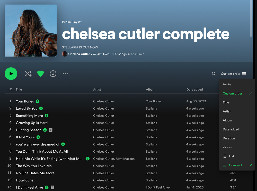
Good news! The "Artist" column is back!


There is now a new Compact Mode for track lists (playlists and album pages) in the desktop app and Web Player


This has been a highly requested feature since the redesign came out a few years ago.


The drop down menu now has "Sort by" and "View as" options. To turn on compact mode, open up the drop down menu at the top right of a playlist or album page and click on "Compact" under "View as".


On Playlist pages, it removes the album art, and breaks out "Title" and "Artist" into their own separate columns again. This view is similar to before the redesign that added album art into playlists a few years ago.


On Album pages, it moves the artist and featured artists from below each track title, to a new "Artist" column to the right of the "Title" column.


When you turn on Compact Mode, it will be remembered and stay on when you are viewing both playlists and album pages. You can switch back to the regular "List" view at any time.


The new Compact Mode for track lists is rolling out in the desktop app and Web Player right now so you should be seeing it soon.


Desktop Compact List Mode.png

MattSudaSpotify Star
Help others find this answer and click "Accept as Solution".
If you appreciate my answer, maybe give me a Like.
Note: I'm not a Spotify employee.

Suggested posts