- Home
- Help
- Your Library
- New Your Library view (iOS & Android)
Help Wizard
Step 1
Type in your question below and we'll check to see what answers we can find...
Loading article...
Submitting...
If you couldn't find any answers in the previous step then we need to post your question in the community and wait for someone to respond. You'll be notified when that happens.
Simply add some detail to your question and refine the title if needed, choose the relevant category, then post.
Just quickly...
Before we can post your question we need you to quickly make an account (or sign in if you already have one).
Don't worry - it's quick and painless! Just click below, and once you're logged in we'll bring you right back here and post your question. We'll remember what you've already typed in so you won't have to do it again.
FAQs
Please see below the most popular frequently asked questions.
Loading article...
Loading faqs...
Ongoing Issues
Please see below the current ongoing issues which are under investigation.
Loading issue...
Loading ongoing issues...
Help categories
Account & Payment
Using Spotify
Listen Everywhere
New Your Library view (iOS & Android)
New Your Library view (iOS & Android)
- Mark as New
- Bookmark
- Subscribe
- Mute
- Subscribe to RSS Feed
- Permalink
- Report Inappropriate Content
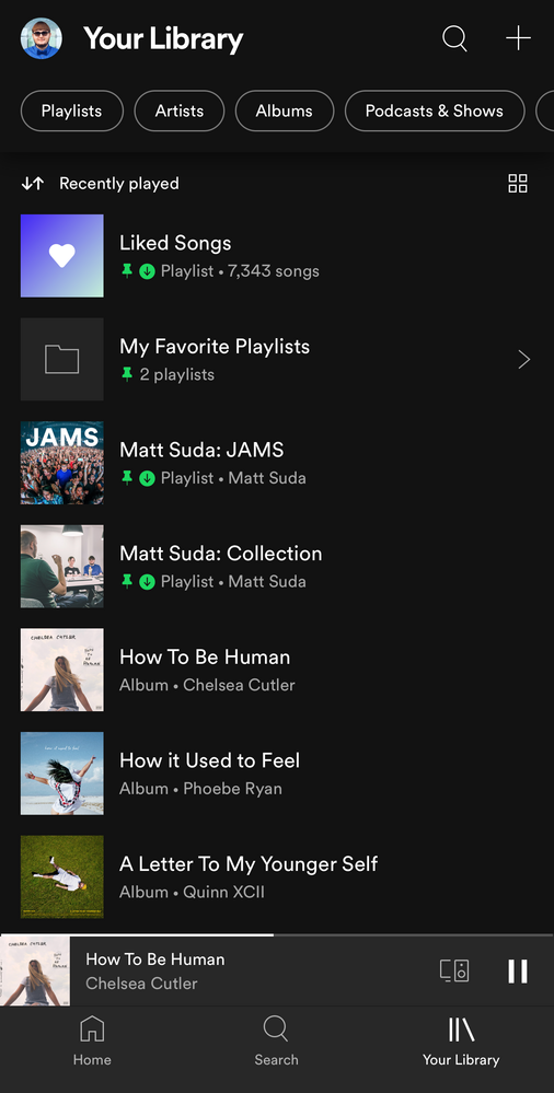
Spotify is introducing a new version of the Your Library view to mobile users of the iOS and Android apps. When you open up the Spotify mobile app you will see this new view. 📱
Check out this Spotify news article for more information:
Listeners Can Explore Their Spotify Collections Faster and Easier With a New ‘Your Library’
This thread is your go-to destination for getting an overview of what's new, asking questions, getting help for issues you might have, as well as to share your feedback on this new version of Your Library. Also, do you have any tips for other users on how you are using the new Your Library? We'd love to hear them.
What's new?
- See your entire collection in one simple list
- Dynamic filters and better sort options for your collection
- Pinned library items to find your favorites, faster
- More control at your fingertips with a new grid view
- Universal search allows you to search through your entire collection and see your recent searches
- Faster settings navigation allows you to tap on your profile picture to get to settings faster
- Get to your downloads, faster
Here is a walkthrough of what's new:
One simple list:
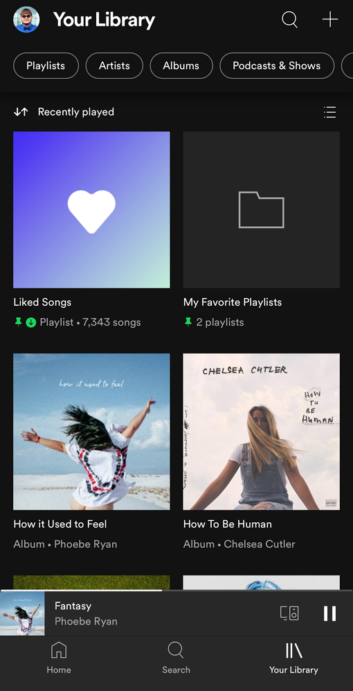
Your Library is now one simple list. At the top, tap on the filters to filter the content you want to see and tap on the sort options to change the sort order of the list. To create a new playlist, tap on the + (plus) symbol at the top right corner.
Dynamic filter options:
At the top, tap on the filters to filter the content you want to see. Tap on the X and then chose another filter to see another type of content. Having no filter selected will show all types of content in the list.
- Playlists
- Artists
- Albums
- Podcasts & Shows
- Downloaded
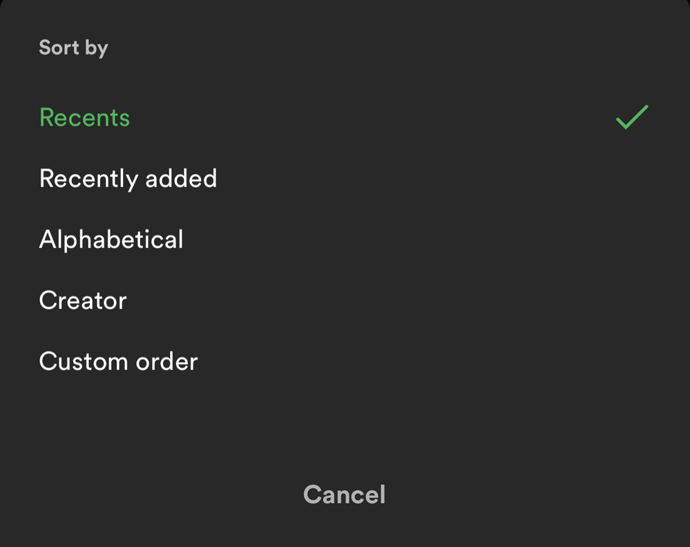
Sort options:
At the top, tap on the sort options to change the sort order of the list.
- Recents
- Recently added
- Alphabetical
- Creator
And in the "Playlists" filter view, you'll have this option to see your playlists in your own order like in the desktop app and web player:
- Custom order
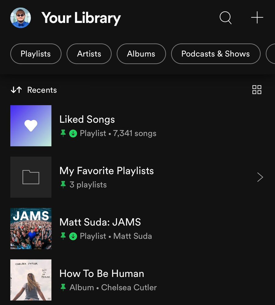
📌 Pinned library items:
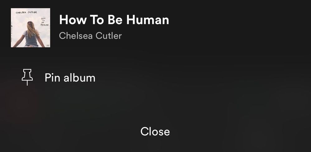
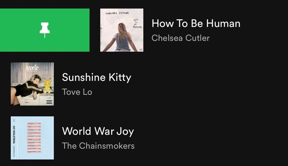
If you tap and hold on the screen on any item in the Your Library list or swipe right on it, an option will show up allowing you to pin it and it will stay at the top of the Your Library list.
You can pin anything in Your Library such as playlists, playlist folders, artists, albums, and podcasts. The limit is 4 pinned items. You can unpin "New Episodes" to free up a pin and still get to that using the "Podcasts & Shows" filter or by searching for it. Same with "Liked Songs", you can unpin it and still get back to it at the top of the "Playlists" filter when it is sorted by "Custom order" or by searching for it. You can also pin the "Your Episodes" list to the main library view in addition to the "New Episodes" list if you also want to be able to access "Your Episodes" from the main library view without having to filter to "Podcasts & Shows" first.
To pin more playlists when you run out of the 4 item pins, you can make a playlist folder in the desktop app or web player and then move multiple playlists inside it and then pin the folder in the mobile app. Then tap on the folder at the top and there you go, easier access to all the playlists in that folder and that can be your 4th pin. However, you can't pin a specific playlist if it is in a folder, so you will need to pin the folder instead. Tip: In the desktop app or web player you can also move playlist folders inside of another playlist folder. That means you can pin a playlist folder that contains a whole bunch of other playlist folders if you want to get super organized.
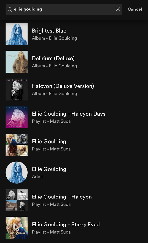
To easily find the item you want to pin, the best way is to use the universal search. At the top of Your Library, tap on the search icon and search for the item you want to pin. The universal search searches your entire library for playlists, playlist folders, artists, albums, podcasts and also shows you your recent searches.
Grid view:
Are you a visual person? You're in control. With the new grid view you can view Your Library with bigger artwork if that's your jam. This is great for when you're on the go or in the car so you can find what you're looking for faster. To switch to the grid view, tap on the squares icon to the right. Tap on it again to go back to the list view.
Universal search:
The new universal search can be accessed by tapping the search icon at the top right corner. The new search allows you to quickly search through your entire library for playlists, playlist folders, artists, albums, and podcasts without having to go to a specific content section.
Recent searches:
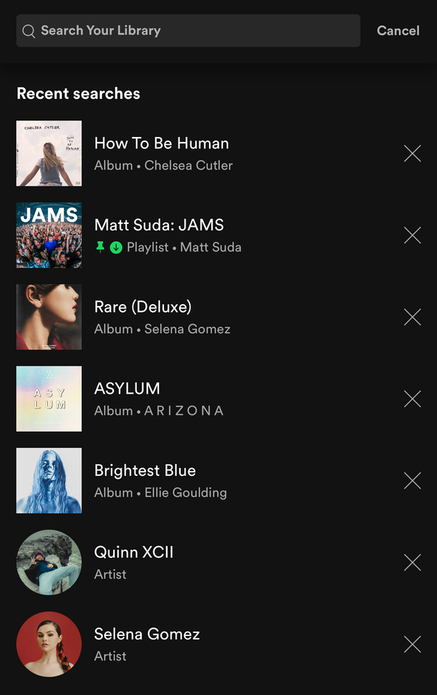
The new universal search also shows you your most recent Your Library searches so you can quickly get back to what you previously searched for.
Faster settings navigation:
Tap on your profile picture in the top left corner to get to settings faster.
Downloads: (Requires Premium)
When you are in offline mode you'll see your downloaded content faster upon app launch in the home tab.
In Your Library, tap on the "Downloaded" filter either in the main list view or after tapping on a filter to view your downloaded content.
How the new version of Your Library (iOS & Android) evolved over time during testing:
When the new version of Your Library on mobile was being tested with users, a few of the main points of feedback were the following:
- Add a custom sort option for the playlists filter like in the old library view
- Add a way to see a feed of new podcast episodes like in the old library view
These two options were added during the testing phase. Other points of feedback were also made by users during the test, but Spotify is always looking to improve the app so hopefully the new library experience will improve over time.
I personally like being able to see my playlists in the same custom sort order I have them arranged in the desktop app, so I was glad to see that issue was addressed. A bonus feature was also added which is the ability to pin a few of your favorite items to the top of Your Library. I really like being able to have my favorites one tap away at the top of my library. A few other new features that I like are being able to quickly search through my entire library, being able to see my library in a new grid view, and being able to get to settings right from the library view.
Feedback:
Now that the new version of Your Library on mobile is rolling out to all users, what do you think? You can leave your feedback as a reply in this thread. If your feedback is suggesting certain changes, it is best to also post each individual idea in the Community Idea Exchange where users can vote and comment on your ideas and it'll be easier to track each idea. You can read more about how your feedback reaches Spotify here.
- Subscribe to RSS Feed
- Mark Topic as New
- Mark Topic as Read
- Float this Topic for Current User
- Bookmark
- Subscribe
- Printer Friendly Page
- Mark as New
- Bookmark
- Subscribe
- Mute
- Subscribe to RSS Feed
- Permalink
- Report Inappropriate Content
The update is horrible, the UI is a mess. The feature I used the most is now gone, there's no way to roll back to an older, stable, clean, nice looking, user friendly version of Spotify on my phone. I've long sense given up all hope on the crappy web version, and after my Deskstop version updated itself without confirming with me or even informing me of there being an update available, I can't see a reason why I even want to keep using spotify.
Simply put: "Simplified" is just your guys way of saying "hey we're doing something without asking people and now you're stuck with it!"
Bring back the old UI, you know, the one THAT SORTED PODCASTS BY RECENTLY UPDATED, not this shitty "New Episodes" blob that sits at the top of the "list". I don't always listen to new podcasts episodes, letting them build up episodes so I can binge a specific series while working. I used to be able to look at the list of podcasts and see when a podcast was last updated, be it yesterday, or last week, and know from a glance when a new episode was added. Now I need to open a specific "playlist" to see all the new episodes of my podcasts, wait about ten minutes for the app to load (on wifi, with me being the only person using it because spotify refuses to acknowledge internet half the time I try to do anything), scroll through a mishmash list of podcasts, looking for specific episodes to download or que up, and then use the "Your Episodes" block just to view what I have downloaded.
Whoever designed the new UI should feel bad for themselves, I don't care what people think of this comment, but seriously, change the UI back, or give people the option to revert, the "new" one is a pile**bleep**
- Mark as New
- Bookmark
- Subscribe
- Mute
- Subscribe to RSS Feed
- Permalink
- Report Inappropriate Content
There is already a lot of feedback in this thread that makes good points, but I have to double down on one: the removal of custom playlist order has nearly killed my desire to use this app. The whole point of a custom playlist order, to me at least, was that I knew what order the playlists would be in, so I could navigate the library/playlist screen quickly. I spent a long time ordering my playlists in terms of how easy it would be to access the ones I want to use. Now, the fact that the library page is based on recent listens means that it will be different every time I see it, which is a disaster in terms of ease of use.
It was already frustrating not being able to change the playlist order on mobile, but this has taken the frustration to another level. I hate to say that the change should be completely reverted, but I cannot see a solution with this new screen where ease of use still isn't significantly hurt.
- Mark as New
- Bookmark
- Subscribe
- Mute
- Subscribe to RSS Feed
- Permalink
- Report Inappropriate Content
“There is already a lot of feedback in this thread that makes good points, but I have to double down on one: the removal of custom playlist order has nearly killed my desire to use this app. The whole point of a custom playlist order, to me at least, was that I knew what order the playlists would be in, so I could navigate the library/playlist screen quickly. I spent a long time ordering my playlists in terms of how easy it would be to access the ones I want to use. Now, the fact that the library page is based on recent listens means that it will be differentevery time I see it, which is a disaster in terms of ease of use.”
Custom playlist order is actually one of the only things this update didn’t ruin. When you’re filtering by playlists, the option for custom sorting is on the dropdown menu for sorting options. It is missing from every other view unfortunately, but it does still exist for playlists.
- Mark as New
- Bookmark
- Subscribe
- Mute
- Subscribe to RSS Feed
- Permalink
- Report Inappropriate Content
Even as a casual user, I don't appreciate having to press more buttons to get to the screen that I want. Maybe a compromise could be that the app "remembers" which filters you had on it last? So if I press the "playlists" filter, it'll stay like that forever, or at least until I choose something else? Curious to hear other people's thoughts.
- Mark as New
- Bookmark
- Subscribe
- Mute
- Subscribe to RSS Feed
- Permalink
- Report Inappropriate Content
“Maybe a compromise could be that the app "remembers" which filters you had on it last? So if I press the "playlists" filter, it'll stay like that forever, or at least until I choose something else?”
That is a good start, and ordinarily I’d agree with something like that — but the only solution here is to revert this terrible update. They probably don’t want to because it took time to implement and time is money… but with some common sense and forward thinking, and perhaps some real user testing and feedback collection, this mistake could’ve been avoided.
- Mark as New
- Bookmark
- Subscribe
- Mute
- Subscribe to RSS Feed
- Permalink
- Report Inappropriate Content
Glad there's more people voicing their opinion on this abomination of a ui now, hopefully they'll revert it but that's unlikely. C. R. A. P. (seriously y'all censor that word? 4 year olds say it come on now) like this is exactly why I have auto update turned off. I will continue to not update until my version of the app straight up stops functioning. You'd think a monkey or rabid gerbil designed this mess.
- Mark as New
- Bookmark
- Subscribe
- Mute
- Subscribe to RSS Feed
- Permalink
- Report Inappropriate Content
One thing that sucks, if you choose one filter, all other filter disappears, and you have to tap once to undo the filter and tap another time to choose another filter. This is really annoying!!!
Take a look at youtube home page (pc version) and do that instead.
- Mark as New
- Bookmark
- Subscribe
- Mute
- Subscribe to RSS Feed
- Permalink
- Report Inappropriate Content
- Mark as New
- Bookmark
- Subscribe
- Mute
- Subscribe to RSS Feed
- Permalink
- Report Inappropriate Content
I can only add to the chorus of opprobrium. I only use my PC for Spotify - mobile almost never - and once again your changes have been made with mobile users in mind only. It's 2014 all over again.
The worst thing of all is that you've taken away the scrolling arrows so I can only move up and down my playlists with extreme difficulty. I have to manhandle my mouse in order to scroll at all. Try taking away the scrolling arrows on this website and see how easy it is to get around. I also don't seem to be able to add new playlists, only save to my library. Who knows what obstacles are in store once I explore further... in fact, my Liked Songs section is a dog's dinner as well.
I found it easy to find and add new material yesterday. Why make it so difficult all of a sudden?
I love Spotify when it's user friendly. This new version is a chore to use. I'm not sure I'll bother unless or until you revert to the old modes of functionality. Why do you keep doing this?
- Mark as New
- Bookmark
- Subscribe
- Mute
- Subscribe to RSS Feed
- Permalink
- Report Inappropriate Content
To mix music and podcasts in “Your Library” is a colossal bad idea. You want to listen to spoken words OR music. Never should the two meet. Please take this away.
Also
When you finally have sorted out that you want Podcast and Shows the sort order I used is gone. You can no longer sort for “latest update” for each podcast.
Conclusion: Spotify is for music! For podcasts, use another app!
- Mark as New
- Bookmark
- Subscribe
- Mute
- Subscribe to RSS Feed
- Permalink
- Report Inappropriate Content
WORST updaye you have ever done. Third time trying to post and it keeps kicking my review out. Starting to think its on purpose.
This update makes everything a higgledy piggledy jumbled up mess that it much more confusing to navigate.
There is no quick and easy way to access the downloaded content. Going to podcasts tab and downloaded filter only shows a list of shows i have episodes downloaded for not a list of the episodes i've downloaded. The "your episodes: list might have addressed this except it doesnt only show downloaded content so i would have to remove an episode from the list as well as remove the download. More clicks. I dont want to have to do MORE WORK.
I use spotify as i am driving on long commutes. I need a quick way to access downloaded content so i can hit play and forget about it. This "update" does not provide that. I dont like switching platforms as i am already used to spotify, but i might because you keep making it more difficult to access downloaded content.
- Mark as New
- Bookmark
- Subscribe
- Mute
- Subscribe to RSS Feed
- Permalink
- Report Inappropriate Content
The update gave me a view of 12 tracks at a time on my 24" monitor and I thought that was bad! You can at least get around that one by clicking View > Zoom out.
- Mark as New
- Bookmark
- Subscribe
- Mute
- Subscribe to RSS Feed
- Permalink
- Report Inappropriate Content
Where did the hidden artist/tracks folder go that was under artist and playlists ?! It’s missing I used that to managed my blocked artists!
[Mobile][Your Library] Bring back Hidden/Block Art... - The Spotify Community
- Mark as New
- Bookmark
- Subscribe
- Mute
- Subscribe to RSS Feed
- Permalink
- Report Inappropriate Content
It's almost an improvement. If each section remembered it's sorting order I'd enjoy it. Also, just a maximum of 4 pins?! Why is there even a limit, let alone one below 10.
- Mark as New
- Bookmark
- Subscribe
- Mute
- Subscribe to RSS Feed
- Permalink
- Report Inappropriate Content
I need now several pages with >65 replies to check whether I find a solution to my simple question: "How can I get back to my individual introduced sorting of folders and playlists?"
I want to control my library on my own. What now happend from one day to the next is not acceptable. Why are you doing this? Do your iOS App developer have to much time?
I recommend to come closer to the real needs of the customer. So, please give us back the option to sort our music to our needs!
- Mark as New
- Bookmark
- Subscribe
- Mute
- Subscribe to RSS Feed
- Permalink
- Report Inappropriate Content
Please change it to the old application, soon!
My whole music is unsorted now. E.g. I named folders which contain single playlists with numbers from 01 to 99 at the beginning to easily sort this due to my personal preference and frequency of listening.
Now, all these folders and playlists are completely mixed. It is a disaster. I do not find an option to sort this again to my needs as mentioned above.
- Mark as New
- Bookmark
- Subscribe
- Mute
- Subscribe to RSS Feed
- Permalink
- Report Inappropriate Content
Me too, please.
If a "classic view" is not back introduced it is time to have an eye on Apple Music, I guess after all these years with Spotify.
I will not spend minutes to navigate through a madly mixed library (even while driving a car) for every song or every album.
P.S.: If I reply to one comment in this whole thread the comment is put to the end of the thread list and it is not transparent to which comment I refer. Sorry from my side to the other users.
- Mark as New
- Bookmark
- Subscribe
- Mute
- Subscribe to RSS Feed
- Permalink
- Report Inappropriate Content
Hey where is the block artist folder that used to be at the bottom of the old playlist and artist section!? We need this to manage our blocked artist!
This is a vital parental control feature to block artists that are explicit even though they are not labeled as explicit! I use this to block pornography artists all together who have pornography album covers! We need this manager feature back. Because you got a 100 artist block limit and now I can’t block them if I hit my limit.
Vote here to bring it back!: https://community.spotify.com/t5/Idea-Submissions/Mobile-Your-Library-Bring-back-Hidden-Block-Artist...
- Mark as New
- Bookmark
- Subscribe
- Mute
- Subscribe to RSS Feed
- Permalink
- Report Inappropriate Content
Again, not the best update at all, please give an option to change back. Thank you
- Mark as New
- Bookmark
- Subscribe
- Mute
- Subscribe to RSS Feed
- Permalink
- Report Inappropriate Content
Suggested posts
Hey there you, Yeah, you! 😁 Welcome - we're glad you joined the Spotify Community! While you here, let's have a fun game and get…
