Help Wizard
Step 1
Type in your question below and we'll check to see what answers we can find...
Loading article...
Submitting...
If you couldn't find any answers in the previous step then we need to post your question in the community and wait for someone to respond. You'll be notified when that happens.
Simply add some detail to your question and refine the title if needed, choose the relevant category, then post.
Just quickly...
Before we can post your question we need you to quickly make an account (or sign in if you already have one).
Don't worry - it's quick and painless! Just click below, and once you're logged in we'll bring you right back here and post your question. We'll remember what you've already typed in so you won't have to do it again.
FAQs
Please see below the most popular frequently asked questions.
Loading article...
Loading faqs...
Ongoing Issues
Please see below the current ongoing issues which are under investigation.
Loading issue...
Loading ongoing issues...
Help categories
Account & Payment
Using Spotify
Listen Everywhere
What's up with this new Home screen?
What's up with this new Home screen?
- Mark as New
- Bookmark
- Subscribe
- Mute
- Subscribe to RSS Feed
- Permalink
- Report Inappropriate Content
Whats up with the new home screen being random playlist? Its really bad, can I change it back?
- Labels:
-
iOS
- Subscribe to RSS Feed
- Mark Topic as New
- Mark Topic as Read
- Float this Topic for Current User
- Bookmark
- Subscribe
- Printer Friendly Page
- Mark as New
- Bookmark
- Subscribe
- Mute
- Subscribe to RSS Feed
- Permalink
- Report Inappropriate Content
It seems to have reverted back to way it was before, so i think it might have been a bug or a glitch!
False alarm! Can't be too sure with spotify though
- Mark as New
- Bookmark
- Subscribe
- Mute
- Subscribe to RSS Feed
- Permalink
- Report Inappropriate Content
They heard enough complaints to revert.
- Mark as New
- Bookmark
- Subscribe
- Mute
- Subscribe to RSS Feed
- Permalink
- Report Inappropriate Content
Hey there folks,
Thanks for reaching out to the Community about this!
To be most accurate in our advice, a screenshot of what you see on your Home screen would've been very helpful for us.
Feel free to leave your details here like your device's model and OS version, along with the Spotify version you're currently running. If you don't know how to check it - go to this FAQ.
We'll be on the lookout for your replies!
- Mark as New
- Bookmark
- Subscribe
- Mute
- Subscribe to RSS Feed
- Permalink
- Report Inappropriate Content
Why did Spotify start up the terrible UI, again? Literally a day after the reversion due to all of the complaints about it's poor design and execution....
- Mark as New
- Bookmark
- Subscribe
- Mute
- Subscribe to RSS Feed
- Permalink
- Report Inappropriate Content
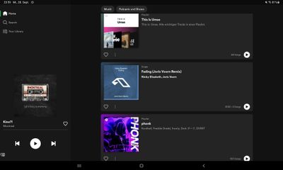
And it is back to the unusable card design on Home... just 3 cards on my tablet, this is not funny. Categories, themes, recommendations are missing. This is just a short list of things related to what I last listened to.
Subscription cancelled again.
- Mark as New
- Bookmark
- Subscribe
- Mute
- Subscribe to RSS Feed
- Permalink
- Report Inappropriate Content
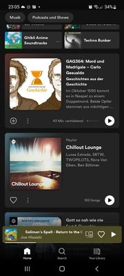
It looks like this on mobile. Themes, recommendations, categories are missing from Home and have been replaced with a few gigantic cards:
I'm paying to discover music which is impossible in this state.
- Mark as New
- Bookmark
- Subscribe
- Mute
- Subscribe to RSS Feed
- Permalink
- Report Inappropriate Content
Its completely unusable and i dont understand why they did it! I hope they revise it ASAP cause theyre about to lose hella people - I tried uninstalling and reinstalling but it showed up again
- Mark as New
- Bookmark
- Subscribe
- Mute
- Subscribe to RSS Feed
- Permalink
- Report Inappropriate Content
Agreed this is insane.

- Mark as New
- Bookmark
- Subscribe
- Mute
- Subscribe to RSS Feed
- Permalink
- Report Inappropriate Content
2 days ago, my home page randomly changed. Aside from the 6 small recent activity rectangles at the top, everything below was an unorganized list of equally large cards. I don’t enjoy having to scroll so much to see the same amount of content as before. I preferred the compact layout that the app typically has. This is especially unfavorable when the recommendations (such as albums) are not well suited to my music tastes. Before, they took up less spaces, so it was easier to glance over them without much issue. I really liked the different sizes of things (the few albums/ playlists at the top to show most recent activity, the artist recommendations, and the playlists at the bottom). I also really liked the added announcement button. I’m not sure if those features would be integrated into this new layout, but it would be hard to make them stand out like they do now. I could see this layout being helpful for people who have visual impairments because the text and images are so large. Perhaps this could be an available option for those who are more comfortable with larger displays, even if they are not as efficient. This display, however, should not replace the style from before. I will attach screenshots of my current home page display.
- Mark as New
- Bookmark
- Subscribe
- Mute
- Subscribe to RSS Feed
- Permalink
- Report Inappropriate Content
This is the home page bug right? With the 50,000 giant cards? Just saw this again. Yesterday, I re-downloaded the app and the home page went back to its original design with all the discovery pathways. BUT this afternoon it reverted back to the CARD FEED.
- Mark as New
- Bookmark
- Subscribe
- Mute
- Subscribe to RSS Feed
- Permalink
- Report Inappropriate Content
Plan
Premium
Country
US
Device
Samsung Galaxy S8
Operating System
Android 9
Spotify Version
8.7.68.568
My Question or Issue
The homescreen for my app just updated to a new layout that is abysmal. It no longer gives me my categories to scroll through it only gives me several different albums and playlists with no clear demarcation whether its recently played, recommended, or other. I absolutely despise this and want to change my layout back to the previous ui version as its actively making me want to use your service less and less and might make me go to a different service if not fixed in some way.

- Mark as New
- Bookmark
- Subscribe
- Mute
- Subscribe to RSS Feed
- Permalink
- Report Inappropriate Content
YEAH Idk why they're pushing for it so hard it's so bad - who is the person that came up with this fr
- Mark as New
- Bookmark
- Subscribe
- Mute
- Subscribe to RSS Feed
- Permalink
- Report Inappropriate Content
This just broke again. Deleting and downloading the app worked for 24 hours. Then this afternoon, the home update came back. NOOOooooOo.
- Mark as New
- Bookmark
- Subscribe
- Mute
- Subscribe to RSS Feed
- Permalink
- Report Inappropriate Content
It’s such a bad experience. I’ll still use the app but now I have to evolve. Look at us trying to evolve by avoiding the home page like it’s a crime scene.


- Mark as New
- Bookmark
- Subscribe
- Mute
- Subscribe to RSS Feed
- Permalink
- Report Inappropriate Content
The new IU is absolutely hideous. I scroll down and only see things I don't have any interest in listening to? Even playlists i don't follow and artists I have hidden. I rely a lot on having my most recent playlist on the homepage or the on repeat playlist and that's now nowhere to be seen. I hope developers consider this and revert things to how it was before.
- Mark as New
- Bookmark
- Subscribe
- Mute
- Subscribe to RSS Feed
- Permalink
- Report Inappropriate Content
This new UI is unbearable. It's gonna be a deal breaker for me. Not only are the recently played and new release options gone, all I'm being shown are playlists full of artists I don't care about and podcasts I don't listen to. It's ridiculous.
- Mark as New
- Bookmark
- Subscribe
- Mute
- Subscribe to RSS Feed
- Permalink
- Report Inappropriate Content
I hate this so much. The only reason I use spotify was the UI. Now Apple seems WAY more appealing.
- Mark as New
- Bookmark
- Subscribe
- Mute
- Subscribe to RSS Feed
- Permalink
- Report Inappropriate Content
I have the same problem. It reverted to the old version yesterday but today the terrible version is back. Very poor from Spotify.
- Mark as New
- Bookmark
- Subscribe
- Mute
- Subscribe to RSS Feed
- Permalink
- Report Inappropriate Content
The new ui is terrible. It’s difficult to navigate and has a lot of wasted space. I trust you didn’t spend a lot of time on it because it looks like a beginner developer did it in 10 minutes. Bring back the previous.
- Mark as New
- Bookmark
- Subscribe
- Mute
- Subscribe to RSS Feed
- Permalink
- Report Inappropriate Content
Is this a sick joke? The new UI is absolutely terrible. It was much better and clearer before. And if you look at the amount of complaints about it, Spotify would be well advised to give people what they want.
Suggested posts
Hey there you, Yeah, you! 😁 Welcome - we're glad you joined the Spotify Community! While you here, let's have a fun game and get…


