- Home
- Help
- Desktop Windows
- New Design, Desktop
Help Wizard
Step 1
Type in your question below and we'll check to see what answers we can find...
Loading article...
Submitting...
If you couldn't find any answers in the previous step then we need to post your question in the community and wait for someone to respond. You'll be notified when that happens.
Simply add some detail to your question and refine the title if needed, choose the relevant category, then post.
Just quickly...
Before we can post your question we need you to quickly make an account (or sign in if you already have one).
Don't worry - it's quick and painless! Just click below, and once you're logged in we'll bring you right back here and post your question. We'll remember what you've already typed in so you won't have to do it again.
FAQs
Please see below the most popular frequently asked questions.
Loading article...
Loading faqs...
Ongoing Issues
Please see below the current ongoing issues which are under investigation.
Loading issue...
Loading ongoing issues...
Help categories
Account & Payment
Using Spotify
Listen Everywhere
New Design, Desktop
New Design, Desktop
- Mark as New
- Bookmark
- Subscribe
- Mute
- Subscribe to RSS Feed
- Permalink
- Report Inappropriate Content
Plan
Premium
Country
Germany
Device
Notebook
Operating System
Windows 8.1
My Question or Issue
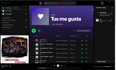
I had to notice today that the design of Spotify has changed again. I guess this can't be undone, right? The previous design was much more compact, if I remember correctly. I think the top and bottom bars are too wide, it just takes up space, especially if you have a small screen. Is there anything I can do to change the design?
- Subscribe to RSS Feed
- Mark Topic as New
- Mark Topic as Read
- Float this Topic for Current User
- Bookmark
- Subscribe
- Printer Friendly Page
Hi everyone,
Thank you for your input so far - we appreciate it!
We can confirm that this was a test that will be gradually coming to an end over the course of the next couple of days. Some of you might have already received the update - it should roll out to the rest of you soon as well.
Thanks again for your feedback. The suggestions you've submitted here will be taken into consideration moving forward.
The Community is always here if something else comes up.
Have a good one!
- Mark as New
- Bookmark
- Subscribe
- Mute
- Subscribe to RSS Feed
- Permalink
- Report Inappropriate Content
Hi! I always enjoy a refreshed update to a macOS app but this update seems a bit strange for a couple of reasons: the navbar at the top looks pretty empty and just pushes all the content down without adding any extra value for the space used for a home button and a search input.
Moreover, the Friend Activity button placement seems inappropriate because it has nothing to do with the music-related buttons around it. Given all that free space in the new navbar, it would make more sense to have it near the profile icon since it's about social stuff and your friends activity, rather than lyrics, queue or devices.
Maybe even more stuff from the bottom player could be moved to the top navbar, making room for a more clear player.

- Mark as New
- Bookmark
- Subscribe
- Mute
- Subscribe to RSS Feed
- Permalink
- Report Inappropriate Content
Plan
Premium
Country
Romania
Device
MacBook Pro 14
Operating System
macOS 12.6
Hi! I always enjoy a refreshed update to a macOS app but this update seems a bit strange for a couple of reasons: the navbar at the top looks pretty empty and just pushes all the content down without adding any extra value for the space used for a home button and a search input.
Moreover, the Friend Activity button placement seems inappropriate because it has nothing to do with the music-related buttons around it. Given all that free space in the new navbar, it would make more sense to have it near the profile icon since it's about social stuff and your friends activity, rather than lyrics, queue or devices.
Maybe even more stuff from the bottom player could be moved to the top navbar, making room for a more clear player.

- Mark as New
- Bookmark
- Subscribe
- Mute
- Subscribe to RSS Feed
- Permalink
- Report Inappropriate Content
Plan
Premium
Country
Brazil
Device
Dell Vostro 2020
Operating System
Windows 11
My Question or Issue
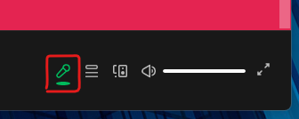
On desktop app, the dot icon below lyrics icon is stretched
- Mark as New
- Bookmark
- Subscribe
- Mute
- Subscribe to RSS Feed
- Permalink
- Report Inappropriate Content
Plan
Premium
Country
Costa Rica.
Device
Windows PC
Operating System
Windows 11 21H2
My Question or Issue
Hello, I wanted to ask how to update desktop spotify to the most recent version, since a friend sent me that photo and I saw that the interface was new and had the group session function and that is why im interested.
- Mark as New
- Bookmark
- Subscribe
- Mute
- Subscribe to RSS Feed
- Permalink
- Report Inappropriate Content
Hi everyone,
Jumping in to shed some light on the matter.
We can confirm that this is an ongoing test we're running for some users which aims to make some features like the Search bar and the Home button more accessible on the desktop app and the Web Player, with the left side panel being reserved just for your library.
The Friend activity on the desktop app has also been made easier to toggle on/off: instead of having to go to the app's Settings each time, the dedicated toggle has been brought forward in the bottom right corner for ease of access.
Your feedback on this is important, so do keep on sharing it here! Let us know what you think of this test and how you think the overall design can be improved in order to provide the best user experience possible.
Cheers!
- Mark as New
- Bookmark
- Subscribe
- Mute
- Subscribe to RSS Feed
- Permalink
- Report Inappropriate Content
Can we please have an option to remove the search bar altogether? I never needed it in the first place, but at least it was small and unobtrusive. Now it is doubling the size of the top bar and stealing lots of extremely valuable space.
As for the rest of the redesign, consider:
Black is the only available color for Windows users who disable desktop backgrounds in their Windows accessibility settings. So your choice to frame the app in pure black hurts accessibility because the window perfectly camouflages with the background. It is also far more common for a user to select a pure black background than any specific shade of grey, so the previous design with a grey frame was strictly better.
The new design generally adds more gutters between sections of the app, which further wastes space. Every year I have a new reason to say this, and I'll say it again: Please, please, please stop bloating the desktop UI without providing any settings to keep it compact. Many users have been expressing this for many years, but yet we keep moving in the opposite direction. Currently, I can only fit 11 songs on my desktop screen and it is beyond frustrating. I suggest putting the artist back into it's own column and adding the often requested option to decrease padding between rows (independently of font size).
- Mark as New
- Bookmark
- Subscribe
- Mute
- Subscribe to RSS Feed
- Permalink
- Report Inappropriate Content
why did you remove the back button? such a basic but fundamental feature for navigation through artists discographgy. Please fix
- Mark as New
- Bookmark
- Subscribe
- Mute
- Subscribe to RSS Feed
- Permalink
- Report Inappropriate Content
instead of having to go to the app's Settings each time, the dedicated toggle has been brought forward in the bottom right corner for ease of access.
Maybe it's easier now, but the button is in the wrong area. The bottom bar is for music handling, not for social stuff. Keep it as for only controlling music and don't flood it with other features (keeping it simple and clean + user-friendly).
About other new features. The upper bar doesn't work on Windows. The "alt" menu and forward/backward buttons are arranged so the upper bar looks unbalanced. Also, profile icon is behind the minimize button:
It feels like the UI is designed on Mac only and released as a stable version without testing it on Windows.
- Mark as New
- Bookmark
- Subscribe
- Mute
- Subscribe to RSS Feed
- Permalink
- Report Inappropriate Content
The friend button is pointless (or should be optional) I'm guessing most will never use it.
- Mark as New
- Bookmark
- Subscribe
- Mute
- Subscribe to RSS Feed
- Permalink
- Report Inappropriate Content
Version
Spotify for Windows
1.1.95.893.g6cf4d40c
Device
HP EliteBook 2540p
Operating System
Windows 10
My Issue
These are minor problems, relating to the layout in the latest update that I've recently got, just to let the devs know.
1. In the picture below, my profile picture is partly covered by the Windows icons. This happens when I press Zoom Out twice (which is the zoom level at which my Spotify is usually displayed). It is fine when I reset my zoom level though.
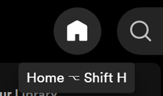
2. In the picture below, it shows a keyboard shortcut for MacOS when I'm using Windows 10.
- Mark as New
- Bookmark
- Subscribe
- Mute
- Subscribe to RSS Feed
- Permalink
- Report Inappropriate Content
Plan
Free
Country
India
Operating System
(Windows 11)
My Question or Issue
I am having issue with the new update, that gives a new look to the spotify application. I have talked to Spotify Help through Live Chat. The problem is that, I have reinstalled Spotify several time, tried steps given on the website like clearing app data and all but nothing works. The application is updated to latest version as told to me in live chat by an agent but UI is still not updated. Same is the case with Spotify Web. Below are some related screenshots.


- Mark as New
- Bookmark
- Subscribe
- Mute
- Subscribe to RSS Feed
- Permalink
- Report Inappropriate Content
Hi there @ArnavToshniwal,
Thanks for the post.
It looks like the "Upgrade" button you see, is promoting to upgrade your account to Spotify Premium, rather than upgrading the app itself. You'll continue seeing this "Upgrade" prompt on the Desktop and web version, as long as you're using the free service.
You can check out current available Premium plans here if you're interested.
If there is a pending software upgrade, you'll see a blue dot next to your profile picture and name.
Hope this clears things up 🙂
- Mark as New
- Bookmark
- Subscribe
- Mute
- Subscribe to RSS Feed
- Permalink
- Report Inappropriate Content
Hi Alex, I'm having the same Issue I've tried both versions (Store and Website) and I see my friends having this new UI too.
- Mark as New
- Bookmark
- Subscribe
- Mute
- Subscribe to RSS Feed
- Permalink
- Report Inappropriate Content
Hi Alex,
Thanks for looking into my problem, but according to I have to purchase premium so that I can experience the new UI/update. I don't think that would be a solution to my problem as many of my friends are able to use the same even without Spotify Premium.
- Mark as New
- Bookmark
- Subscribe
- Mute
- Subscribe to RSS Feed
- Permalink
- Report Inappropriate Content
Hey folks,
Thank you for keeping in contact and for the info shared.
I think there might be some confusion about it. The message sent previously by @Alex was explaining that the Upgrade button is for subscribing to Premium, but not updating the app. The new UI is available for Premium and free users. In this case, since you are not seeing the new UI yet, it could be related to some damaged cache stored from previous versions.
Taking this into account we'd recommend performing a clean reinstall of the app by following the steps in this article. This is often an overlooked step, but it's more thorough than a quick one and can be helpful in getting rid of any cache that might be causing trouble. After this, restart your device and try again.
In case the issue persists, include in your next response the Spotify version you're currently running, along with a screenshot where we can see the old UI to continue investigating.
Lastly, would you mind checking if the Web Player also shows the old UI, or if it displays correctly?
We'll be on the lookout.
- Mark as New
- Bookmark
- Subscribe
- Mute
- Subscribe to RSS Feed
- Permalink
- Report Inappropriate Content
Hi OscarDC, I've made a clean reinstall but it didn't work, the browser is the same as the as the app, you can see the reply above with the UI + version with a screenshot.
- Mark as New
- Bookmark
- Subscribe
- Mute
- Subscribe to RSS Feed
- Permalink
- Report Inappropriate Content
Since one of the later Spotify updates revamped the whole UI. There have been some changes that are visually unpleasing. For example the Top bar icons do not neatly line up anymore. There is also just a whole lot of wasted space now, mainly enlarged boxes filled with small text and icons.
- Mark as New
- Bookmark
- Subscribe
- Mute
- Subscribe to RSS Feed
- Permalink
- Report Inappropriate Content
Hello,
As in the first original post, I have clearly mentioned all the things, please read that.
Thanks
- Mark as New
- Bookmark
- Subscribe
- Mute
- Subscribe to RSS Feed
- Permalink
- Report Inappropriate Content
Put it baaaaack.
Probably 99% of the time I want either Home or My Library which are now in different parts of the UI. Home doesn't relate to "Search" in any way, but very much relates to my library and playlists.
Old way was better.
Suggested posts
Hey there you, Yeah, you! 😁 Welcome - we're glad you joined the Spotify Community! While you here, let's have a fun game and get…


