- Home
- Help
- Your Library
- Desktop: New Your Library sidebar
Help Wizard
Step 1
Type in your question below and we'll check to see what answers we can find...
Loading article...
Submitting...
If you couldn't find any answers in the previous step then we need to post your question in the community and wait for someone to respond. You'll be notified when that happens.
Simply add some detail to your question and refine the title if needed, choose the relevant category, then post.
Just quickly...
Before we can post your question we need you to quickly make an account (or sign in if you already have one).
Don't worry - it's quick and painless! Just click below, and once you're logged in we'll bring you right back here and post your question. We'll remember what you've already typed in so you won't have to do it again.
FAQs
Please see below the most popular frequently asked questions.
Loading article...
Loading faqs...
Ongoing Issues
Please see below the current ongoing issues which are under investigation.
Loading issue...
Loading ongoing issues...
Help categories
Account & Payment
Using Spotify
Listen Everywhere
Desktop: New Your Library sidebar
Solved!

- Mark as New
- Bookmark
- Subscribe
- Mute
- Subscribe to RSS Feed
- Permalink
- Report Inappropriate Content
Spotify is introducing a new Your Library sidebar in the desktop app and Web Player.
The new Your Library sidebar improves navigation and makes it easier and faster to collect and retrieve all types of content, bringing new features to desktop that you're already familiar with in the mobile app. The new sidebar is also more customizable than before to meet different preferences.
This thread is your go-to destination for learning what's new, asking questions, getting help for issues you might have, as well as to share your feedback about the new Your Library sidebar for desktop. Also, do you have any tips for other users on how you are using the new Your Library sidebar? We'd love to hear them.
What's new in the Your Library sidebar?
- See your entire collection and all of the content types (not just playlists)
- Filters for your collection (Playlists, Artists, Albums, Podcasts) that can be combined with other filters (By you, By Spotify, Downloaded)
- Sort options for your collection (Recents, Recently Added, Alphabetical, Creator, Custom Order)
- Chosen filters and sort options will be remembered in the sidebar across restarts of the desktop app
- Search through your collection in the sidebar
- Pinned library items to find your favorites, faster – current limit is 4 (Playlists, Playlist Folders, Artists, Albums, Podcasts)
- Art covers are now shown in the sidebar
- Compact library layout (no art covers) is available as an option in Settings to increase content density
- Dedicated + (plus) button to create Playlists and Playlist Folders
- Flexible Sizing: A collapsed library view (with only art covers) to maximize the browsing area, a regular width view, and an expanded view for more focused library management and curation. (you can also drag to customize the size)
- In the expanded library view, you have options for list view, compact view, and a grid view. The list and compact views show you more details in 2 columns, Date Added and Last Played, and the grid view allows you to see larger art covers.
- Playlist Folders can still be expanded into the sidebar in a tree view, and now when you click on them, the sidebar only shows the Playlist Folder and what's inside for a more focused view.
- Menu option to move a playlist to a folder (with search)
Note: The Your Library sidebar experience will be the same for the most part in the Web Player. However, the Web Player does not support all of the features found in the desktop app. To be able to use all of the features, you can download the desktop app right here.
Tips to get started:
If you need a familiar experience to help you get started with the new Your Library sidebar, here's how to get it as close as possible to the old sidebar that previously only showed playlists:
- In the left "Your Library" sidebar, click on the "Playlists" filter at the top.
- Then, in the drop down menu select "Custom Order" under "Sort by". You will then see your previous playlist order and be able to move your playlists and folders like before.

- Your currently chosen filters and sort options will be remembered across restarts of the desktop app.
- If you would like to only see text in the Your Library sidebar (no art covers), go to the drop down menu and at the bottom of the menu click on "Compact" under "View as".


- Flexible Sizing: You can drag the Your Library sidebar to different sizes. Fully expand the sidebar by clicking the arrow button at the top, and fully collapse the sidebar by clicking on the "Your Library" heading to see only art covers.
- At the top, you can scroll through the different filters with your mouse scroll wheel for faster navigation when the sidebar is set to a smaller size.
Walkthrough of the basics:
Sidebar List:
You can now see your entire collection and all of the content types (not just playlists) in the sidebar list. At the top, click on the filters to filter the content you want to see, and click on the drop down menu to change the sort order or view of the list. To create a new Playlist or Playlist Folder, click on the + (plus) button at the top right corner of the sidebar. To search through your collection, click on the search button.

Filter Options:
At the top, click on the filters to filter the content you want to see. You can scroll through the different filters with your mouse scroll wheel for faster navigation when the sidebar is set to a smaller size.
To remove the filter, click on the X or the currently selected filter and then choose another filter to see another type of content. Having no filter selected will show all types of content mixed in the list.
- Playlists
- Artists
- Albums
- Podcasts & Shows
- These can be combined with other filters: By you, By Spotify, Downloaded
Sort Options:
At the top, click on the drop down menu to change the sort order of the list under "Sort by".
- Recents
- Recently Added
- Alphabetical
- Creator
When the "Playlists" filter is selected, you have the option to see your playlists in your own custom order.
- Custom Order
When the "Podcasts & Shows" filter is selected, you have the following option:
- Recently Updated
View Options:
At the top, click on the drop down menu to change the view of the list under "View as".
- Compact (view text only without art covers)
- List
- Grid (bigger art covers)
Flexible Sizing:
You can hover over and click on the right edge of the sidebar to drag it to your preferred width. You can also fully expand the sidebar by clicking the arrow button at the top, and fully collapse the sidebar by clicking on the "Your Library" heading to see only art covers.
In the expanded library view, you have options for list view, compact view, and a grid view. The list and compact views show you more details in 2 columns, Date Added and Last Played, and the grid view allows you to see larger art covers.

FAQ:
This section will answer your frequently asked questions and will be updated with the latest answers.
Related help articles on the support website:
• Your Library • Sort and filter • Keyboard Shortcuts
Can I view the Your Library page in the main browsing area like before?
- Unfortunately, the old Your Library page in the main browsing area is being discontinued with the release of the new Your Library sidebar. You can adjust the size of the Your Library sidebar to be bigger and you can also enable the "grid view" if you would like to see bigger art covers.
How do I see only my playlists in the sidebar like I used to be able to, I can't drag and move my playlists or folders anymore?
-
In the left "Your Library" sidebar, click on the "Playlists" filter at the top.
Then, in the sort options drop down menu select "Custom Order". You will then see your previous playlist order and be able to move your playlists and folders like before.
Your currently chosen filters and sort options will be remembered across restarts of the desktop app.
I don't want to see art cover images in the sidebar, how do I turn them off?
- If you would like to only see text in the Your Library sidebar (no art covers), go to the drop down menu and at the bottom of the menu click on "Compact" under "View as".
How do I get the album art to expand in the bottom left corner like before? When I try to expand the album art, it opens the Now Playing View sidebar to the right.
-
Unfortunately, that is no longer possible. When you expand the album art in the bottom left corner of the app, it will no longer hover over the Your Library sidebar. Instead, the new right sidebar will open up. You can resize the Now Playing View sidebar to your preferred size.
You can read more information about this by going here.
How do I play or shuffle play a Playlist Folder now? (I don't see dedicated pages with play / shuffle options anymore)
- Right click on a Playlist Folder and select the "Play" option. To shuffle play, make sure to turn on the shuffle mode first before selecting the "Play" option in the right click menu.
How do I get to my Local Files now?
-
In the left "Your Library" sidebar, click on the "Playlists" filter at the top.
Then, in the sort drop down select "Custom Order".
The "Local Files" playlist will be near the top of the list under your pinned items (if any).
Feedback:
Where can I give my feedback about the new Your Library sidebar in the desktop app?
- We welcome your feedback about this change. The best way to share your feedback is to comment here in this thread.
Solved! Go to Solution.
- Subscribe to RSS Feed
- Mark Topic as New
- Mark Topic as Read
- Float this Topic for Current User
- Bookmark
- Subscribe
- Printer Friendly Page

- Mark as New
- Bookmark
- Subscribe
- Mute
- Subscribe to RSS Feed
- Permalink
- Report Inappropriate Content
Still a usability nightmare 6 months later, and it resets to defaults whenever you reinstall

- Mark as New
- Bookmark
- Subscribe
- Mute
- Subscribe to RSS Feed
- Permalink
- Report Inappropriate Content
So my Windows laptop died after 2 years. The battery broke when it was updating, it just turned off and no more on. Even powered. It was 15" laptop and it was back then a pain in the thing to use it. I couldn't afford or explain good enough to pay 899 for a laptop, so I went back to Chromebook. This time it is 14". The view is still bad because my mouse broke too for 59 pieces. Warranty claims and I was able to take a refund as they break often. With laptop mouse pad and keyboard scrolling is even harder through this artist/album/podcast/playlist heaven when followed artists alone over 1 200. it takes too long to scroll. The compact view is even the best option here and it still takes time. Did anyone of you at Spotify try it on a tiny laptop screen without a mousey mouse, just a laptop's mouse pad and keyboard up/down? Please revert. I cannot use the tile view as then it will be too much clutter, when one could almost hear colors when scrolling endlessly just to find something to hear. At the same time the mobile app is going up down, so what to do next if not looking around?

- Mark as New
- Bookmark
- Subscribe
- Mute
- Subscribe to RSS Feed
- Permalink
- Report Inappropriate Content
I will do my best not to shoot the messenger. And yes, I appreciate that I'm six months late on this rollout.
But holy (**bleep**), this new interface is awful!
Spotify has constantly made things worse. They have methodically removed features that people actually use, and given us no way to modify our revert our experience.
"Liked the old layout? Too bad, it's gone now. We could have put a toggle in the settings, but we didn't because F-YOU! Now give us our money."
What I would like to know is this: Why does Spotify go out of its way to degrade the user experience, when they could easily leave it alone?

- Mark as New
- Bookmark
- Subscribe
- Mute
- Subscribe to RSS Feed
- Permalink
- Report Inappropriate Content
Because the suits are greedy **bleep**s, they now want even more money together with the big "Stars" and everyone Else should get less or we Pay more. 101 on how to Ruin good Reputation and a product people actually likes

- Mark as New
- Bookmark
- Subscribe
- Mute
- Subscribe to RSS Feed
- Permalink
- Report Inappropriate Content
What's the point of this sh!tty sidebar if it's not updating? The recent albums/playlist don't synchro with mobile. Even If I choose something new from PC app it doesn't appear in this shvtty sidebar - it's just random. For example home screen where I see "Good Morning" message is synchronized so there's something totally messed up.

- Mark as New
- Bookmark
- Subscribe
- Mute
- Subscribe to RSS Feed
- Permalink
- Report Inappropriate Content
Please fix this issue already!!

This is since release, all the icons will throw this information row under the top sidebar with buttons.
Who is designing this? Hire someone to fix already.

- Mark as New
- Bookmark
- Subscribe
- Mute
- Subscribe to RSS Feed
- Permalink
- Report Inappropriate Content
"This is quite good. We should, you know, destroy it".
- Spotify.

- Mark as New
- Bookmark
- Subscribe
- Mute
- Subscribe to RSS Feed
- Permalink
- Report Inappropriate Content
Please provide separate song and artist columns. They have been stacked for far too long and its incredibly difficult to find and sort artists in my libraries and playlists.

- Mark as New
- Bookmark
- Subscribe
- Mute
- Subscribe to RSS Feed
- Permalink
- Report Inappropriate Content
Recently the right click menu for songs on the Windows browser app was **bleep** up something fierce. It's absolutely ridiculous to place "Remove from your Liked Songs" right where "Add to queue" used to be. I've accidentally removed so many songs, and since I can't manually change the order of songs in my Liked Songs I've now got like 10 songs just permanently out of place after I added them back.

btw why the heck would you censor "scr*wed"?
- Mark as New
- Bookmark
- Subscribe
- Mute
- Subscribe to RSS Feed
- Permalink
- Report Inappropriate Content
Again new desktop update which not fixed hoovered icons text bug.
Tried in the time being to expand/use all possible columns on default view. And I laughed big.

Thanks for these 2 playlist rows on 14" laptop screen.
- Mark as New
- Bookmark
- Subscribe
- Mute
- Subscribe to RSS Feed
- Permalink
- Report Inappropriate Content
exactly, at the same time, I can see why Spotify management cannot afford to roll back to their previous design. Its very likely a bussiness issue, where they don't to afford losing face by taking the shame of announcing they have made a mistake.
That and more likely they can implement more reevenue-generating features with the new code that the new ui is made with. So its likely a compatability and implementation issue as well but fundamentally i see it aas a business issue, which is why it feels like they absolutely dont give a sh*t about anything that is going on here.
- Mark as New
- Bookmark
- Subscribe
- Mute
- Subscribe to RSS Feed
- Permalink
- Report Inappropriate Content
@lunderdor10
i agree, after being for over 7 years with them, and originally riding happy on the endless tree structure of playlists and folders that got me really satisfied with the product and services (as I got everybody hooked on the premium, got in my family freinds etc.), I have come to loathe this company and their "we don't give a sh*t" attitude so damn much for what they did in the last few years with it, that I am even willing to rebuild all of my music hierarchy offline away from all these riddiculous bullsh*t they are doing to us.
And even more, I am thinking of going public with my sentiment about this company as my patience for this level of market deception and corporate practices begins to hit rock bottom. I don't think any company in the world should get away with this, I believe Spotify underestimates the public market.

- Mark as New
- Bookmark
- Subscribe
- Mute
- Subscribe to RSS Feed
- Permalink
- Report Inappropriate Content
Whilst I 100% agree that the interface is appalling, I think the more likely explanation is that they did their research, focus groups etc. and this is probably what the majority of users want. I'm 62 and what I want is simply to easily find albums by artists and play them, but I am far from being their core user!
I suspect that the way young people digest music these days is primarily through playlists and suggestions/recommendations. My ten-year-old son uses Spotify constantly and that is all he is interested in, and "mood" playlists: mellow, happy etc. He doesn't, and probably will never, know the name of the artistes. If we add AI generated "music" into that scenario you can see why the record companies are falling over themselves to get into it; no royalties for them to pay, just pure profit from streams by people who don't have any interest in artistes, just the "feel" of the sound.
So, don't blame Spotify for probably giving the majority of their users what they want.
- Mark as New
- Bookmark
- Subscribe
- Mute
- Subscribe to RSS Feed
- Permalink
- Report Inappropriate Content
@reg091
very good point! Holy sh*t! well put!
Yes, you might be exactly right, and this is exactly the point! Its fair to say that there is too little people for them to even care, yes they probably make tons of smirky jokes about this in their offices, thinking this thread is a sh*thole nobody in their company even cares about, and that's just perfect!
I mean, can't you see the perfect storm? When a company decides to ignore things like this, eventually all the problems gain in size so much - it hits them, heck sometimes even takes the whole company down.
Reading your comment here made it clear for me now...you're right, nobody gives sh*t about this thread, damn I should've thought of that earlier!
But that just means, we need a place with a lot of traction, traffic and following! A lot publicity, a voice and place where all of these ideas can gain a large following. A place that influences the masses and presents the facts with reason.
Aah..if there are no channels on this, I will most likely make one.
- Mark as New
- Bookmark
- Subscribe
- Mute
- Subscribe to RSS Feed
- Permalink
- Report Inappropriate Content
Don't make a new channel, make a new app 🙂 One that all of us here complaining will like! Actually, that made me wonder if there are third-party apps that provide a different interface for Spotify? I shall look into that.
- Mark as New
- Bookmark
- Subscribe
- Mute
- Subscribe to RSS Feed
- Permalink
- Report Inappropriate Content
i am 33 soon and all I want from Spotify is MUSIC and PLAYLISTS. So no podcasts, no tiktok views. Simple app design.
I used to like Google Music, but it's not out anymore, that was fittng ones purpose the most.
I listen so much different tracks, buying them could be too expensive. Over 10 000 tracks in playlists alone...
It seems they just ignore our concerns.
The previous look with lists only in sidebar was really good as you could look library in a bigger size.
Now expanding everything and minimizing steals space.
I think UI coders can't understand some may have 14" not 34" screens...
- Mark as New
- Bookmark
- Subscribe
- Mute
- Subscribe to RSS Feed
- Permalink
- Report Inappropriate Content
Please, for the love of god. Remove this UI abomination.


- Mark as New
- Bookmark
- Subscribe
- Mute
- Subscribe to RSS Feed
- Permalink
- Report Inappropriate Content
Pure poetry-- all of your comments here! The best of history.
- Mark as New
- Bookmark
- Subscribe
- Mute
- Subscribe to RSS Feed
- Permalink
- Report Inappropriate Content
Hey @wanderful @feedthedog @Marl_Karx @merrett22 @kcwebbah @ericmoncivais02 @gousto01
@SonicDimension @sascasey @Blacklabel78 @canadasandra @avis-icarus @sarahfelldown @Meiliv @thomassness @djmirage
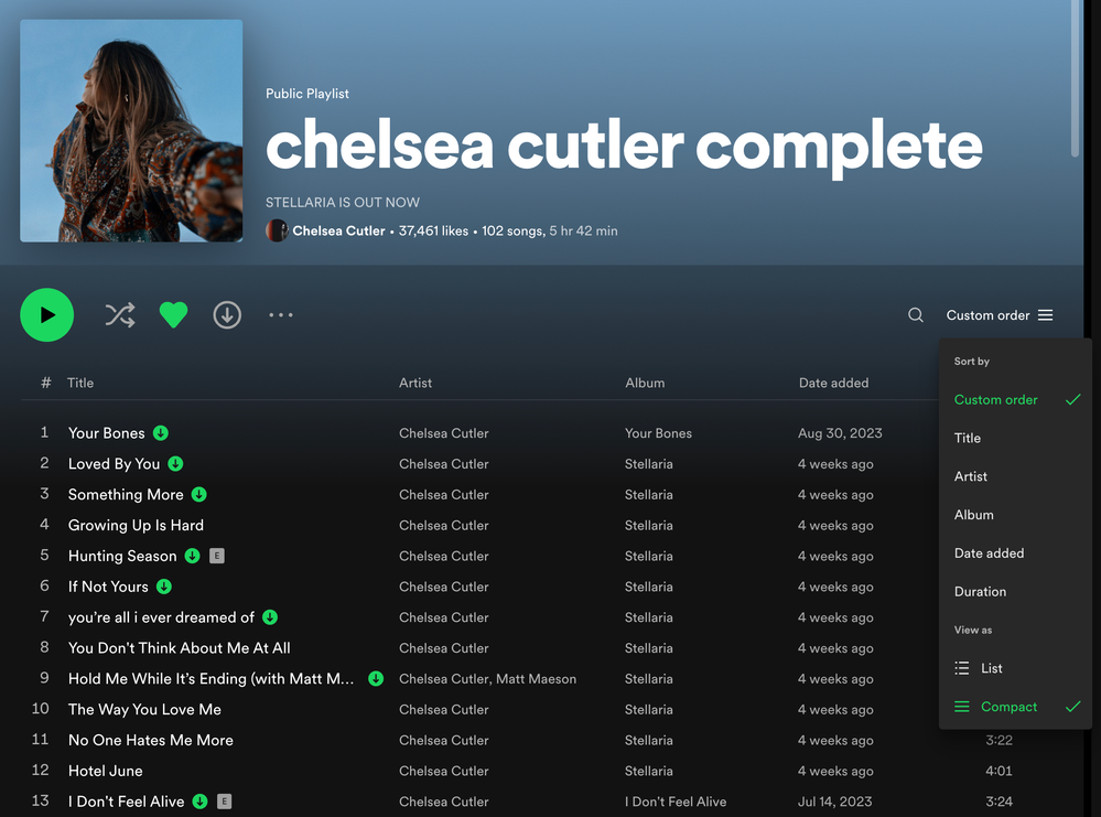
Good news! The "Artist" column is back! I thought you'd like to know that the "Compact" view from the Your Library sidebar has now been brought to track listings in the main content area of the desktop app.
There is now a new Compact Mode for track lists (playlists and album pages) in the desktop app and Web Player
The drop down menu now has "Sort by" and "View as" options. To turn on compact mode, open up the drop down menu at the top right of a playlist or album page and click on "Compact" under "View as".
On Playlist pages, it removes the album art, and breaks out "Title" and "Artist" into their own separate columns again. This view is similar to before the redesign that added album art into playlists a few years ago.
On Album pages, it moves the artist and featured artists from below each track title, to a new "Artist" column to the right of the "Title" column.
When you turn on Compact Mode, it will be remembered and stay on when you are viewing both playlists and album pages. You can switch back to the regular "List" view at any time.
The new Compact Mode for track lists is rolling out in the desktop app and Web Player right now so you should be seeing it soon. This has been a highly requested feature since the redesign came out a few years ago.
- Mark as New
- Bookmark
- Subscribe
- Mute
- Subscribe to RSS Feed
- Permalink
- Report Inappropriate Content
Hey folks,
Thanks for your feedback so far!
Here are the Your Library sidebar updates that were recently released in September 2023.
September 2023:
- "Compact View" option has moved to the drop down menu
The "Compact View" option has moved from the settings page. You can now select this option directly from the Your Library sidebar.
At the top, click on the drop down menu to change the view of the list under "View as".- Compact (view text only without art covers)
- List
- Grid (bigger art covers)
- "Grid View" option is now available when the sidebar is set to a smaller width
You can now select the "Grid View" option from the drop down menu to see bigger art covers when the sidebar is set to a smaller width and not fully expanded with the arrow button at the top.

Suggested posts

Hey there you, Yeah, you! 😁 Welcome - we're glad you joined the Spotify Community! While you here, let's have a fun game and get…
