Help Wizard
Step 1
Type in your question below and we'll check to see what answers we can find...
Loading article...
Submitting...
If you couldn't find any answers in the previous step then we need to post your question in the community and wait for someone to respond. You'll be notified when that happens.
Simply add some detail to your question and refine the title if needed, choose the relevant category, then post.
Just quickly...
Before we can post your question we need you to quickly make an account (or sign in if you already have one).
Don't worry - it's quick and painless! Just click below, and once you're logged in we'll bring you right back here and post your question. We'll remember what you've already typed in so you won't have to do it again.
FAQs
Please see below the most popular frequently asked questions.
Loading article...
Loading faqs...
Ongoing Issues
Please see below the current ongoing issues which are under investigation.
Loading issue...
Loading ongoing issues...
Help categories
Account & Payment
Using Spotify
Listen Everywhere
New Your Library test (iOS & Android)
Solved!- Mark as New
- Bookmark
- Subscribe
- Mute
- Subscribe to RSS Feed
- Permalink
- Report Inappropriate Content
Spotify is testing a new version of Your Library in the mobile app with select users. There is currently no way to sign up for this test without being invited, but we thank you for your interest.
This thread is your go-to destination for asking questions, getting help for issues you may have, as well as to share your impressions and feedback on this new version of Your Library.
Note: Some of the screenshots shown might be slightly different than the latest version of the test
What's new?
- See your entire collection in one simple list
- Easy filters to find your favorites, faster
- More control at your fingertips with a new grid view
- Unified search allows you to search through your entire collection and see your recent searches
- Faster settings navigation allows you to tap on your profile picture to get to settings faster
Here is a walkthrough of what's new:
One simple list:
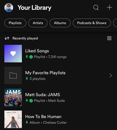
Your Library is now one simple list. At the top, tap the filters to filter the content you want to see and tap on the sort options to change the sort order of the list.
Filter Options:
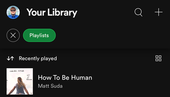
At the top, tap the filters to filter the content you want to see. Tap the X and then chose another filter to see another type of content. Having no filter selected will show all types of content in the list.
- Playlists
- Artists
- Albums
- Podcasts
- Downloaded
Sort Options:
At the top, tap on the sort options to change the sort order of the list.
- Most relevant
- Recently played
- Recently added
- Alphabetical
- Creator
New grid view:
Are you a visual person? You're in control. With the new grid view you can view Your Library with bigger artwork if that's your jam. This is great for when you're on the go or in the car so you can find what you're looking for faster. To switch to the grid view, tap on the squares icon to the right. Tap on it again to go back to list view.
New unified search:
The new unified search can be accessed by tapping the search icon in the top right. This new search allows you to quickly search through your entire library without having to go to a specific content section.
Recent searches:
The new unified search also shows you your most recent Your Library searches so you can quickly get back to what you previously searched for.
Note: Remember that this is a test and features may change during the new Your Library test. Features in this test might not end up being generally released. The purpose of this test is to gather feedback and help improve the new Your Library. Please read this help article for more information about Spotify feature testing.
The other Stars and I got the chance to test the new mobile Your Library first and now more users will be able to test it out and give their feedback to the team. If you are a passionate Spotify user and would like to join the Spotify Star Program and be part of cool experiences like this then check out this page.
Solved! Go to Solution.
- Subscribe to RSS Feed
- Mark Topic as New
- Mark Topic as Read
- Float this Topic for Current User
- Bookmark
- Subscribe
- Printer Friendly Page
- Mark as New
- Bookmark
- Subscribe
- Mute
- Subscribe to RSS Feed
- Permalink
- Report Inappropriate Content
Also, to provide more input:
I agree with a previous poster. When you're included in a random test you should probably get an e-mail or notification pointing to this community section which describes the test. I didn't know about it until a support tech informed me when I contacted about the reverted UI. This would likely help to get feedback and reduce negative experiences from those who would otherwise be left confused.
- Mark as New
- Bookmark
- Subscribe
- Mute
- Subscribe to RSS Feed
- Permalink
- Report Inappropriate Content
@Nikster @Thisiscreature @jamator and other podcast users
How do I see the latest podcast episodes?
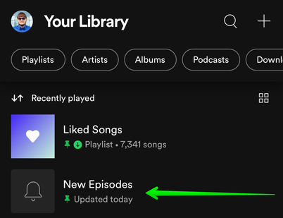
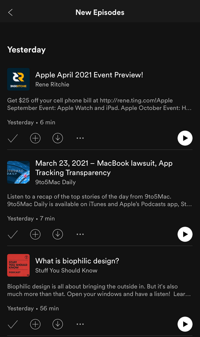
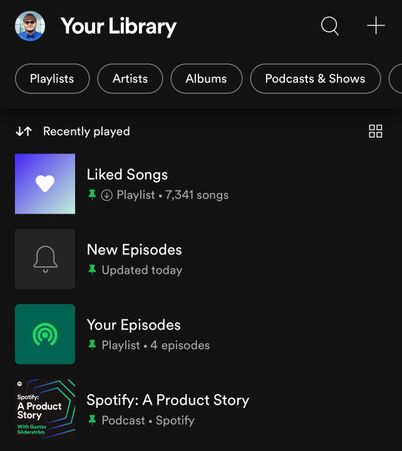
I previously mentioned that there is a new pinned section called "New Episodes" that shows you the latest updates.
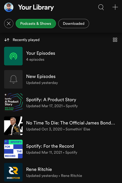
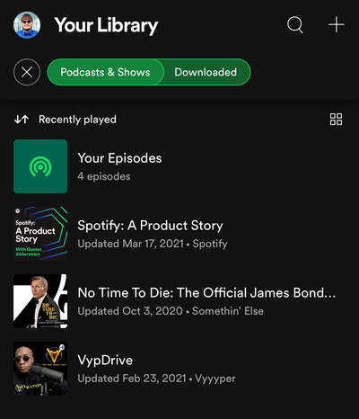
In addition to this new pinned "New Episodes" list, if you tap on the "Podcasts & Shows" filter at the top, the same "New Episodes" list will show there too, and another list called "Your Episodes" will show there at the top as well.
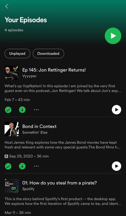
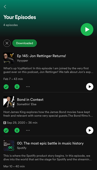
In the "Your Episodes" list, it will show you all of the individual podcast episodes you saved and downloaded. When you download a podcast it is automatically saved as well.
There is a filter at the top of the "Your Episodes" list you can tap on to filter and see only podcast episodes that have been downloaded. From the main library view you can also tap on "Podcasts & Shows" filter and combine it with the "downloaded" filter.
You can also pin the "Your Episodes" list to the main library view under the "New Episodes" list if you also want to be able to access "Your Episodes" from the main library view without having to filter to "Podcasts and Shows" first. Just long press and hold on the "Your Episodes" list or swipe right on it in the iOS app, and select the "pin playlist option". You have the ability to pin up to 4 items to the main Your Library list. I will have another post here in the thread soon that goes over pinning items to the main Your Library list. Currently there is a limit of up to 4 pins and you can pin everything from playlists, playlist folders, podcasts, albums, artists, etc.
- Mark as New
- Bookmark
- Subscribe
- Mute
- Subscribe to RSS Feed
- Permalink
- Report Inappropriate Content
- Mark as New
- Bookmark
- Subscribe
- Mute
- Subscribe to RSS Feed
- Permalink
- Report Inappropriate Content
These are the latest updates to the Your Library test. Make sure your app is up to date with the latest version. iOS and Android updates are not always released at the same time so there may be a short delay.
March 25, 2021 (app version 8.6.12):
📌 Pinned items in Your Library
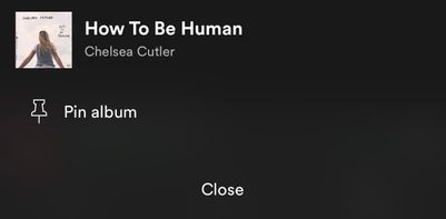
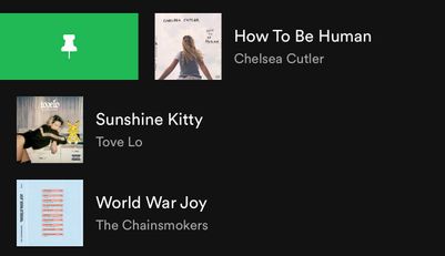
If you tap and hold on the screen on any item in the Your Library list or swipe right on it, an option will show up allowing you to pin it and it will stay at the top of the Your Library list. You can pin anything in Your Library such as playlists, playlist folders, artists, albums, podcasts, etc. You can only have 4 pinned items. You can unpin "New Episodes" to free up a pin and still get to that using the "Podcasts & Shows" filter and it'll still be there at the top. Same with "Liked Songs", you can unpin it and still get back to it at the top of the "Playlists" filter. You can also pin the "Your Episodes" list to the main library view in addition to the "New Episodes" list if you also want to be able to access "Your Episodes" from the main library view without having to filter to "Podcasts & Shows" first.
To pin more playlists when you run out of the 4 item pins, you can make a playlist folder in the desktop app or web player and then move multiple playlists inside it and then pin the folder in the mobile app. Then tap on the folder at the top and there you go, easier access to all the playlists in that folder and that can be your 4th pin. However you can't pin a specific playlist if it is in a folder, so you have to pin the folder instead.
To easily find the item you want to pin, the best way is to use the universal search. At the top of Your Library, tap on the search icon and search for the item you want to pin. The universal search searches your entire library for playlists, playlist folders, artists, albums, podcasts, etc and also shows you your recent searches.
- Mark as New
- Bookmark
- Subscribe
- Mute
- Subscribe to RSS Feed
- Permalink
- Report Inappropriate Content
Feedback:
After using the new mobile Your Library through all of the changes for the past several months I wanted to post my own personal feedback. My main feedback is that the new library needs to be better optimized for one handed use (especially on bigger phones), more customization is needed, and the artist follow system / artists section of Your Library needs to be fixed.
Note: I am not a Spotify employee, I am a user that is part of Spotify's Star Program. I have been helping users in this thread with this test and this is just my personal feedback.
Things I don't like about the new library and suggestions I have to improve them:
- The whole concept of just one long list and then filtering it based on content is slower especially having to wait for the annoying animation to finish. When I am done filtering I have to tap the X and then tap on another filter and it just feels slow and annoying compared to the old way of swiping back and forth between sections or just tapping between them. On a big phone like the iPhone 12 Pro Max, one handed use is no longer easy since you can no longer swipe between the sections. You have to use 2 hands to hold the phone and reach to the very top of the phone to tap on the filters. My suggestion is to leave all of the filters on display at the top when one is activated. The activated one remains green, but the other filters remain shown at the top, and instead of tapping an X and waiting for a slow animation and then having to tap on another filter, only one tap will be required to switch filters. For example: You open up the Spotify app and see all of the filters at the top, you tap on playlists and it switches the view and the playlists filter turns green, you then want to switch the filter you will see the other filters at the top (not colored in green) you then tap on albums, and it switches to albums and then the filter turns green to show that it has been activated. This would be much faster than having to X out of a filter first, wait, and then tap on another one. Another suggestion I have for one handed use is to show the filters at the bottom of the Your Library view, above the now playing bar, instead of at the top. That way one handed use on bigger phones is much easier and then you wouldn't need to bring the swipe left and right to change filters gestures back. If you don't move the filters to the bottom of the view, then at least allow us to swipe left and right to switch between the filters like in the old library view. Swiping left and right would then only switch between the main filters (you would still need to reach to the top and select "Downloaded" fitler if that's the one you want, to avoid conflicts when swiping) I feel like you did not take one handed use when you're quickly on the go (especially with bigger phones) into consideration when designing this new library. The old library took this into consideration with the ability to swipe left and right between each view.
- "Podcasts & Shows" is a long name... and makes it so the "Downloaded" filter is more hidden off screen and requires scrolling through the filters to get to it. Why not just leave it how it used to be named as "Podcasts"
- I don't like how the main view of library, albums, artists, and podcasts share the same saved sort order. The only filter that allows you to set a separate saved sort order is the "playlists" filter. For example, I want the main view to be recently played, playlists to be custom order, artists to be recently added, albums to be recently added, and a different order for podcasts if I chose so, etc. Allow us to save sort order per filter and not share the same sort order setting between all of the filters.
- I would like the ability to set a default filter view so that the filter of my choosing is automatically showing / activated on app startup. I generally only want to see my playlists on app launch like how it was in the old library design. The option to set the playlists filter to be the default view, or any of the other filters to be the default view would be nice. This is also why my suggestion of leaving all of the filters in view and just showing the active filter as green as mentioned above should happen. If a default filter view is not selected by the user then the current unfiltered unified view is shown.
- The artists section of my library has been broken ever since the 2019 mobile Your Library redesign and it is still broken with the new Your Library design here in 2021. The problem is that I follow more than 1,000 artists (2,300) and lots of the artists I follow don't show up in the artists section even though in the desktop and web player the artist page shows I am following them. The mobile artist page shows that I am NOT following them. It's really inconsistent across platforms. I was told by a product manager that this was being looked into exactly 1 year ago and I have not seen any progress on this following artists / artists section of Your Library issue. In fact this problem is now even worse with the new desktop app design showing my following count as "1,000" when it is around "2,300". Old desktop app design properly showed my following count. The web player has the wrong following count as well, but the web player is the only Spotify app that will show me all of my artists when I scroll through the artists section of my library. Weird since the desktop app and web player share the same underlying infrastructure. This inconsistency for the artist following system and the artist section of Your Library is terrible and I have no idea why nobody at Spotify can fix this issue that has been happening for 2 years now and I am not the only user with this issue. I even had this issue on the test account customer support had me use to test at one point and that account was following more than 2,000 artists too. I have an entire thread dedicated to this issue and you can read it right here
Things I like about the new library and suggestions I have to improve them:
- The ability to get to my profile and settings faster with the new profile icon. Although I don't think most users will know to tap on their profile pic to get to settings. It will be an adjustment.
- Option to have GRID view instead of only having the list view. I noticed that playlist folders don't have a grid view. That would be nice to add.
- A unified search button so I don't have to go to a specific section of my library to search for something, although the option to search specific sections would be nice like the old library view so it's not so cluttered when looking for something specific in the big list of results. This is the perfect opportunity to put filters at the top of the library search results that match the filters in the main library view: Playlists, albums, artists, podcasts, etc and then easily be able to filter the search more specifically if I want to.
- Ability to pin items. I noticed that all of the filters share the same pinned items. It would be nice to have a set of pinned items for the main library view, and then separate additional sets of pinned items once you activate each filter. Like if I fitler to albums, allow me to set 4 specific albums to show at the top. Same with artists, playlists, and podcasts. The flow for this would be when you pin an item, a popup would ask you to choose which filter you want to pin the item to: main view, playlists, artists, albums, podcasts, etc. Also in the main library view it would be nice to increase the maximum limit of pinned items from 4 to 5 or make the Liked Songs playlist pin not count towards the 4 limit.
General suggestions:
- Add the ability to create playlist folders in the mobile app. We can pin them, but they can only be created in the desktop app and web player right now.
- Also please add the ability to add playlists to playlists folders in the mobile app
- Mark as New
- Bookmark
- Subscribe
- Mute
- Subscribe to RSS Feed
- Permalink
- Report Inappropriate Content
I am one of the "lucky" beta testers and I think the old ui with splitting of music and podcast was better. Another issue is that if I download an episode of a podcast without following, it does not show up in my downloads list.
Can we please be allowed to opt of of these in the future?
- Mark as New
- Bookmark
- Subscribe
- Mute
- Subscribe to RSS Feed
- Permalink
- Report Inappropriate Content
- Mark as New
- Bookmark
- Subscribe
- Mute
- Subscribe to RSS Feed
- Permalink
- Report Inappropriate Content
Thanks for the information. Downloaded episodes actually being available and pinning various things do seem to be improvements over not having those options.
But given the choice, I'd still take the current library over this bubble menu option. I just don't see that any of the supposed advantages (I guess some easier sorting?) are worth the trade off. There are lots of Spotify users and I assume many ways of using Spotify. So maybe someone would want a library starting place that combines playlists and podcasts, but it's hard to imagine why. And so right from the beginning that's extra clicks for almost everyone to get somewhere usable.
And even if you allow a user to set their default"your library" starting place, you've still got to close that one and start over to get to your podcasts from playlists or vice versa. And to what end? How is that better than what is there now? You could leave the menu options as suggested above - which would be better for sure, but why change just to end up where you started (with just different shaped options and maybe some easier sorting)?
I do think a "classic view" option, if possible might be a good way to go (but of course I have no idea about the tech requirements for supporting both functionalities). I haven't seen anything about the interface being tested that would remotely make me choose it over the existing one, but maybe someone would.
I guess I'm not totally sure what the goal is here. Do people complain a lot about not being able to change how playlists are sorted? I could see where that could be improved certainly. And I guess the grid view might be nice in some cases. Is there some other advantage here that I'm not seeing?
- Mark as New
- Bookmark
- Subscribe
- Mute
- Subscribe to RSS Feed
- Permalink
- Report Inappropriate Content
- Mark as New
- Bookmark
- Subscribe
- Mute
- Subscribe to RSS Feed
- Permalink
- Report Inappropriate Content
My idea? The new update is terrible. I liked how I could have my own custom order on my playlists and liked playlists. now I can only sort it by Alphabetical, Recently Played, Creator name, and Recently Added.
- Mark as New
- Bookmark
- Subscribe
- Mute
- Subscribe to RSS Feed
- Permalink
- Report Inappropriate Content
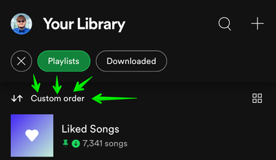
You can now sort the playlists view by custom order. First tap on the playlists filter and then tap on the sort options and change it to "custom order".
- Mark as New
- Bookmark
- Subscribe
- Mute
- Subscribe to RSS Feed
- Permalink
- Report Inappropriate Content
Recently, the mobile library has changed. Instead of being sorted by playlists, albums, and artists, everything is one big jumbled mess and i have to filter what i want to see to even be able to find what I'm looking for.
The three category system was MUCH more efficient and user-friendly. I can't see why you made the change, and hope that you will be reverting back soon.
- Mark as New
- Bookmark
- Subscribe
- Mute
- Subscribe to RSS Feed
- Permalink
- Report Inappropriate Content
- Mark as New
- Bookmark
- Subscribe
- Mute
- Subscribe to RSS Feed
- Permalink
- Report Inappropriate Content
Mixed feelings on this update...
I love seeing my listening history and It gets me to podcasts in fewer clicks.
That said, it also disrupts an essential workflow for me. I like to proactivity pick & download podcast episodes I want to listen to. In the "old" library, it was very helpful to see all the episodes I downloaded in one list.
With the new library, I have to go show-by-show to find the ones I downloaded. If I downloaded an episode from a show I don't subscribe to, I have no way of finding it.
- Mark as New
- Bookmark
- Subscribe
- Mute
- Subscribe to RSS Feed
- Permalink
- Report Inappropriate Content
I went to listen to something on Spotify and the UI for the Your Library section changed for the worse.
I don't like that the default is to now mix together everything and then you toggle "Playlists" or "Podcasts and Shows" in order to separate them. It was better when it just said "Music" and "Podcasts" options at the top and they were completely separate.
If I click on "Podcasts and Shows" the podcasts are all out of order, and the sorting mechanism sorts by "Recently played" (not sure what the point of that is) and "Recently added" (again not sure the point.) Maybe these are useful and I just have no idea why, but I want podcasts to just be sorted by which podcast has most recently released an episode. You can get to this by clicking on "New episodes" but this also has a section for episodes I am in the middle of, which is useful, but I don't know why it's under "New episodes." It should be moved somewhere else.
Good features - blue dot that shows a show has a new episode from the "Home" tab, and the progress bar that shows how far you are into the episode.
TLDR - just switch it back to "Music" and "Podcasts" and under the "Podcasts" tab just sort it by shows that have most recently released episodes.
- Mark as New
- Bookmark
- Subscribe
- Mute
- Subscribe to RSS Feed
- Permalink
- Report Inappropriate Content
You claim one of the sorting options is “custom order” but all that I get shown is recently played, recently added, alphabetical, and by creator. How do I get custom order?? I absolutely hate this new interface
- Mark as New
- Bookmark
- Subscribe
- Mute
- Subscribe to RSS Feed
- Permalink
- Report Inappropriate Content
- Mark as New
- Bookmark
- Subscribe
- Mute
- Subscribe to RSS Feed
- Permalink
- Report Inappropriate Content
- Mark as New
- Bookmark
- Subscribe
- Mute
- Subscribe to RSS Feed
- Permalink
- Report Inappropriate Content
I DESPISE the new Library organization. Being able to easily toggle from Music to Podcasts was a great experience. Within Podcasts, the fact that shows are no longer ordered by added most recent episode is REALLY frustrating and is already making me listen FEWER minutes per day.
- Mark as New
- Bookmark
- Subscribe
- Mute
- Subscribe to RSS Feed
- Permalink
- Report Inappropriate Content
i hate it
Suggested posts
Hey there you, Yeah, you! 😁 Welcome - we're glad you joined the Spotify Community! While you here, let's have a fun game and get…

